Modal
Create focused interactions in overlay windows with custom content.
You can create a modal by adding a new modal from the modal list within the editor page.

Modals can be edited or viewed by selecting the modal from the modal list in the editor page.
Modals can be opened or closed through event handlers in workflows. The execute target property of button components can also be set to open or close modals. Clicking outside the modal will close it.
Properties
| Property | Type | Description |
|---|---|---|
| name | string | Unique identifier for the modal component |
| isHeaderVisible | boolean | Whether to show the modal header |
| isFooterVisible | boolean | Whether to show the modal footer |
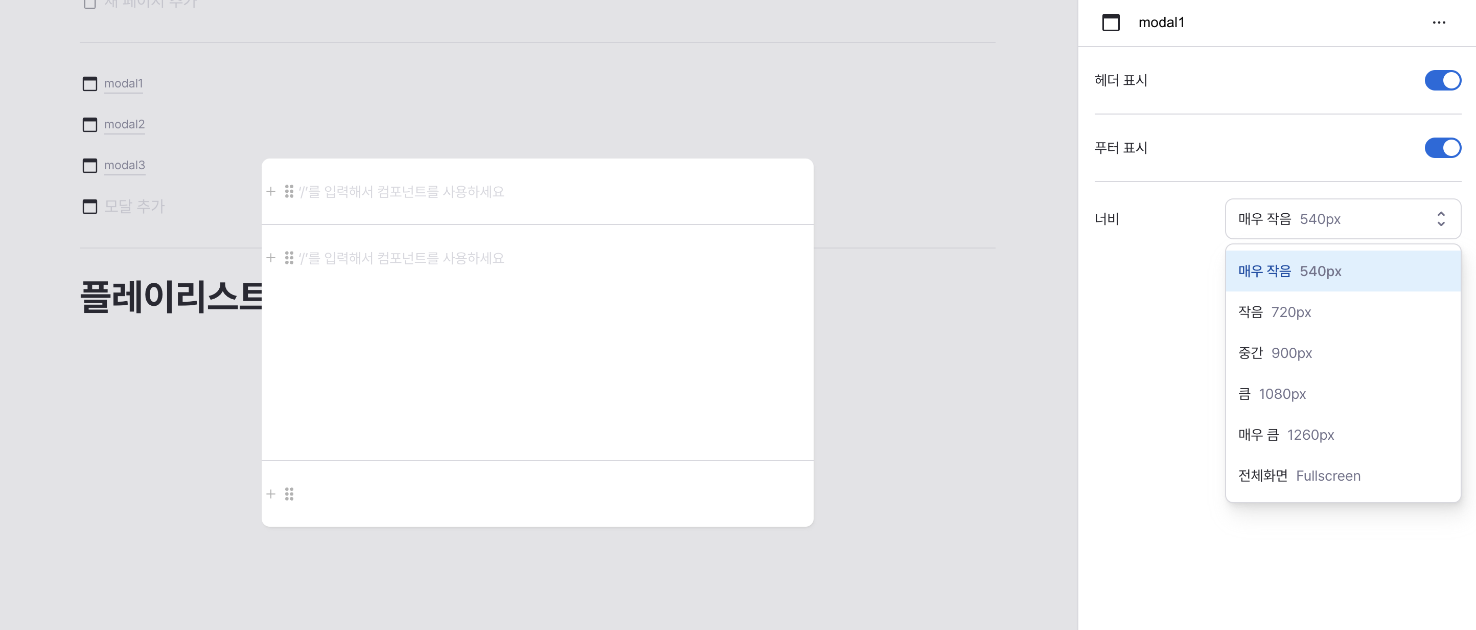
| width | ModalWidth | Width of the modal component |
name
Sets the unique identifier for the modal component. Please refer to the component naming rules
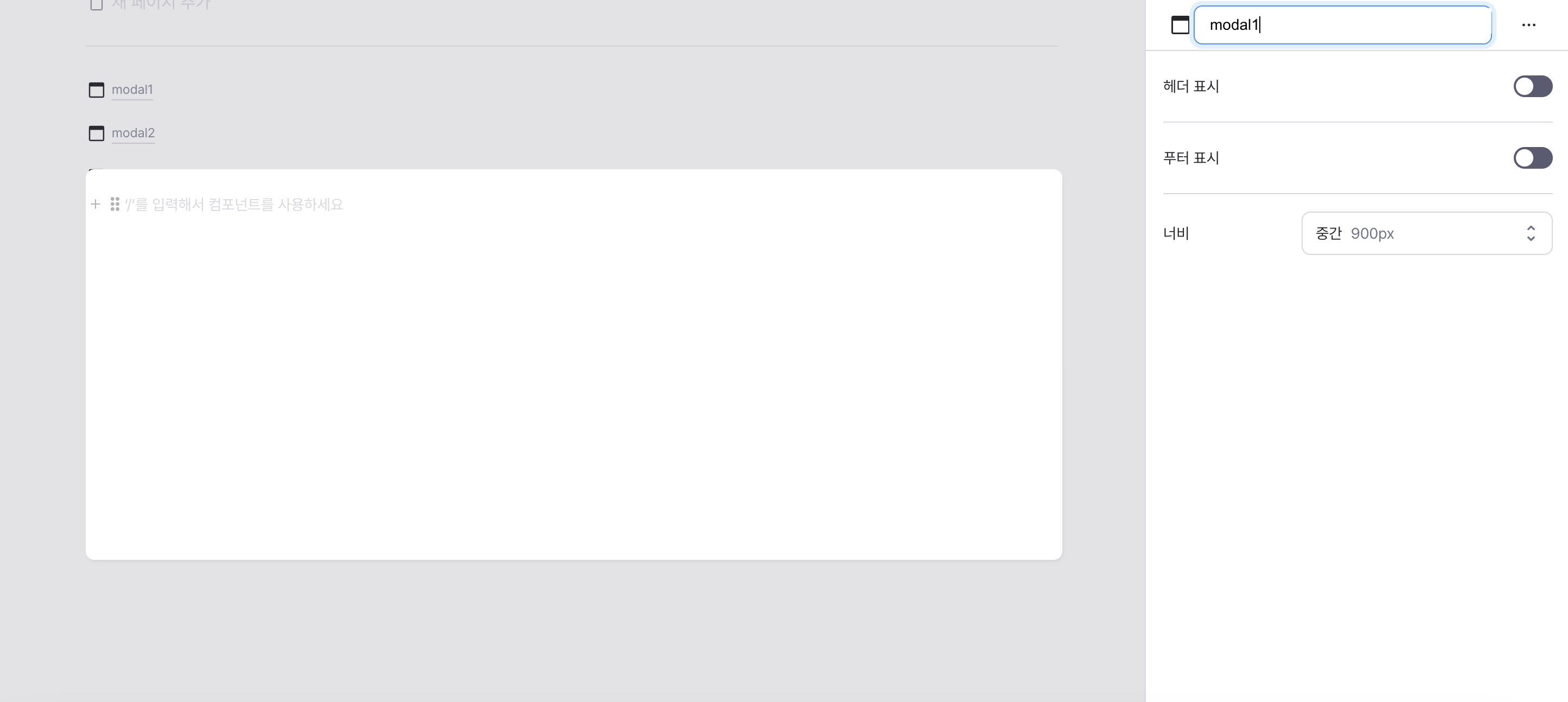
isHeaderVisible
Controls visibility of the modal header.
When enabled, displays customizable header section.

isFooterVisible
Controls visibility of the modal footer.
When enabled, displays customizable footer section.

width
Sets the modal's width dimension.
Options:
- Extra Small (540px)
- Small (720px)
- Medium (900px, default)
- Large (1080px)
- Extra Large (1260px)
- Full Screen (100% - 160px)
Header
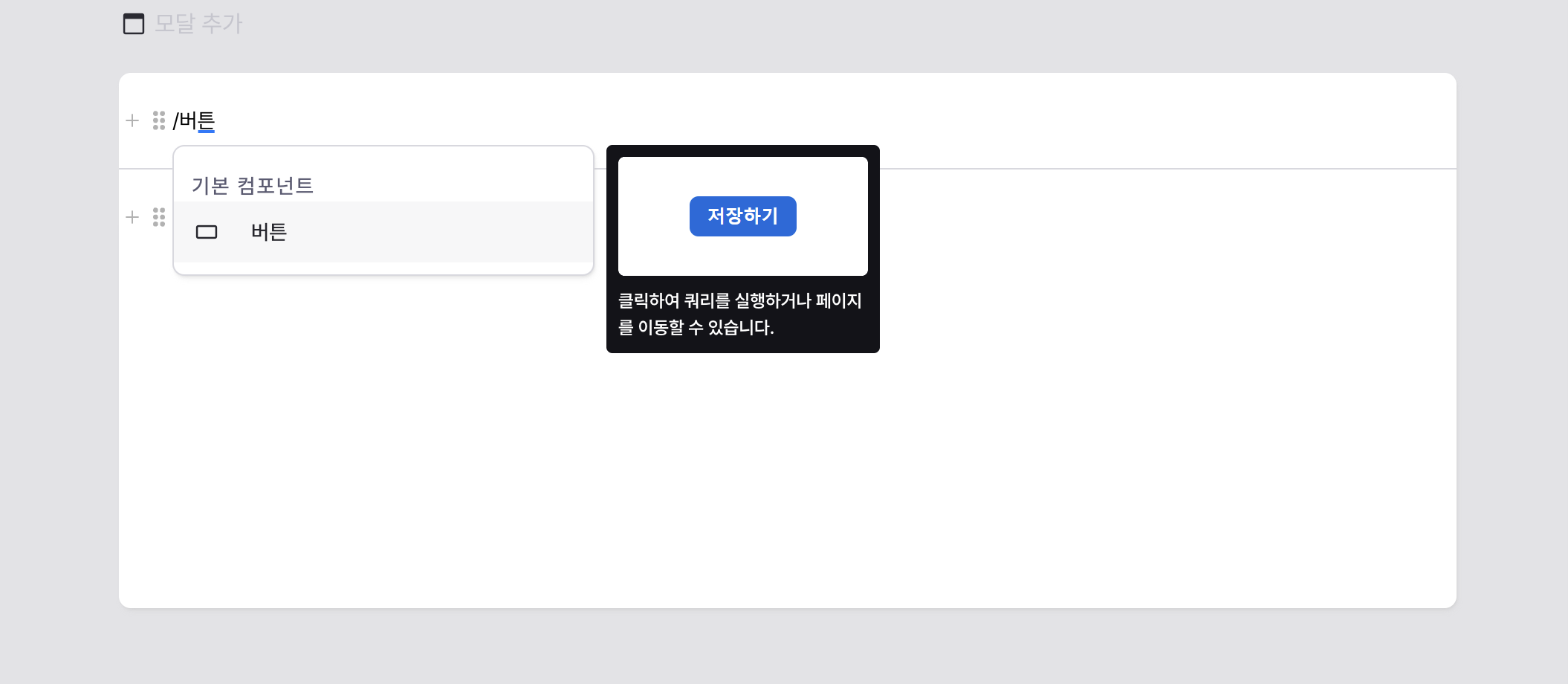
Configurable section at the top of the modal.
Available when header visibility is enabled.
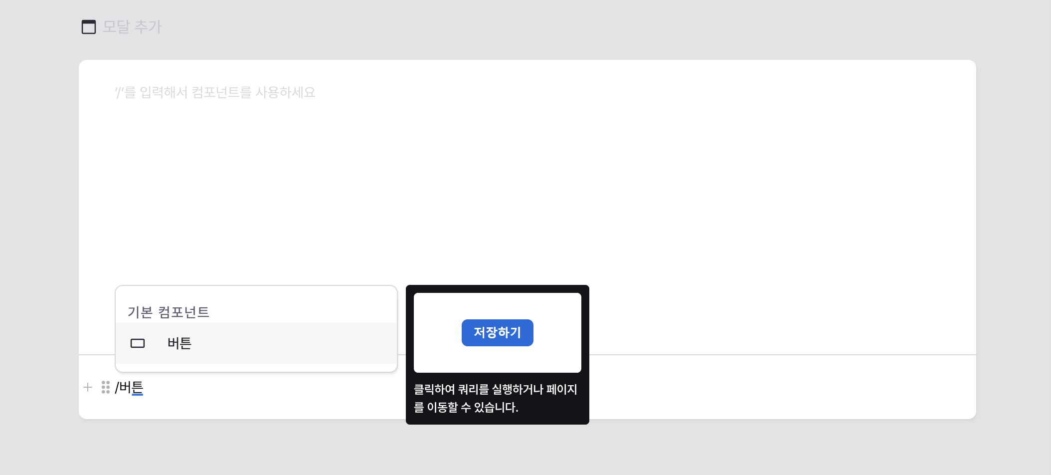
Supports all standard components with full property configuration.
Content
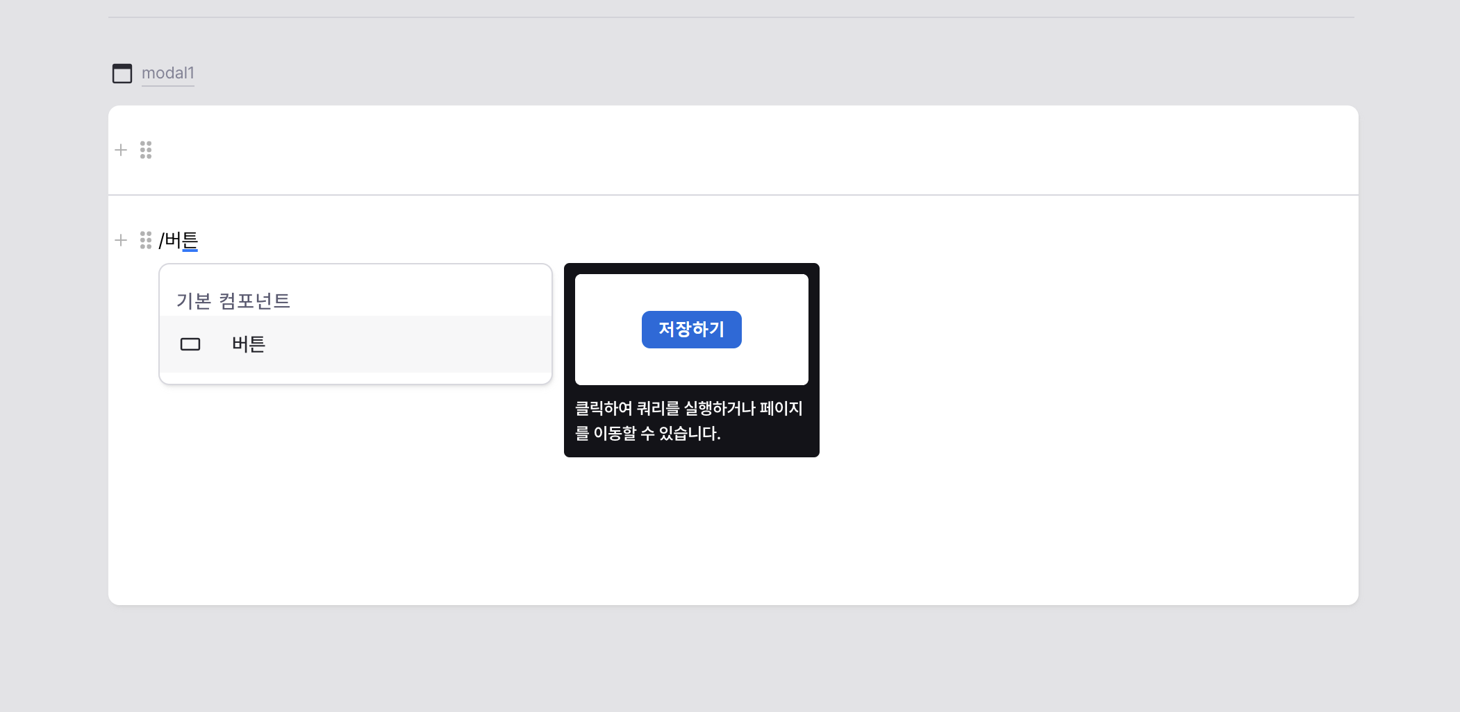
Main content area of the modal.
Supports all standard components with full property configuration.
Footer
Configurable section at the bottom of the modal.
Available when footer visibility is enabled.
Supports all standard components with full property configuration.
States
| Property | Type | Description |
|---|---|---|
| isOpened | boolean | Open state of modal |
Type Definitions
type ModalWidth =
  // 540px
  | 'xs'
  // 720px
  | 'sm'
  // 900px
  | 'md'
  // 1080px
  | 'lg'
  // 1260px
  | 'xl'
  // Fullscreen
  | 'full';