Textarea
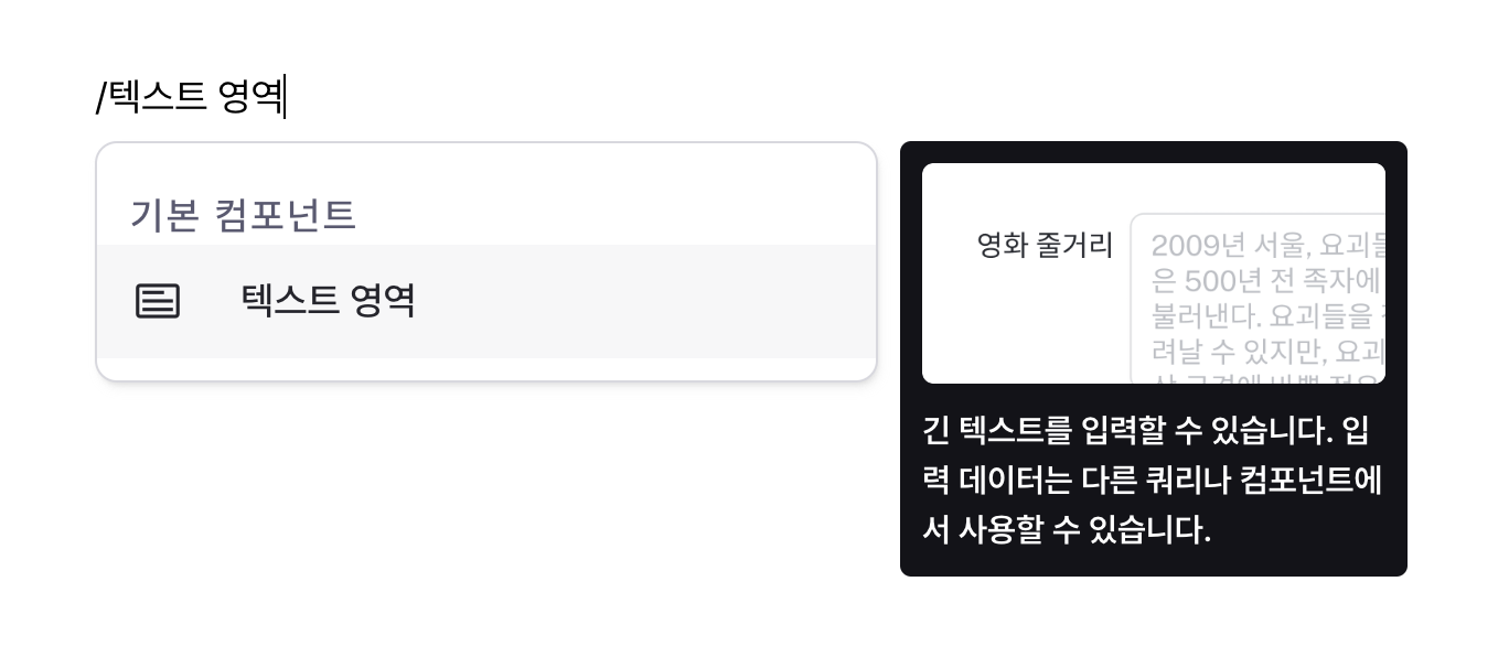
Handle multi-line text input with flexible sizing.
Properties
| Property | Type | Description |
|---|---|---|
| name | string | Unique identifier for the textarea component |
| label | string | Text displayed on the left side of the textarea |
| defaultValue | string | The default value template applied to the textarea |
| isAutoHeight | boolean | Whether to automatically adjust the textarea height |
| minRows | number | Number of lines when auto-height is disabled |
| minRows | number | Minimum number of lines when auto-height is enabled |
| maxRows | number | Maximum number of lines when auto-height is enabled |
| placeholder | string | Placeholder applied to the textarea |
| isDisabled | boolean | Whether the textarea is disabled |
| isHidden | boolean | Whether to hide the textarea on the deployed page |
| labelWidth | string | The width of the label on the left side of the textarea |
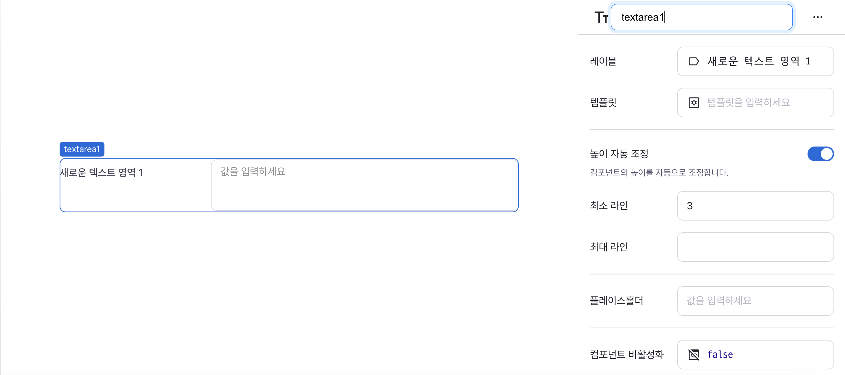
name
Sets the unique identifier for the textarea component. Please refer to the component naming rules
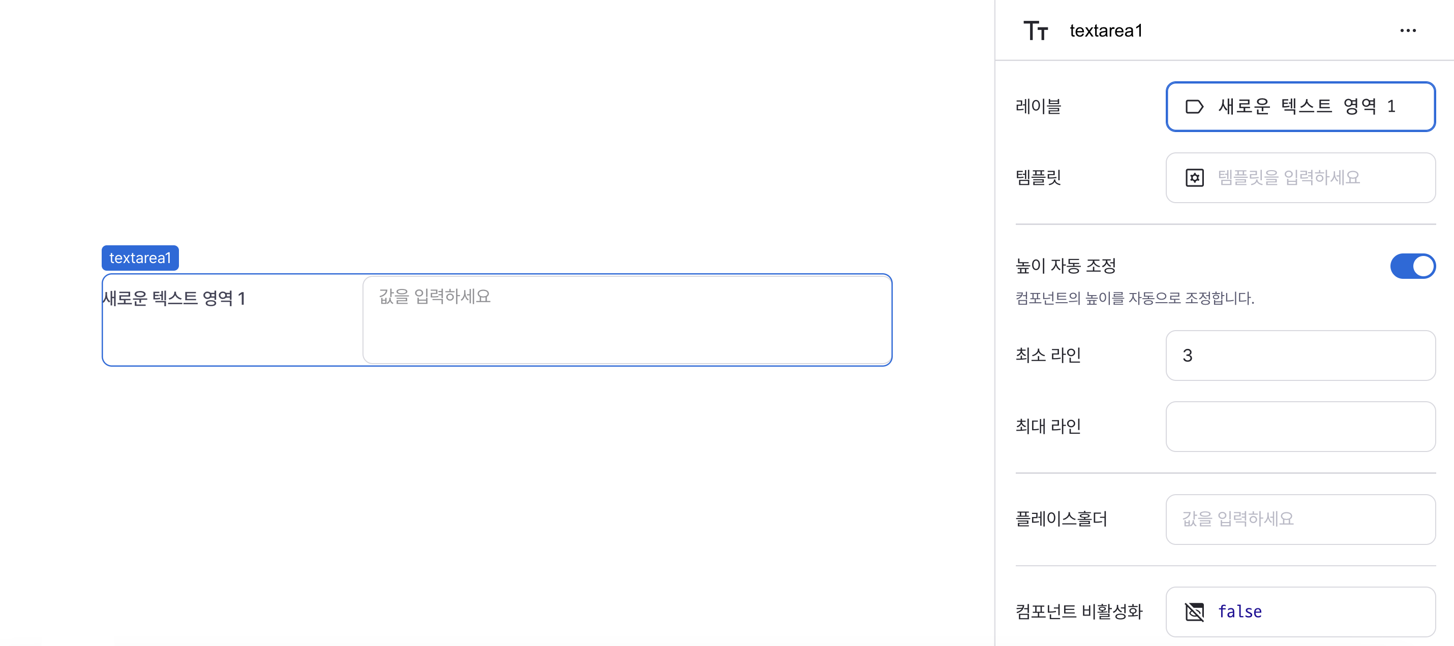
label
Sets the text displayed on the left side of the textarea. (Supports Template Text)
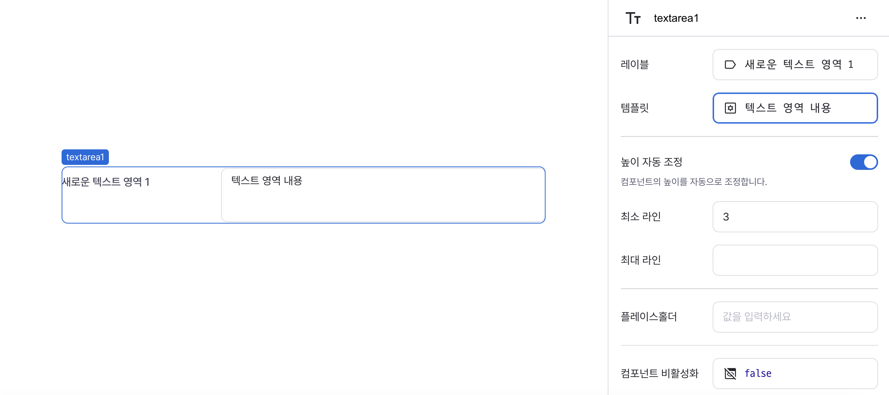
defaultValue
Sets the default value for the component.
Can be set through workflow results, direct input.
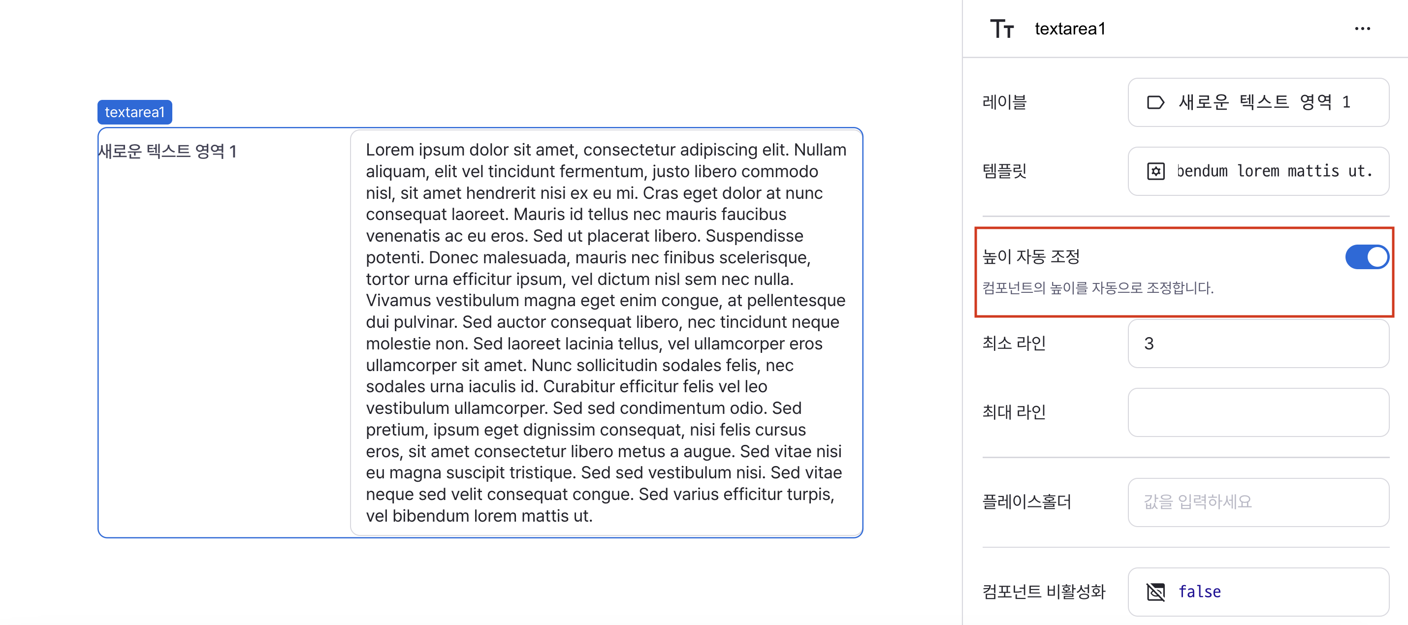
isAutoHeight
Controls automatic height adjustment of the textarea.
When enabled:
- Height adjusts based on content
- Can be constrained by minRows and maxRows if specified
minRows
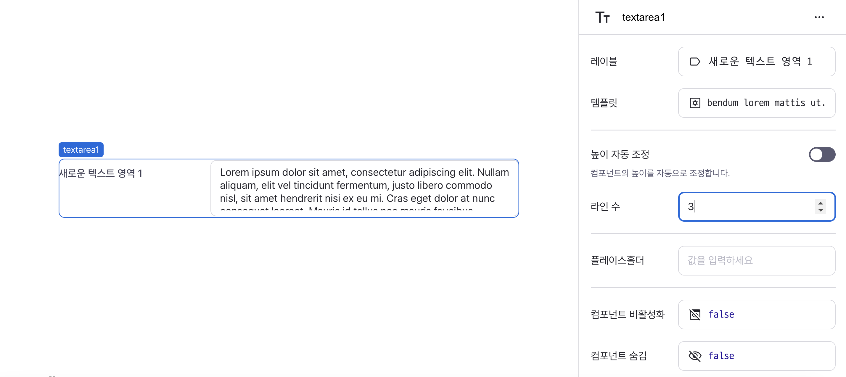
Sets the minimum number of lines in the textarea.
Behavior depends on isAutoHeight setting:
- When auto-height disabled: Sets fixed number of lines
- When auto-height enabled: Sets minimum height boundary
maxRows
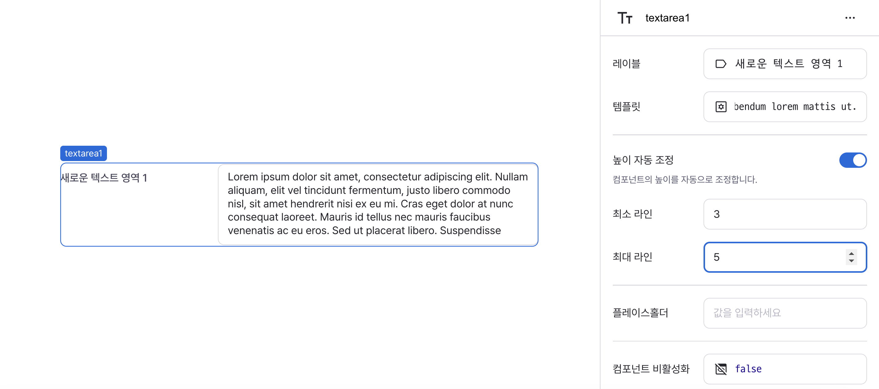
Sets the maximum number of lines in the textarea.
Only applies when auto-height is enabled.
When specified, height will adjust between minRows and maxRows.
placeholder
Sets the field's placeholder text.
Defaults to field type's standard placeholder if unspecified.

isDisabled
Sets the disabled state of the component.
Can be set through workflow results, direct input.
When enabled, prevents user interaction with the component.

isHidden
Controls visibility of the component.
When set to true:
- Hidden in deployed view
- Visible with reduced opacity in edit mode

labelWidth
Sets the width of the label section.
Accepts values in pixels or percentages.

States
| Property | Type | Description |
|---|---|---|
| value | string | The value of textarea |