Table
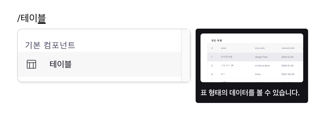
Present and manage data in tabular format with comprehensive features like sorting, filtering, and export options.
Properties
| Property | Type | Description |
|---|---|---|
| name | string | Unique identifier for the table component |
| label | string | Text displayed in table header |
| data (code) | string (Record<string, unknown>[]) | Data to be displayed in the table |
| isDataTable | boolean | true: Data table (pagination, sorting, filtering, server-side paging enabled)false: Basic table |
| isRowSelectionEnabled | boolean | true: Enable single/multiple row selectionfalse: Disabled |
| isMultipleRowSelectionDisabled | boolean | true: Single row selection false: Multiple row selection |
| rowKey | string | Unique key for rows used during row selection |
| editingMode | string | Method for editing table cells |
| isServerSidePaginationEnabled | boolean | Enable server-side pagination for data tables |
| rowsPerPage | string | Number of rows per page when server pagination is enabled |
| rowsCount | string | Total number of rows when server pagination is enabled |
| isServerSideFilteringEnabled | boolean | Enable server-side filtering for data tables |
| isServerSideSortingEnabled | boolean | Enable server-side sorting for data tables |
| isCsvDownloadable | boolean | Enable CSV download of table data |
| isHeightFixed | boolean | Enable fixed height for table |
| contentHeight | string | Fixed height value for table |
| isHidden | boolean | Hide table in deployed pages |
name
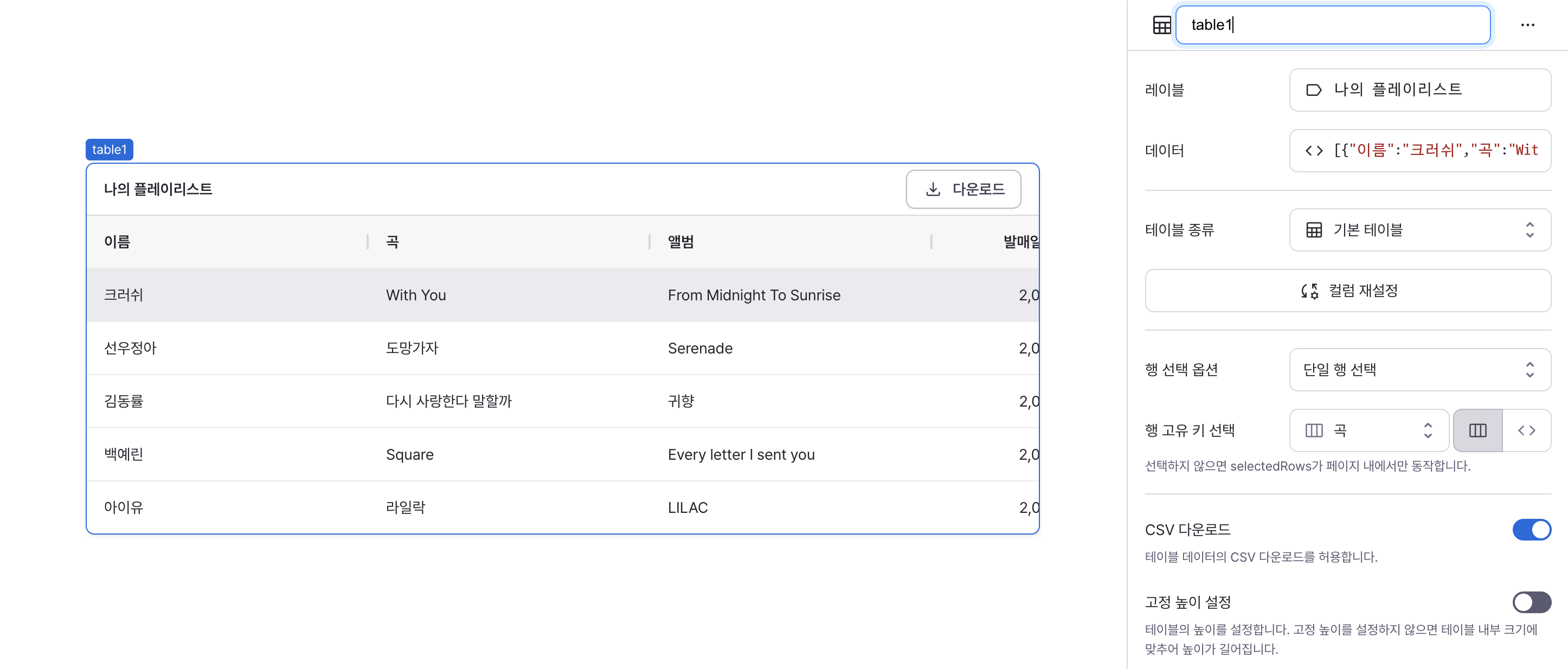
Sets the unique identifier for the table component. Please refer to the component naming rules
label
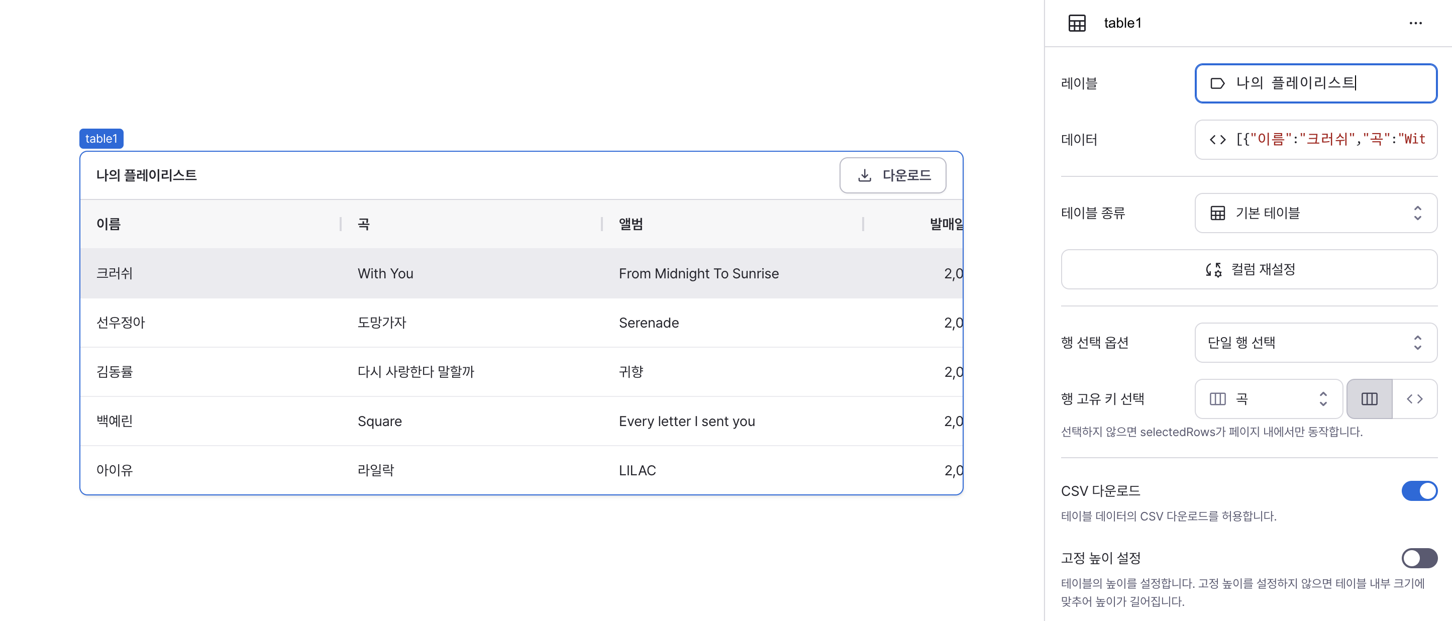
Sets the text displayed in the table header.
data (code)
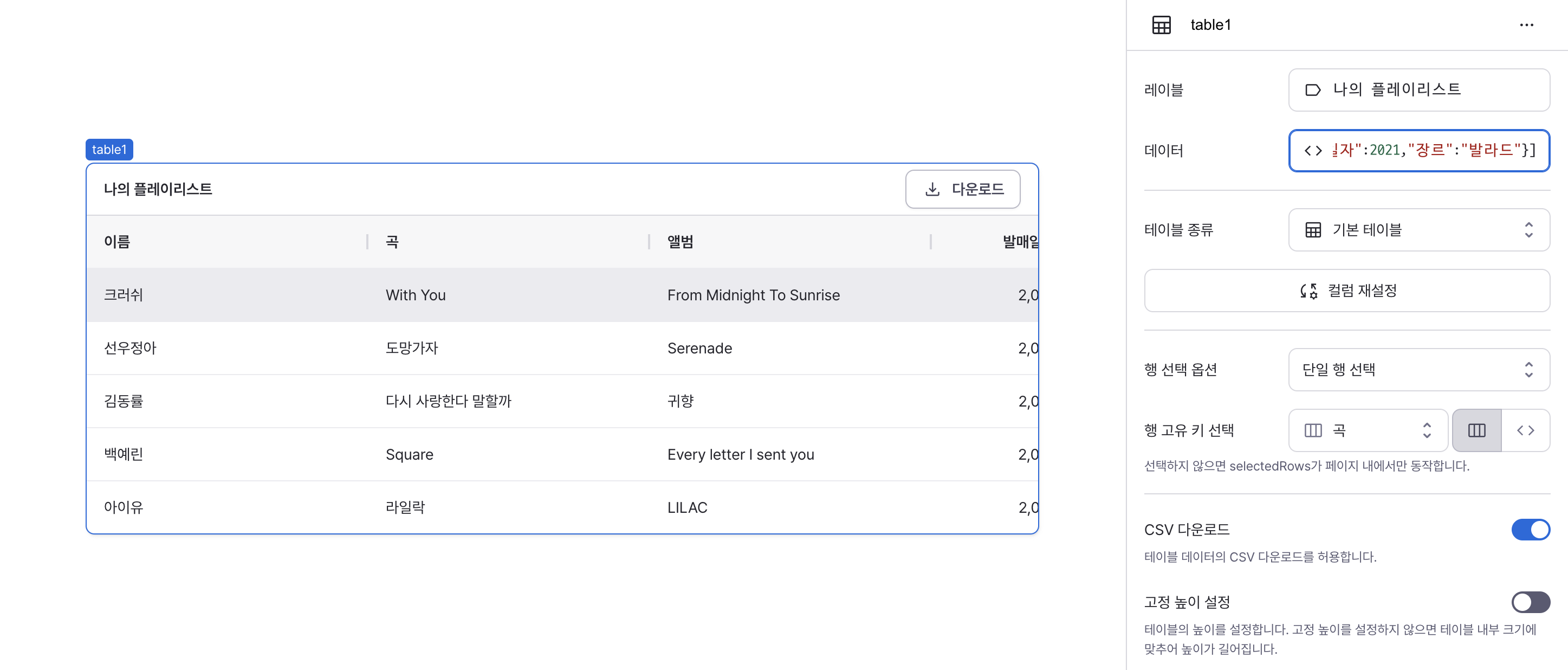
Sets the data to be displayed in the table.
Can be set through:
Direct data input
- Enter array data directly into the data property
- Example:
[
  { name: "Crush", song: "With You", album: "From Midnight To Sunrise", releaseYear: 2019, genre: "R&B" },
  { name: "Sunwoo JungA", song: "Run Away", album: "Serenade", releaseYear: 2019, genre: "R&B" },
  { name: "Kim Dong Ryul", song: "Should I Say I Love You Again", album: "Return", releaseYear: 2001, genre: "Ballad" },
  { name: "Yerin Baek", song: "Square", album: "Every letter I sent you", releaseYear: 2019, genre: "R&B" },
  { name: "IU", song: "Lilac", album: "LILAC", releaseYear: 2021, genre: "Ballad" },
];
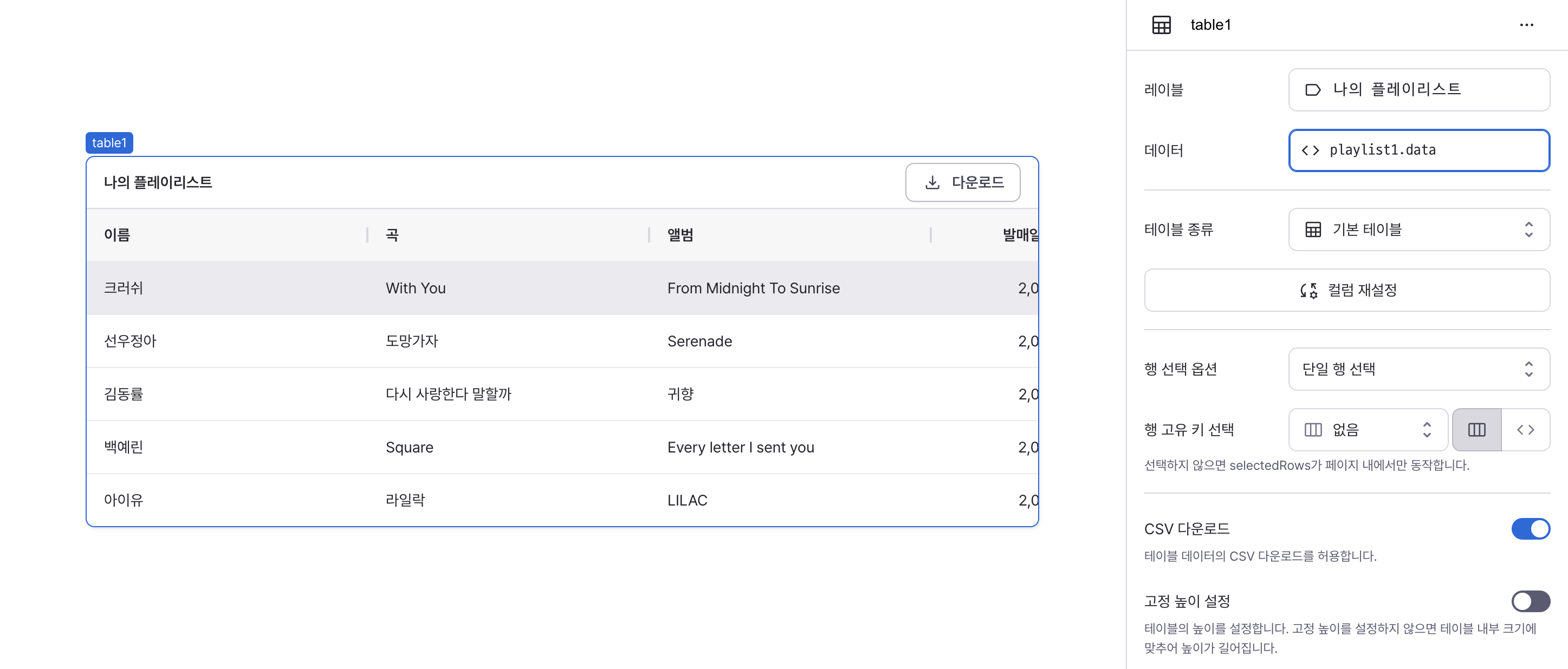
Workflow execution results
- If a registered workflow returns an array, its data can be used
- Example: If workflow named
playlist1returns above data, useplaylist1.data
[
  { name: "Crush", song: "With You", album: "From Midnight To Sunrise", releaseYear: 2019, genre: "R&B" },
  { name: "Sunwoo JungA", song: "Run Away", album: "Serenade", releaseYear: 2019, genre: "R&B" },
  { name: "Kim Dong Ryul", song: "Should I Say I Love You Again", album: "Return", releaseYear: 2001, genre: "Ballad" },
  { name: "Yerin Baek", song: "Square", album: "Every letter I sent you", releaseYear: 2019, genre: "R&B" },
  { name: "IU", song: "Lilac", album: "LILAC", releaseYear: 2021, genre: "Ballad" },
];
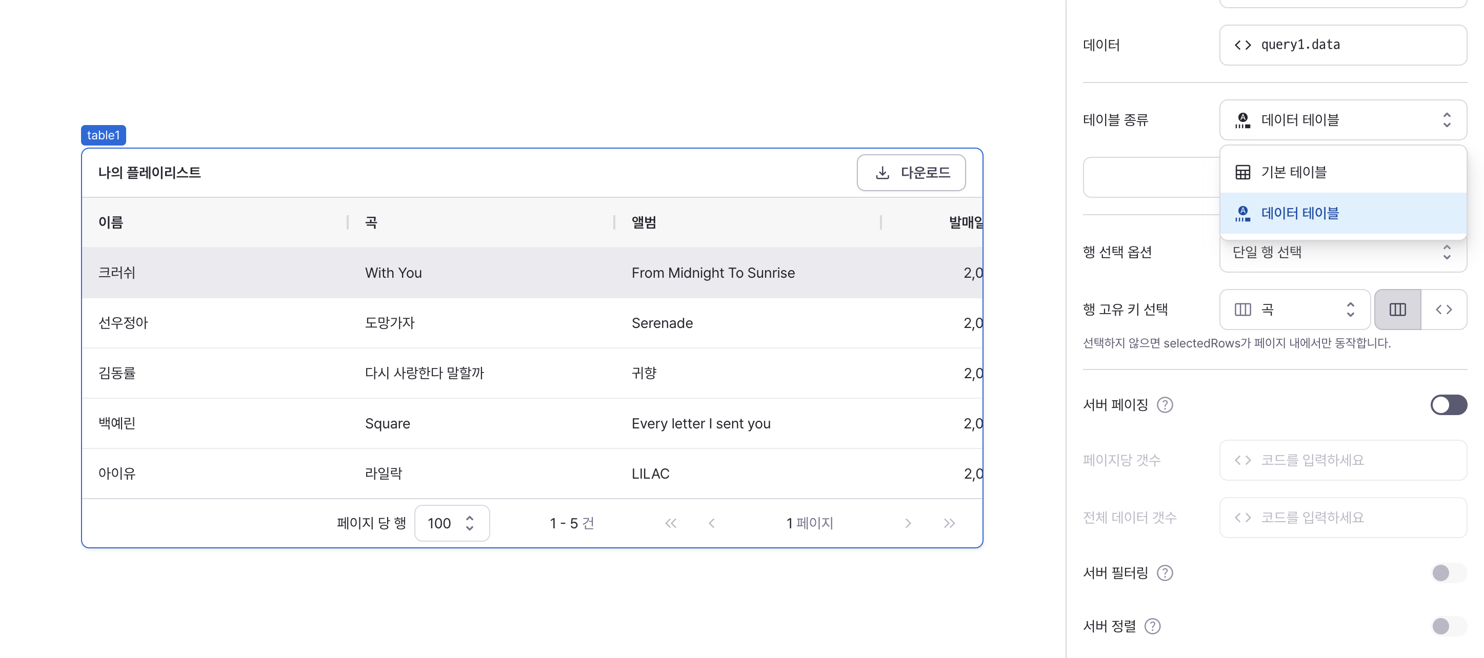
isDataTable
Sets the table type and feature set.
Options:
true: Enables advanced features (pagination, sorting, filtering, server-side paging)false: Provides basic table functionality
Pagination
When data table is selected, pagination is enabled by default. Pagination is executed client-side.
You can check rows per page, current page, and total pages at the bottom. Navigate between pages using next page, previous page, last page and first page buttons.
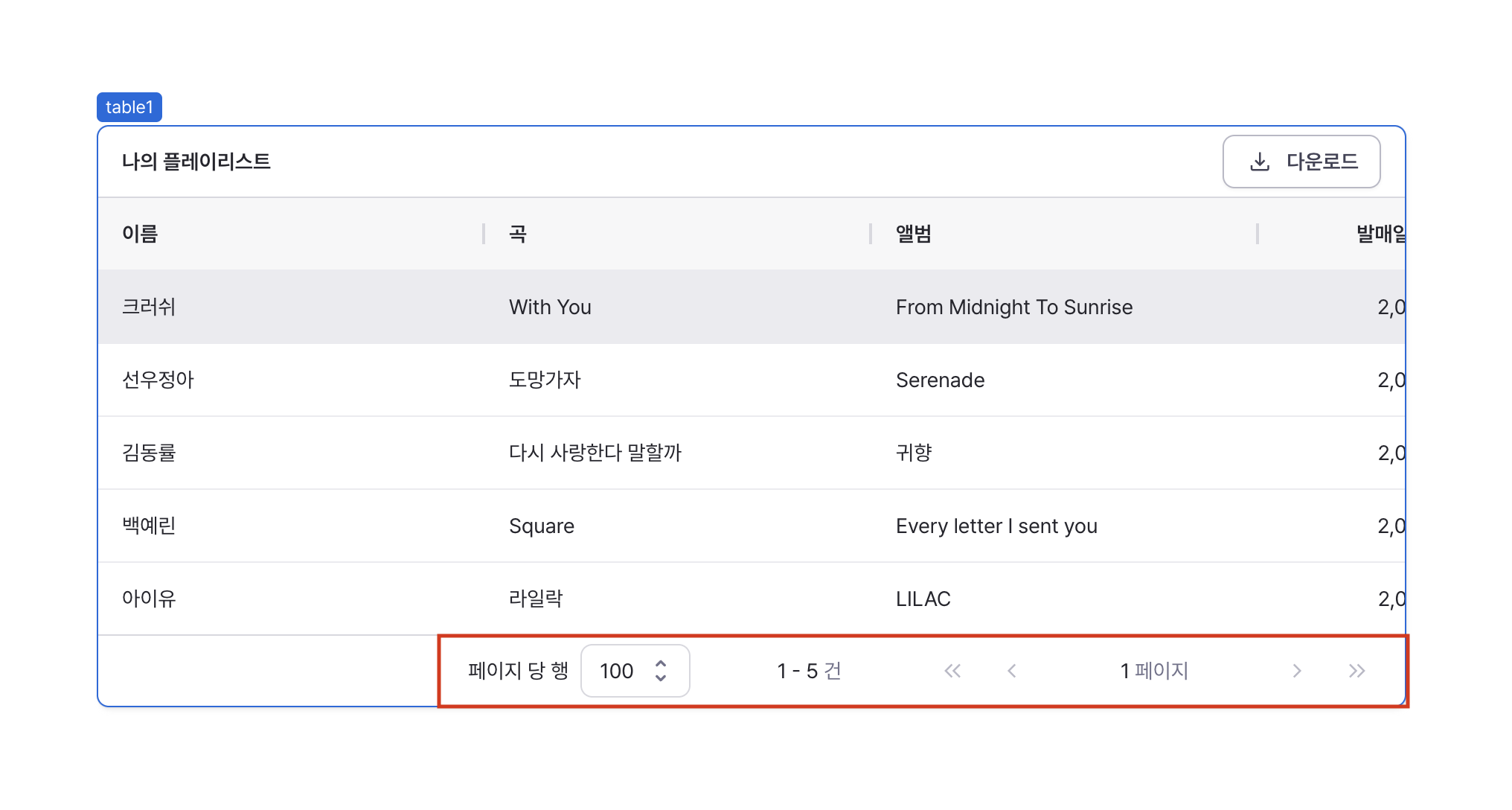
Default rows per page is 100. Can be adjusted to 10, 20, 50, or 100.

Sorting
Sorting can be enabled for each column. All columns are unsorted by default.
When hovering over a column, a sort icon appears allowing you to toggle between ascending, descending, and unsorted states.
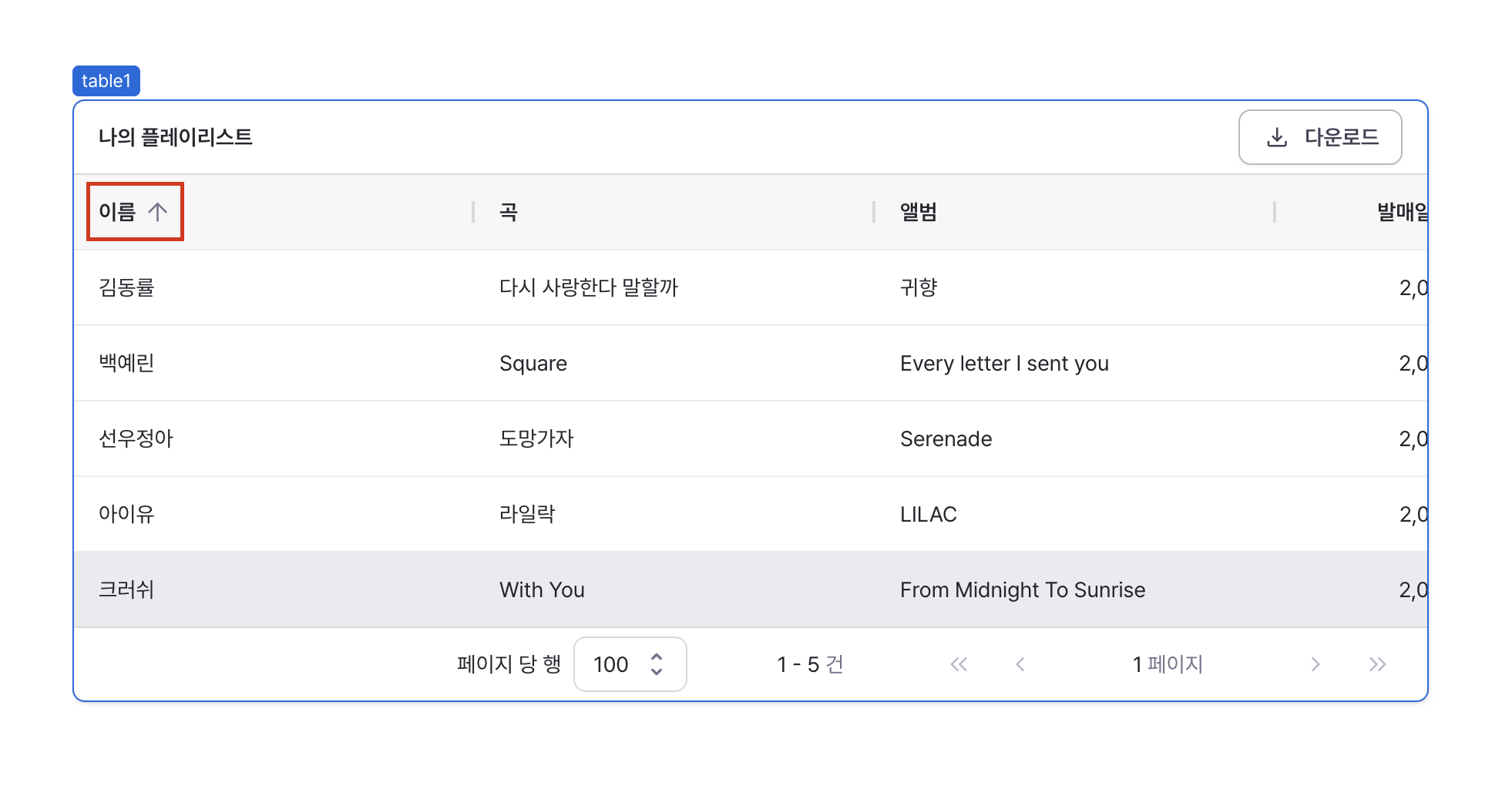
Only one column can be sorted at a time within a table. Sorting is applied based on the component values in each cell.
Filtering
Enable filtering for columns to filter rows based on specific conditions.
Click the menu icon on the right or left of the column header and select the filter option to enter filter criteria.
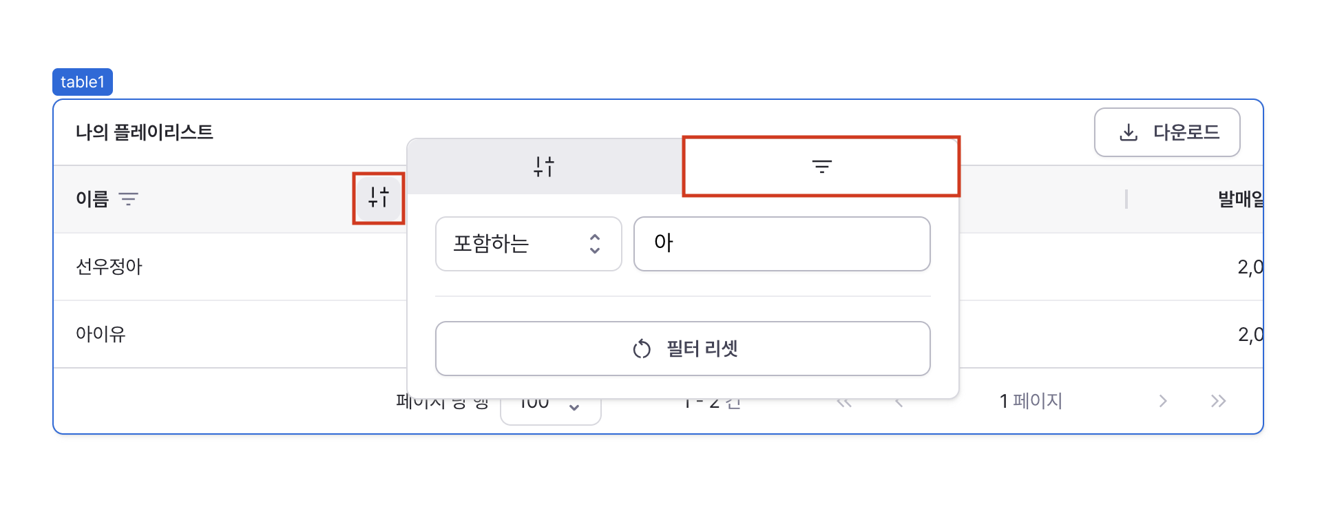
- Select the column to filter from the list. Available filtering operators vary by component type.
- Select the filtering method from the operators. Available filtering operators include:
| Operator | Description |
|---|---|
| Contains | Filters rows containing the input value |
| Equals | Filters rows with exact matches to the input value |
| Is Empty | Filters for empty strings or empty arrays |
| Is Not Empty | Filters for non-empty strings or arrays |
| Is True | Filters for rows where value is true |
| Is False | Filters for rows where value is false |
| Greater Than | Filters for values greater than input |
| Greater Than or Equal | Filters for values greater than or equal to input |
| Less Than | Filters for values less than input |
| Less Than or Equal | Filters for values less than or equal to input |
| Has Value | Filters for rows with non-null values |
| No Value | Filters for rows with null values |
- Filtering is applied after entering a value based on the selected operator.
Column Reset
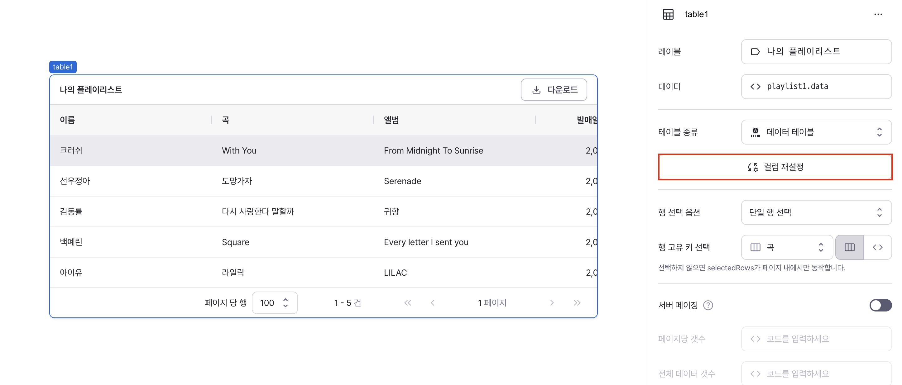
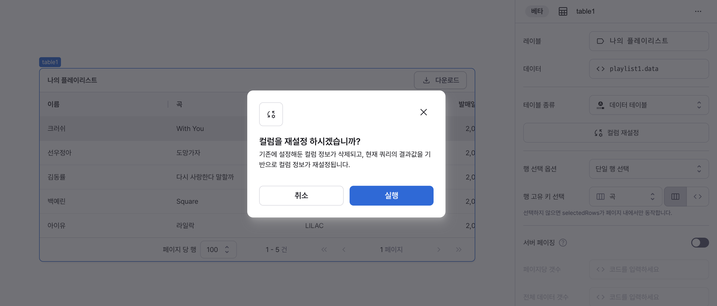
Property to reset column configurations. Deletes existing column settings and resets column information based on current table data.
Row Selection Options (isRowSelectionEnabled, isMultipleRowSelectionDisabled)
Sets the row selection mode.
When rows are selected, various selection states like selectedRows can be utilized.
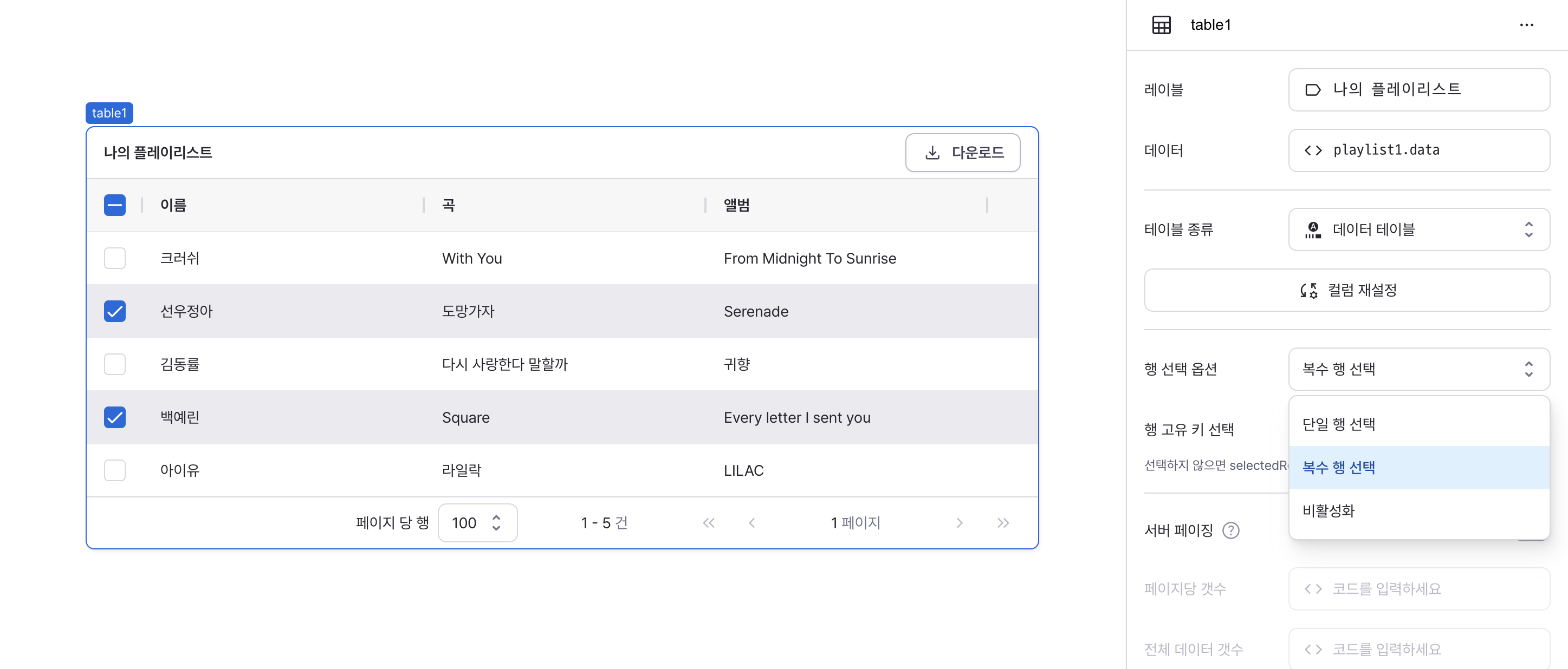
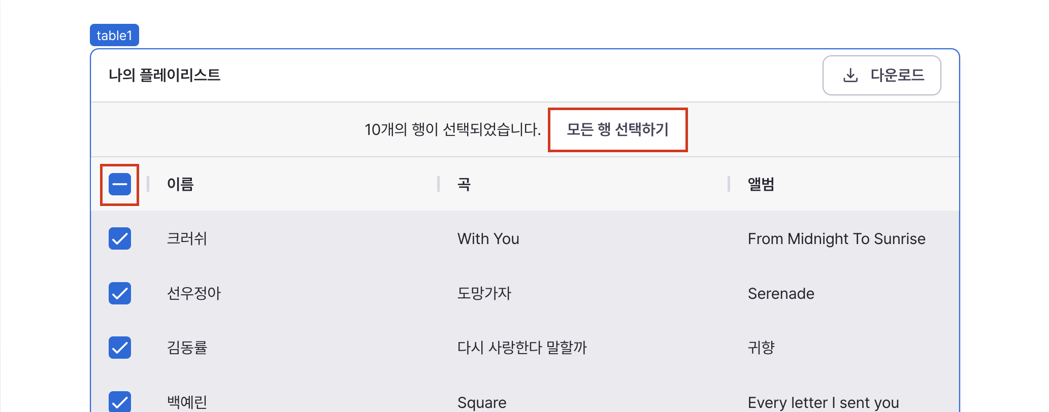
When multiple row selection is enabled, clicking the header checkbox selects all rows on the current page. Clicking "Select All" selects all rows across pages.
rowKey
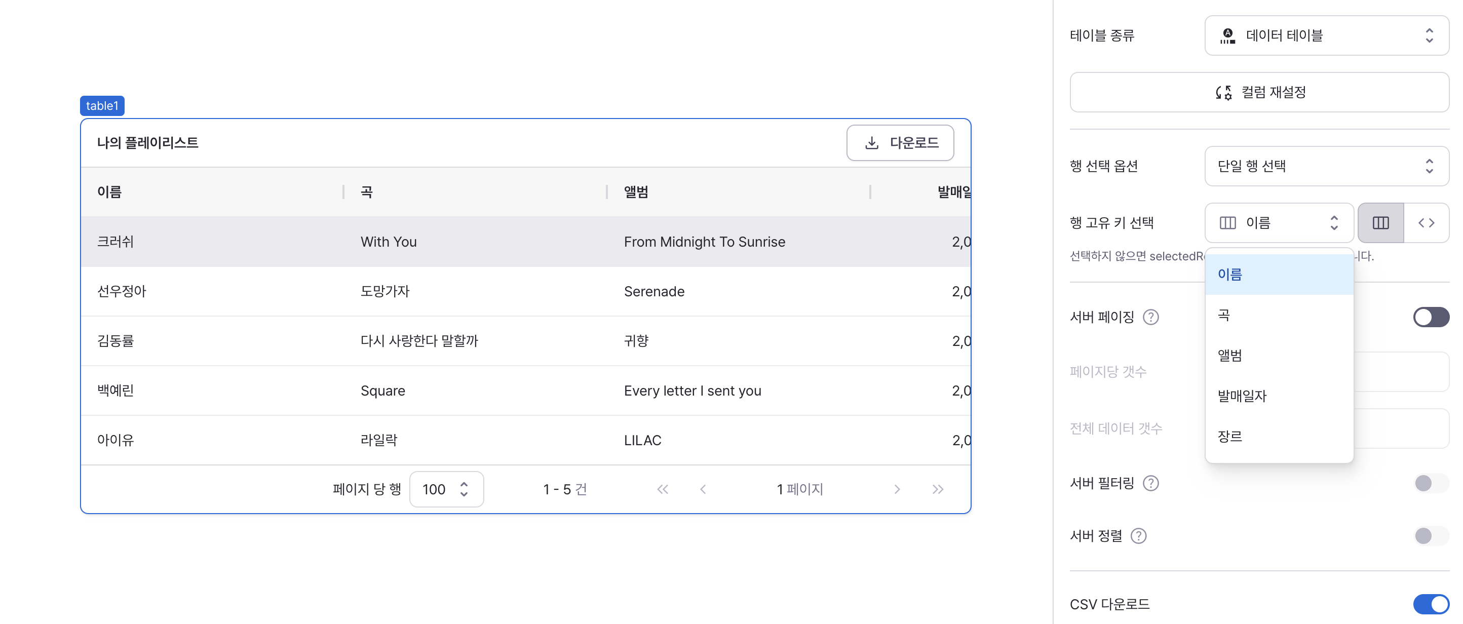
Sets the unique identifier for row data.
Selects a unique identifier for rows to prevent duplicate selection of rows with the same values.
If not selected, selectedRows only works within the current page.
editingMode
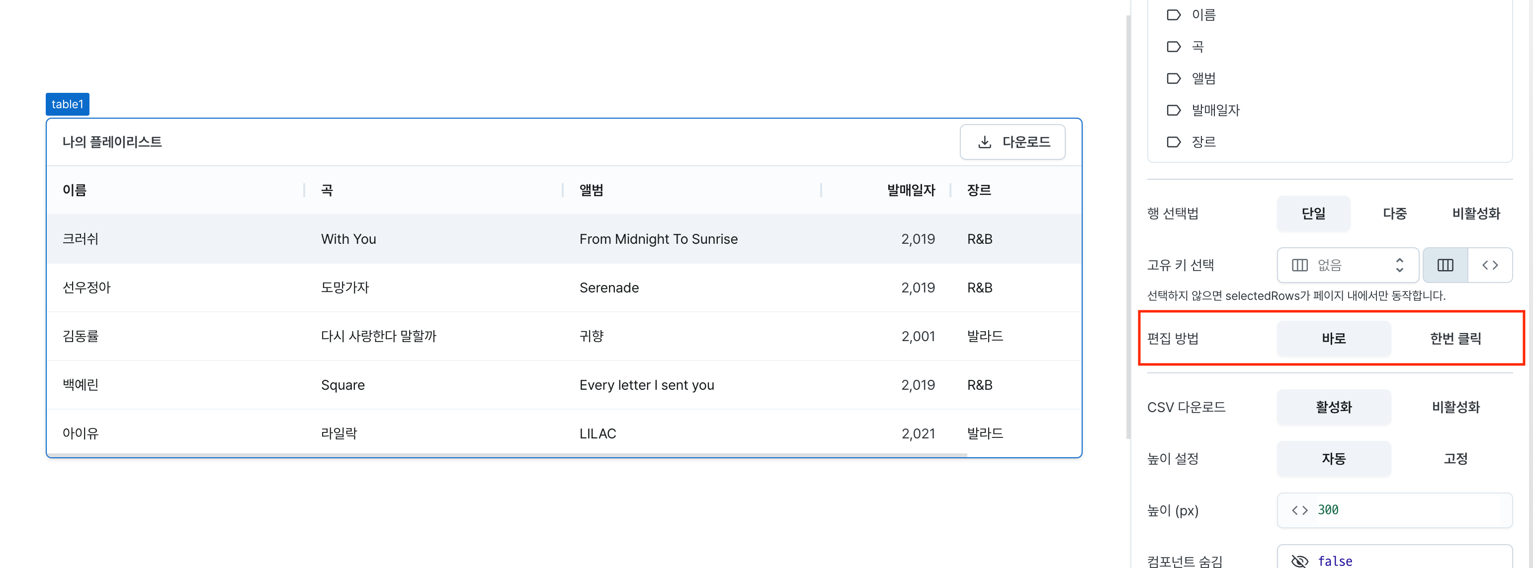
Sets how table cells enter edit mode.
- Always (
always): Edit fields always visible - Single Click (
singleClick): Enter edit mode with single click
isServerSidePaginationEnabled
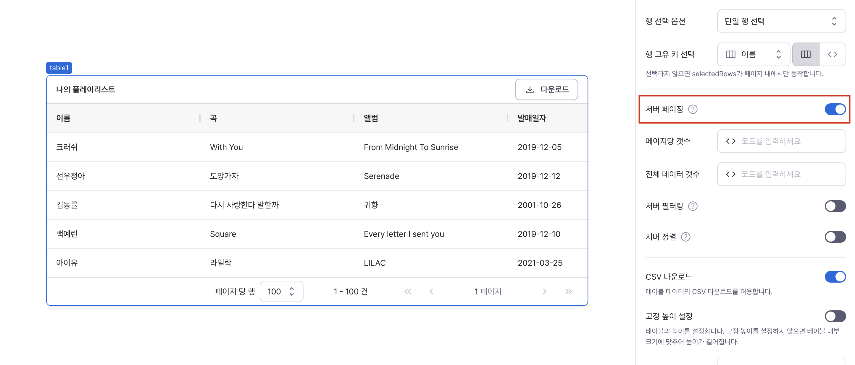
Controls server-side pagination.
When enabled, adds page state to allow server-side data pagination without applying pagination in the current table.
Refer to the States section below for detailed state information.
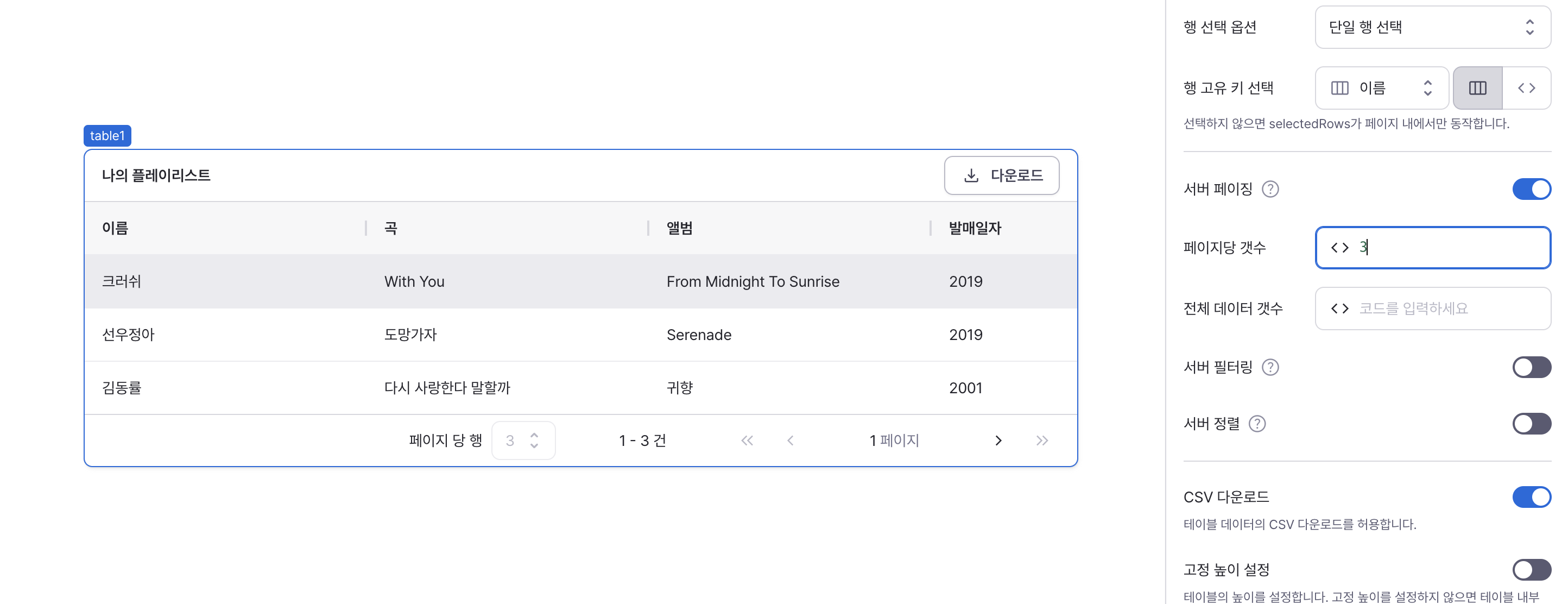
rowsPerPage
Sets the number of rows displayed per page.
Only applies when server-side pagination is enabled.
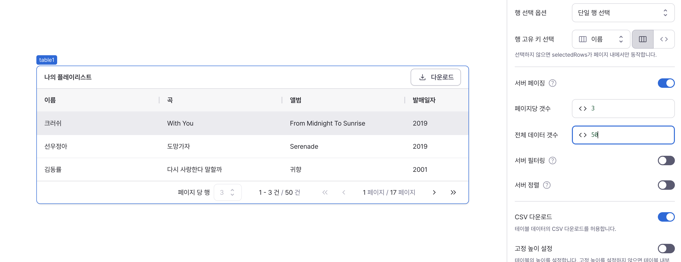
rowsCount
Sets the total number of data rows.
Only applies when server-side pagination is enabled.
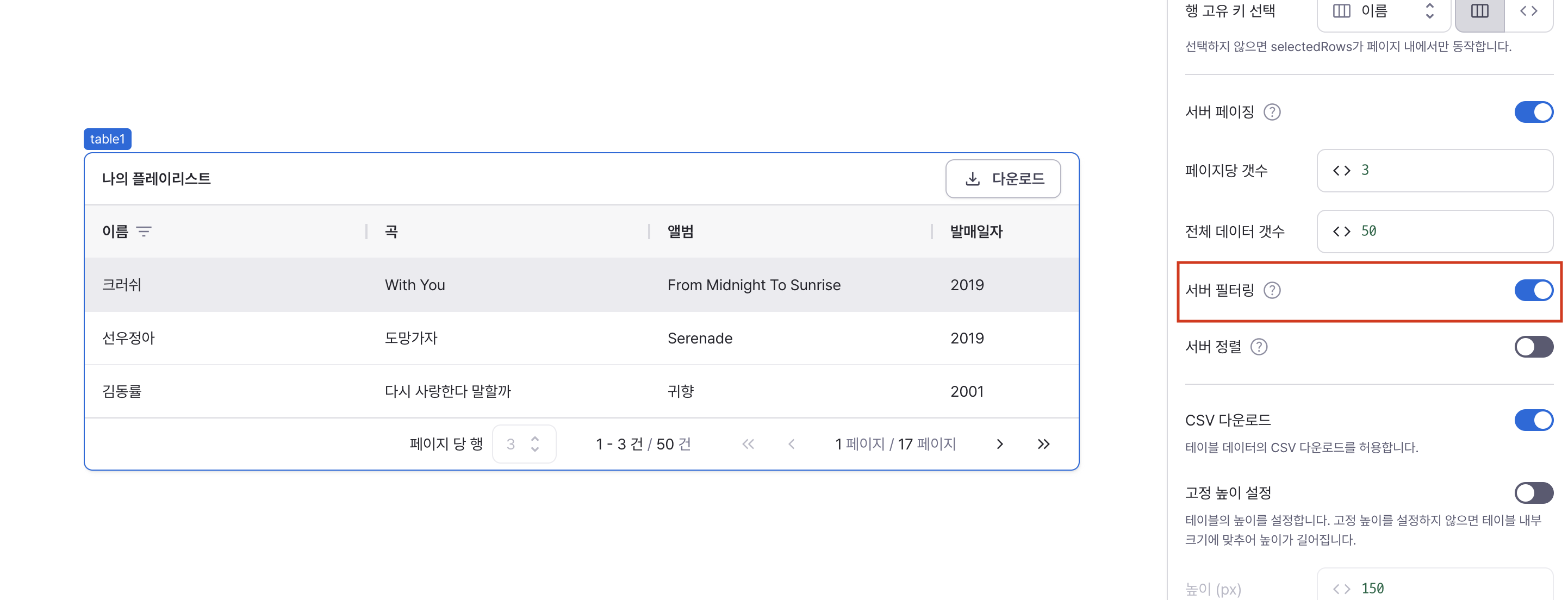
isServerSideFilteringEnabled
Controls server-side filtering capability.
When enabled, adds filters state to allow server-side data filtering without applying filtering in the current table.
Refer to the States section for detailed filtering state information.
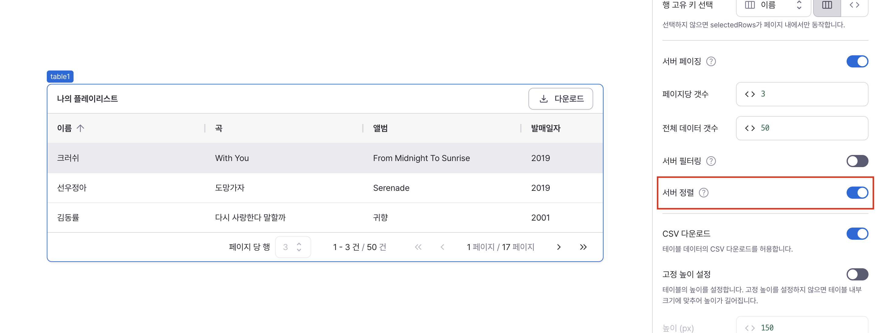
isServerSideSortingEnabled
Controls server-side sorting capability.
When enabled, adds sort state to allow server-side data sorting without applying sorting in the current table.
Refer to the States section for detailed sorting state information.
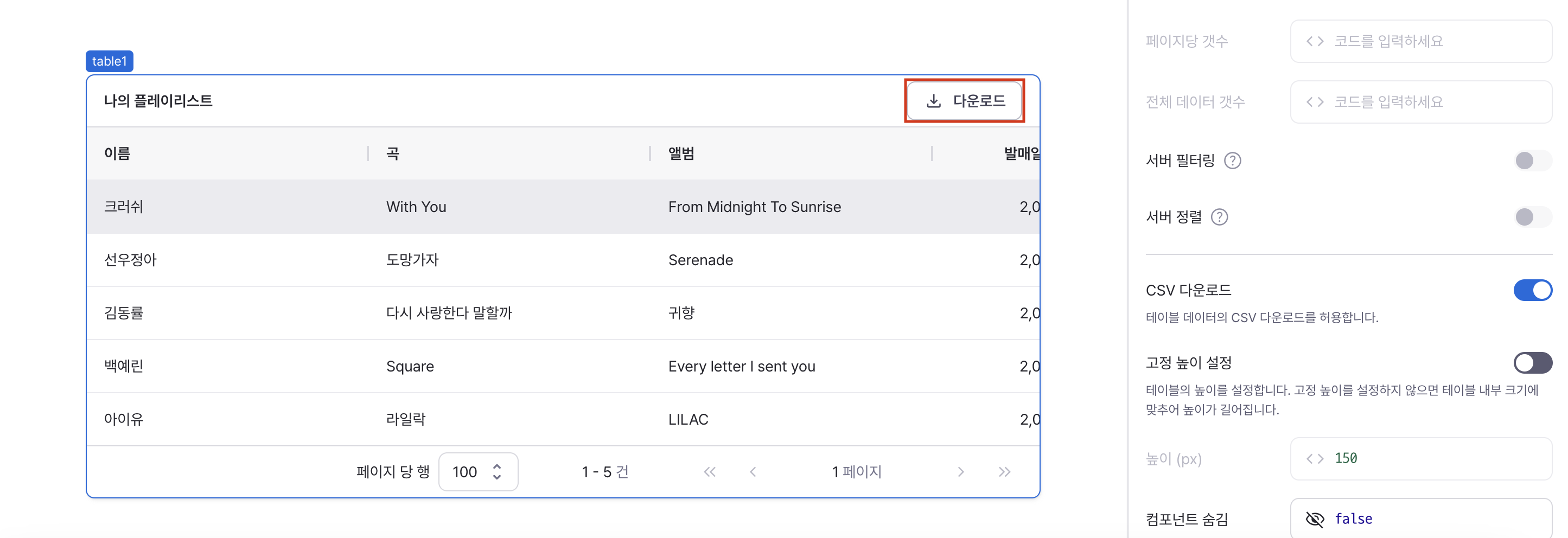
isCsvDownloadable
Controls CSV export functionality.
When enabled, adds CSV download button to table header.
isHeightFixed
Controls height behavior of the component.
When disabled, height adjusts automatically to content.
contentHeight
Sets the component's vertical height.
Can be set through workflow results, direct input.

isHidden
Controls visibility of the component.
When set to true:
- Hidden in deployed view
- Visible with reduced opacity in edit mode

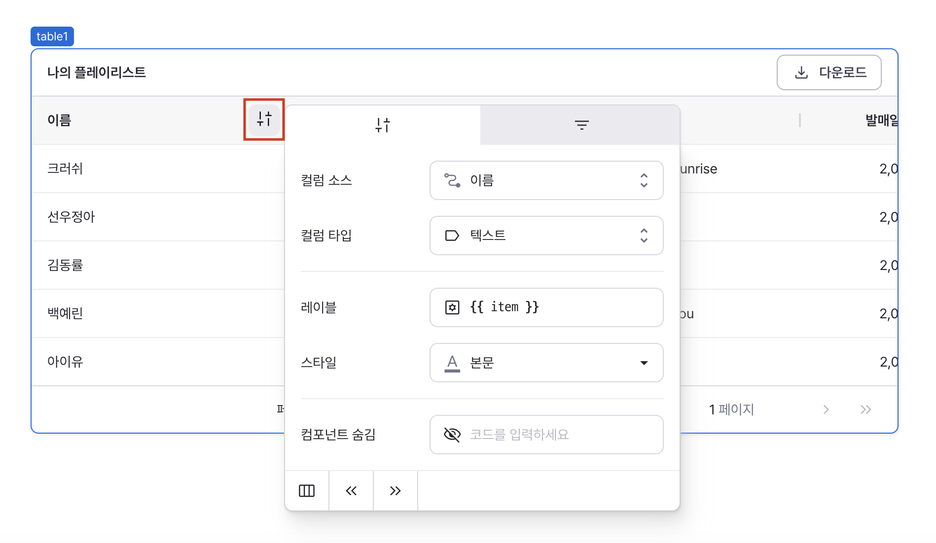
Column Settings
Configures individual column behavior and appearance.
Access settings via the column header menu.
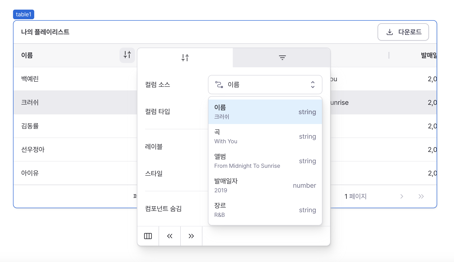
Column Source
Sets the data source for column content.
Determines how cell values are populated and formatted.
- Cell values can change based on column type - for example, text field type cells allow value manipulation. The cell value typically becomes the default value.
- Cell values can be accessed using
itemin column settings code or templates. You can also reference current row data likerow. - Cell values are also used when accessing table data from outside the table component.
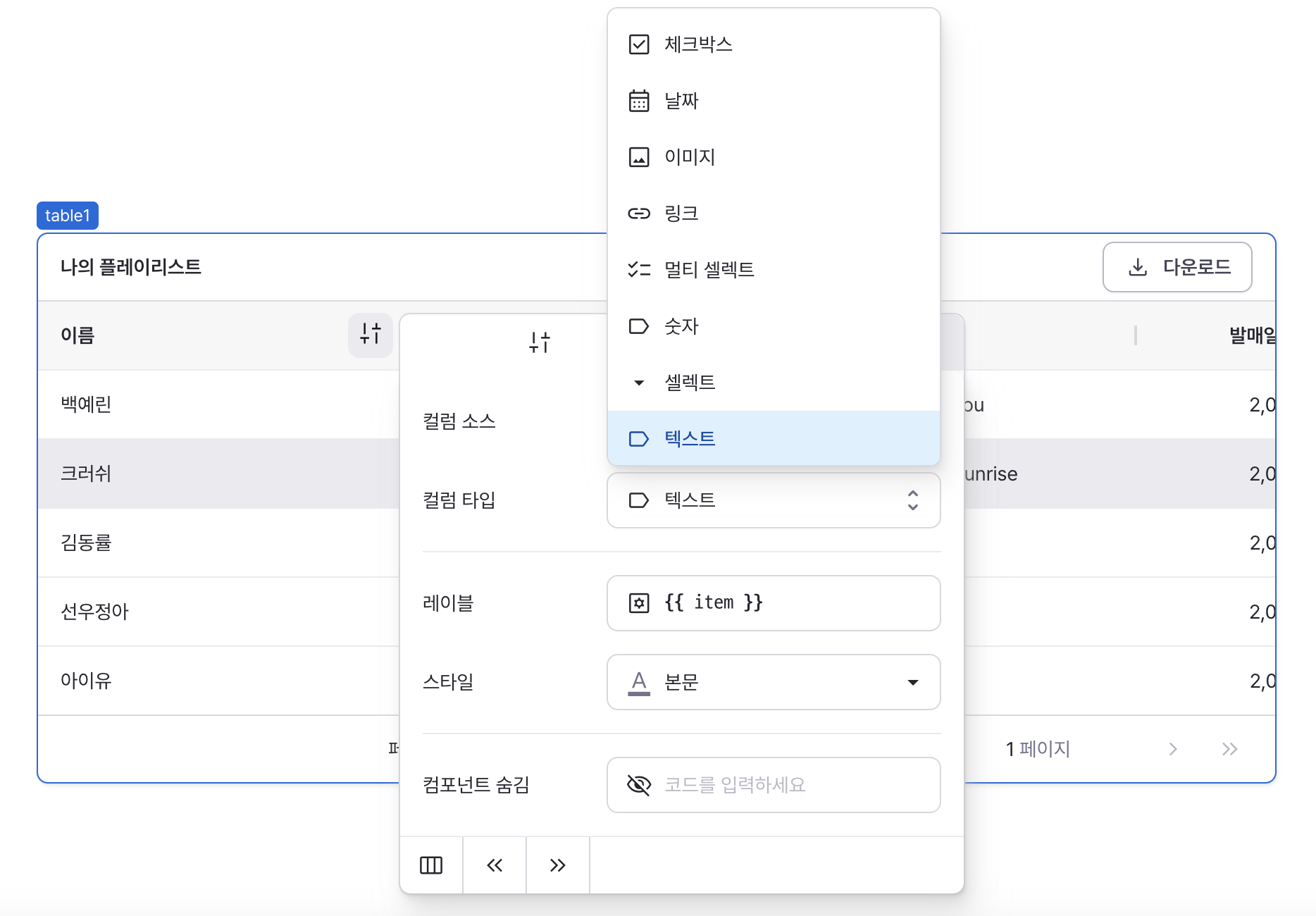
Column Type
Sets the component type for displaying cell data.
Supported Component Types
Currently supported component types include: button, checkbox, date, image, link, multi-select, number, select, text.
Column Detail Settings
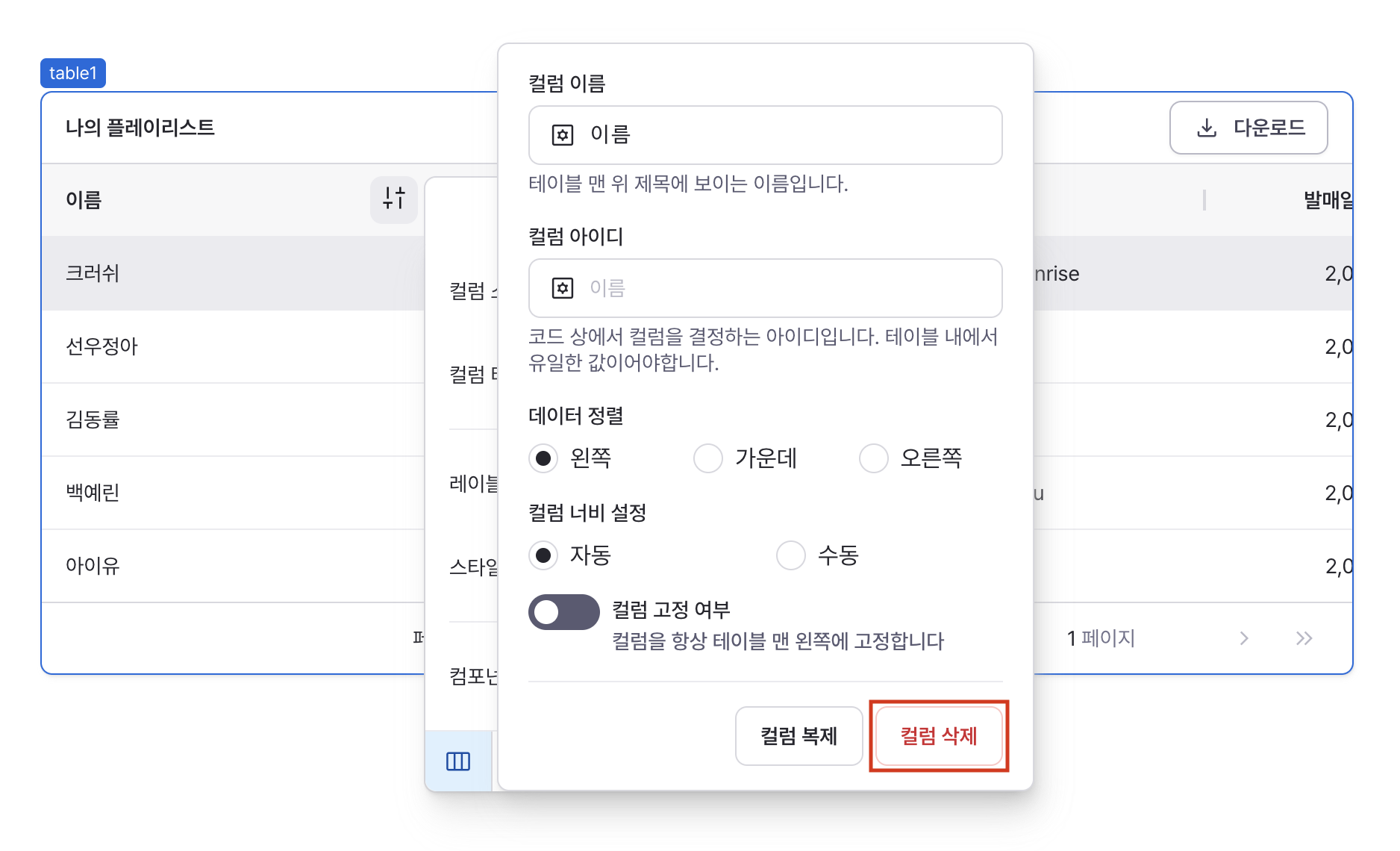
Provides advanced column configuration options: name, ID, alignment, width, column pinning, and more.
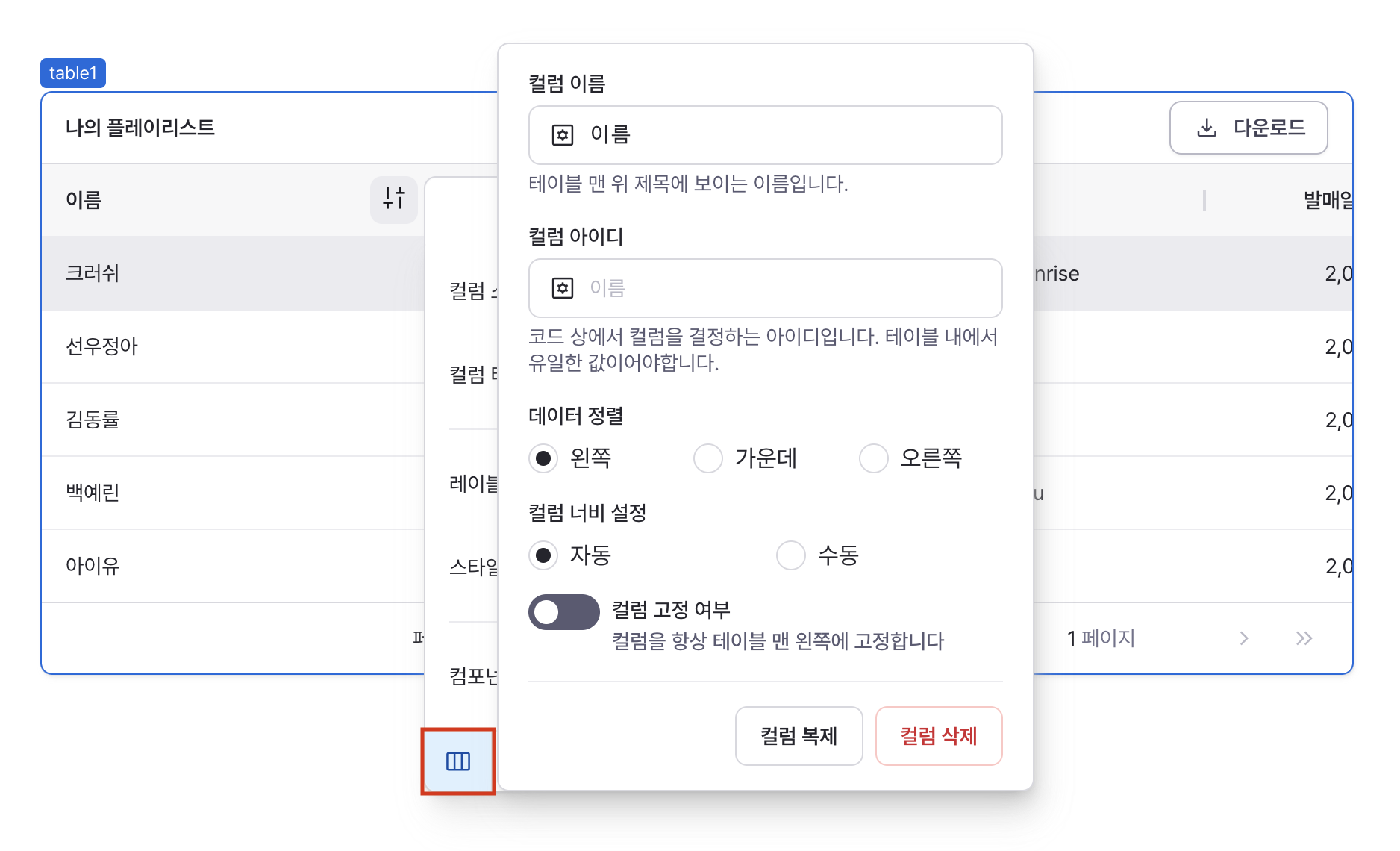
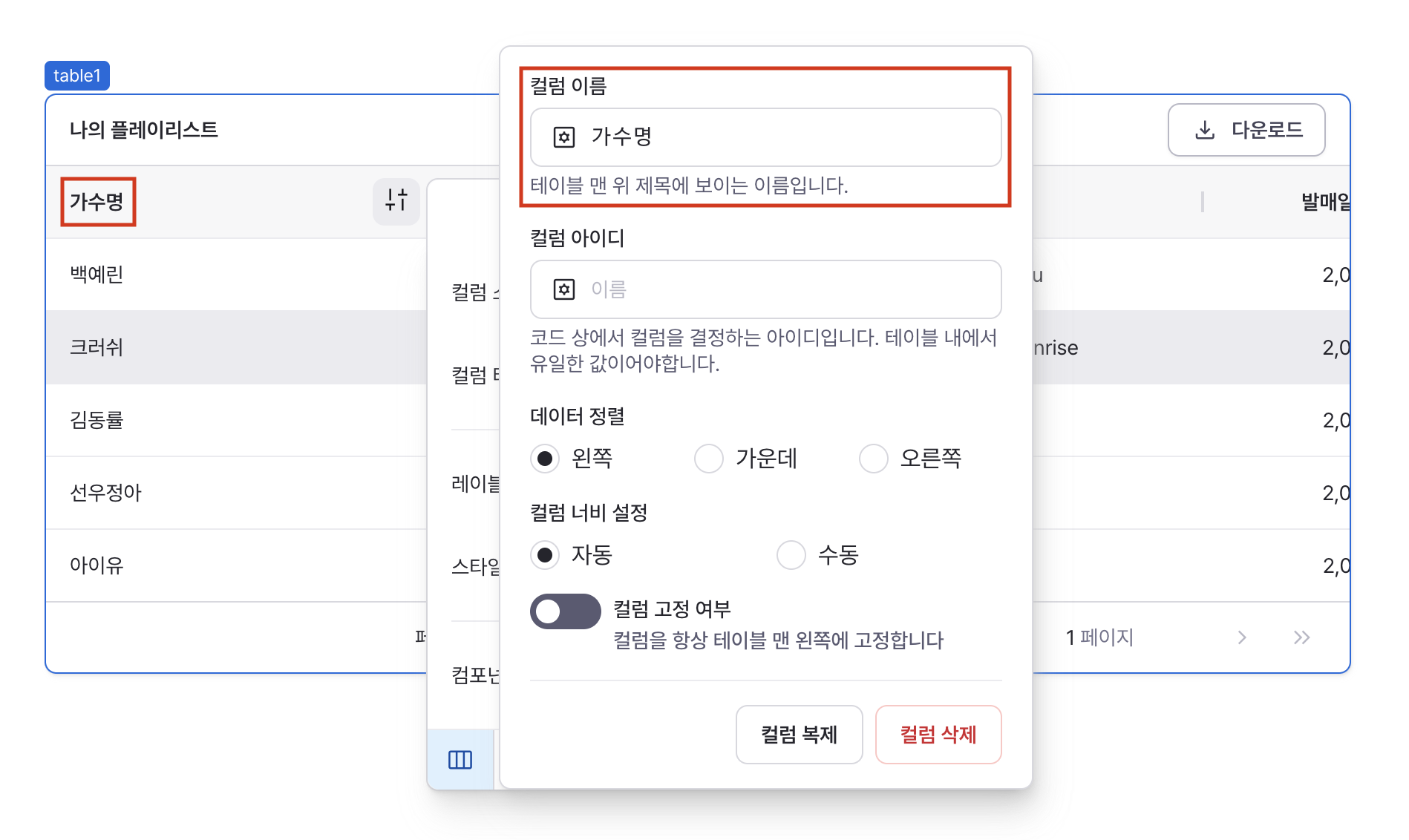
Column Name
Sets the display name in column header.
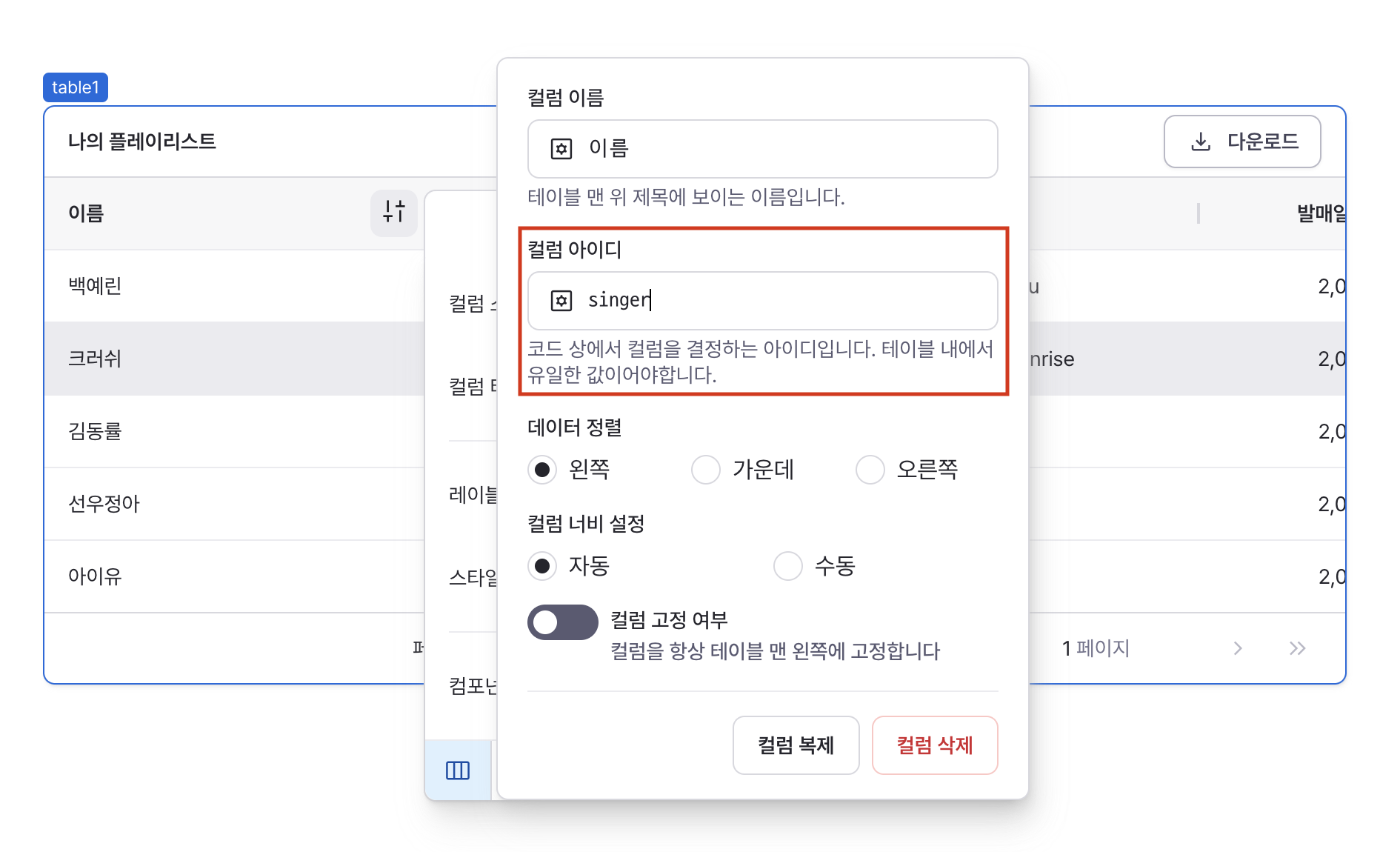
Column ID
Sets the unique identifier for the column.
Used for data access and column operations.
Must be unique within the table.
When accessing table data from outside the table component, this ID is used as the key for each cell. If column IDs are duplicated, column data may be ignored in the table's data.
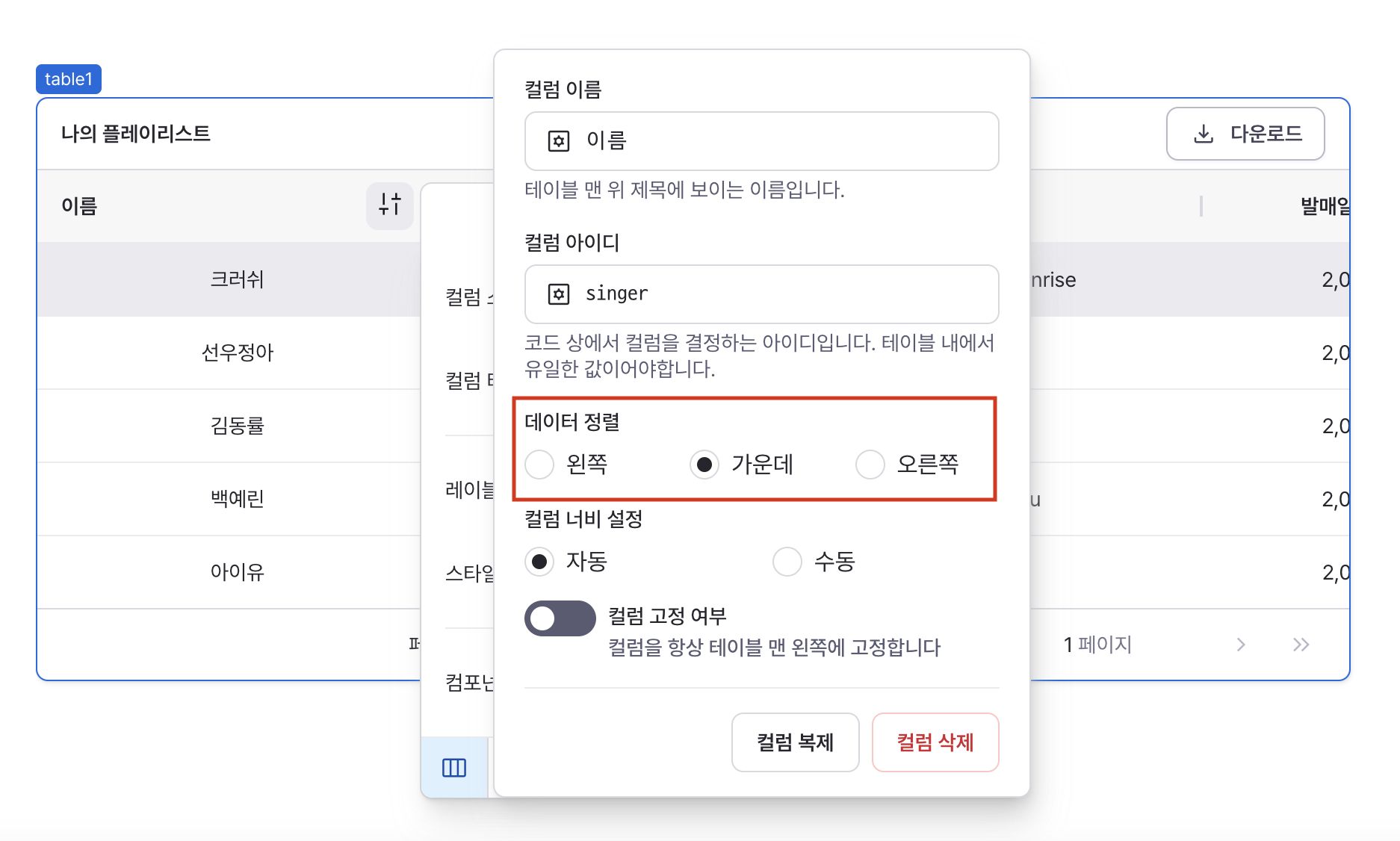
Data Alignment
Sets horizontal alignment of cell content.
Options:
- Left
- Center
- Right
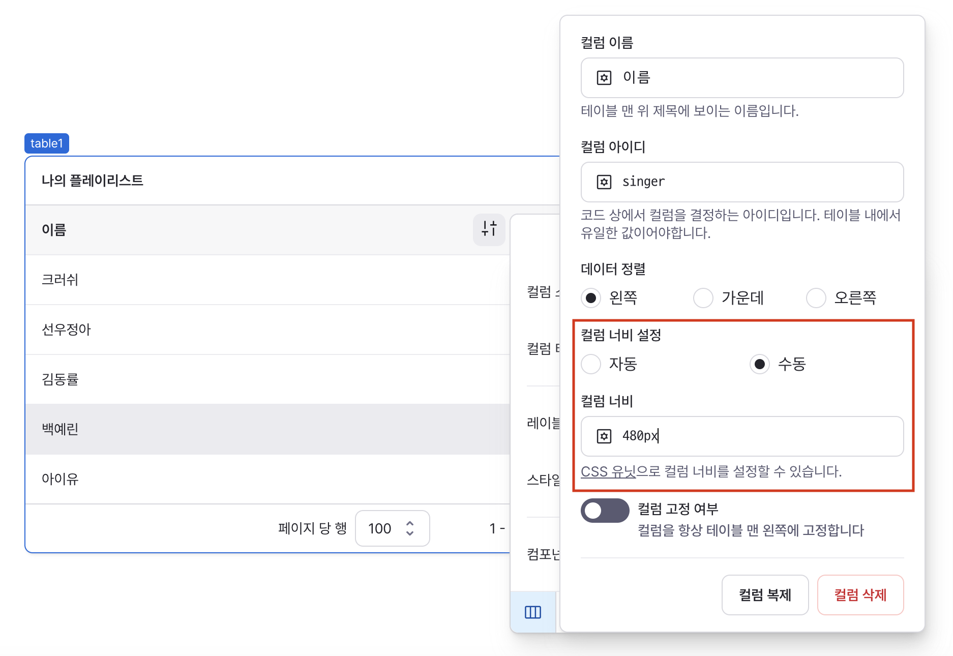
Column Width Settings
Sets column width behavior.
Options:
- Auto: Adjusts based on content
- Manual: Uses specified width value
Column Pinning
Controls column position locking.
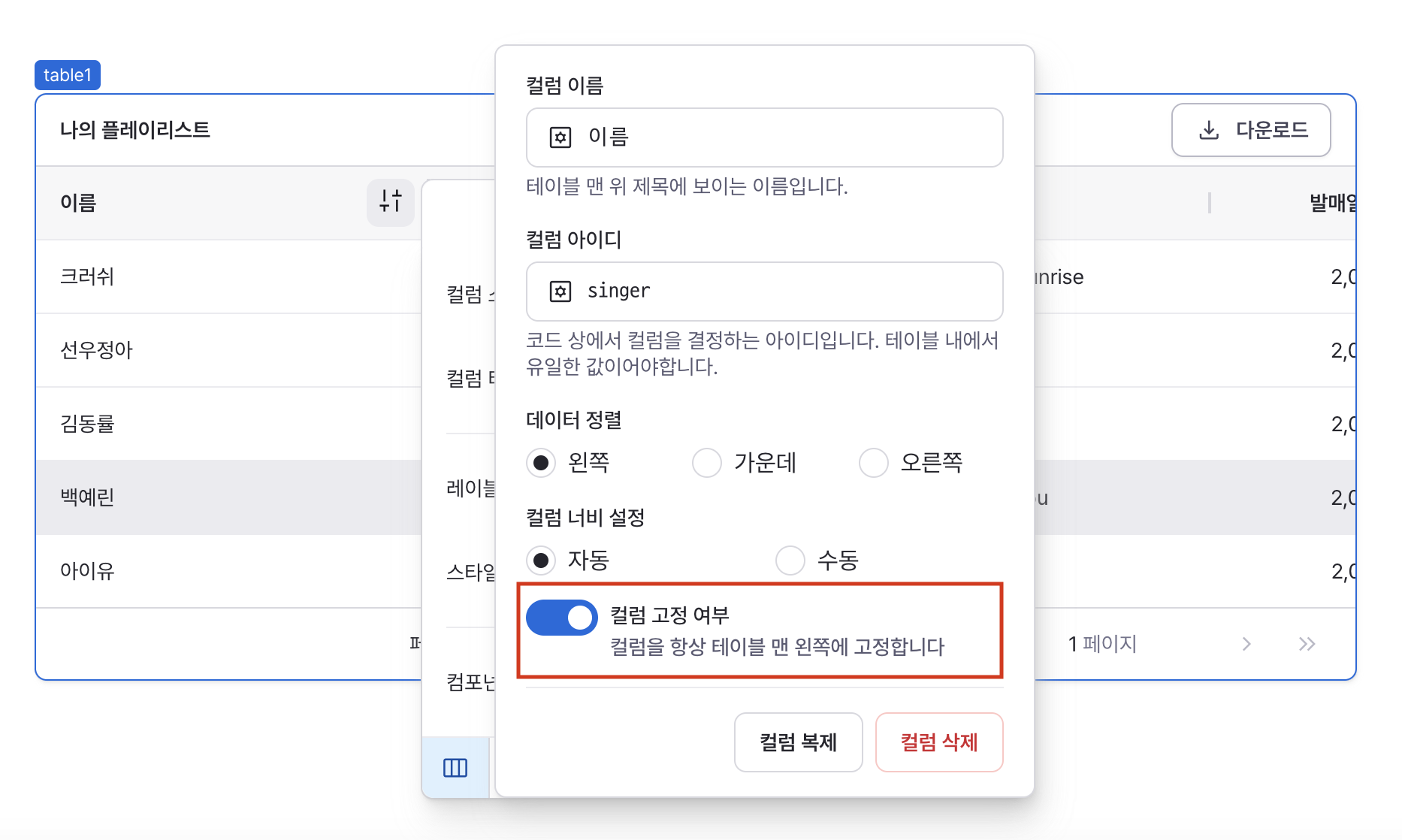
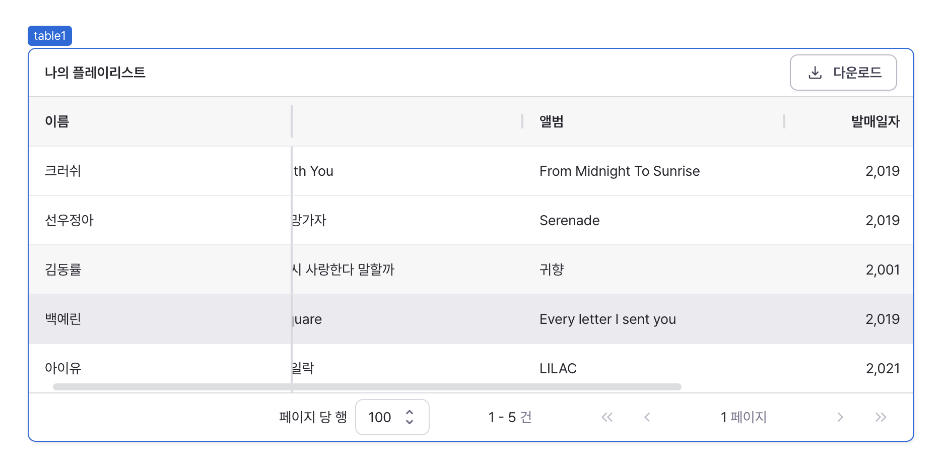
When enabled, pins column to left side of table. Multiple columns can be pinned.
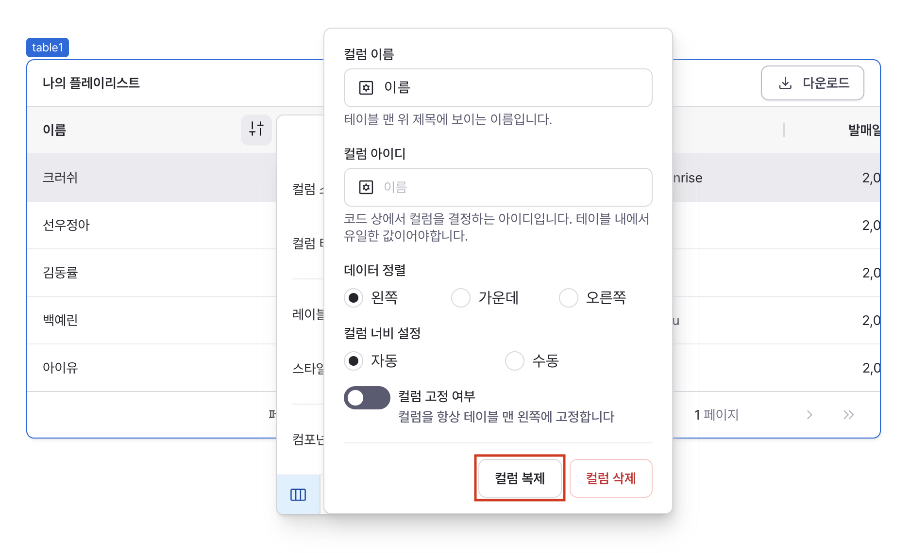
Column Duplication
Duplicates the column and adds the copy to the last column of the table.
Column Deletion
Removes the column from the table.
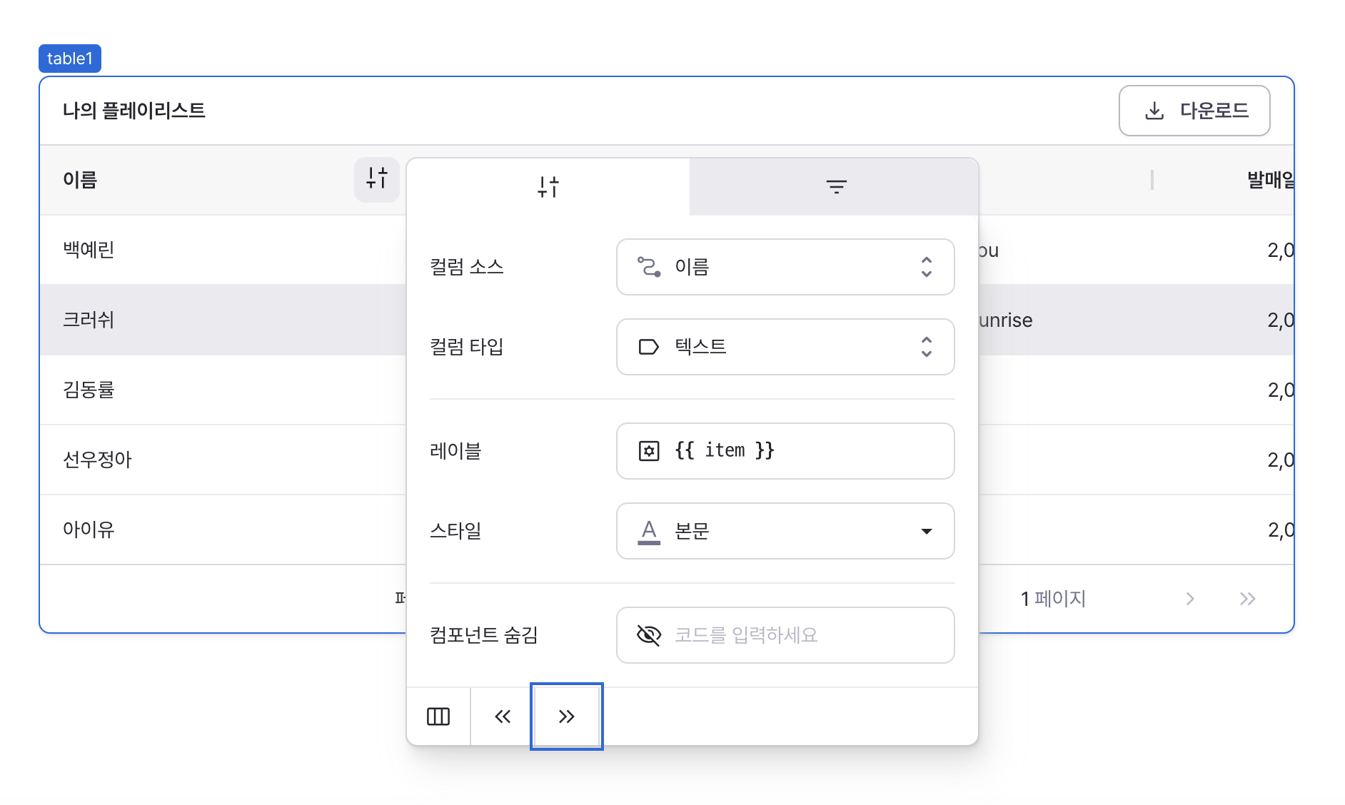
Column Movement
Uses the left and right icons at the bottom of the settings panel to change column order.
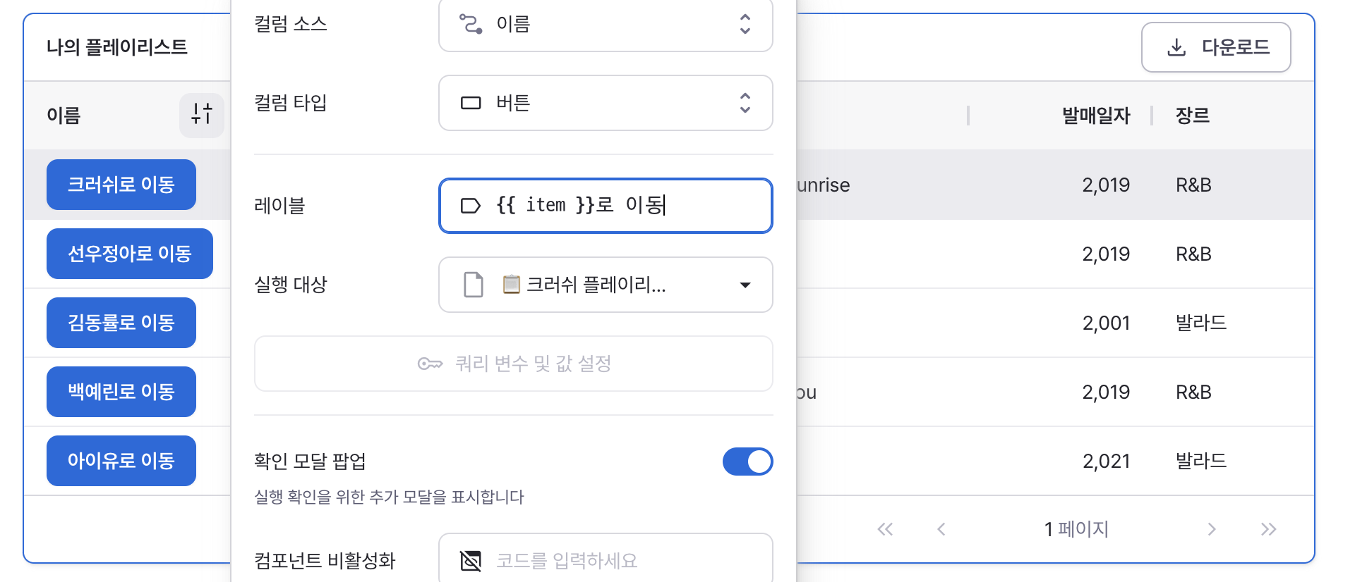
Type: Button
label
Sets the text displayed on the button.
handler
Configures the button's click behavior.
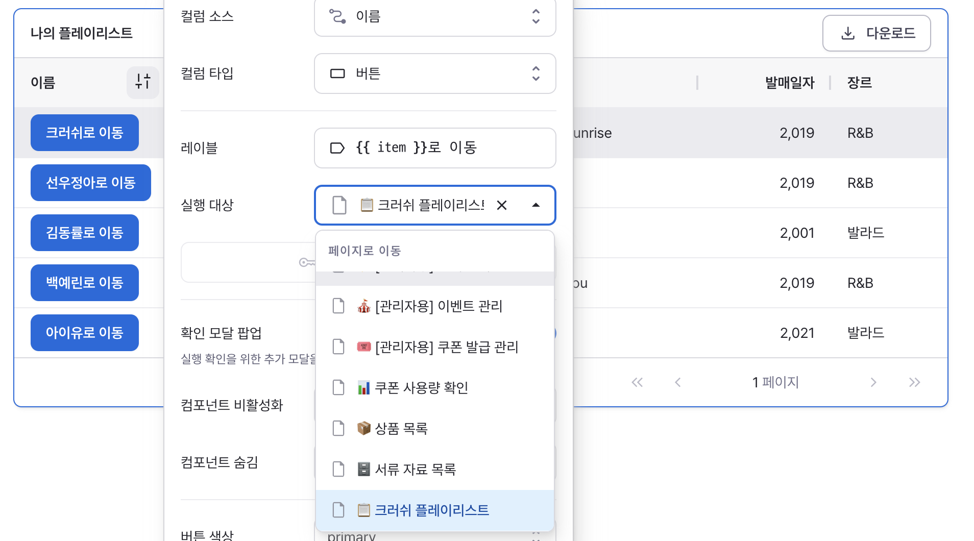
- Page Navigation
- Navigates to selected page
- Supports variable parameter passing

- Workflow Execution
- Runs specified workflow
- Supports variable parameter passing
- Modal Control
- Opens or closes specified modal
- Toggles modal visibility state
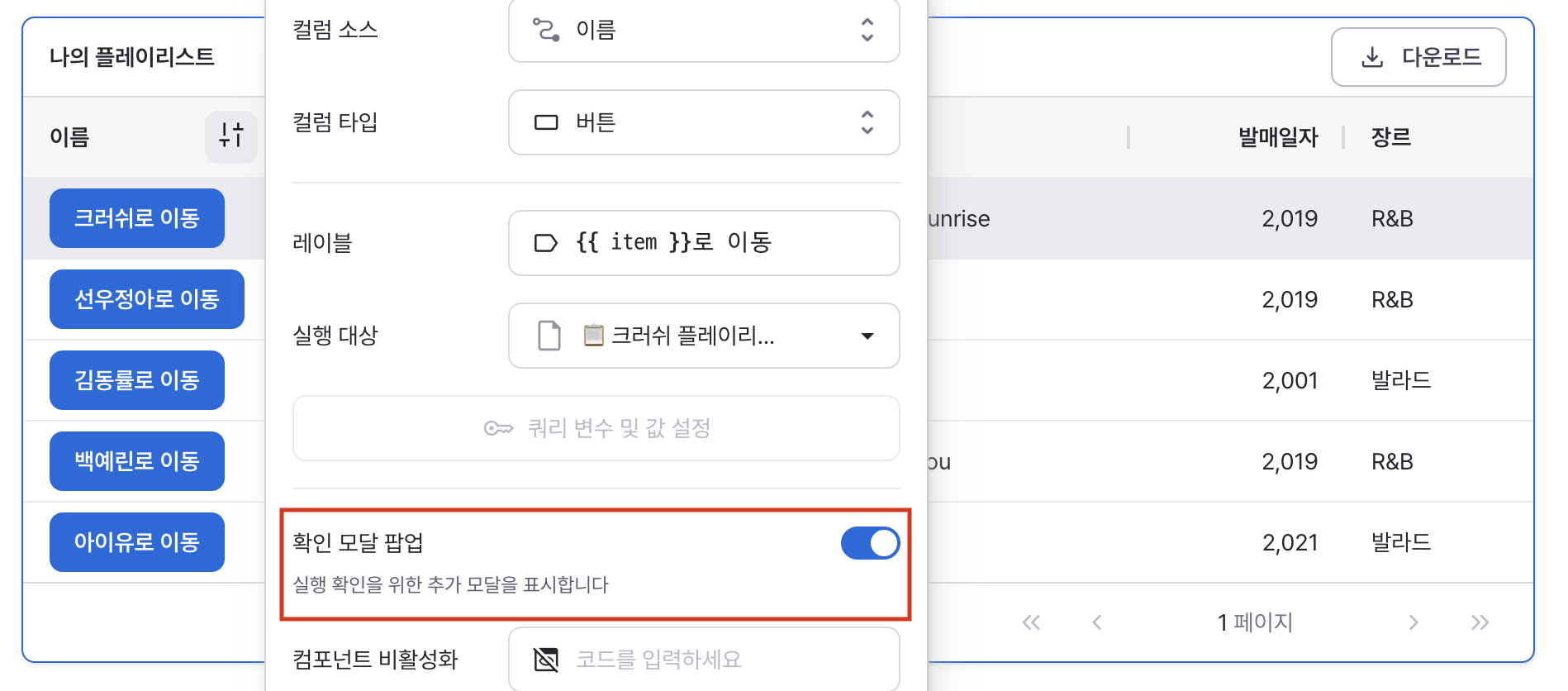
confirmModal
Adds confirmation dialog before action execution.
Recommended for destructive or important actions.
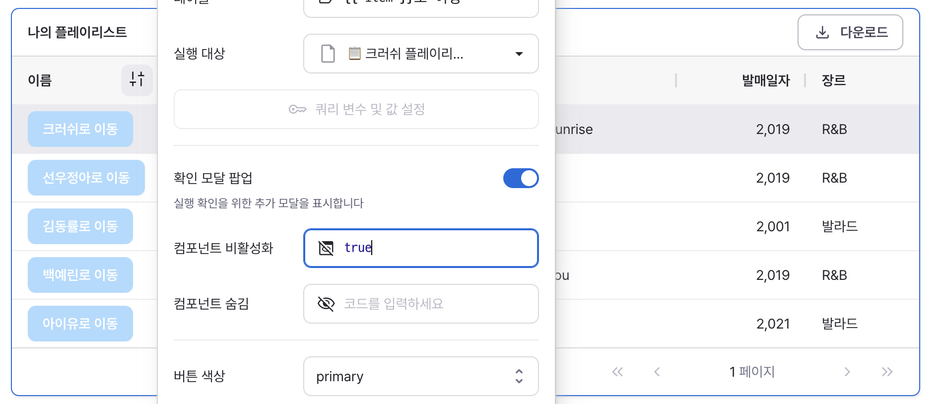
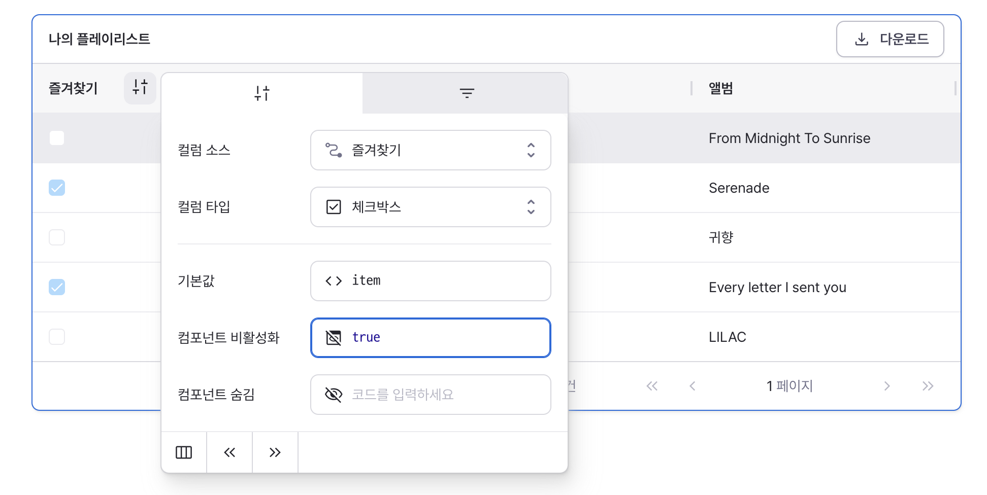
isDisabled
Sets to true to disable the button.
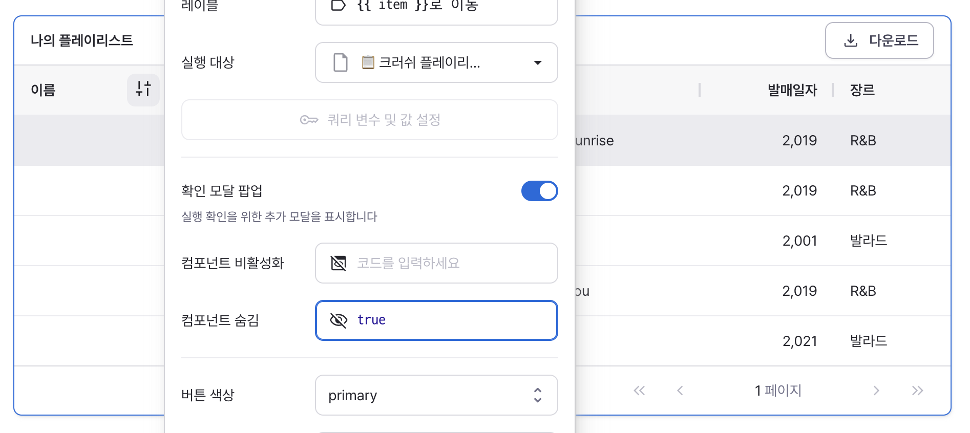
isHidden
Sets to true to hide the button from the table.
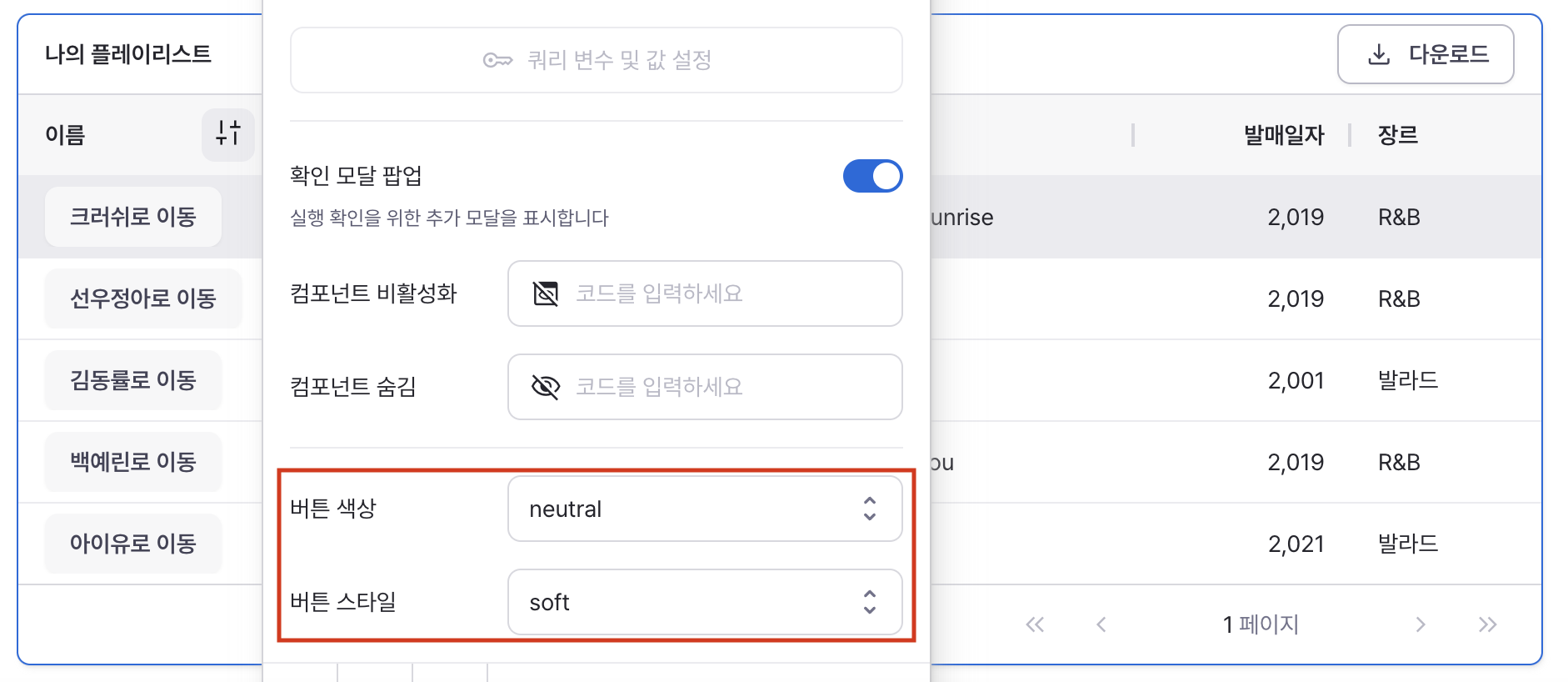
variant
Sets the button's visual style.
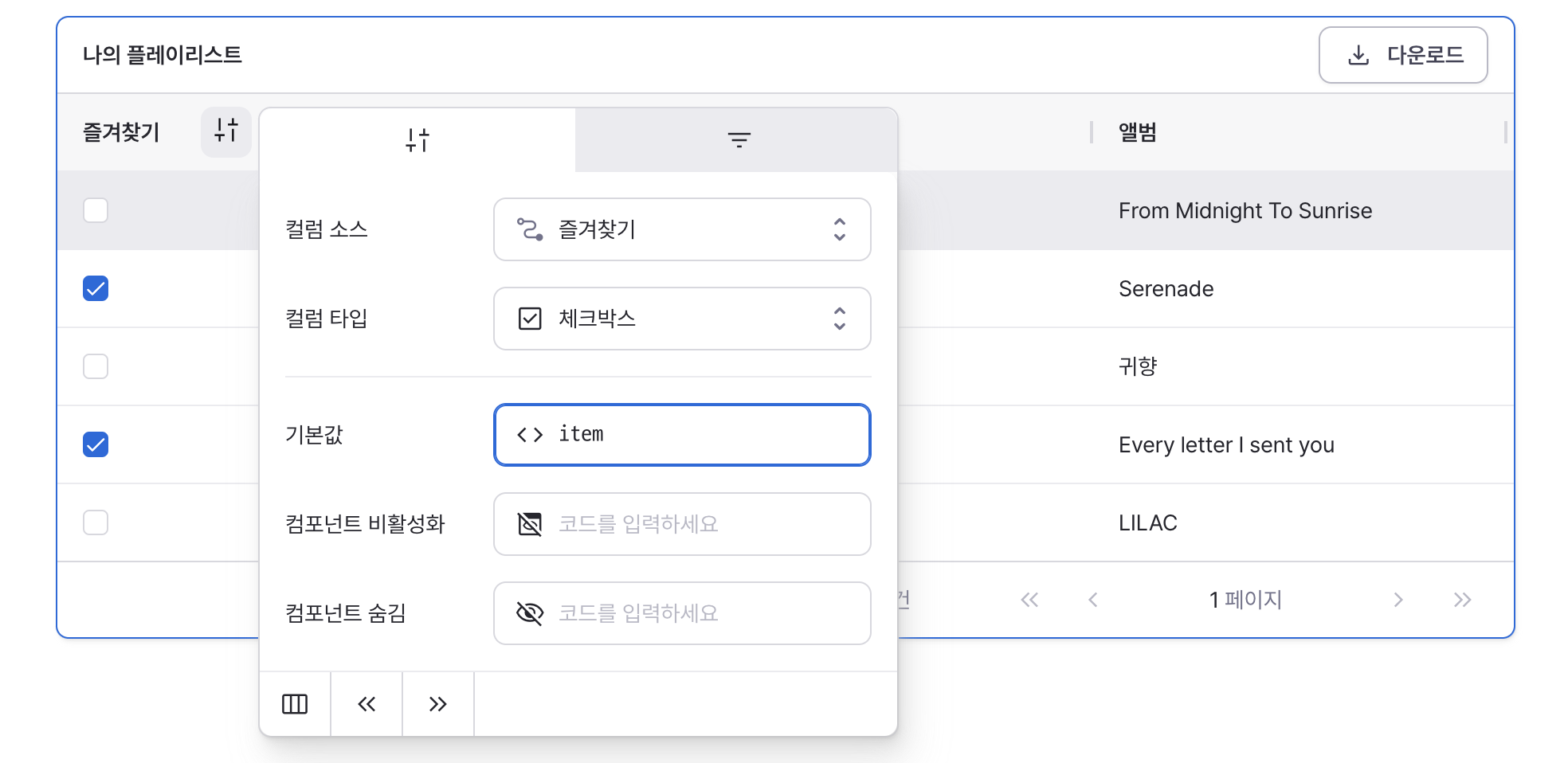
Type: Checkbox
defaultValue
Sets the default checked value for the component.
Can be set through workflow results, direct input.
isDisabled
Sets to true to disable the checkbox.
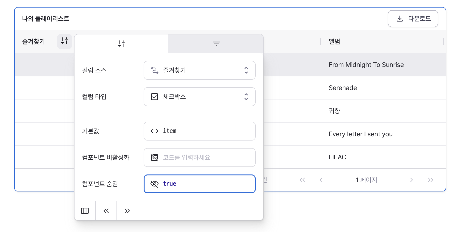
isHidden
Sets to true to hide the checkbox from the table.
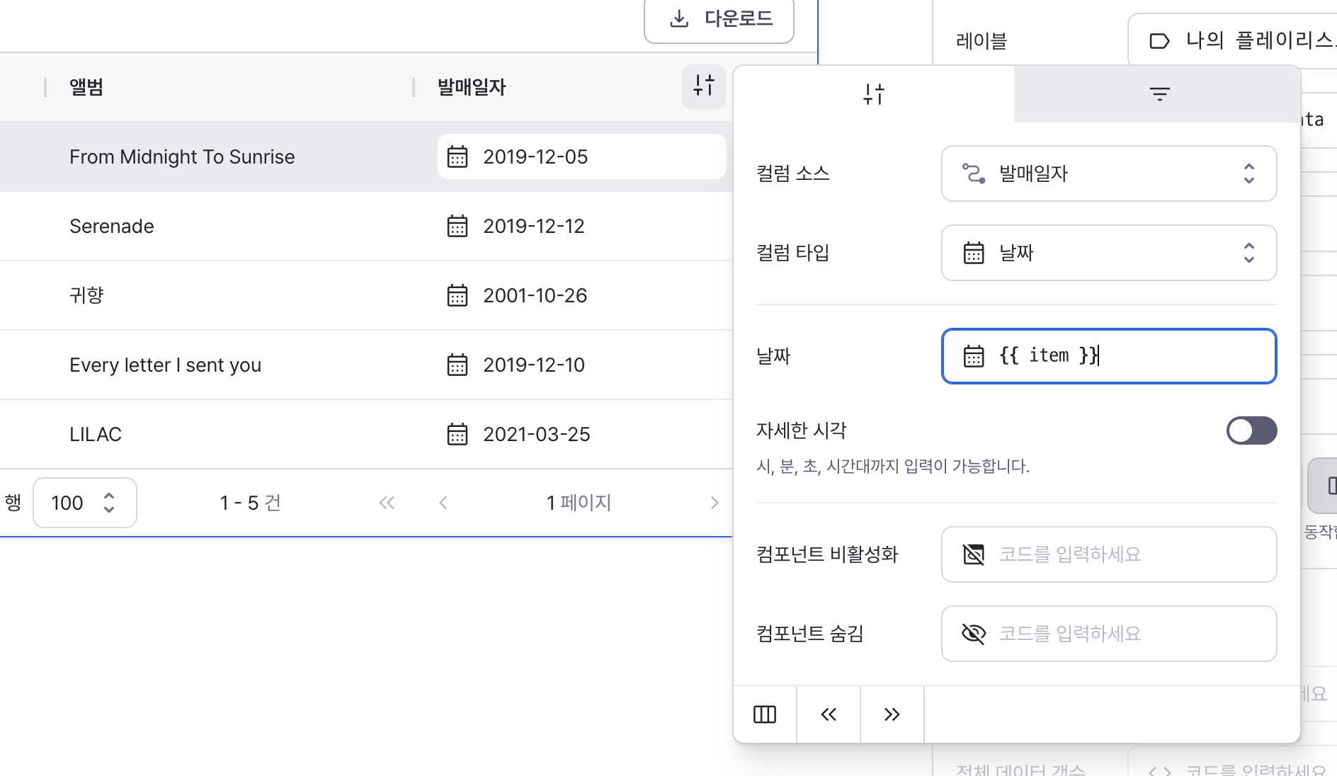
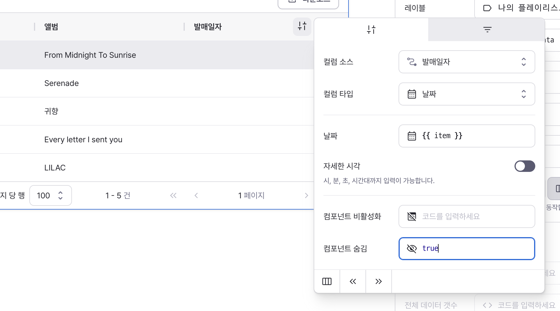
Type: Date
defaultValue
Sets the default date value for the component.
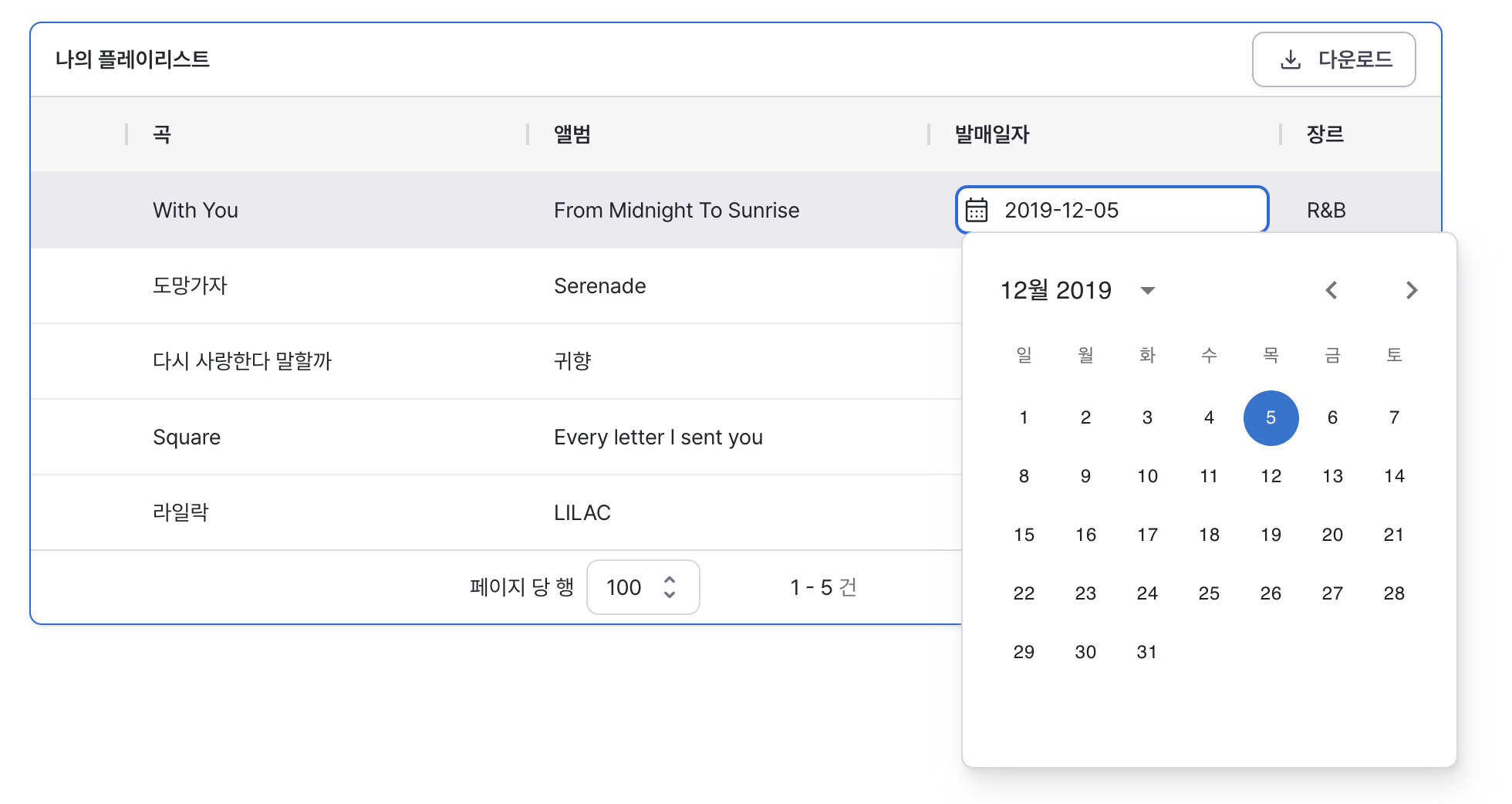
Can be set through workflow results, direct input, or calendar selection.
Click the calendar icon to open the date picker interface.
dateTime
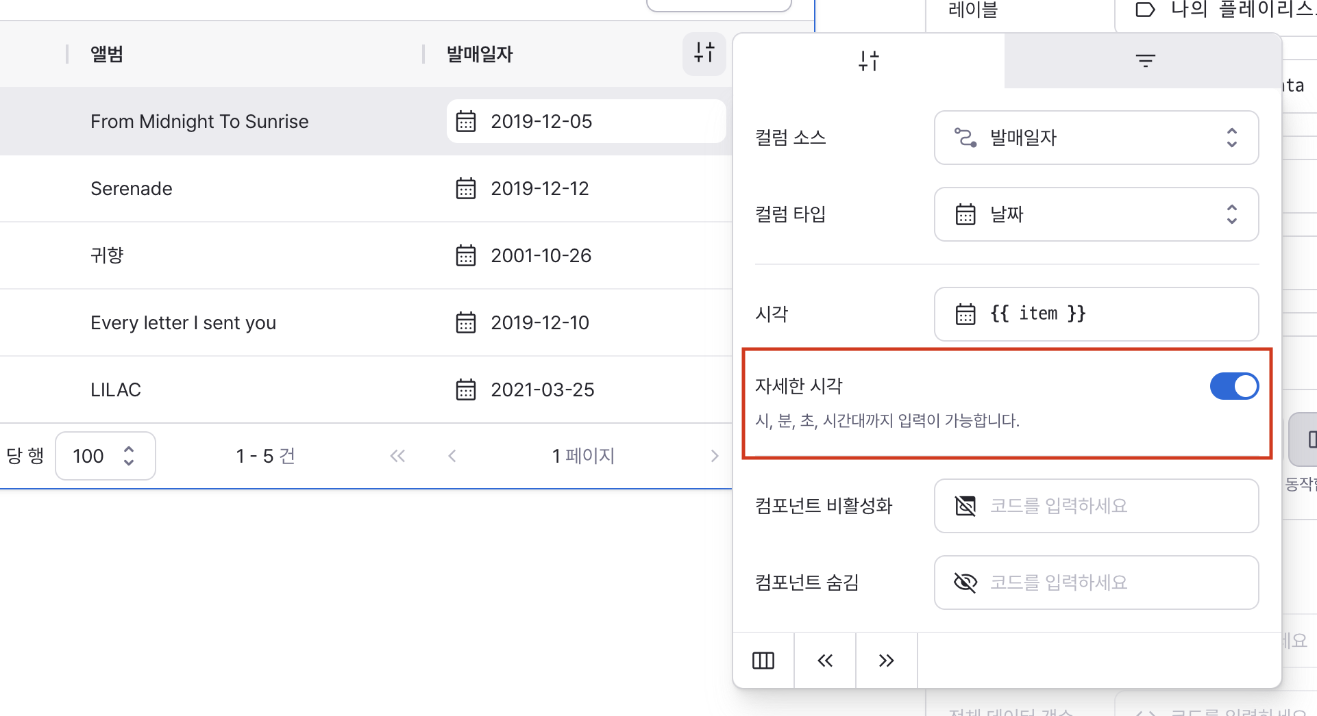
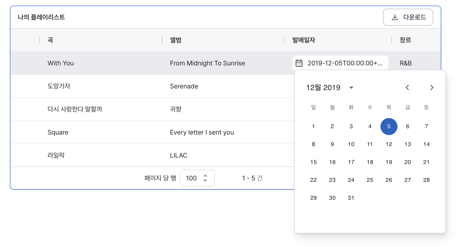
When enabled, allows input of hours, minutes, seconds, and timezone.
isDisabled
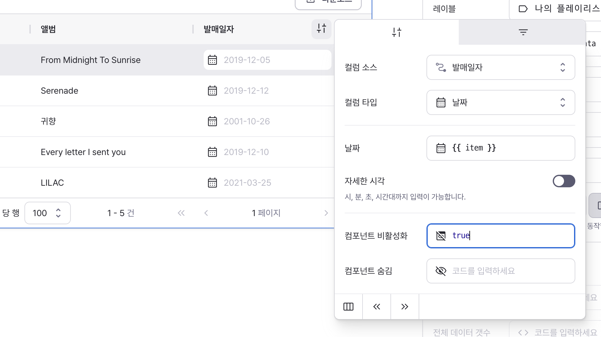
Sets to true to disable the date field.
isHidden
Sets to true to hide the date field from the table.
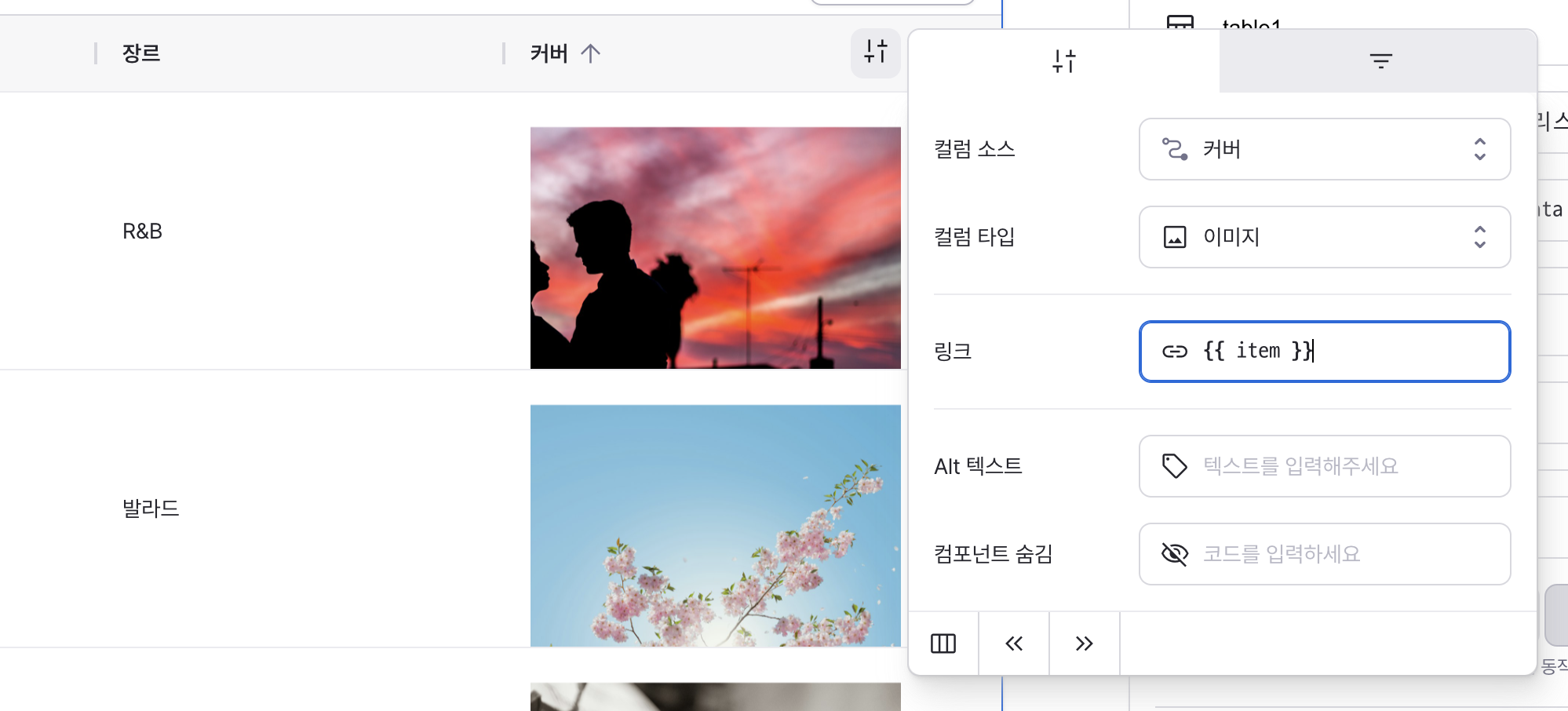
Type: Image
link
Sets the image source URL.
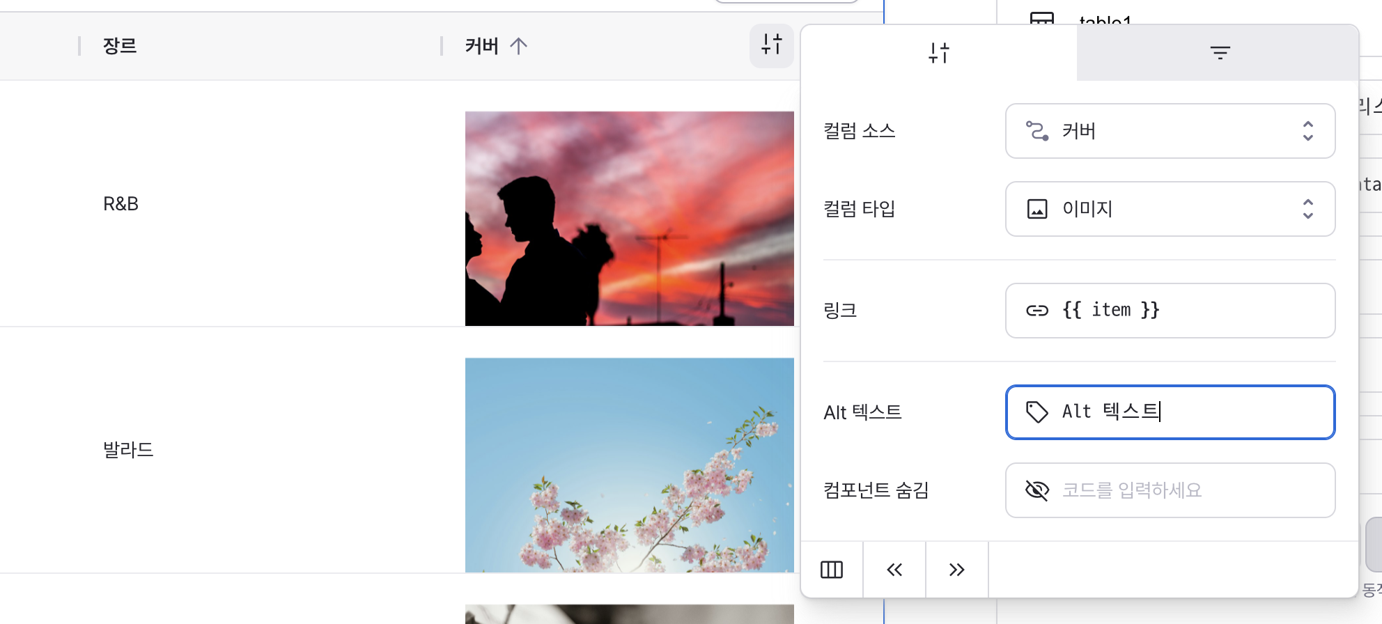
altText
Sets fallback text displayed when image fails to load.
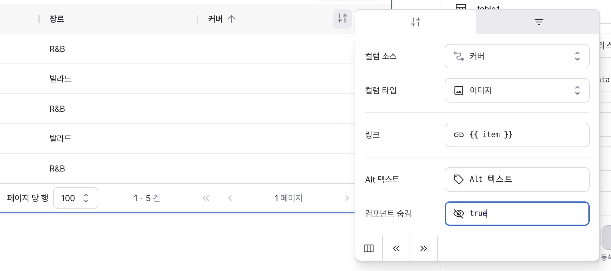
isHidden
Sets to true to hide the image from the table.
Type: Link
label
Sets the text displayed on the link.
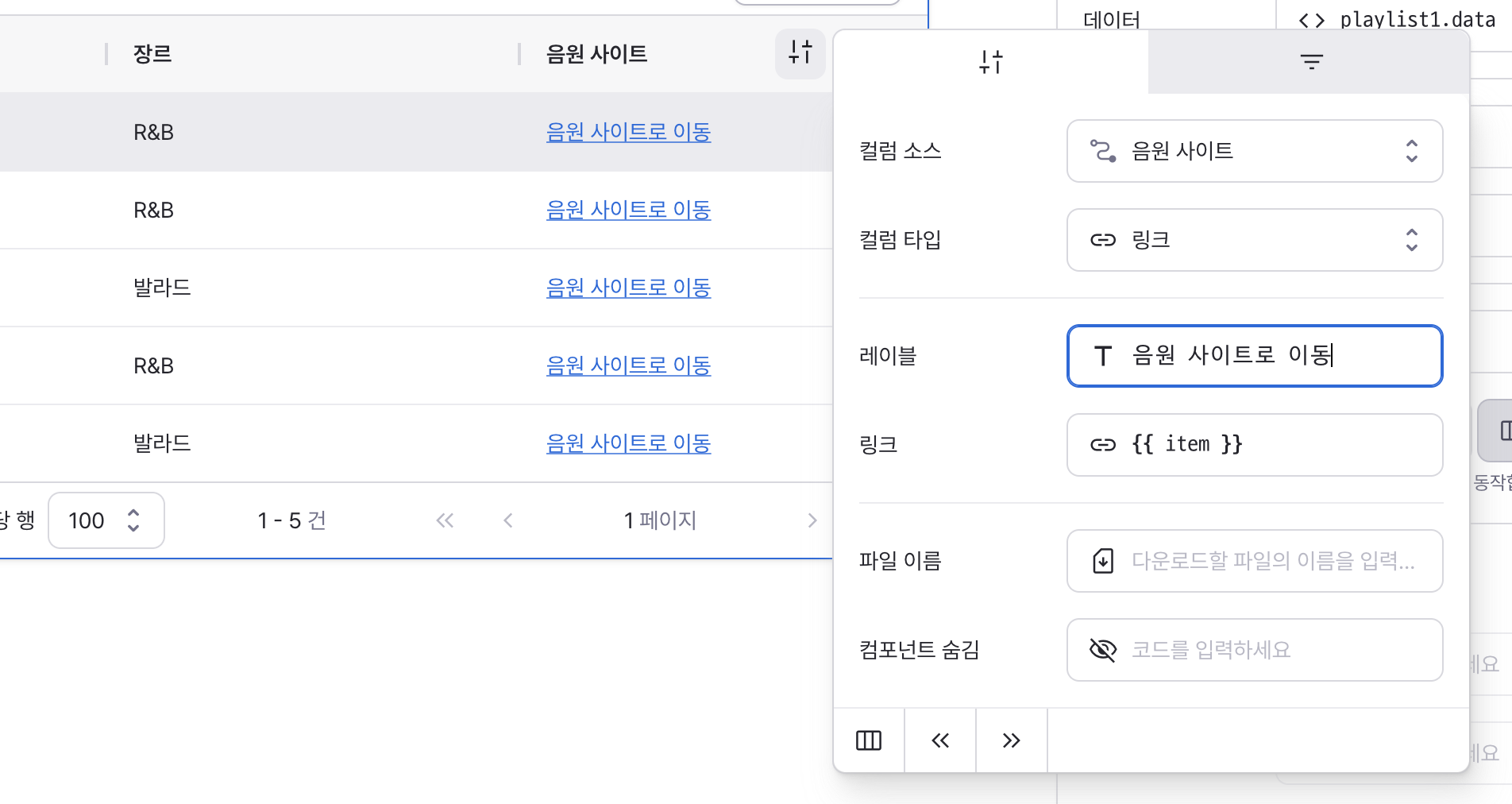
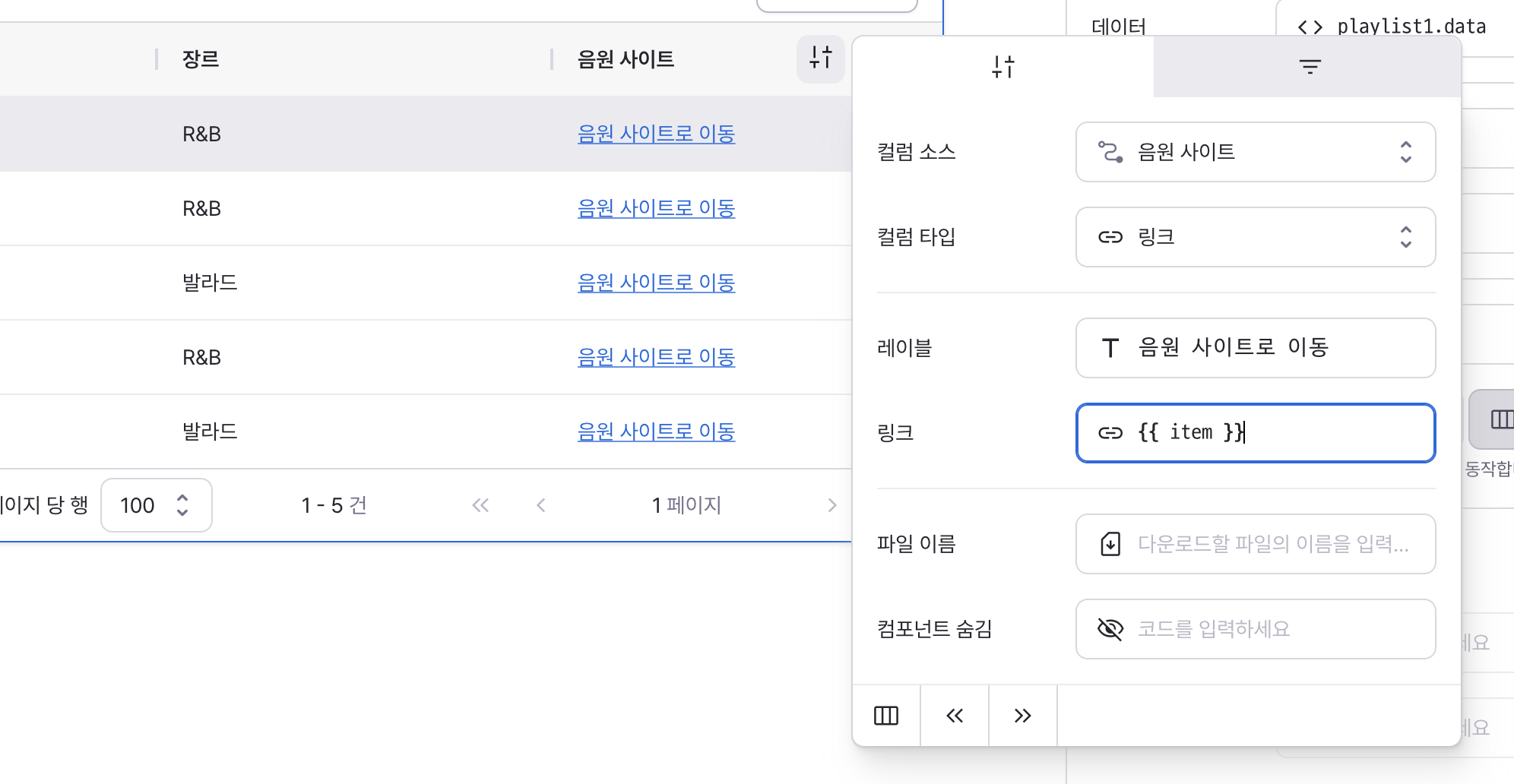
href
Sets the target URL for the link.
Supports:
Web URLs for navigation
- File URLs for download behavior
- Can be set through workflow results, direct input.
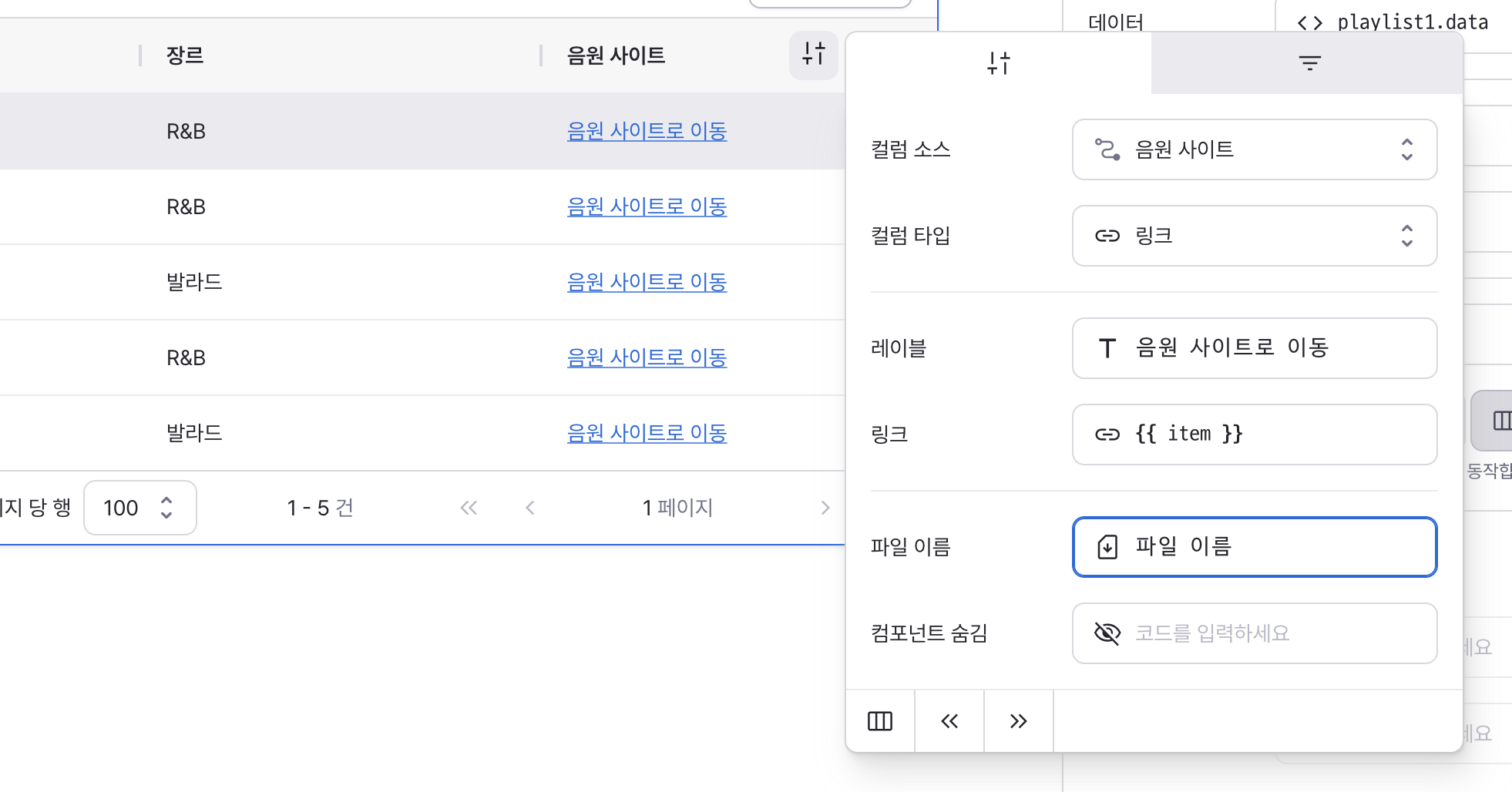
downloadName
Sets the filename for downloaded files.
Only applies when href points to a downloadable resource.
Can be set through workflow results, direct input.
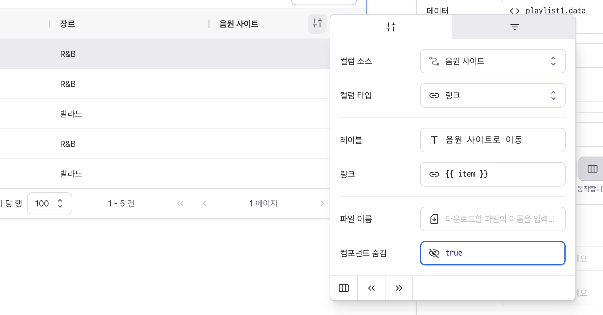
isHidden
Sets to true to hide the link from the table.
Type: Select
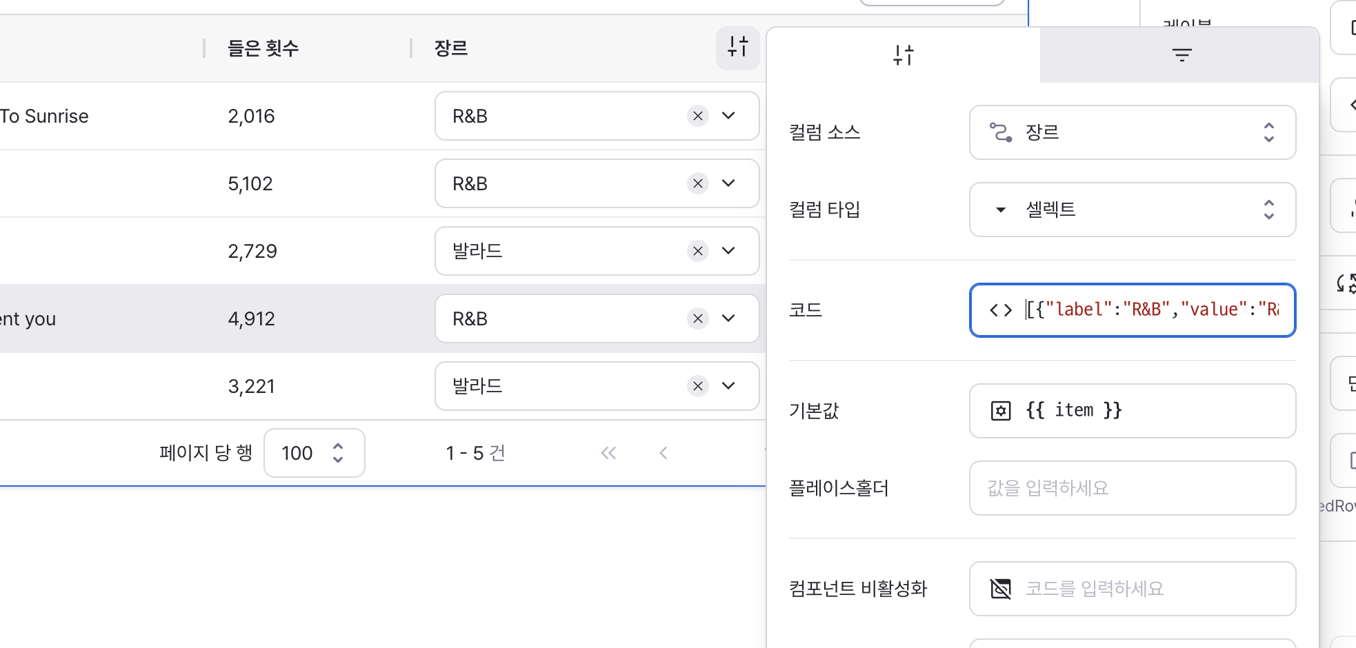
code
Sets the available options for the component.
Can be set through workflow results, direct input.
Example:
[
  { label: "Heavy Metal", value: "Heavy Metal", isHidden: true },
  { label: "R&B", value: "R&B" },
  { label: "Dance", value: "Dance" },
  { label: "Jazz", value: "Jazz" },
  { label: "Ballad", value: "Ballad" }
];
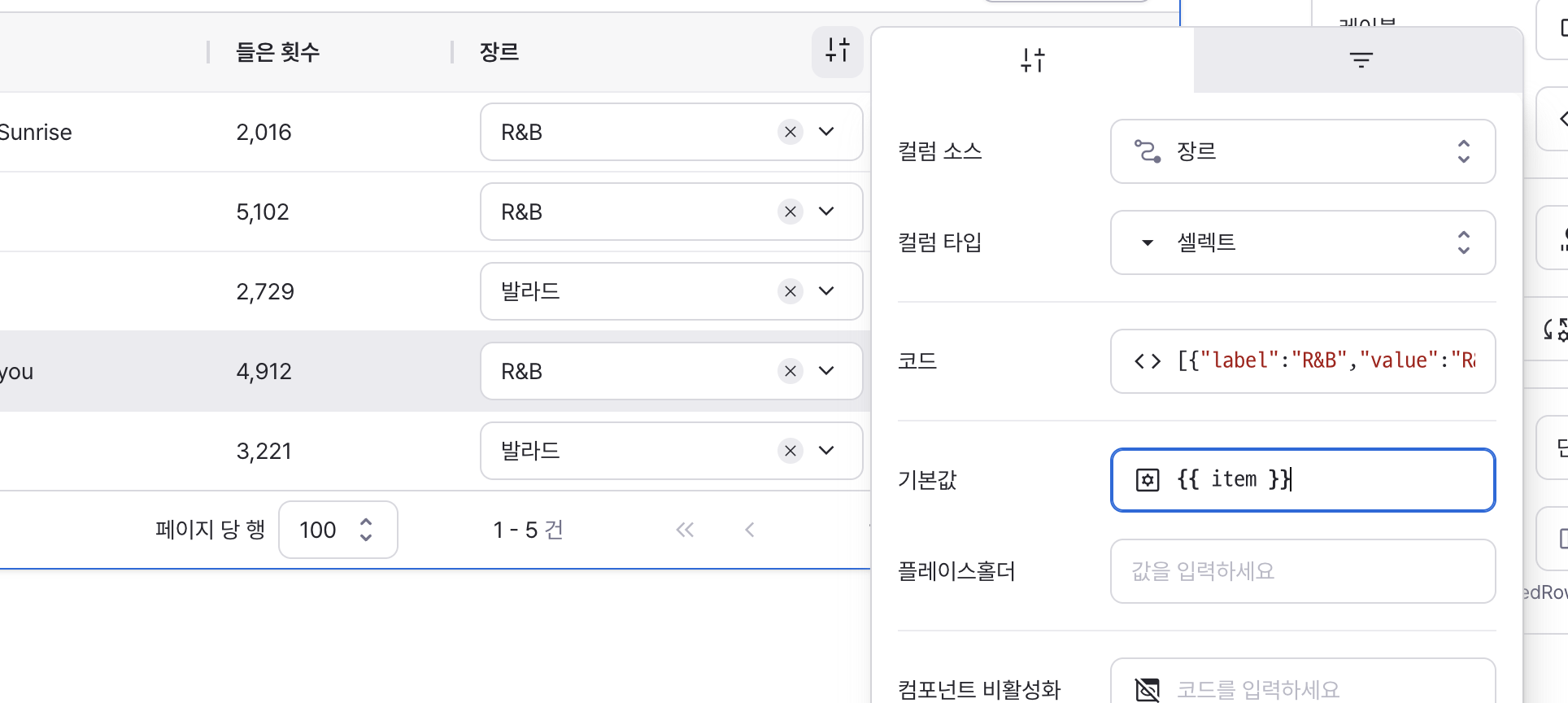
defaultValue
Sets the default selected value for the component.
Can be set through workflow results, direct input.
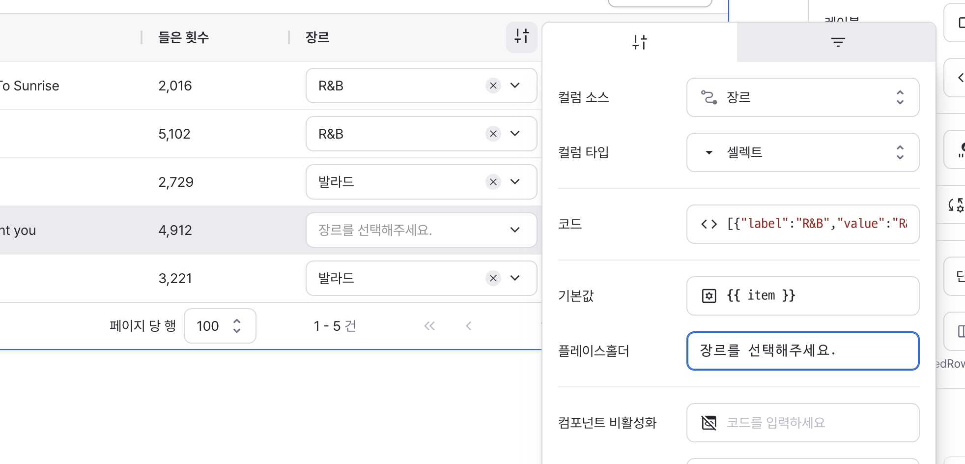
placeholder
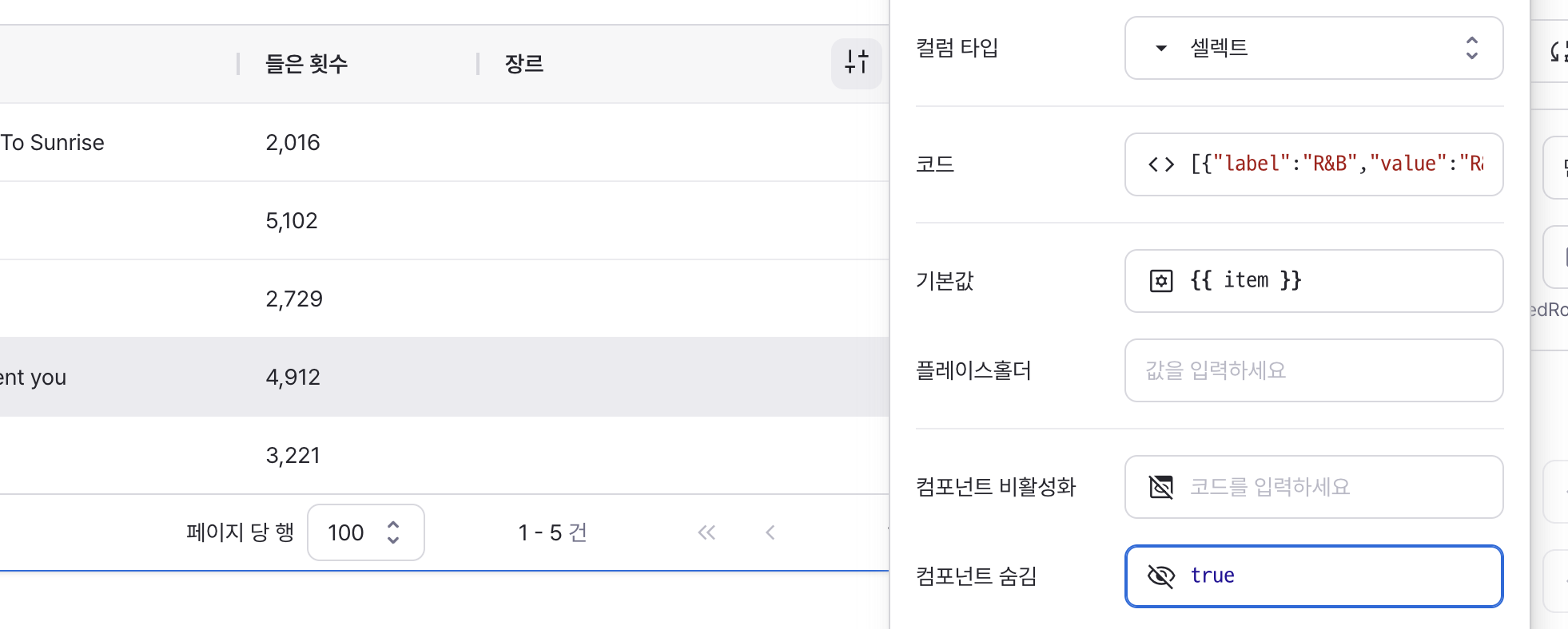
Directly enter text for the field’s placeholder.
If unspecified, the default placeholder for each field type is shown.
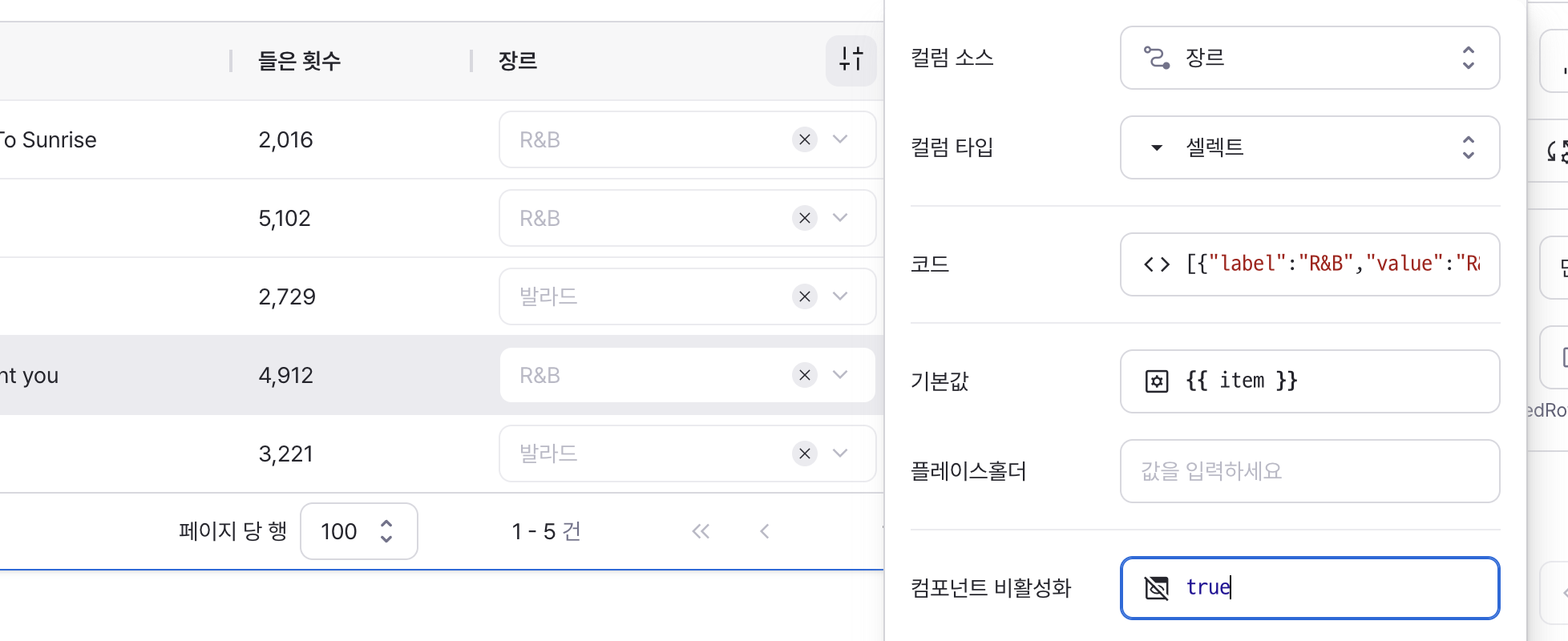
isDisabled
Sets to true to disable the select field.
isHidden
Sets to true to hide the select field from the table.
Type: Multi-Select
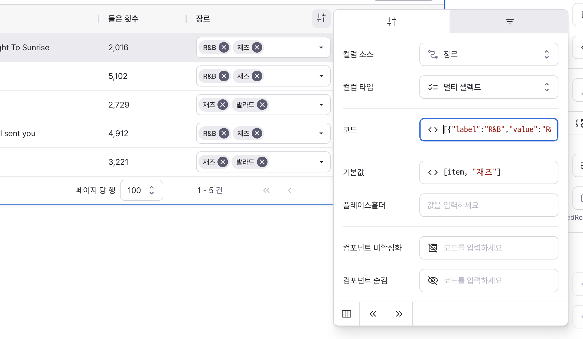
code
Sets the available options for the component.
Can be set through workflow results, direct input.
Example:
[
  { label: "Heavy Metal", value: "Heavy Metal", isHidden: true },
  { label: "R&B", value: "R&B" },
  { label: "Dance", value: "Dance" },
  { label: "Jazz", value: "Jazz" },
  { label: "Ballad", value: "Ballad" }
];
defaultValue
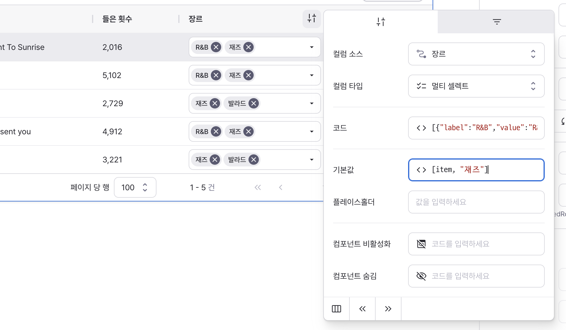
Sets the default selected values for the component.
Can be set through workflow results, direct input.
placeholder
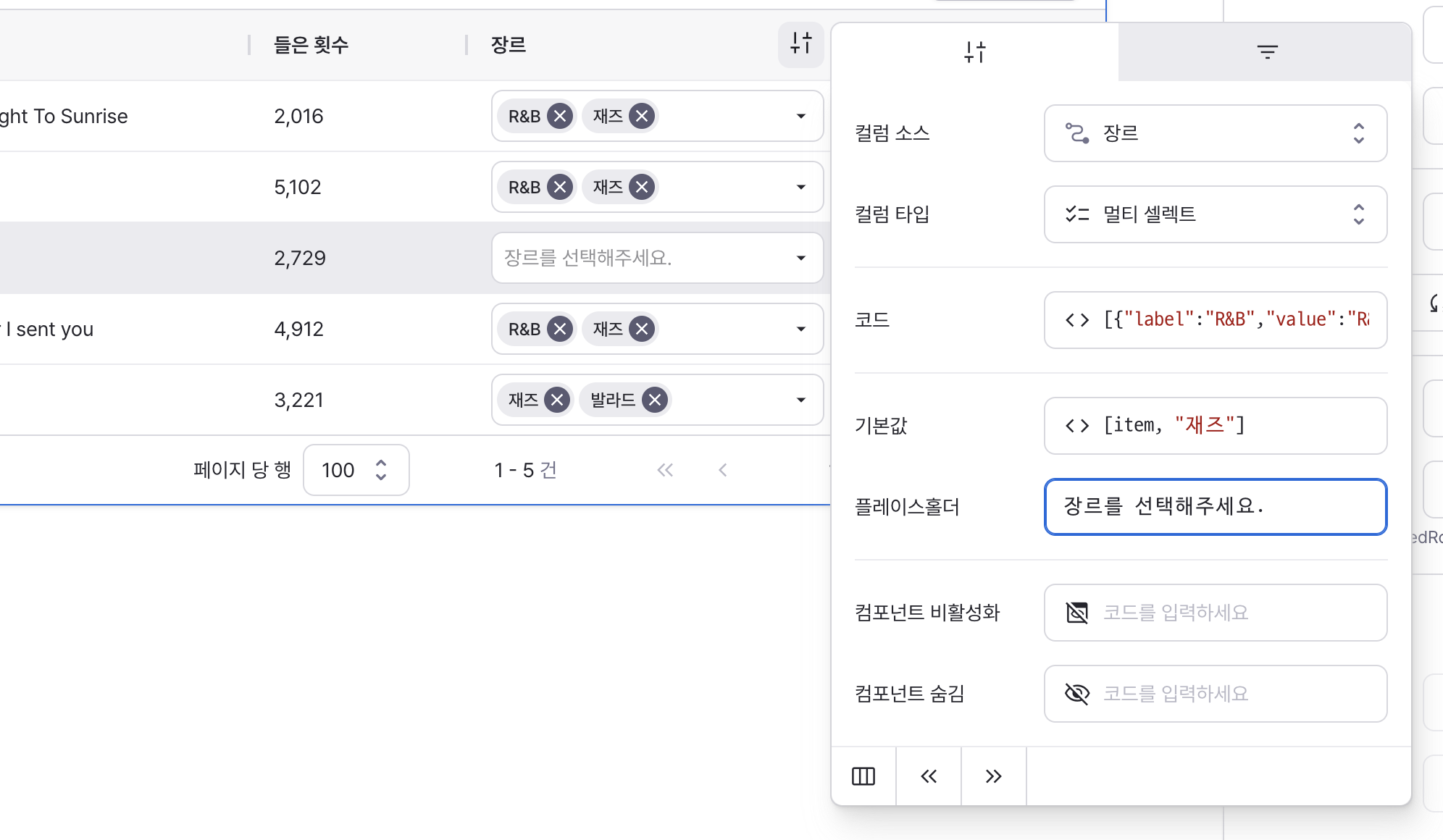
Directly enter text for the field’s placeholder.
If unspecified, the default placeholder for each field type is shown.
isDisabled
Sets to true to disable the multi-select field.
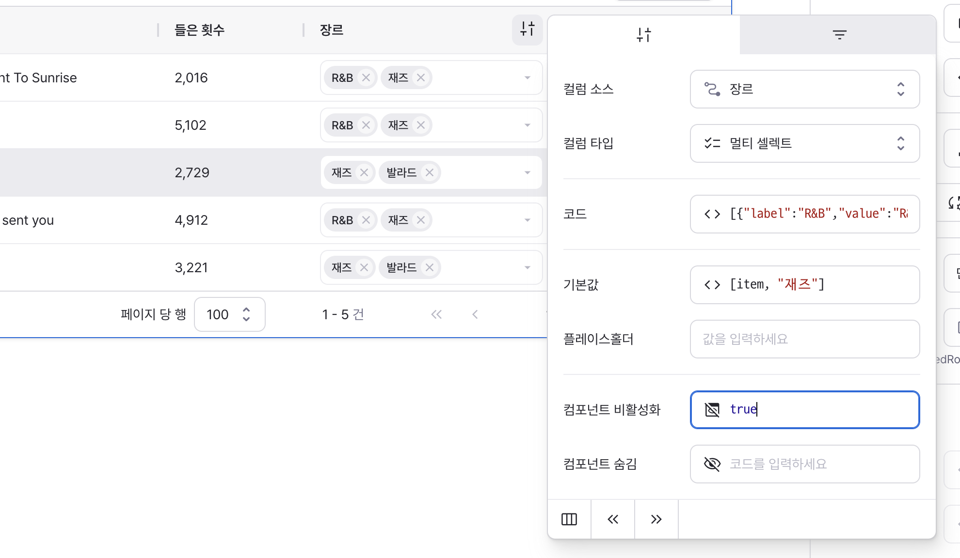
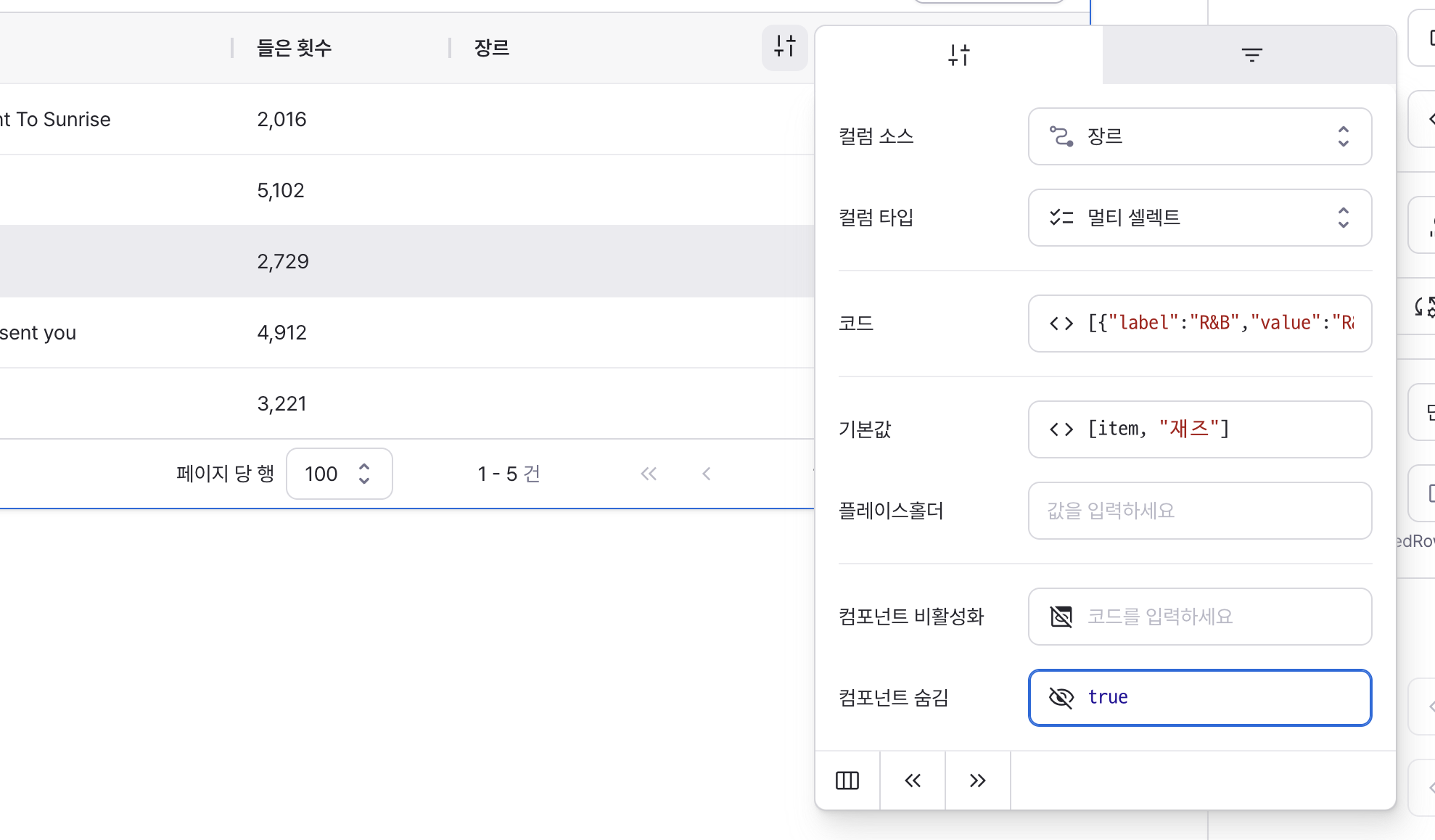
isHidden
Sets to true to hide the multi-select field from the table.
Type: Text
defaultValue
Sets the default value for the component.
Can be set through workflow results, direct input.
style
Sets the text's style.
color
Choose text color:
- Click the color drop button to open color picker UI
- Enter HEX color code in left text field
- Enter opacity value in right text field
validator
Validate number values and display error messages. Uses default error message if no custom message is specified.
placeholder
Directly enter text for the field’s placeholder.
If unspecified, the default placeholder for each field type is shown.
align
Sets the horizontal alignment of text.
isHidden
Sets to true to hide the text from the table.
Type: Number
defaultValue
Sets the default value for the component.
Can be set through workflow results, direct input.
format
Determines how numbers are displayed.
decimalPlaces
Sets the maximum number of decimal places to display.
Accepts values between 0 and 20.
isDecimalPlacesFilled
Determines whether to pad decimal places with zeros.
When enabled, numbers are padded with zeros to match the specified decimal places.
useGrouping
Controls the display of thousand separators.
When enabled, adds commas as thousand separators (e.g., 1,000,000).
validator
Validate number values and display error messages. Uses default error message if no custom message is specified.
placeholder
Directly enter text for the field’s placeholder.
If unspecified, the default placeholder for each field type is shown.
align
Sets the horizontal alignment of numbers.
isHidden
Sets to true to hide the number from the table.
States
| Property | Type | Description |
|---|---|---|
| originalData | Record<string, unknown>[] | Original data input to table data property |
| data | Record<string, unknown>[] | Current table view data with applied column order and settings |
| selectedRowIndex | Optional(number) | Index of selected table row |
| selectedRow | Optional(unknown) | Selected table row |
| selectedRowKey | Optional(unknown) | Key of selected table row |
| selectedRowIndicies | Optional(number[]) | Indices of selected multiple rows |
| selectedRows | Optional(unknown[]) | Selected multiple rows |
| selectedRowKeys | Optional(unknown[]) | Keys of selected multiple rows |
| rowsCount | Optional(number) | Total number of table rows |
| rowsPerPage | Optional(number) | Rows per page when pagination is enabled |
| page | Optional(TablePageState) | Page data when server pagination is enabled |
| filters | Optional(TableFilterState[]) | Filter data when server filtering is enabled |
| sort | Optional(TableSortState) | Sort data when server sorting is enabled |
Type Definitions
interface TablePageState {
  // Rows per page
  rowsPerPage: number | undefined;
  // Current page index
  index: number | undefined;
  // Starting position for page data query
  offset: number | undefined;
  // Maximum number of records per query
  limit: number | undefined;
  // Total number of records
  rowsCount?: number;
}

export type TableFilter =
  | { operator: 'none' }
  | { operator: 'isNull' }
  | { operator: 'isNotNull' }
  | { operator: 'isTrue' }
  | { operator: 'isFalse' }
  | { operator: 'isEmpty' }
  | { operator: 'isNotEmpty' }
  | { operator: 'eq'; value: string }
  | { operator: 'includes'; value: string }
  | { operator: 'gt'; value: string }
  | { operator: 'gte'; value: string }
  | { operator: 'lt'; value: string }
  | { operator: 'lte'; value: string };

export type TableFilterOperator = TableFilter['operator'];

interface TableFilterState {
  // ID of column to filter
  id: string;
  // Type of filter
  operator: TableFilterOperator;
  // Filter input value
  value?: string;
}

interface TableSortState {
  // ID of column to sort
  id: string;
  // Sort direction
  direction: 'ASC' | 'DESC';
}