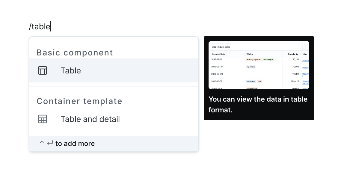
Table
Presents and manage data in tabular format with comprehensive features like sorting, filtering, and export options.
Properties
| Property | Type | Description |
|---|---|---|
| Name (name) | string | Unique identifier for the table component |
| Label (label) | string | Text displayed in table header |
| Data (code) | string (Record<string, unknown>[]) | Data to be displayed in the table |
| Table Type (isDataTable) | boolean | true: Data table (pagination, sorting, filtering, server-side paging enabled)false: Basic table |
| Column List (columnDefinitions) | TableColumnDefinitionTemplate[] | Table column definition list |
| Row Selection (isRowSelectionEnabled) | boolean | true: Enable single/multiple row selectionfalse: Disabled |
| Row Selection (isMultipleRowSelectionDisabled) | boolean | true: Single row selection false: Multiple row selection |
| Unique Row Key (rowKey) | string | Unique key for rows used during row selection |
| Edit Method (editingMode) | string | Method for editing table cells |
| Server Pagination (isServerSidePaginationEnabled) | boolean | Enable server-side pagination for data tables |
| Server Rows Per Page (rowsPerPage) | string | Number of rows per page when server pagination is enabled |
| Server Total Count (rowsCount) | string | Total number of rows when server pagination is enabled |
| Server Filtering (isServerSideFilteringEnabled) | boolean | Enable server-side filtering for data tables |
| Server Sorting (isServerSideSortingEnabled) | boolean | Enable server-side sorting for data tables |
| CSV Download (isCsvDownloadable) | boolean | Enable CSV download of table data |
| Height Setting (isHeightFixed) | boolean | Enable fixed height for table |
| Height (contentHeight) | string | Fixed height value for table |
| Hide Component (isHidden) | boolean | Hide table in deployed pages |
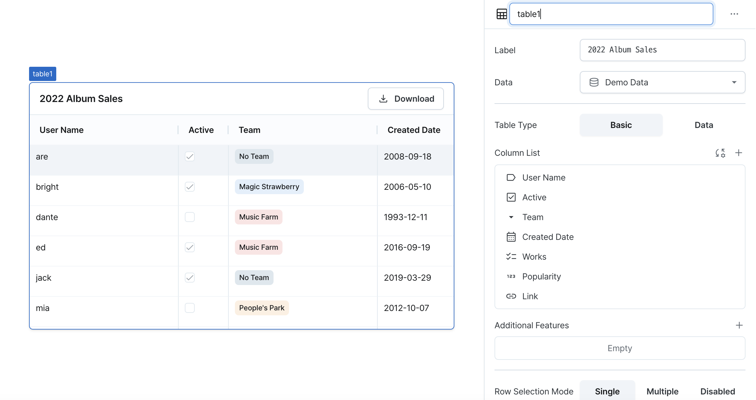
Name (name)
Sets the unique identifier for the table component. Please refer to the component naming rules
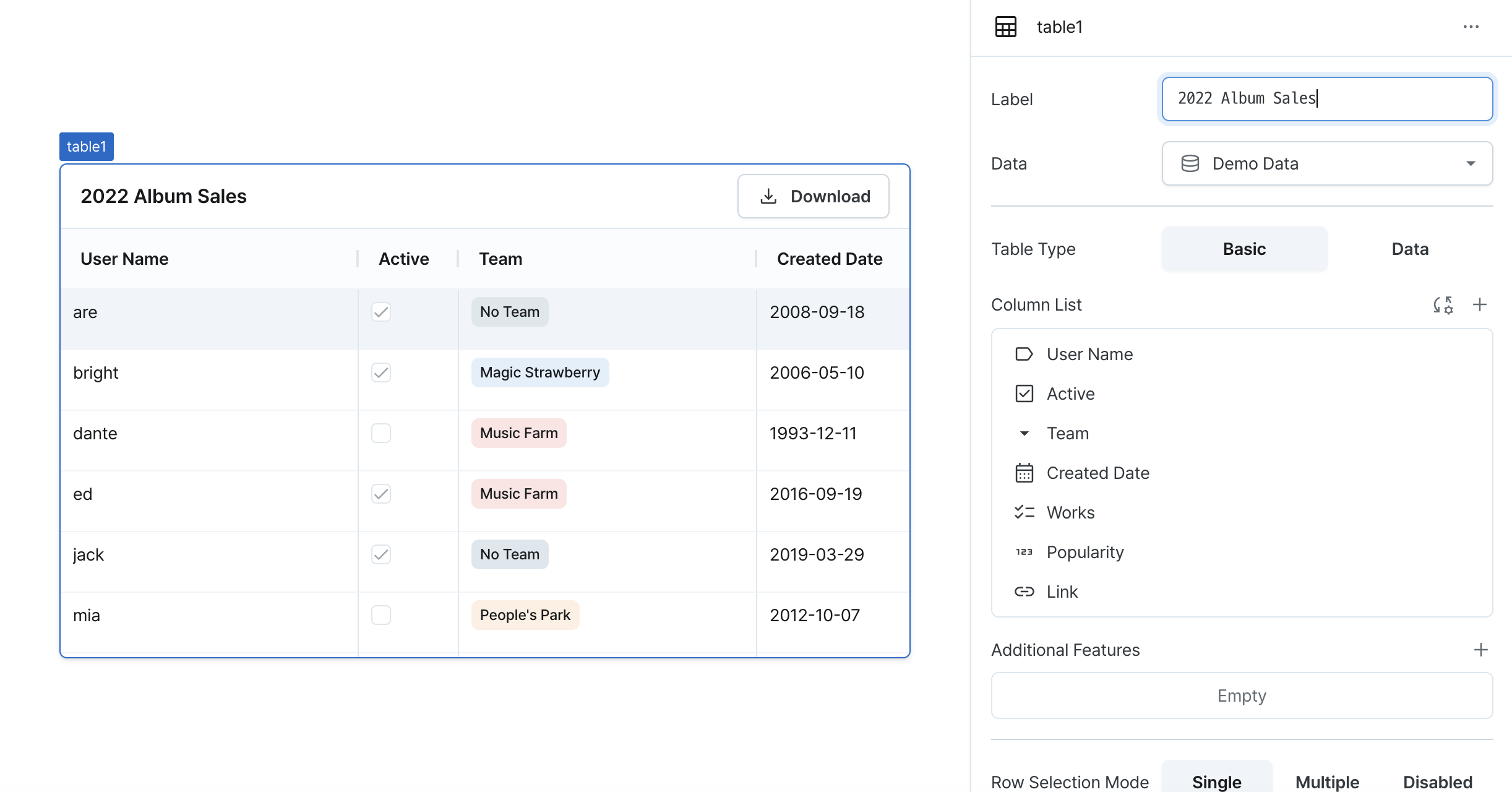
Label (label)
Sets the text displayed in the table header.
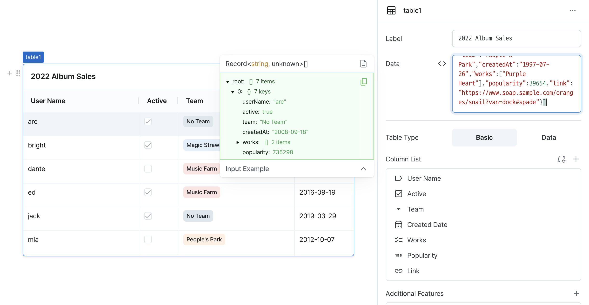
Data (code)
Sets the data to be displayed in the table.
Can be set through:
-
Direct data input
- Enter array data directly into the data property
- Example:
[
  { name: 'Crush', song: 'With You', album: 'From Midnight To Sunrise', releaseYear: 2019, genre: 'R&B' },
  { name: 'Sunwoo JungA', song: 'Run Away', album: 'Serenade', releaseYear: 2019, genre: 'R&B' },
  {
    name: 'Kim Dong Ryul',
    song: 'Should I Say I Love You Again',
    album: 'Return',
    releaseYear: 2001,
    genre: 'Ballad',
  },
  { name: 'Yerin Baek', song: 'Square', album: 'Every letter I sent you', releaseYear: 2019, genre: 'R&B' },
  { name: 'IU', song: 'Lilac', album: 'LILAC', releaseYear: 2021, genre: 'Ballad' },
];
-
Workflow execution results
- If a registered workflow returns an array, its data can be used
- Example: If workflow named
playlist1returns above data, useplaylist1.data
[
  { name: 'Crush', song: 'With You', album: 'From Midnight To Sunrise', releaseYear: 2019, genre: 'R&B' },
  { name: 'Sunwoo JungA', song: 'Run Away', album: 'Serenade', releaseYear: 2019, genre: 'R&B' },
  {
    name: 'Kim Dong Ryul',
    song: 'Should I Say I Love You Again',
    album: 'Return',
    releaseYear: 2001,
    genre: 'Ballad',
  },
  { name: 'Yerin Baek', song: 'Square', album: 'Every letter I sent you', releaseYear: 2019, genre: 'R&B' },
  { name: 'IU', song: 'Lilac', album: 'LILAC', releaseYear: 2021, genre: 'Ballad' },
];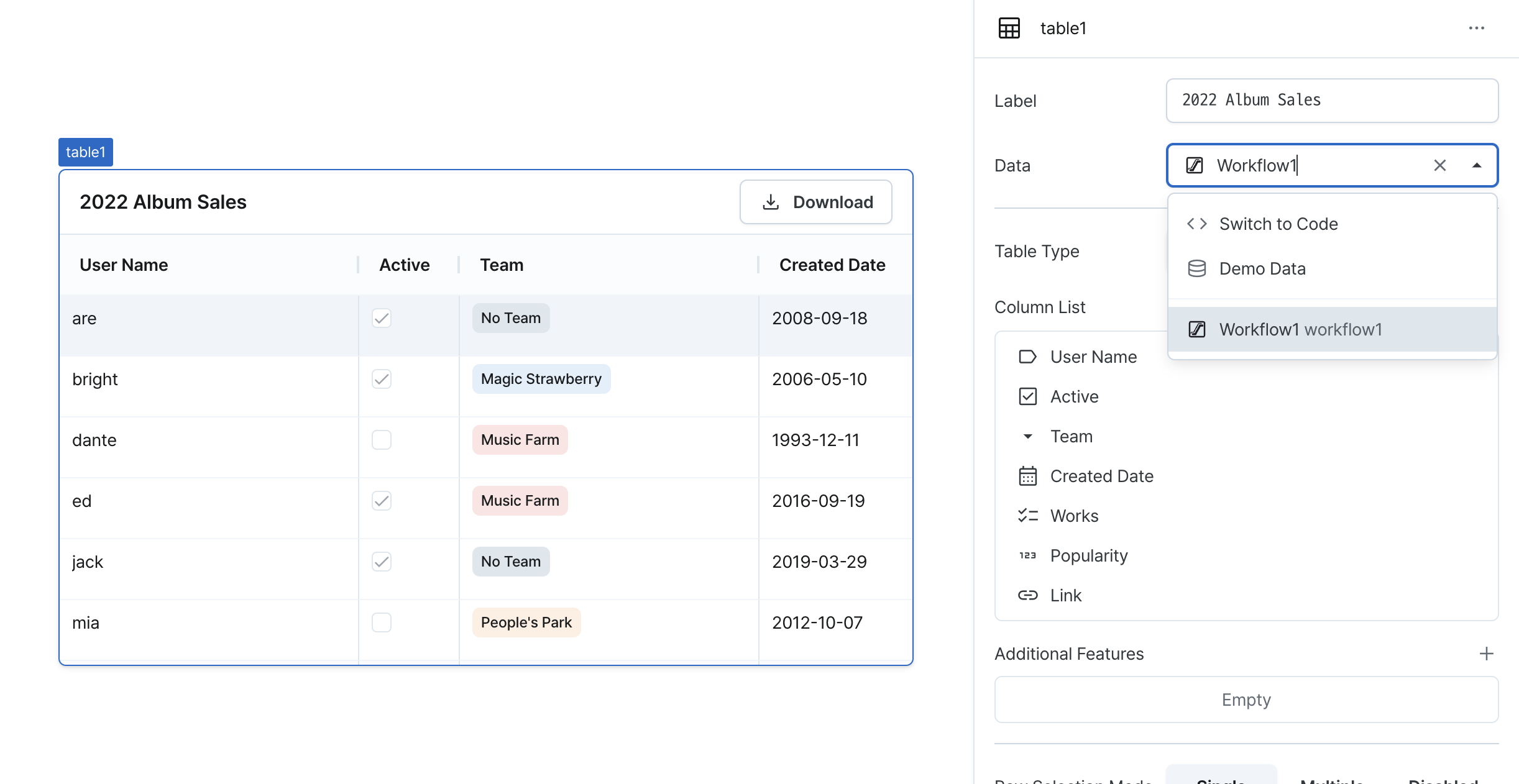
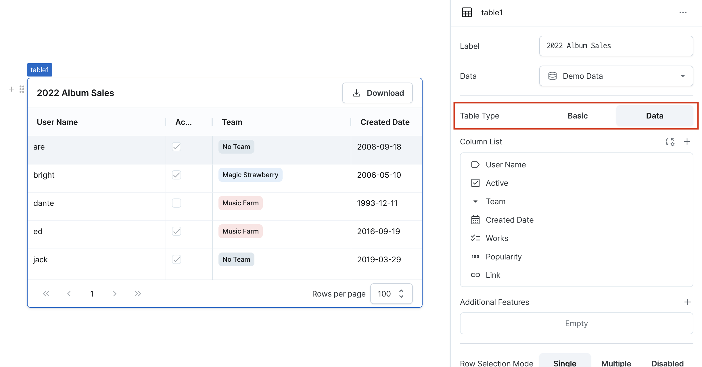
Table Type (isDataTable)
Sets the table type and feature set.
Options:
true: Enables advanced features (pagination, sorting, filtering, server-side paging)false: Provides basic table functionality
Pagination
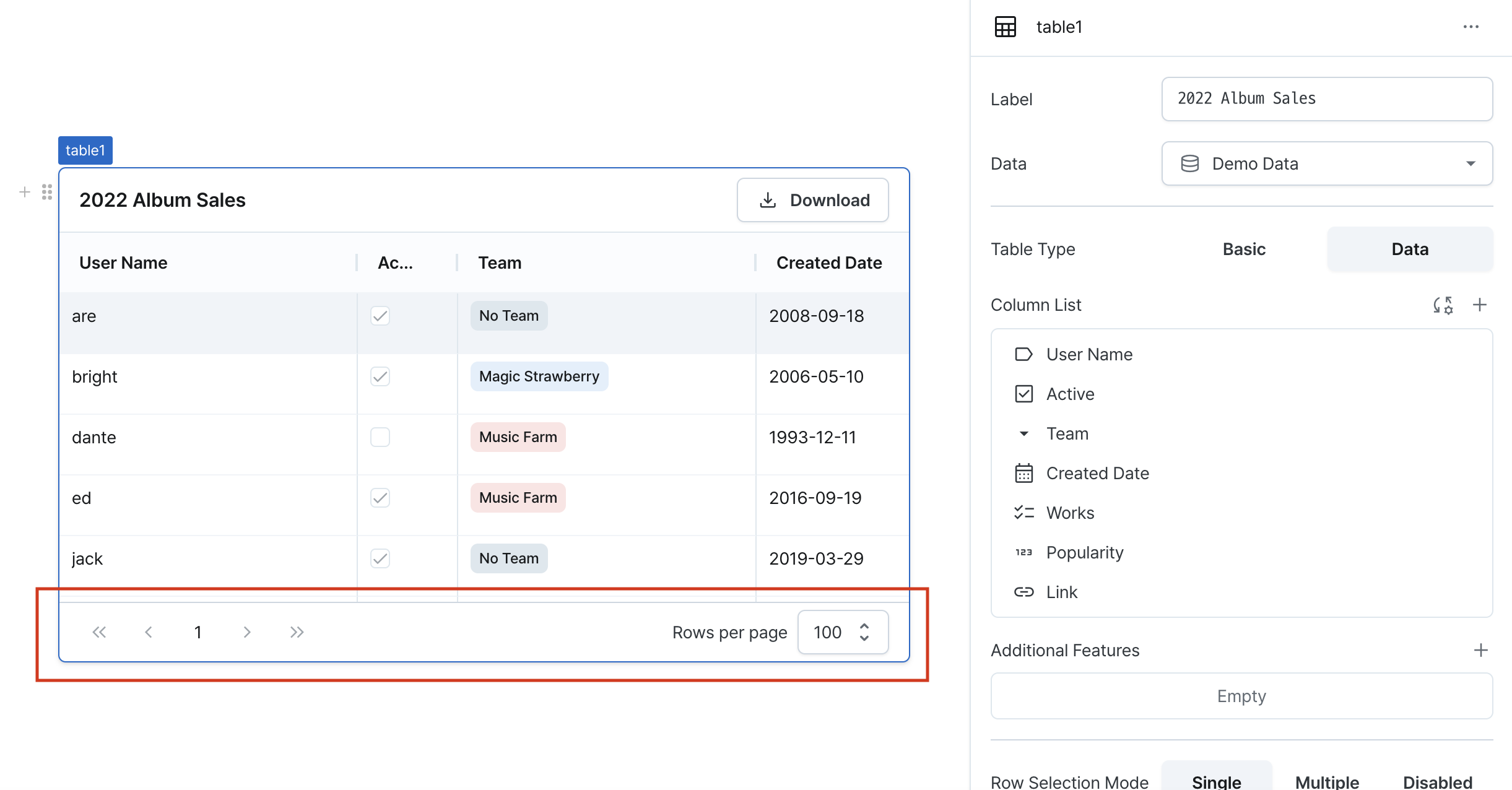
Enables pagination by default when data table is selected. Executes pagination client-side. Displays rows per page, current page, and total pages at the bottom.
You can check rows per page, current page, and total pages at the bottom. Provides navigation between pages using next page, previous page, last page and first page buttons.
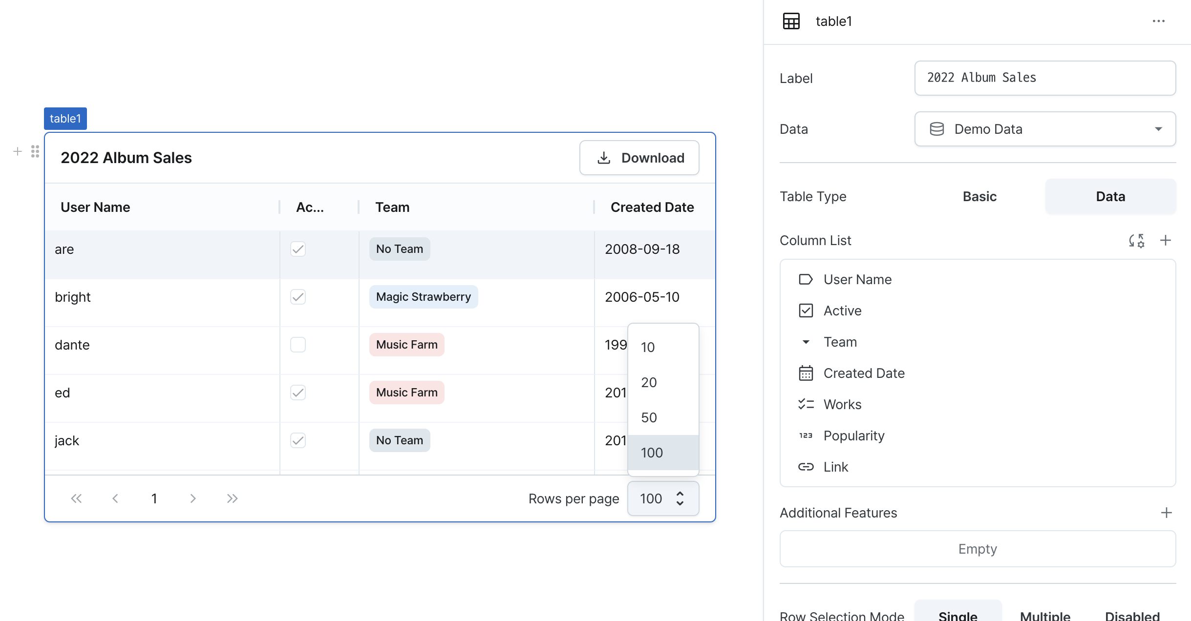
Sets default rows per page to 100. Supports adjustment to 10, 20, 50, or 100.
Filtering
Filters columns to display only desired data. You can set filters by clicking the menu icon in the column header.
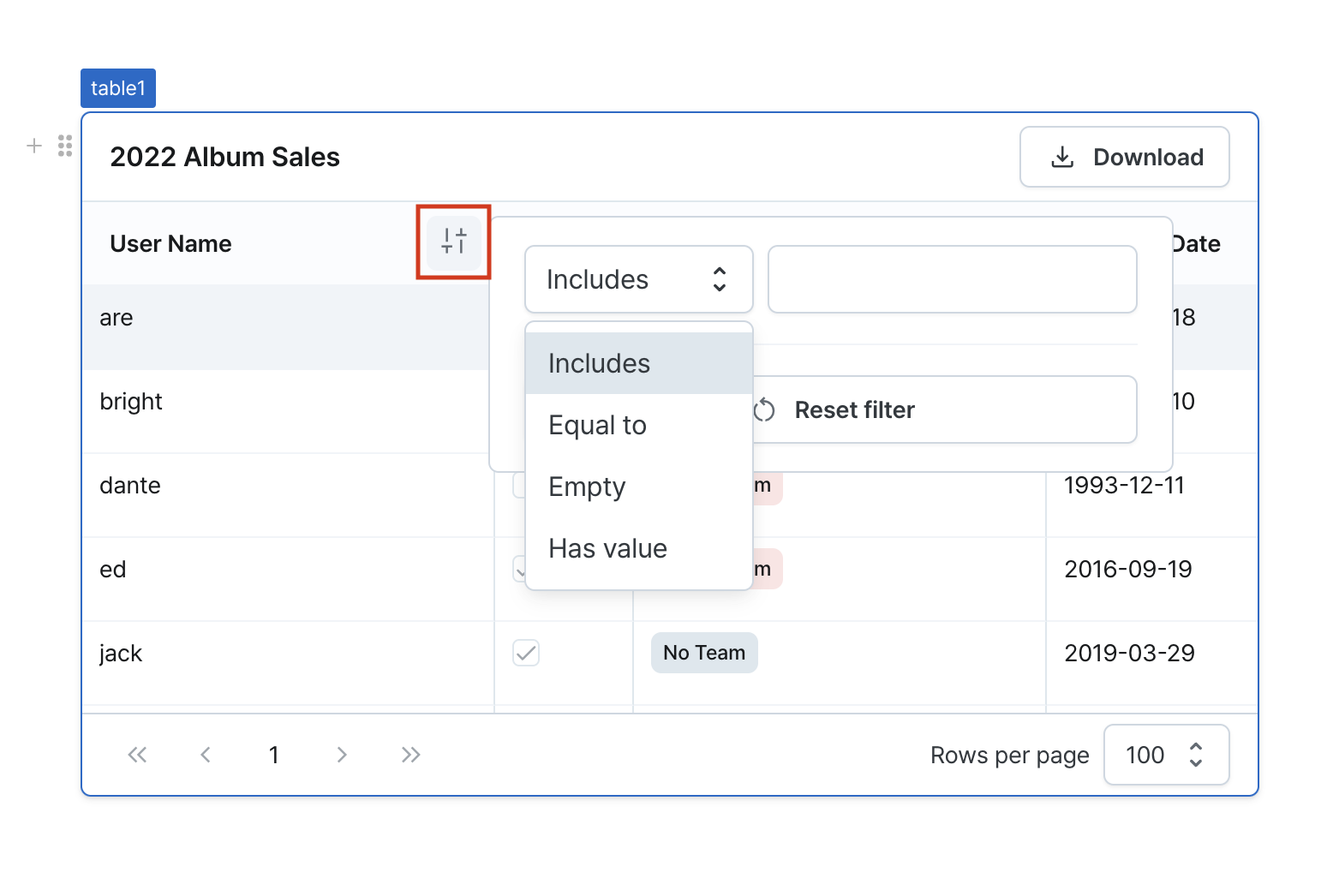
- Select the column to filter. Available filter operators vary by component type.
- Select the filter operator. Available operators are shown in the table below:
| Operator | Description |
|---|---|
| Contains | Filters rows containing the input value |
| Equals | Filters rows with exact matches to the input value |
| Is Empty | Filters for empty strings or empty arrays |
| Is Not Empty | Filters for non-empty strings or arrays |
| Is True | Filters for rows where value is true |
| Is False | Filters for rows where value is false |
| Greater Than | Filters for values greater than input |
| Greater Than or Equal | Filters for values greater than or equal to input |
| Less Than | Filters for values less than input |
| Less Than or Equal | Filters for values less than or equal to input |
| Has Value | Filters for rows with non-null values |
| No Value | Filters for rows with null values |
- Filtering is applied when you enter the filter value.
Sorting
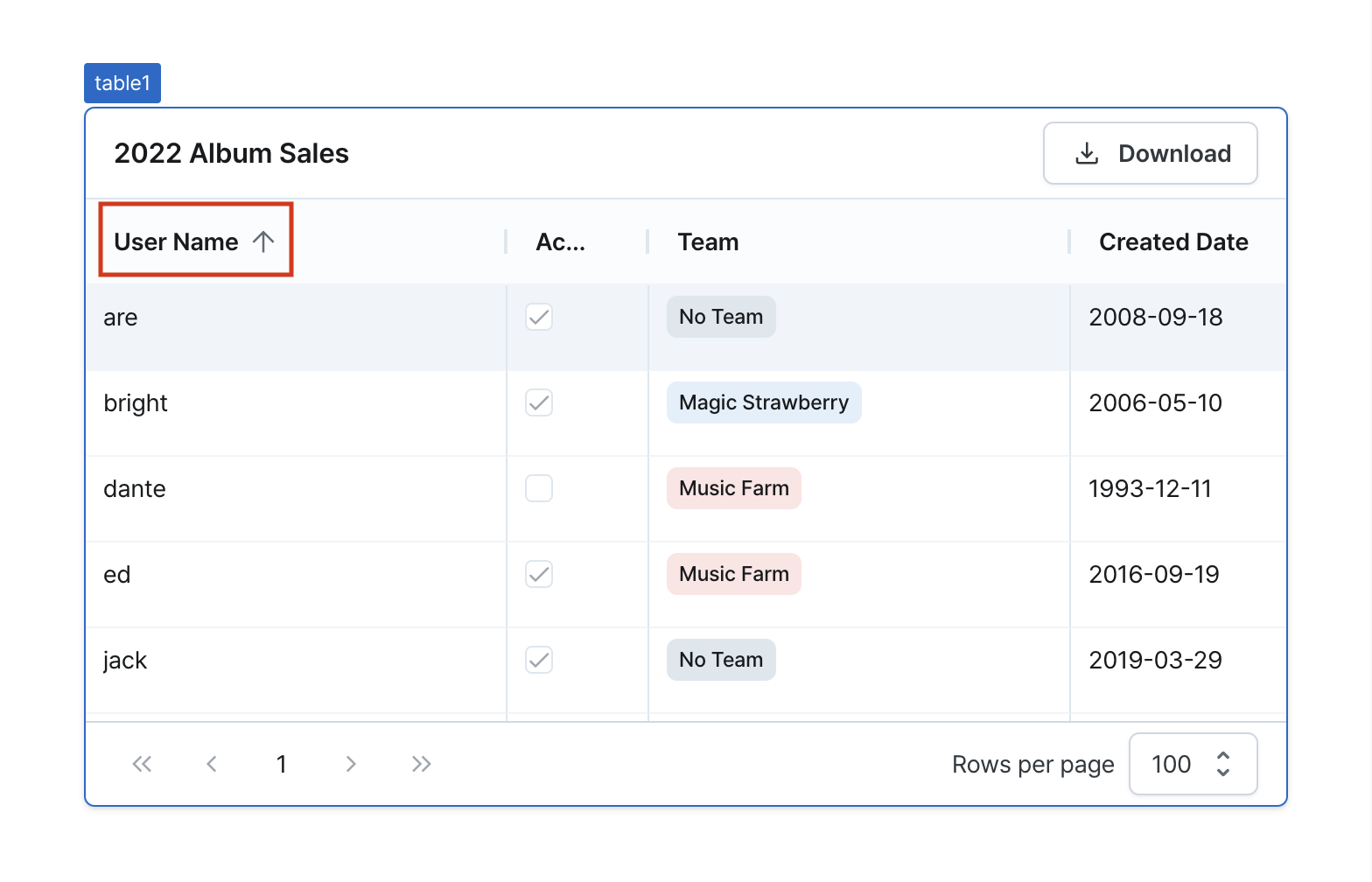
Enables sorting by column. Applies no sorting by default.
Click the sort icon that appears when hovering over a column header to toggle between ascending/descending/no sort. Only one column can be sorted at a time, and sorting is based on the values of each component.
Column List (columnDefinitions)
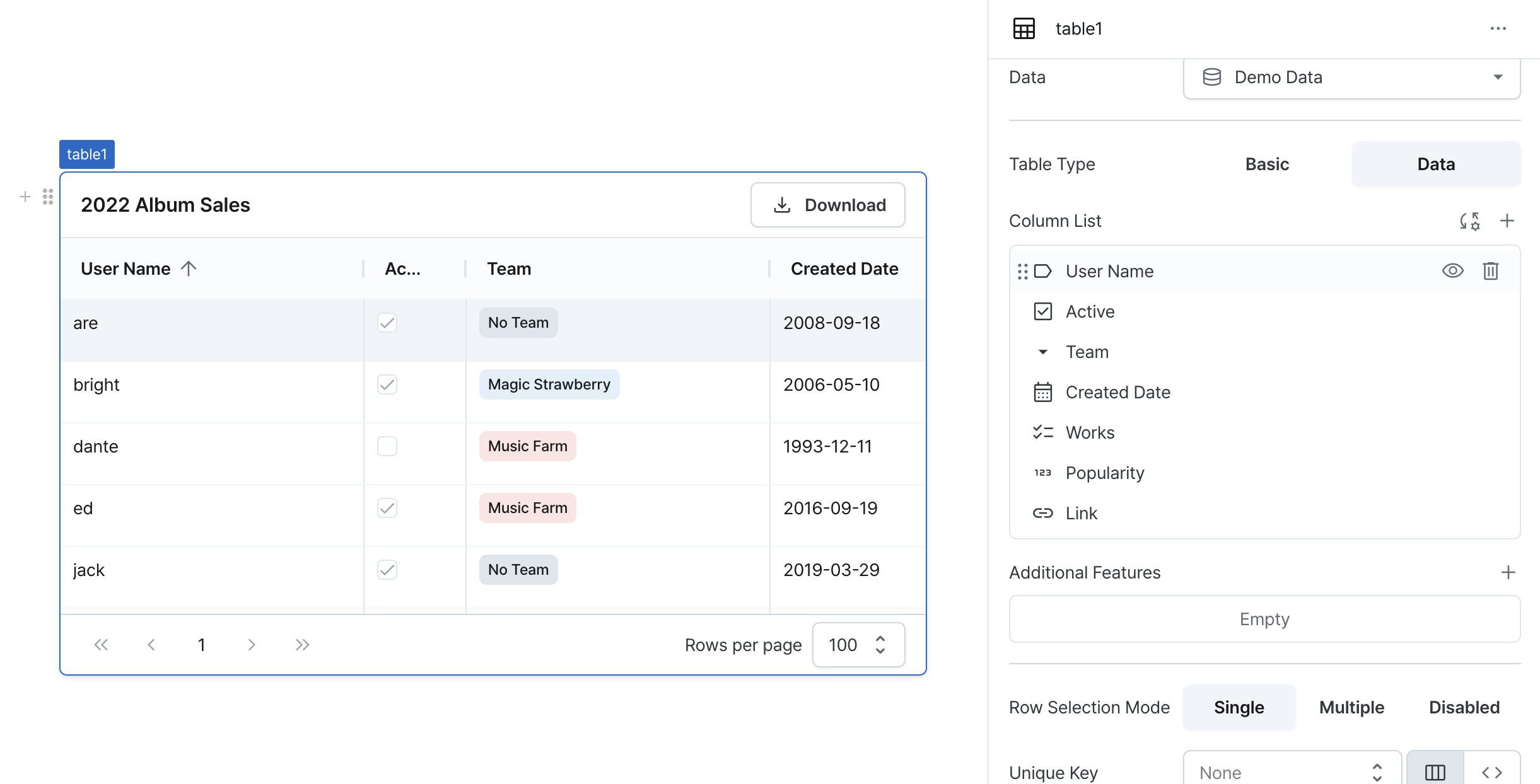
Manages table columns. Provides functionality to add/delete/hide/reorder/reset columns. Opens column settings window when clicking on the column list.
Column Adding
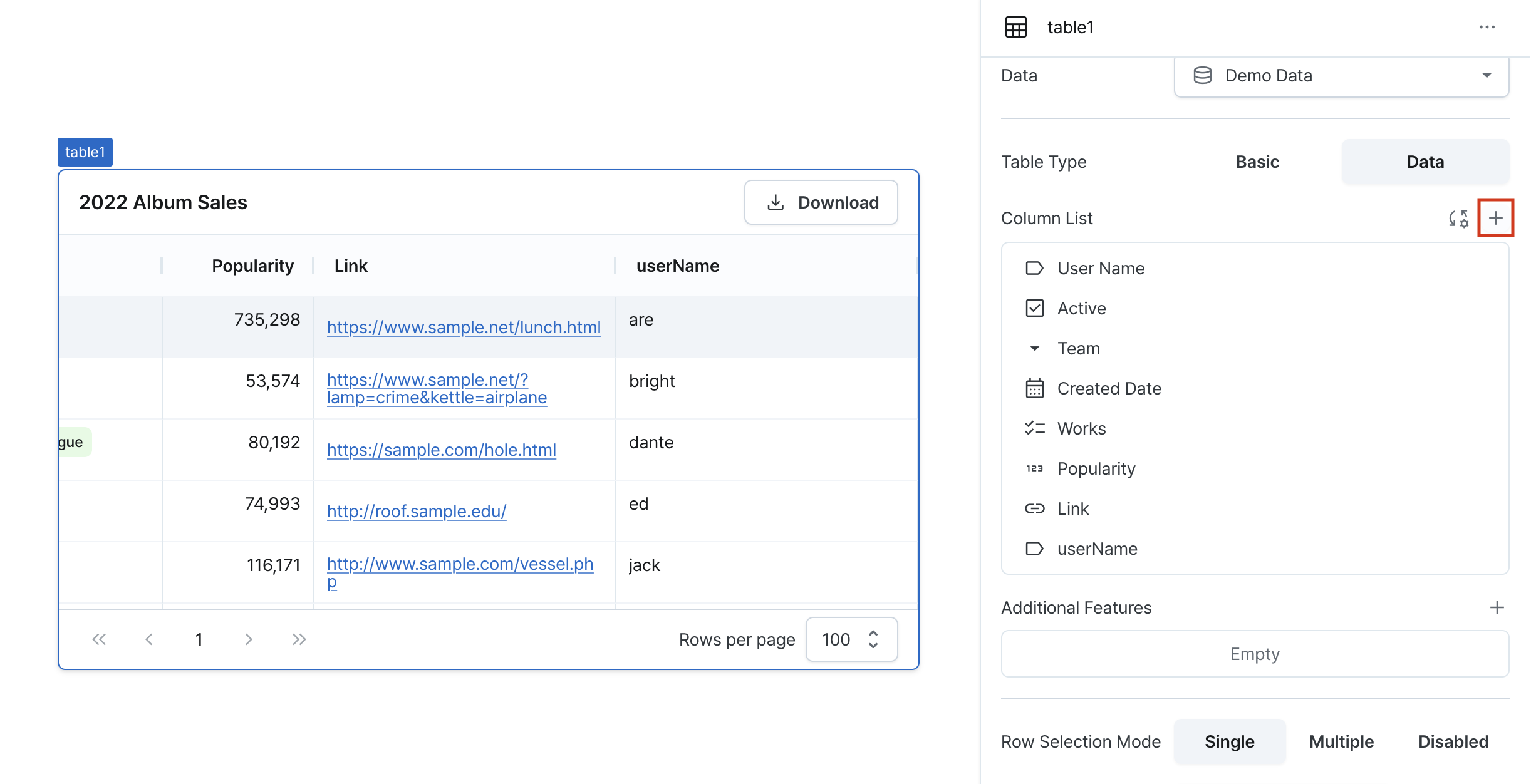
Adds a new column using the + button in the top right. Added columns are placed at the far right of the table.
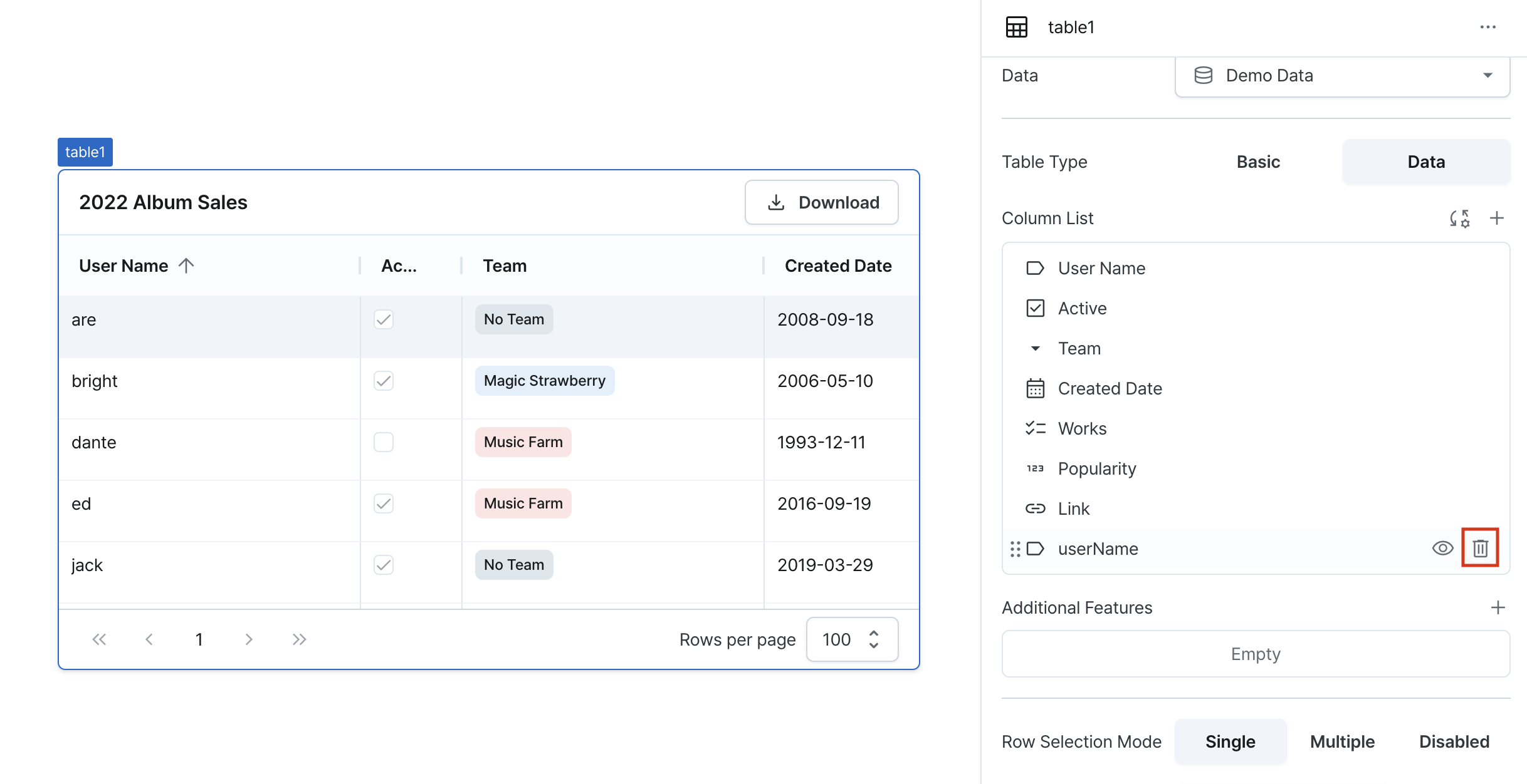
Column Deleting
Deletes a column using the delete icon on the right. Deleted columns cannot be recovered.
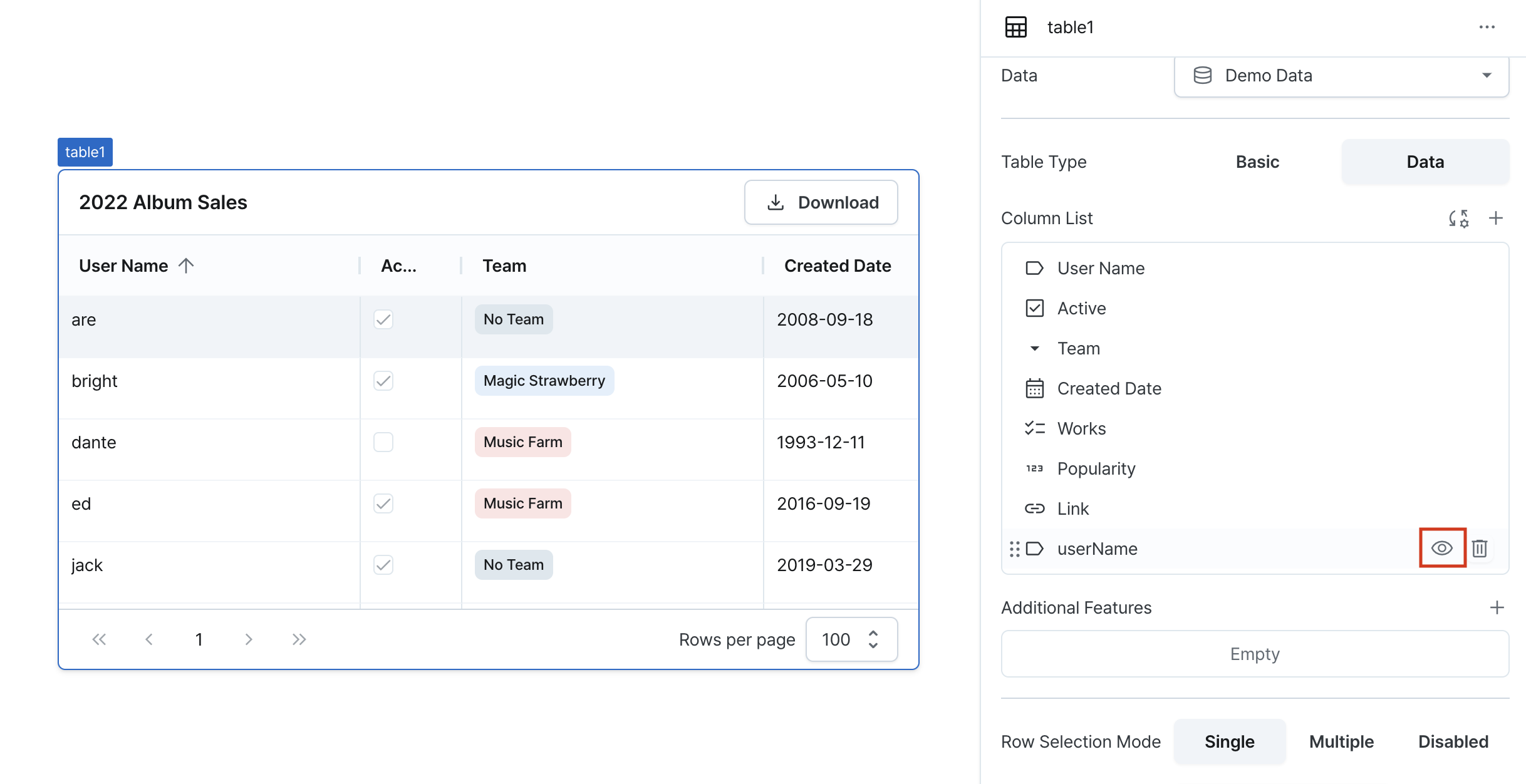
Column Hiding
Hides a column using the hide icon on the right. Data from hidden columns is retained.
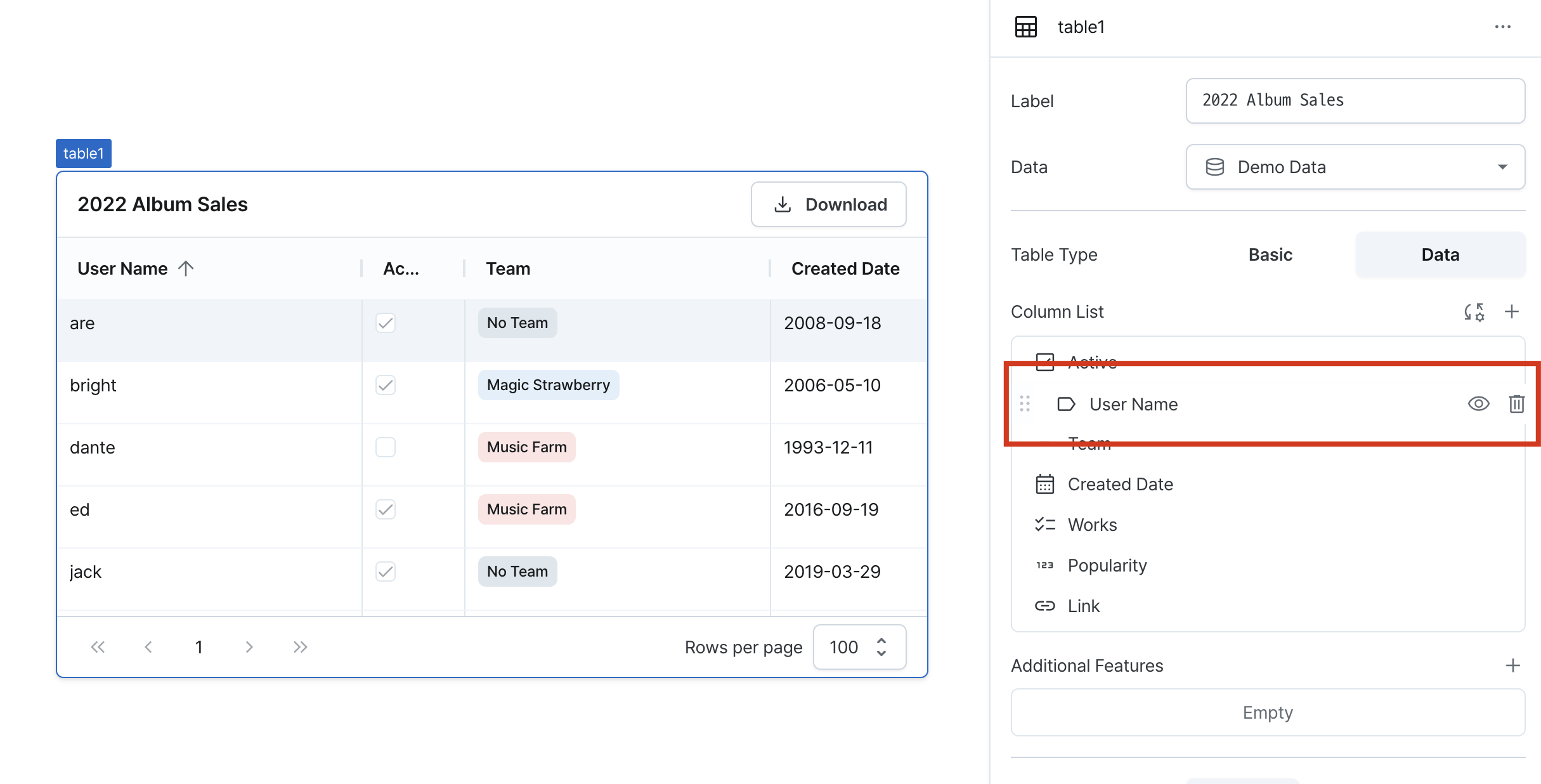
Column Ordering
Changes column order by dragging columns.
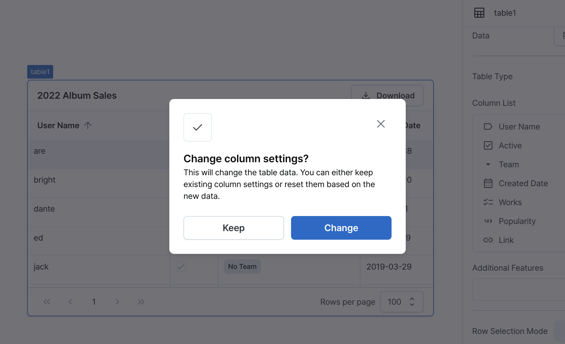
Column Resetting
Resets columns using the reset button in the top right. Columns are reconstructed based on current table data, and previous settings cannot be recovered.
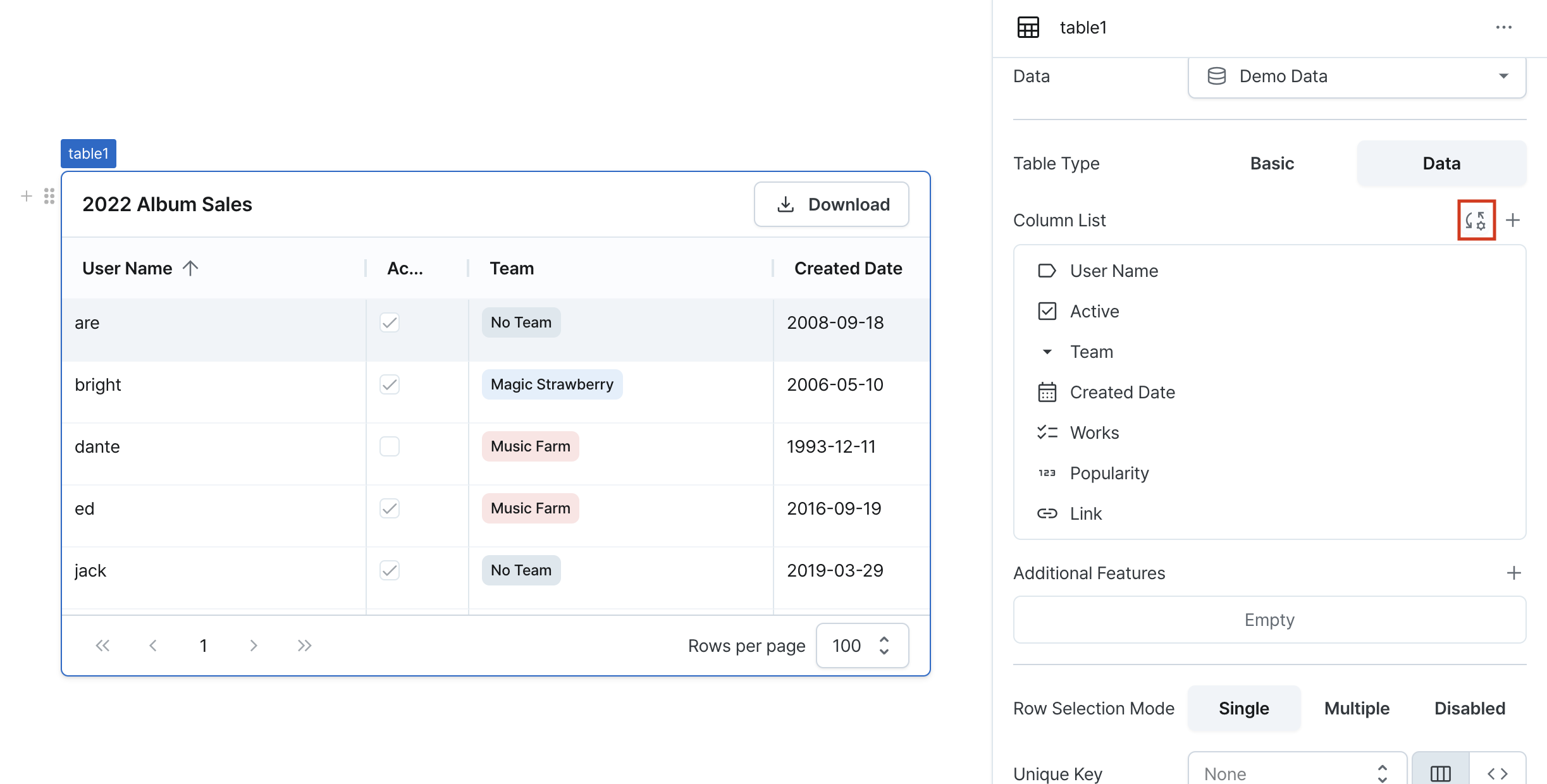
A confirmation popup will appear to proceed with the reset.
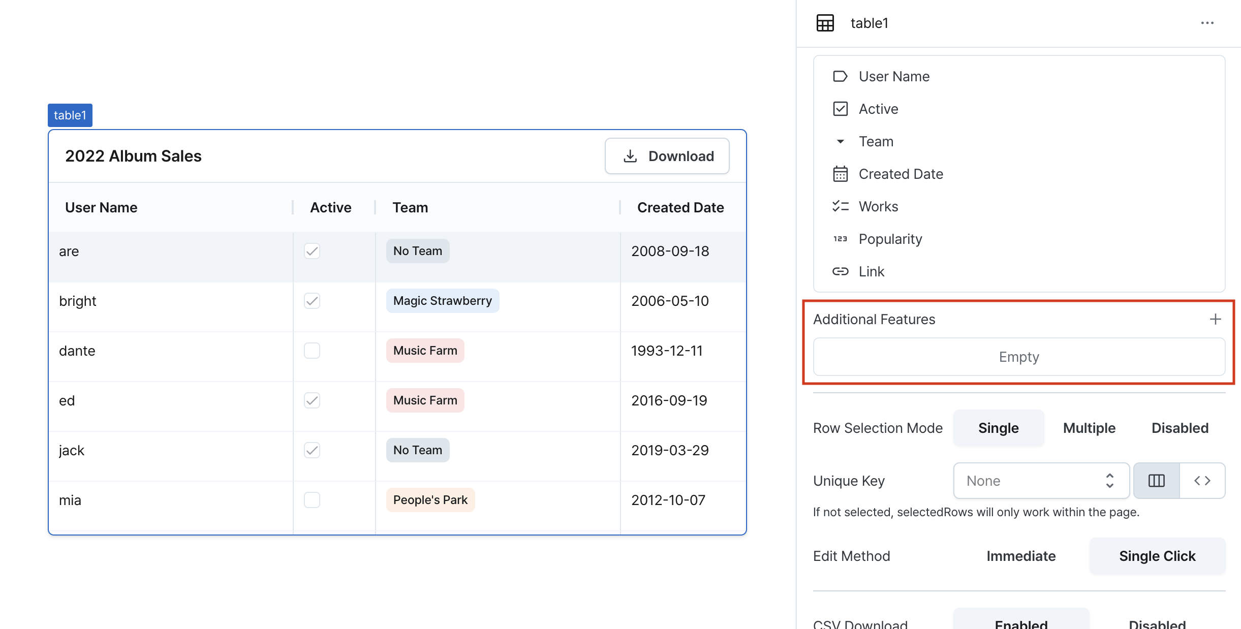
Additional Features
Configures table data saving and server-side features (paging/filtering/sorting).
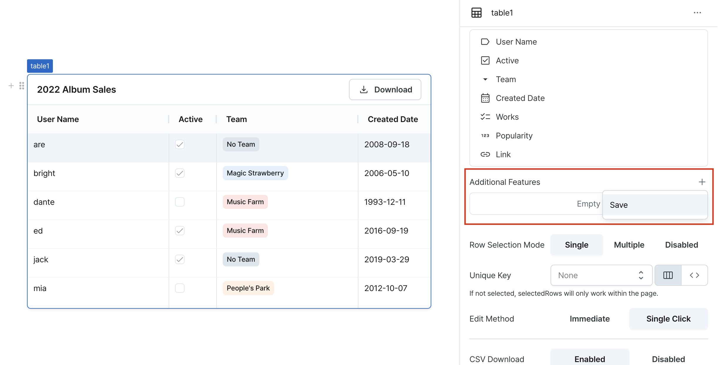
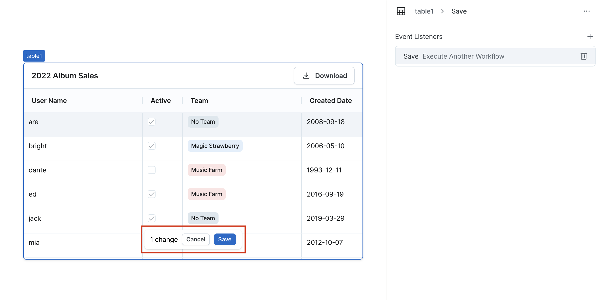
Save (eventListeners)
Provides functionality to modify and save table data.
When data is modified, changes are recorded in the updatedRows state. When the save button is clicked:
- The configured event listener executes to process the
updatedRowsdata updatedRowsis reset after saving is complete
Adds event listeners using the + button in the top right and specify the workflow to execute when saving.
Supports multiple event listeners if needed.
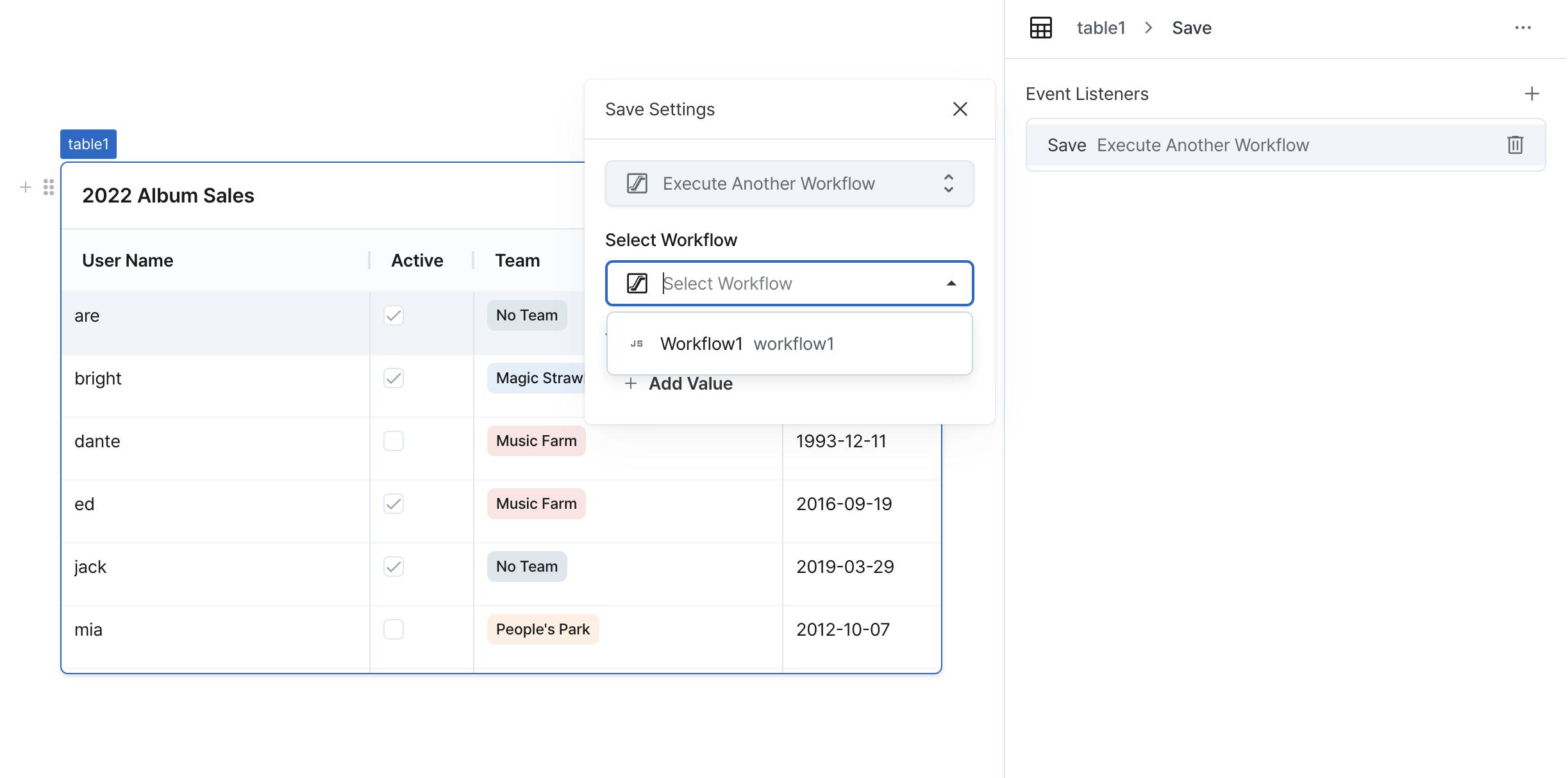
After configuration, when data is modified and saved, the specified workflows will execute.
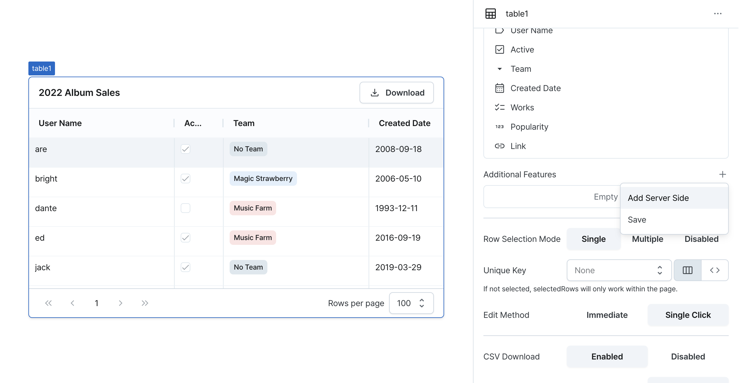
Server Side Features
Enables server-side features (pagination/filtering/sorting) for data tables.
Supports independent or combined usage of these features.
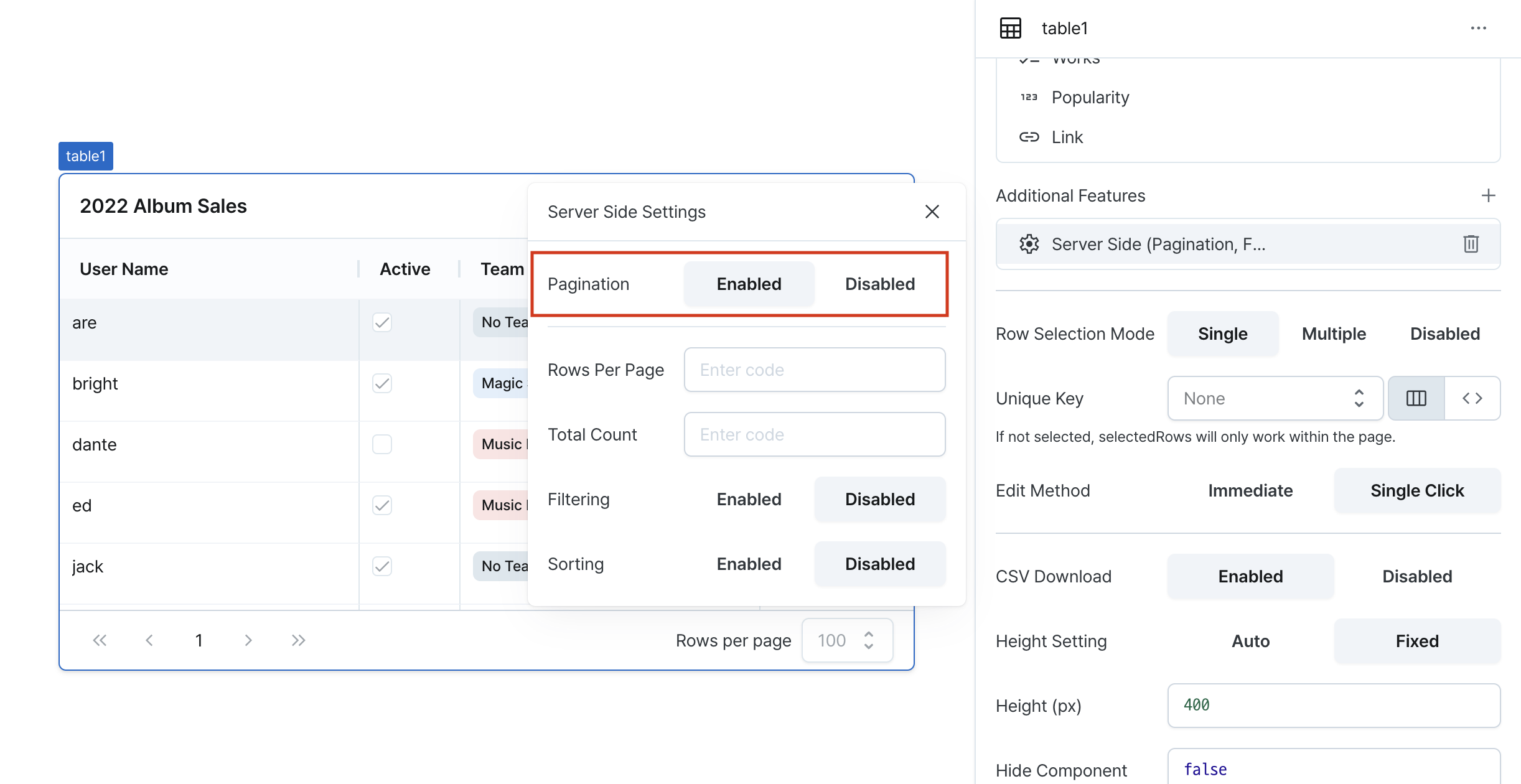
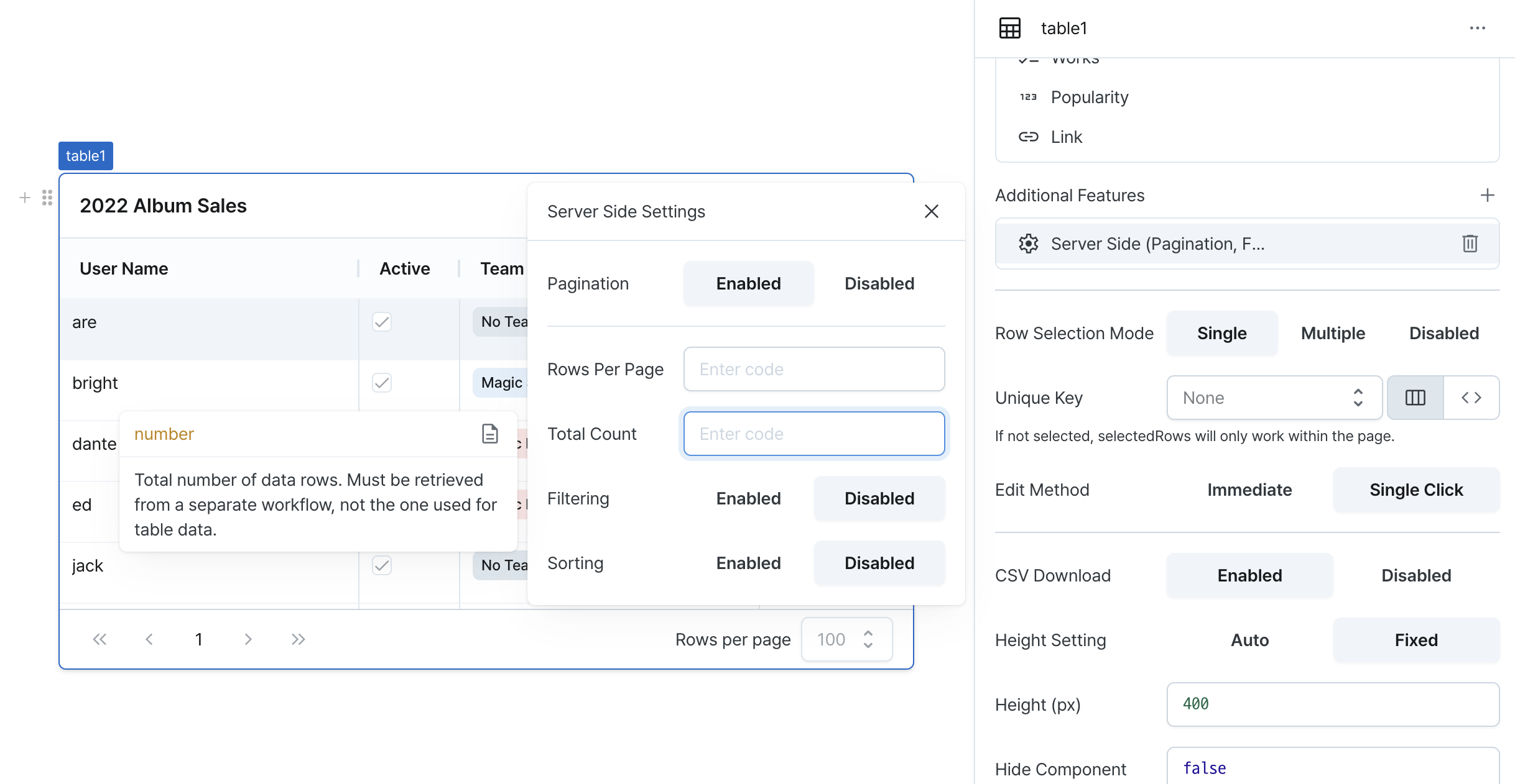
Server Side Pagination (isServerSidePaginationEnabled)
Loads data from the server in page units.
When enabled, adds the page state and disables client-side pagination.
For more details, please refer to the States documentation.
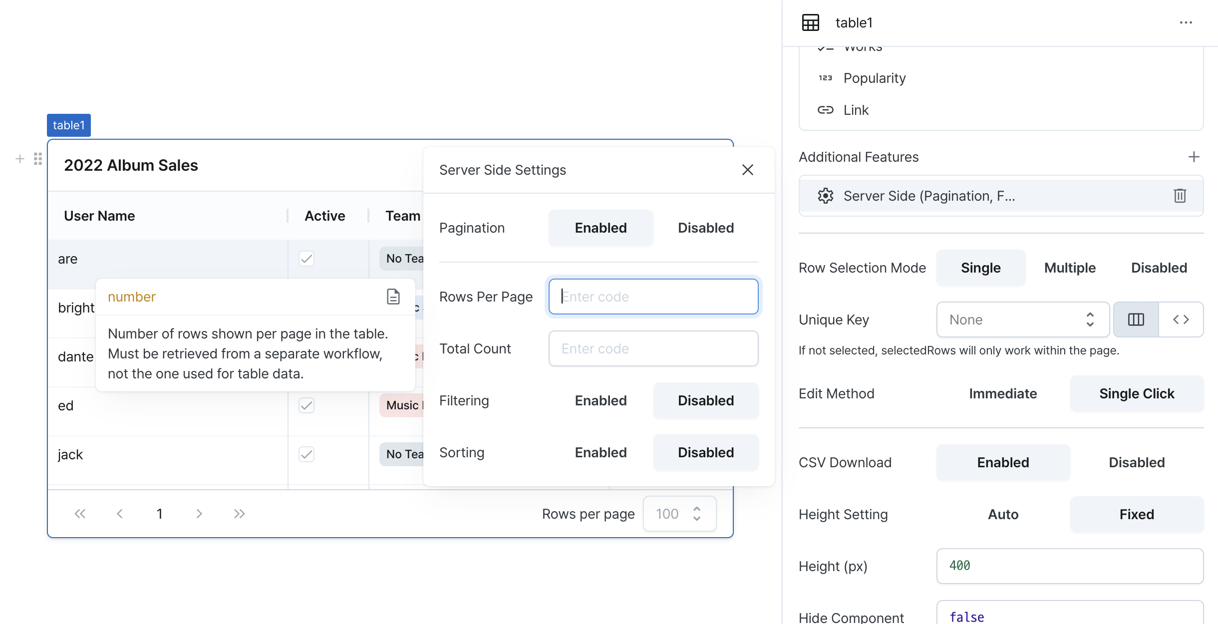
Rows Per Page (rowsPerPage)
Sets the number of rows to fetch per page from the server. You can use workflow results or enter values directly.
Total Count (rowsCount)
Sets the total number of records on the server. You can use workflow results or enter values directly.
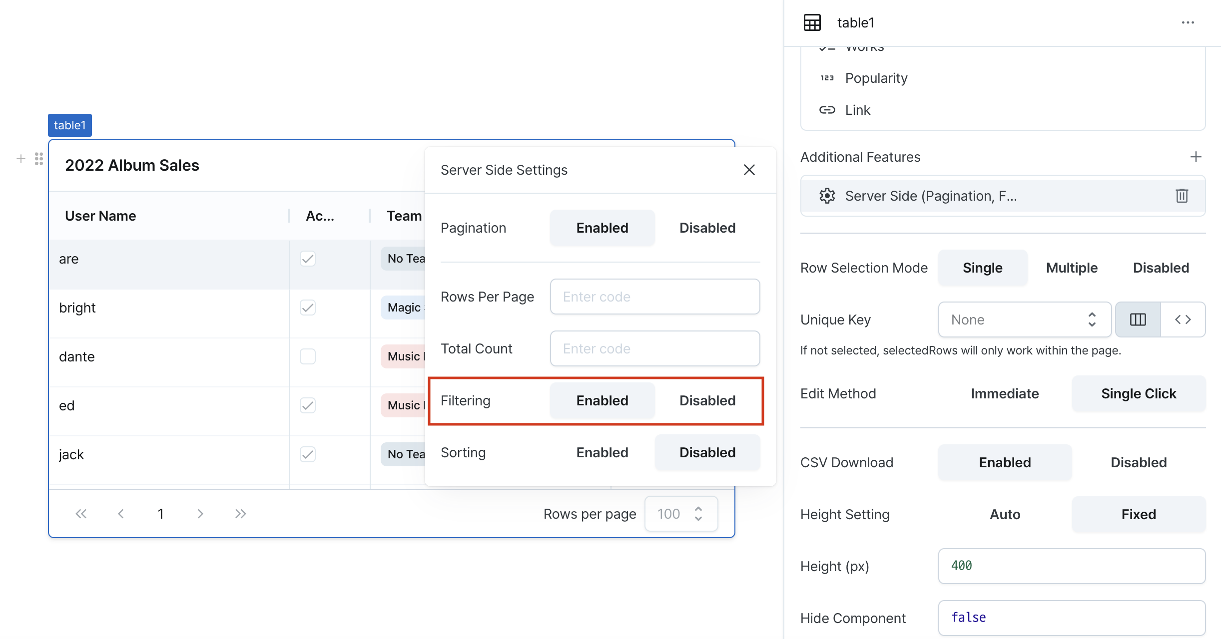
Server Side Filtering (isServerSideFilteringEnabled)
Performs data filtering on the server.
When enabled, adds the filters state and disables client-side filtering.
For more details, please refer to the States documentation.
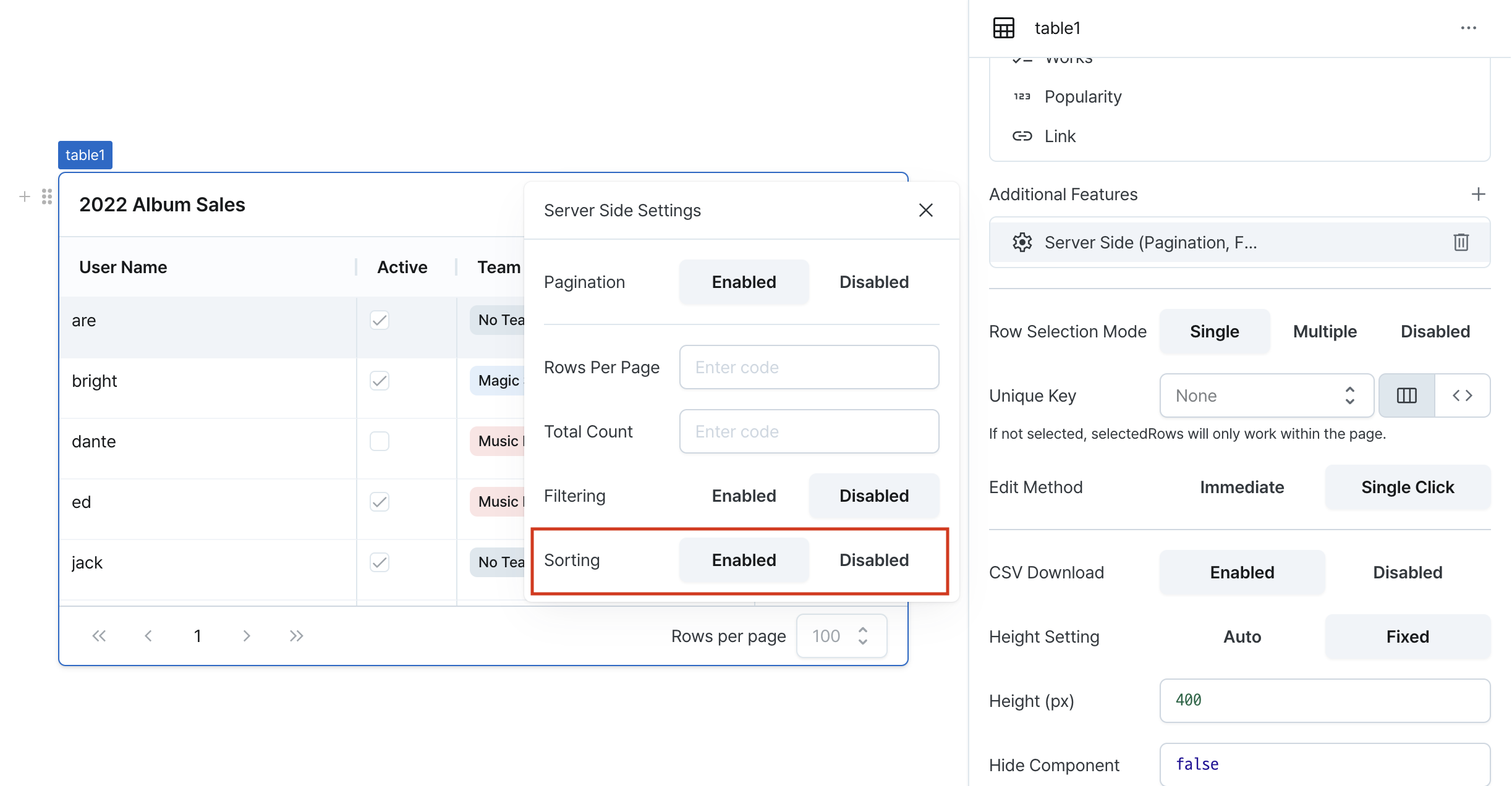
Server Side Sorting (isServerSideSortingEnabled)
Performs data sorting on the server.
When enabled, adds the sort state and disables client-side sorting.
For more details, please refer to the States documentation.
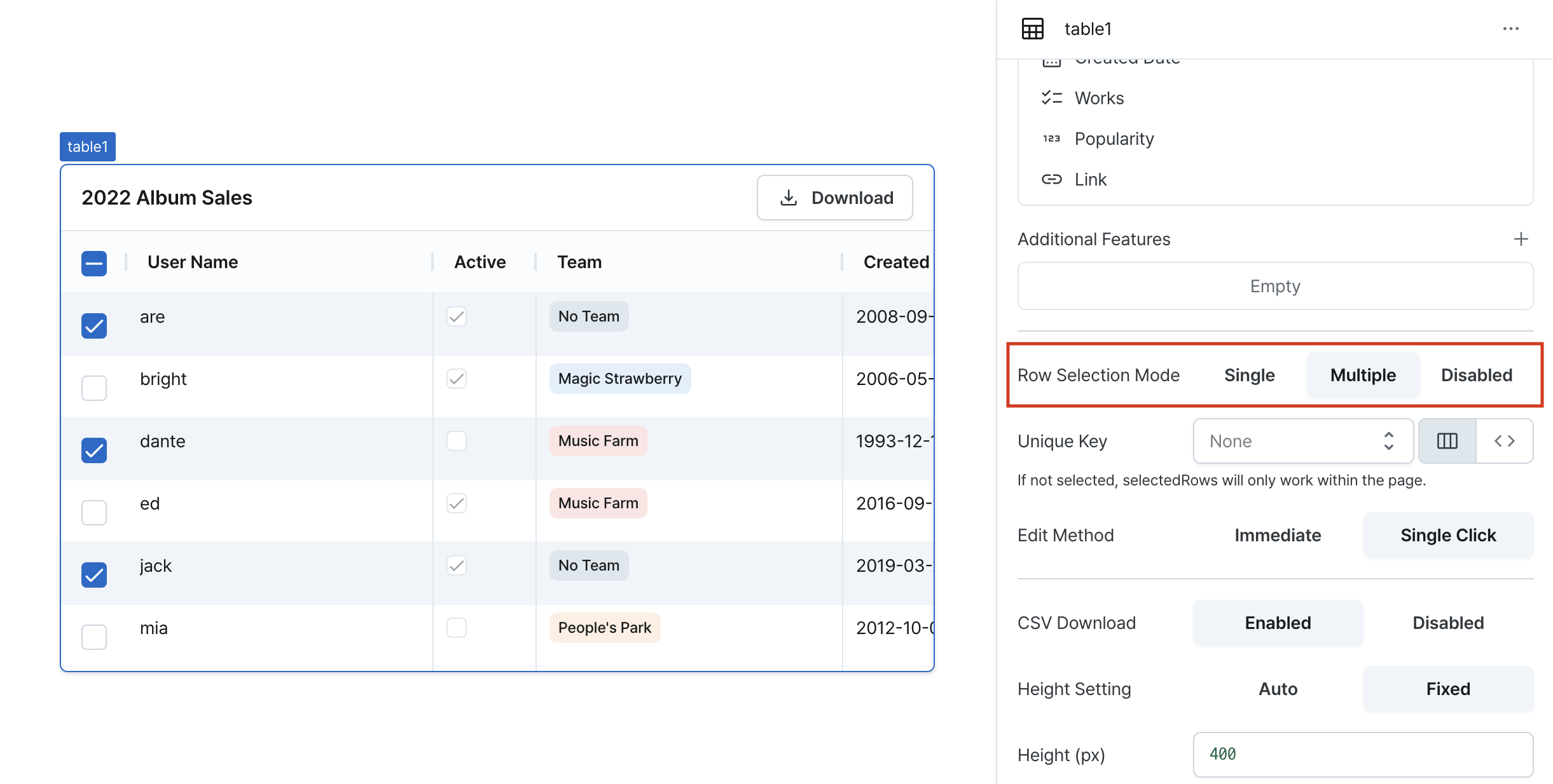
Row Selection Mode (isRowSelectionEnabled, isMultipleRowSelectionDisabled)
Configure row selection functionality.
Enables single selection for clicking rows, while implementing multiple selection uses checkboxes to select multiple rows.
Selected rows are managed through states like selectedRows.
Row Key (rowKey)
Sets a unique key to identify rows.
Choose a field with unique values to prevent duplicate selections.
If not set, selectedRows will only work within the current page.
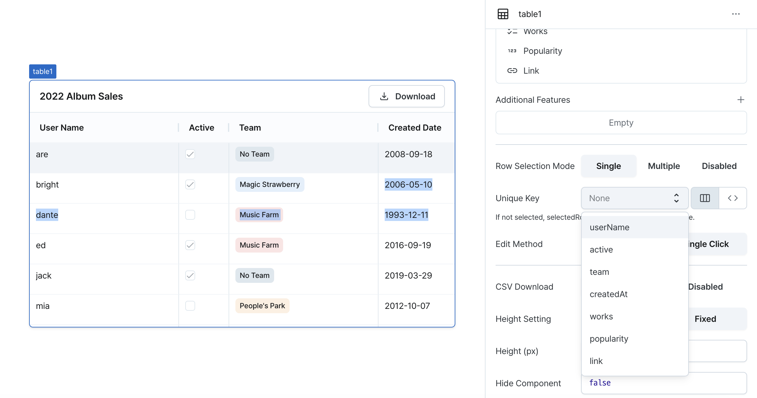
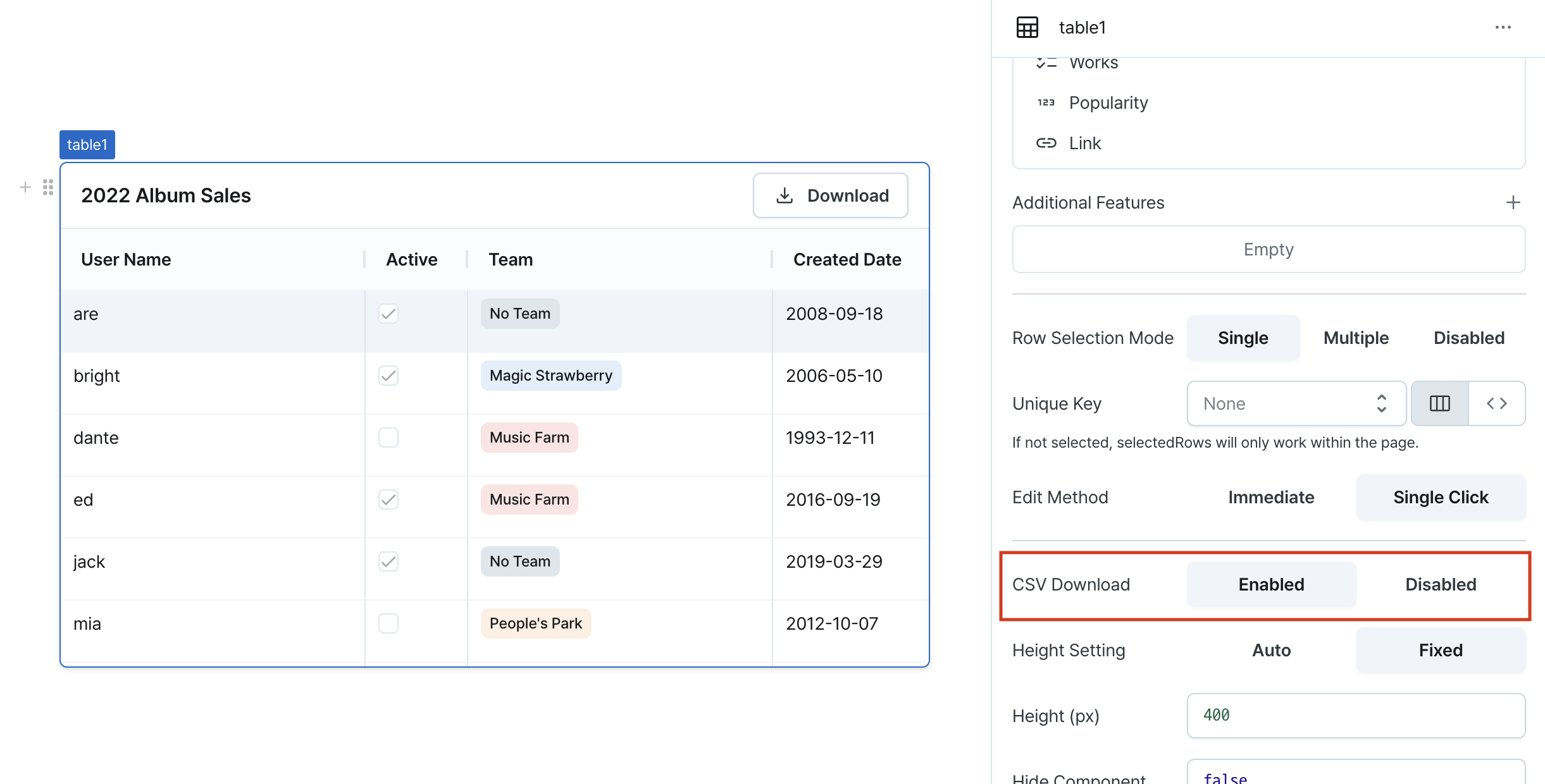
CSV Download (isCsvDownloadable)
Controls CSV export functionality.
When enabled, adds CSV download button to table header.
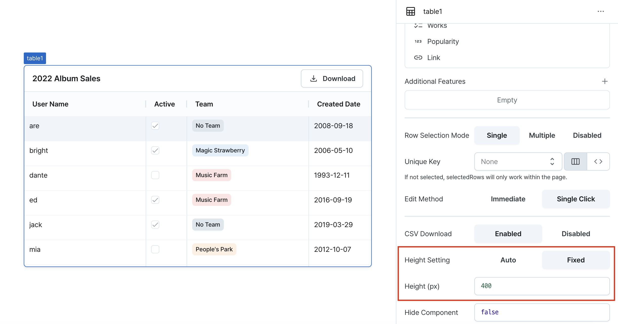
Height Setting (isHeightFixed)
Controls height behavior of the component.
When set to 'auto', height adjusts automatically to content.
Height (px) (contentHeight)
Sets the component's vertical height.
Can be set through workflow results, direct input.
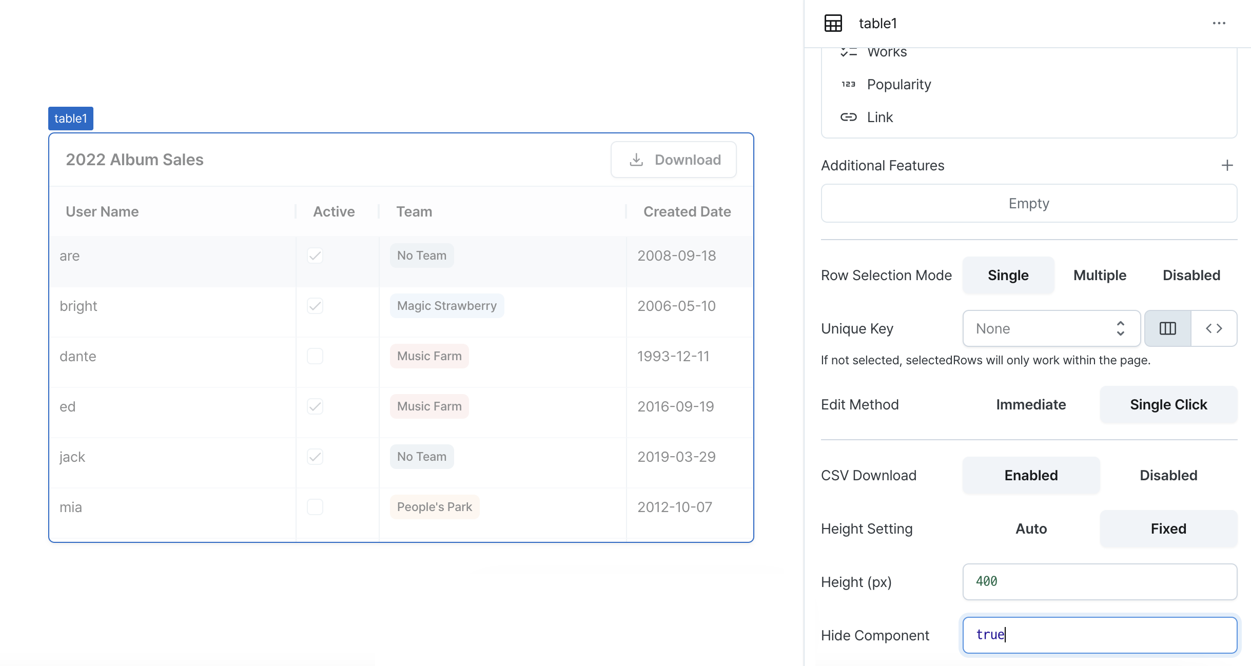
Hide Component (isHidden)
Controls visibility of the component.
When set to true:
- Hidden in deployed view
- Visible with reduced opacity in edit mode
Column Settings
Click on each column in the column list to access detailed settings.

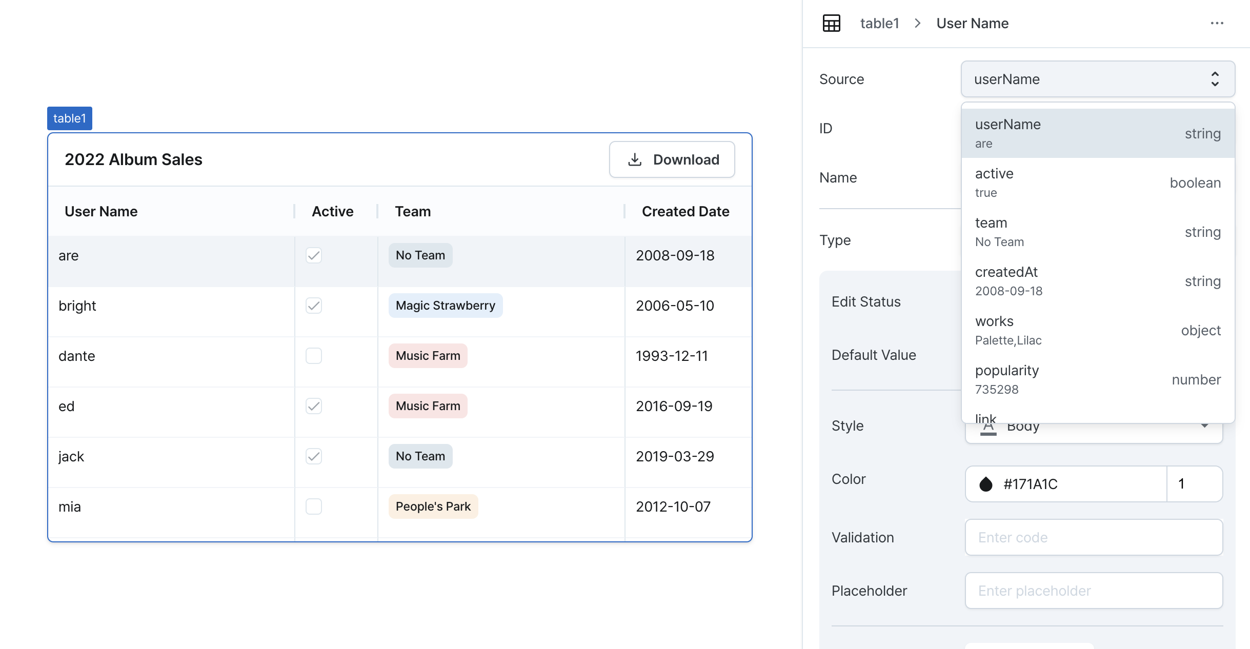
Column Source
Sets the data source to display in the column. This value becomes the base data for each cell and is displayed differently depending on the column type.
Provides access to cell values using item in column settings code or templates,
and enables access to entire row data using row.
Outside the table, cell data is accessed using the column ID as a key.
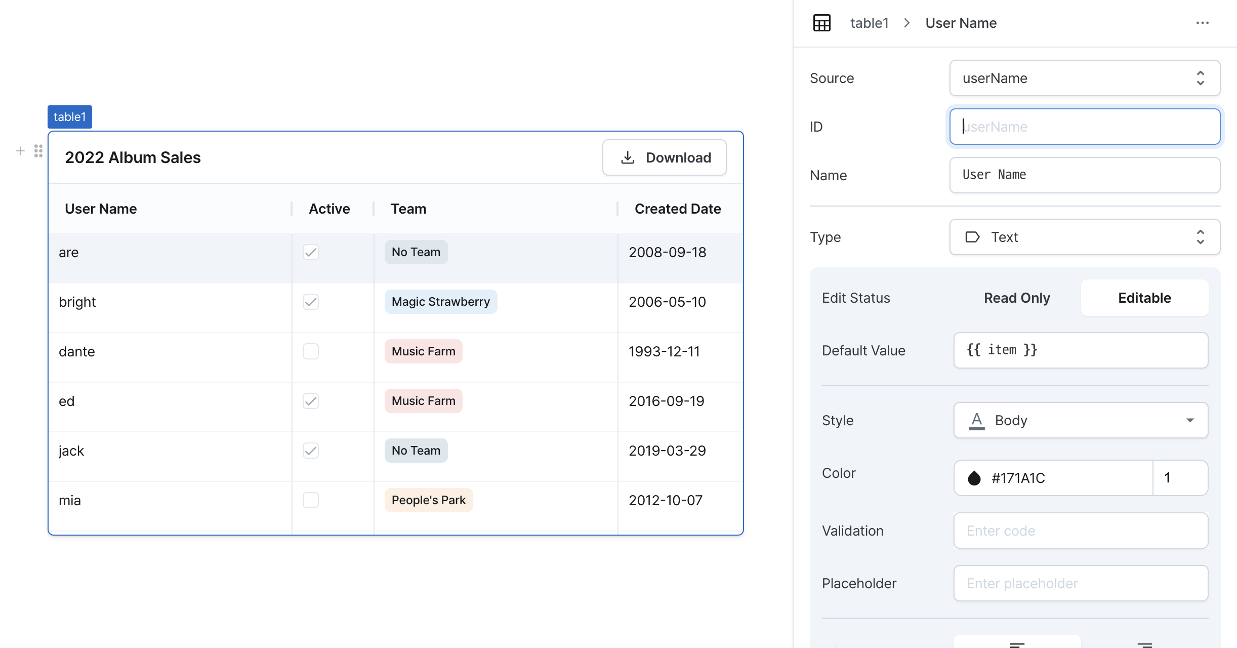
Column ID
Sets a unique identifier for the column. If left blank, the column source becomes the ID.
Requires:
- Must be unique within the table
- Used as a key when accessing data externally
- Data may be lost if duplicated
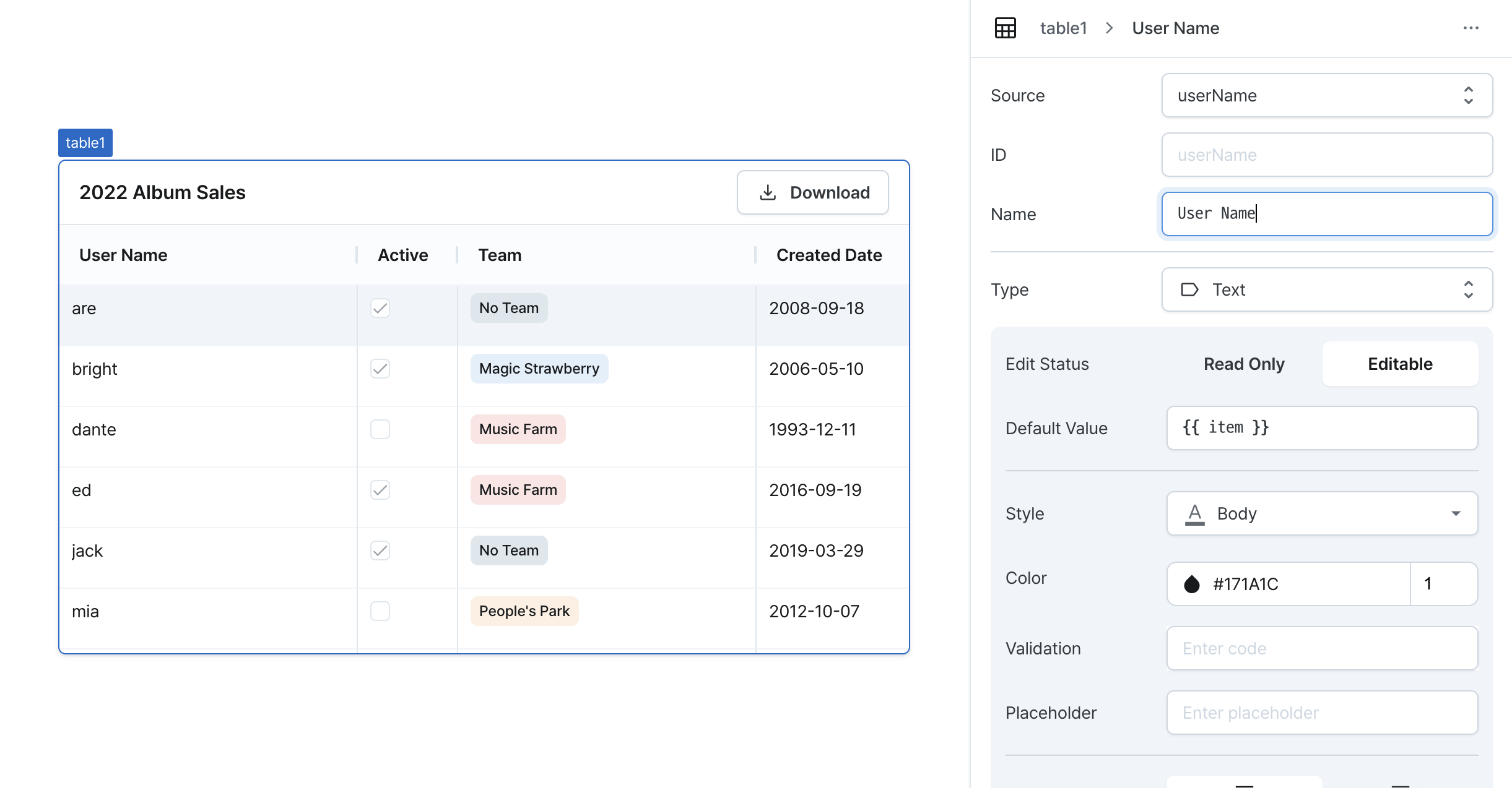
Column Name
Sets the display name in column header.
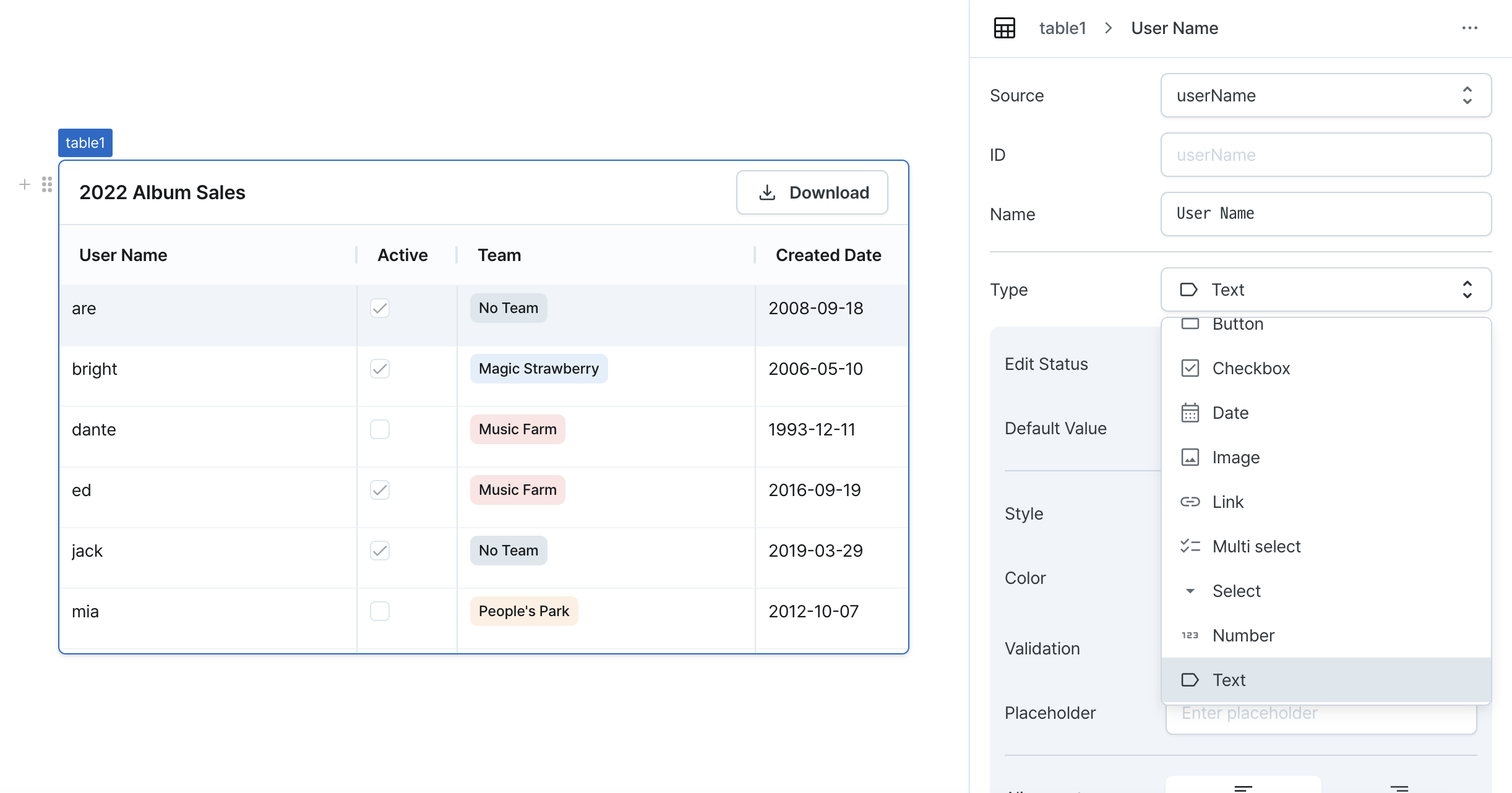
Column Type
Sets the component type to display in the column. Provides additional settings for each type.
Supported Component Types
- Button: Clickable button
- Checkbox: Checkbox input
- Date: Date format data
- Image: Image display
- Link: Clickable link
- Multi Select: Multiple selection dropdown
- Select: Single selection dropdown
- Number: Numeric format data
- Text: Plain text
- Create Modal Form: Generate modal form based on table data
For detailed settings of each type, refer to Component Type Settings.
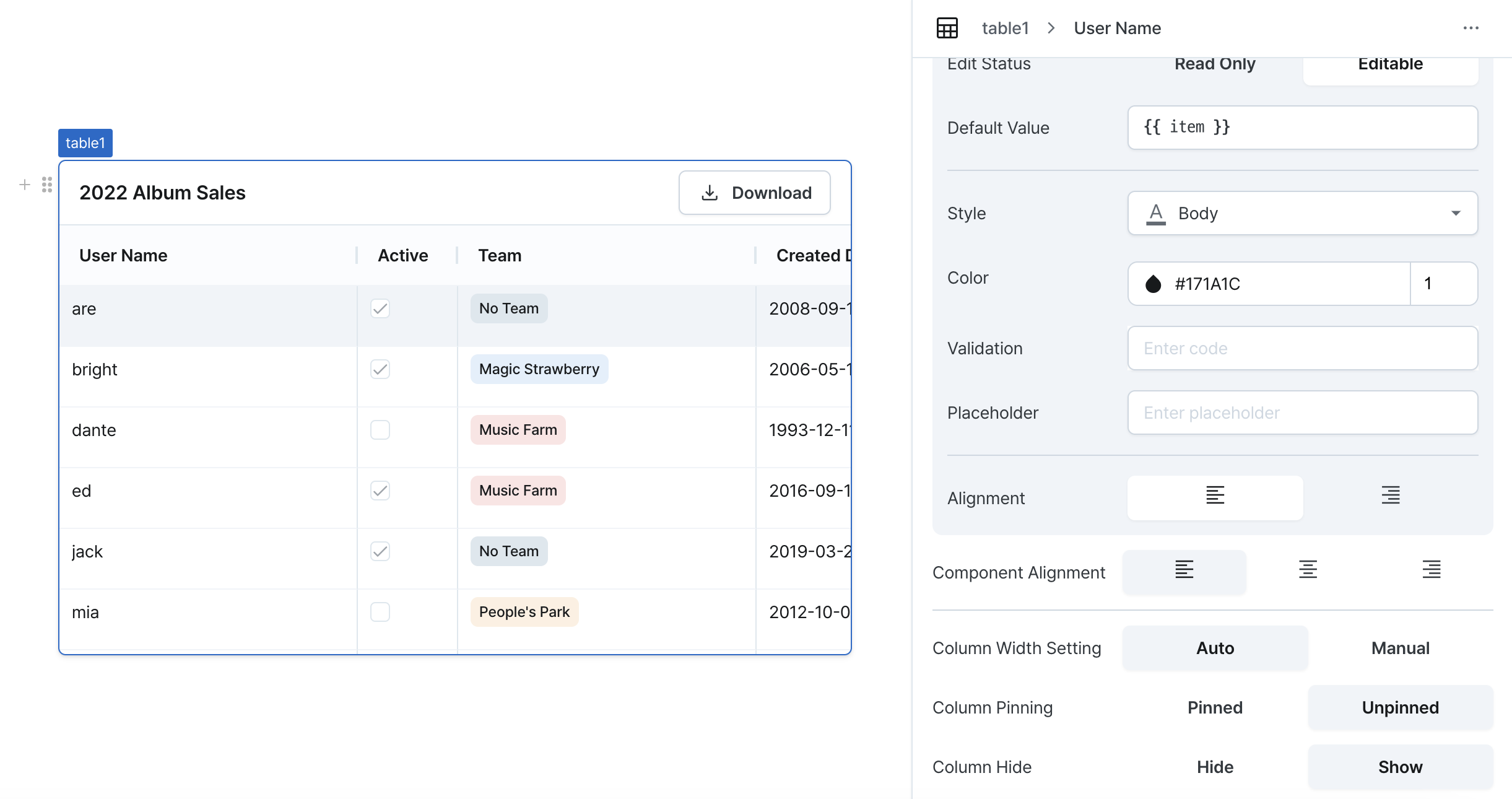
Component Alignment
Sets horizontal alignment of cell content.
Options:
- Left
- Center
- Right
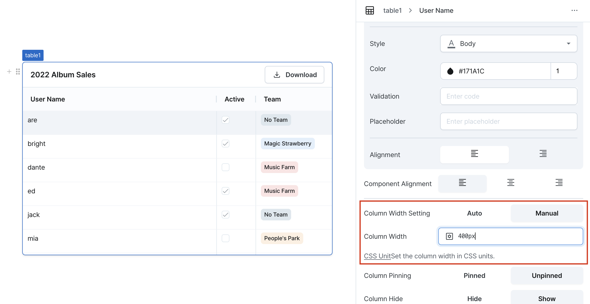
Column Width Setting
Sets column width behavior.
Options:
- Auto: Adjusts based on content
- Manual: Uses specified width value
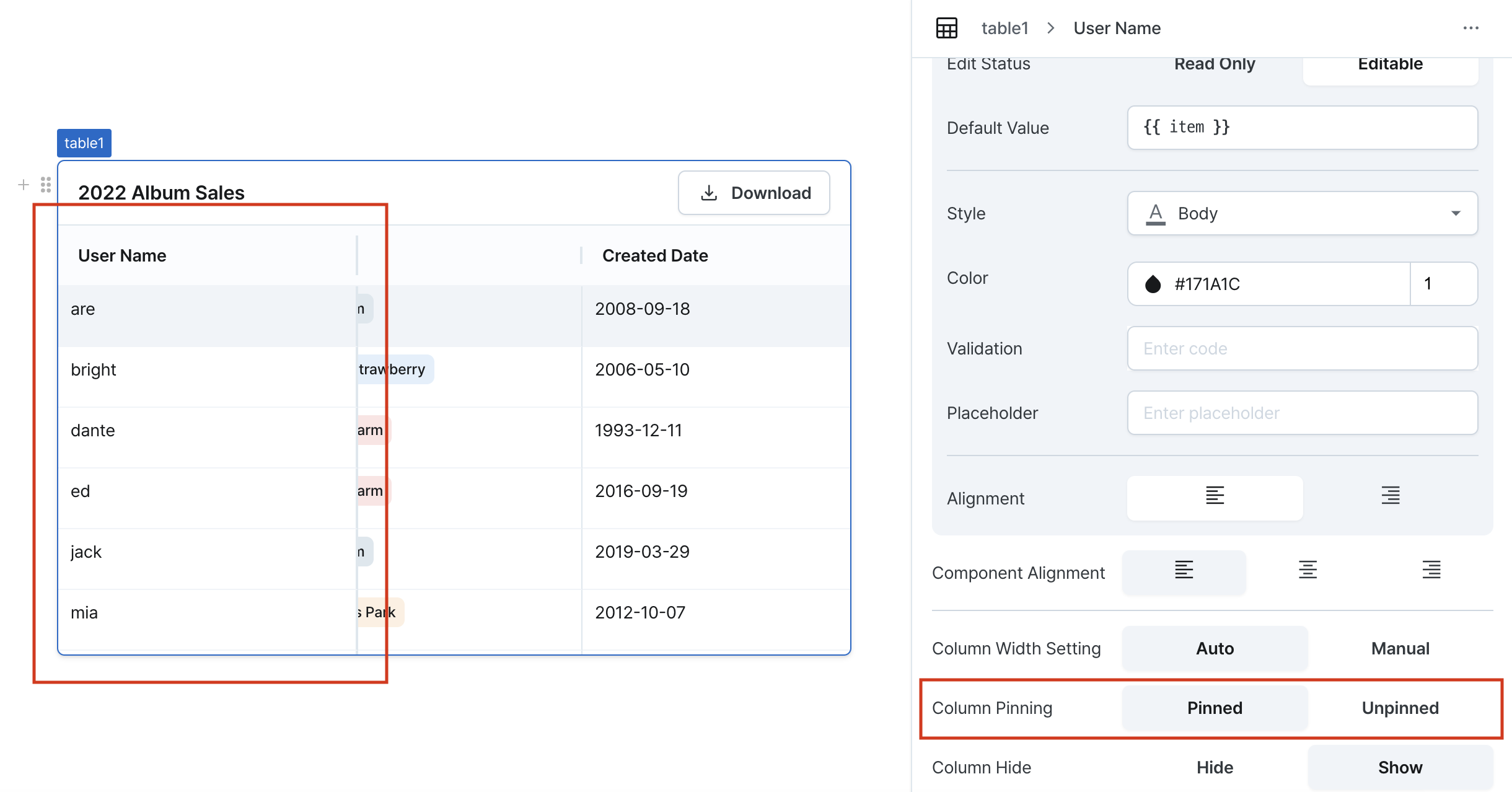
Column Pinning
Pin columns to the left side of the table:
- Multiple columns can be pinned simultaneously
- Pinned columns always stay on the left
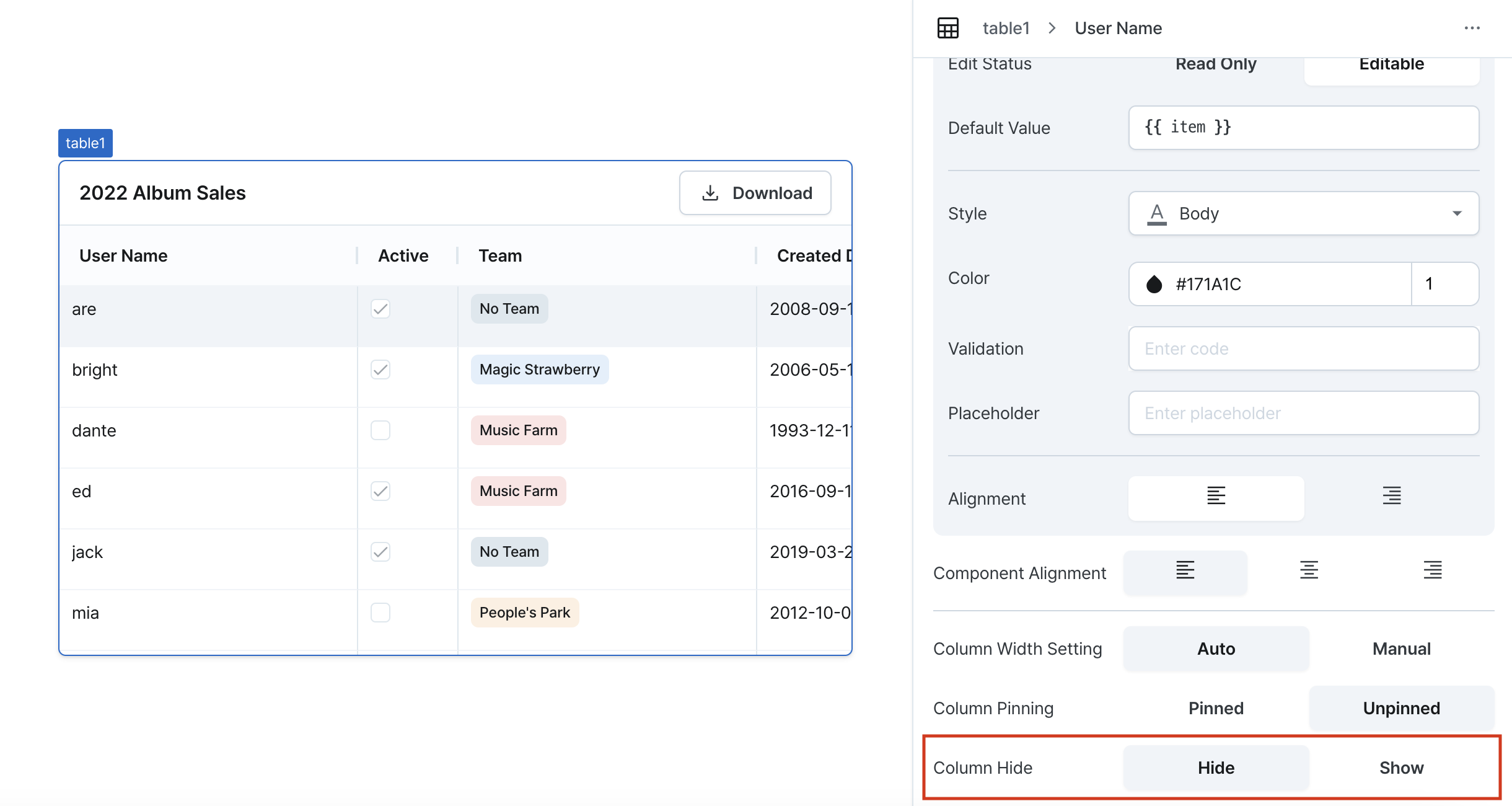
Column Hide
Hide specific columns from view.
Type: Button
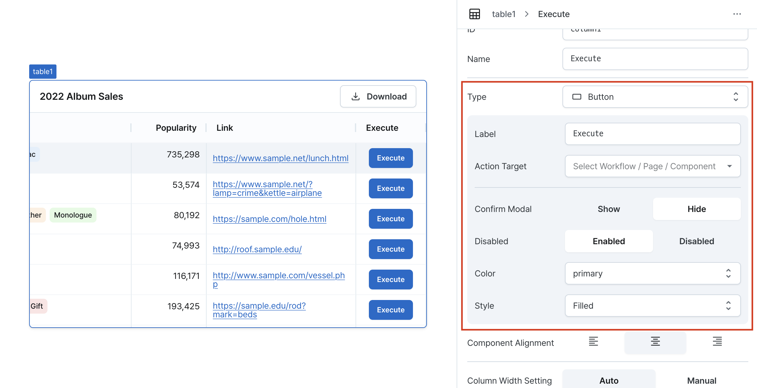
Label
Sets the text displayed on the button. Can be set through direct input or workflow results.
Action Target
Configure the action triggered on button click:
- Page Navigation
- Select target page
- Pass values to page variables
- Pass table data as variables
- Workflow Execution
- Select workflow to execute
- Pass values to workflow variables
- Pass table data as variables
- Modal Control
- Select target modal
- Choose open/close action
- Pass table data to modal
Confirm Modal
Sets whether to display a confirmation modal on button click. Modal title and content can be set through direct input or workflow results.
Disabled
Sets the button's enabled/disabled state. Can be dynamically controlled through workflow results or conditions.
Color
Sets the button color. Choose between neutral and primary.
Style
Sets the button style. Choose from outlined, filled, soft, or plain.
Type: Checkbox
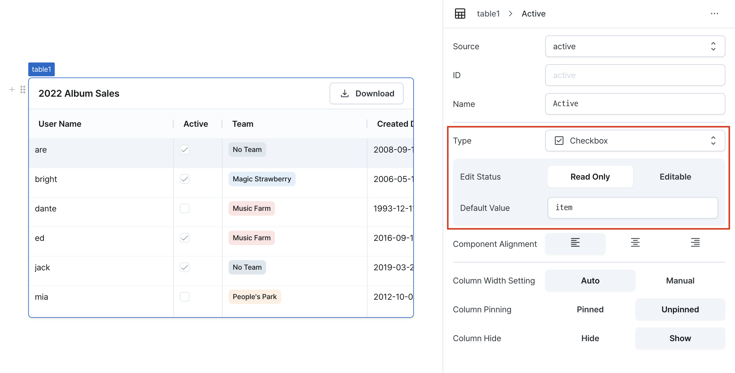
Edit Status
Sets whether the checkbox is editable. When editable, based on table edit mode:
Read Only: Table cell data modification not allowedEditable: Table cell data modification allowed
Default Value
Sets the initial state of the checkbox.
Type: Date
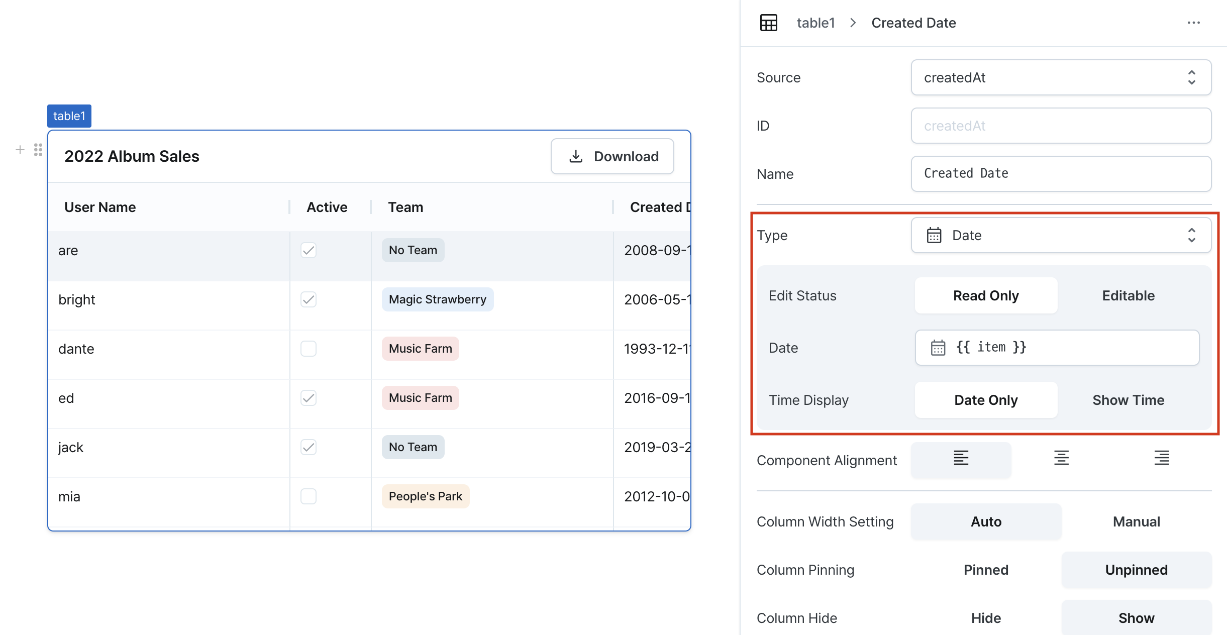
Edit Status
Sets whether the date field is editable. When editable, based on table edit mode:
Read Only: Table cell data modification not allowedEditable: Table cell data modification allowed
Date
Sets the initial date value. Can be set through workflow results, direct input, or calendar selection.
Time Display
Configures whether to include hours/minutes/seconds/timezone input.
Type: Image
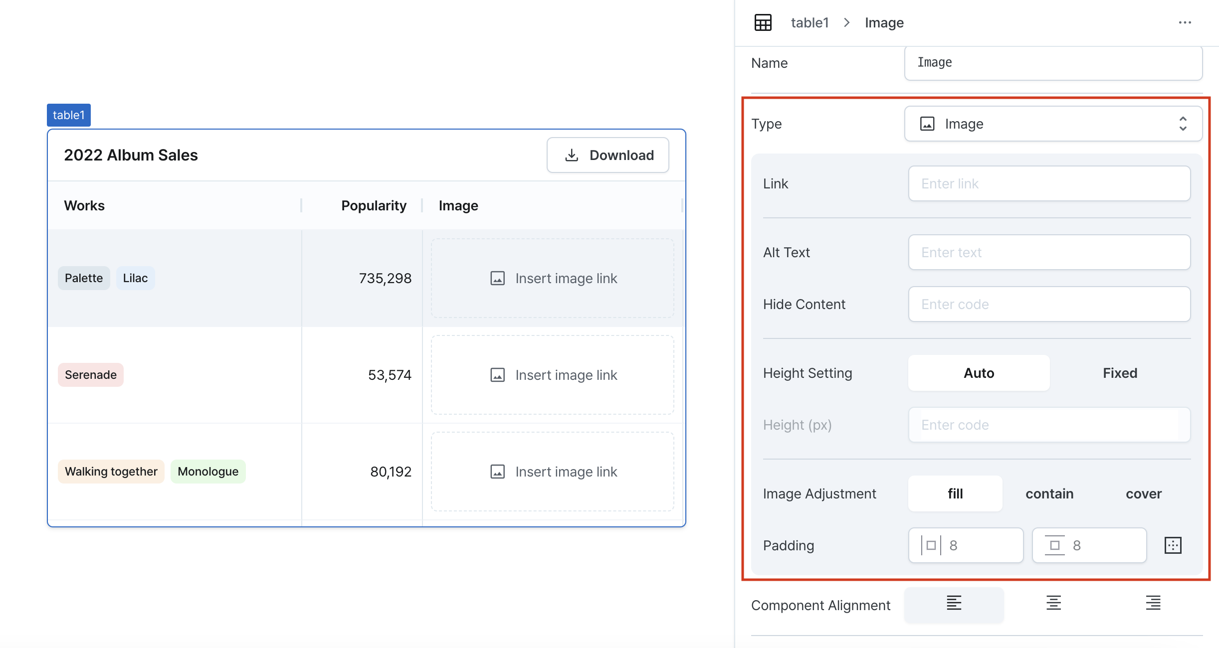
Link
Sets the image URL.
Alt Text
Sets alternative text displayed when the image cannot be shown.
Hide Content
Sets whether to display or hide the image.
Height Setting
Configure whether to use fixed height for the image.
Height (px)
Sets the pixel value when using fixed height.
Image Adjustment
Sets how the image is displayed when using fixed height:
fill: Image fills the content box by matching component width and height. Aspect ratio may change.contain: Image maintains aspect ratio while fitting within content box. May leave empty space.cover: Image fills content box while maintaining aspect ratio. Parts of image may be cropped.
Padding
Sets padding around the image.
Type: Link
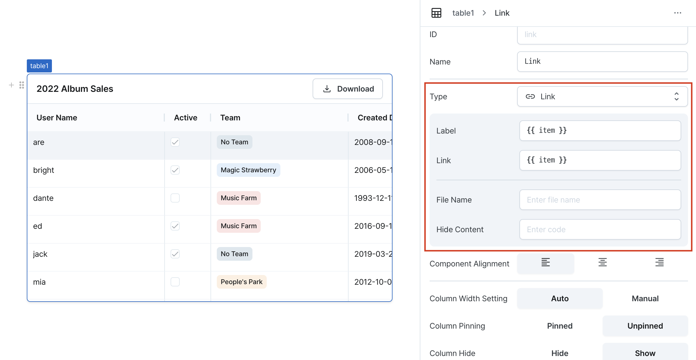
Label
Sets the text label for the link.
Link
Enter a URL to navigate to or a file link to download when clicked.
File Name
For file download links, entering a filename will download the file with that name.
Hide Content
When set to true, hides the link in the table.
Type: Multi Select
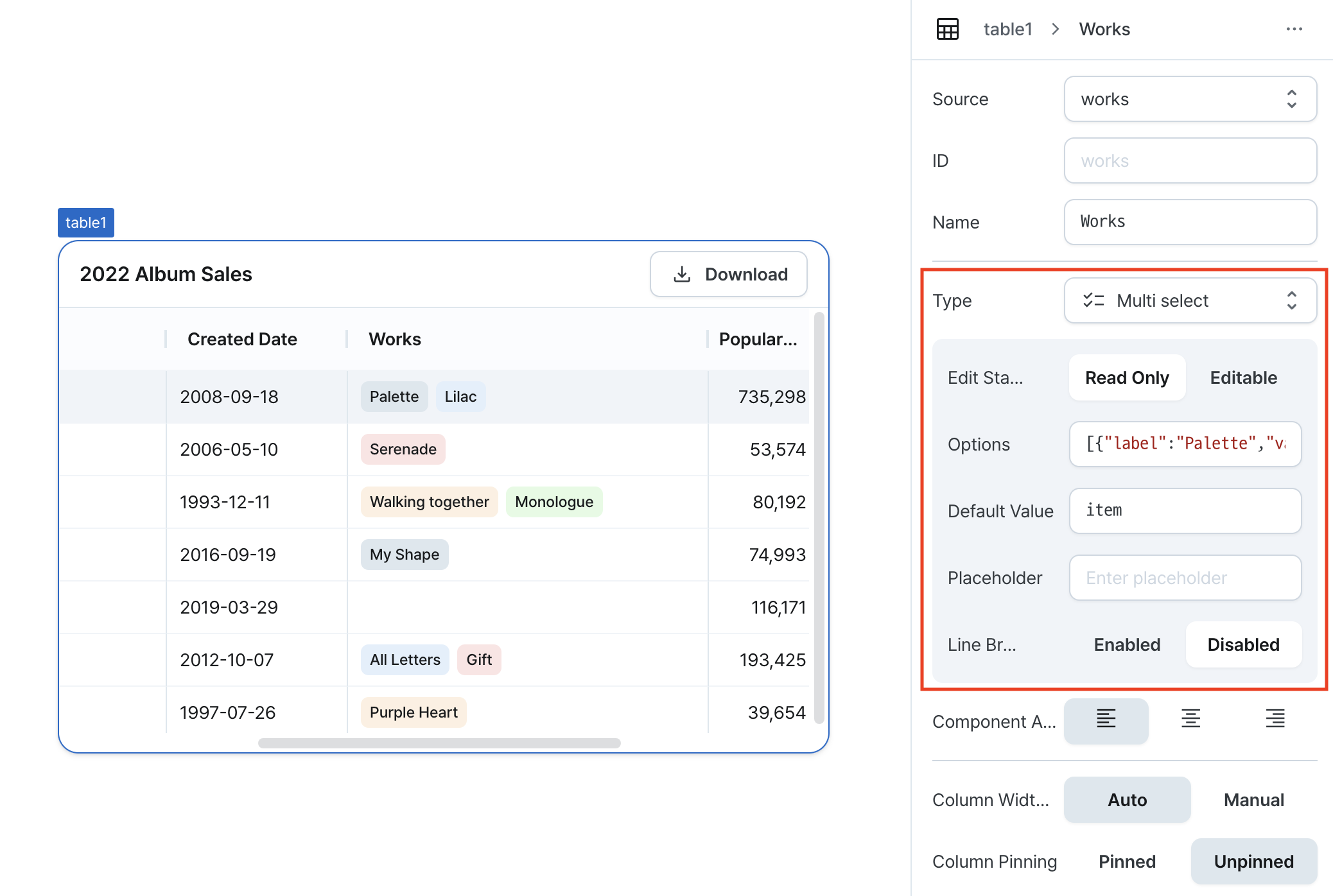
Edit Status
Configures the editing state of the multi-select. When set to Editable, the editing behavior follows the table's editing mode:
Read Only: Table cell data modification not allowedEditable: Table cell data modification allowed
Options
Set the code for multi-select options.
Type: Number
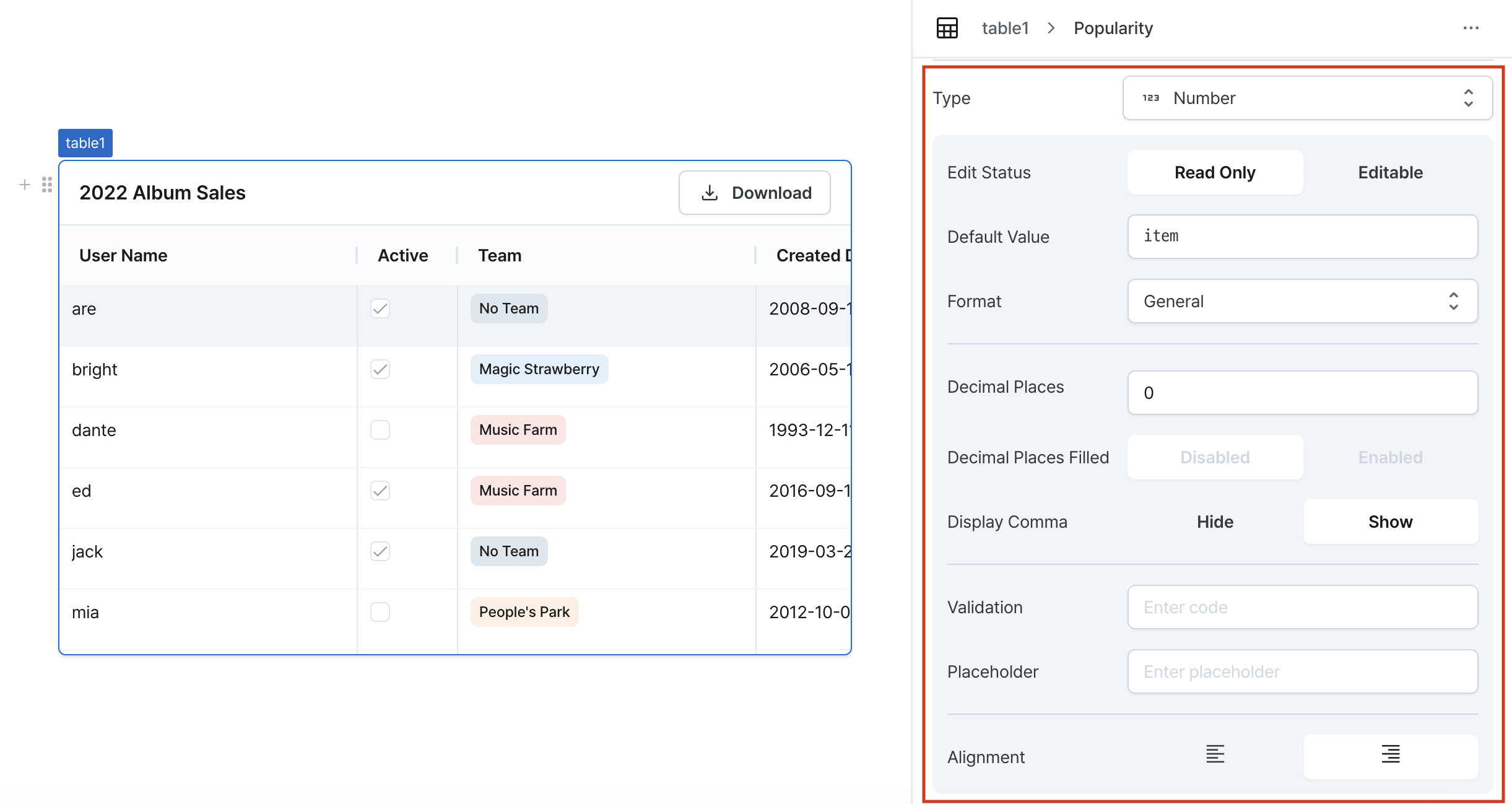
Edit Status
Configures the editing state of the number field. When set to Editable, the editing behavior follows the table's editing mode:
Read Only: Table cell data modification not allowedEditable: Table cell data modification allowed
Default Value
Sets a default value for the number field.
Format
Chooses how to display numbers. Options include normal, percentage, and currency formats.
Decimal Places
Specifies the maximum number of decimal places. You can enter between 0 and 20 decimal places.
Decimal Places Filled
When enabled, if the entered value has fewer decimal places than specified, the remaining places will be filled with zeros.
Display Comma
When selected, displays commas for every thousand place value.
Validation
Validates the number values. Displays error messages. Shows default error message when no custom error message is set.
Placeholder
Sets a placeholder for the number.
Alignment
Aligns the numbers according to the selected direction.
Type: Text
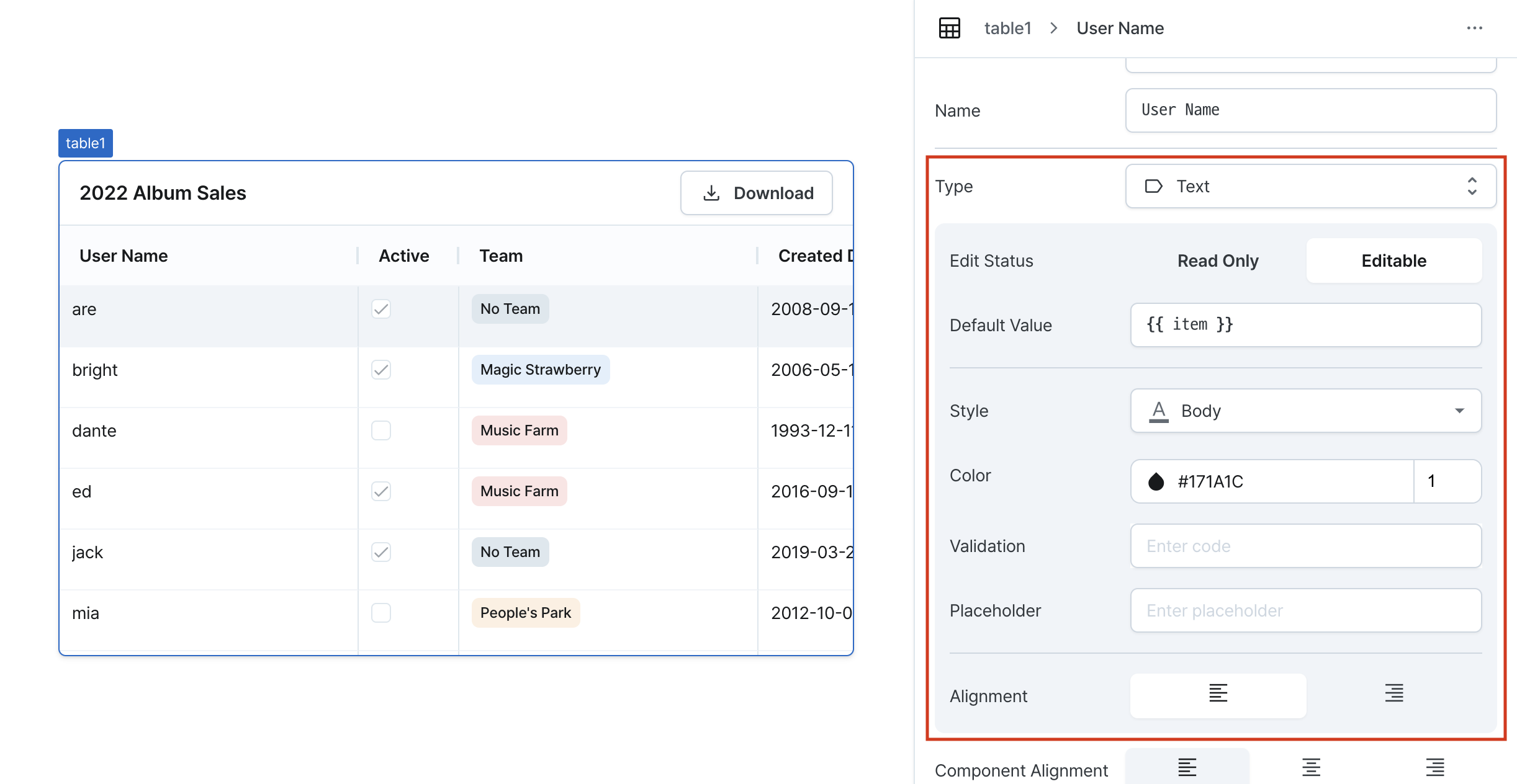
Edit Status
Configures the editing state of the text field. When set to Editable, the editing behavior follows the table's editing mode:
Read Only: Table cell data modification not allowedEditable: Table cell data modification allowed
Default Value
Enters a label for the column and sets a default value for the text field.
Style
Chooses the text style.
Color
Selects the text color.
Opens color picker UI when clicking the color droplet button on the left. Accepts HEX color codes in the left text field.
Enters opacity values in the right text field.
Validation
Validates the text values. Displays error messages. Shows default error message when no custom error message is set.
Placeholder
Sets a placeholder for the text.
Alignment
Aligns the text according to the selected direction.
States
The table manages the following states:
Data States
| Properties | Type | Description |
|---|---|---|
| originalData | TableData | undefined | Original table data |
| data | TableData | undefined | Currently displayed table data |
| createdRows | Record<string, unknown>[][] | Newly created row data |
| updatedRows | Record<string, unknown>[][] | Modified row data |
| deletedRows | Record<string, unknown>[][] | Deleted row data |
| updatedRowKeys | string[] | List of modified row keys |
Selection States
| Properties | Type | Description |
|---|---|---|
| selectedRow | Record<string, unknown>[] | undefined | Currently selected row data |
| selectedRowIndex | number | undefined | Index of currently selected row |
| selectedRowKey | string | undefined | Key of currently selected row |
| selectedRows | Record<string, unknown>[][] | List of all selected row data |
| selectedRowIndicies | number[] | List of all selected row indices |
| selectedRowKeys | string[] | List of all selected row keys |
| selectedOriginalRow | Record<string, unknown>[] | undefined | Selected row from original data |
| selectedOriginalRows | Record<string, unknown>[] | undefined | Selected rows from original data |
Pagination States
| Properties | Type | Description |
|---|---|---|
| page | TablePageState | Current page state |
| rowsCount | number | undefined | Total number of rows |
| rowsPerPage | number | undefined | Rows per page |
Filtering and Sorting States
| Properties | Type | Description |
|---|---|---|
| filters | TableFilterState[] | List of current filter states |
| sort | TableSortState | undefined | Current sort state |
Other States
| Properties | Type | Description |
|---|---|---|
| isCsvDownloadable | boolean | Whether CSV download is enabled |
| isDataTable | boolean | Whether it's a data table |
| isError | boolean | Whether error occurred |
| isLoading | boolean | Whether loading |
| editingMode | TableEditingMode | Current table editing mode |
| columnDefinitions | TableColumnDefinition[] | List of table column definitions |
| rowKeys | unknown | undefined | List of row keys |
| isMultipleRowSelectionDisabled | boolean | Whether multiple row selection is disabled |
| isRowSelectionEnabled | boolean | Whether row selection is enabled |
| isServerSideFilteringEnabled | boolean | Whether server-side filtering is enabled |
| isServerSidePaginationEnabled | boolean | Whether server-side pagination is enabled |
| isServerSideSortingEnabled | boolean | Whether server-side sorting is enabled |
| eventListeners | EventListener[] | List of event listeners |
Type Definitions
interface TablePageState {
  // Rows per page
  rowsPerPage: number | undefined;
  // Current page index
  index: number | undefined;
  // Starting position for page data query
  offset: number | undefined;
  // Maximum number of records per query
  limit: number | undefined;
  // Total number of records
  rowsCount?: number;
}

export type TableFilter =
  | { operator: 'none' }
  | { operator: 'isNull' }
  | { operator: 'isNotNull' }
  | { operator: 'isTrue' }
  | { operator: 'isFalse' }
  | { operator: 'isEmpty' }
  | { operator: 'isNotEmpty' }
  | { operator: 'eq'; value: string }
  | { operator: 'includes'; value: string }
  | { operator: 'gt'; value: string }
  | { operator: 'gte'; value: string }
  | { operator: 'lt'; value: string }
  | { operator: 'lte'; value: string };

export type TableFilterOperator = TableFilter['operator'];

interface TableFilterState {
  // ID of column to filter
  id: string;
  // Type of filter
  operator: TableFilterOperator;
  // Filter input value
  value?: string;
}

interface TableSortState {
  // ID of column to sort
  id: string;
  // Sort direction
  direction: 'ASC' | 'DESC';
}

type TableEditingMode = 'singleClick' | 'doubleClick';