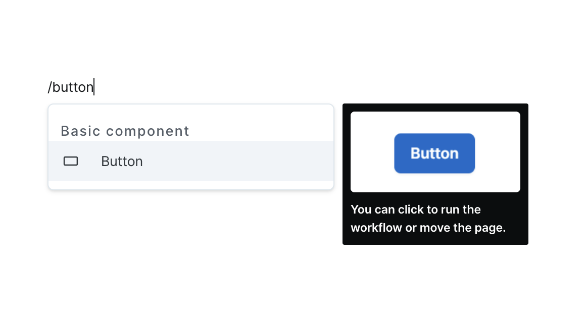
Button
Execute workflows or navigate between pages with a clickable interaction.
Properties
| Property | Type | Description |
|---|---|---|
| Name (name) | string | Unique identifier for the button component |
| Label (label) | string | Text displayed on the button |
| Action Target (handler) | ActionHandler | Defines the action when button is clicked |
| Confirm Modal (confirmModal) | boolean | Whether to show confirmation modal on click |
| Disable Component (isDisabled) | boolean | Whether button is disabled |
| Hide Component (isHidden) | boolean | Whether button is hidden in deployed page |
| Width (display) | Display | How the button component occupies width |
| Color (color) | ButtonColor | Button color style |
| Variant (variant) | ButtonVariant | Button variant style |
Name (name)
Unique identifier for the button component. Please refer to the component naming rules
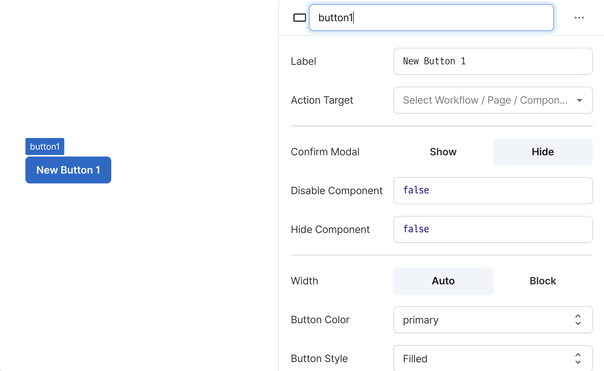
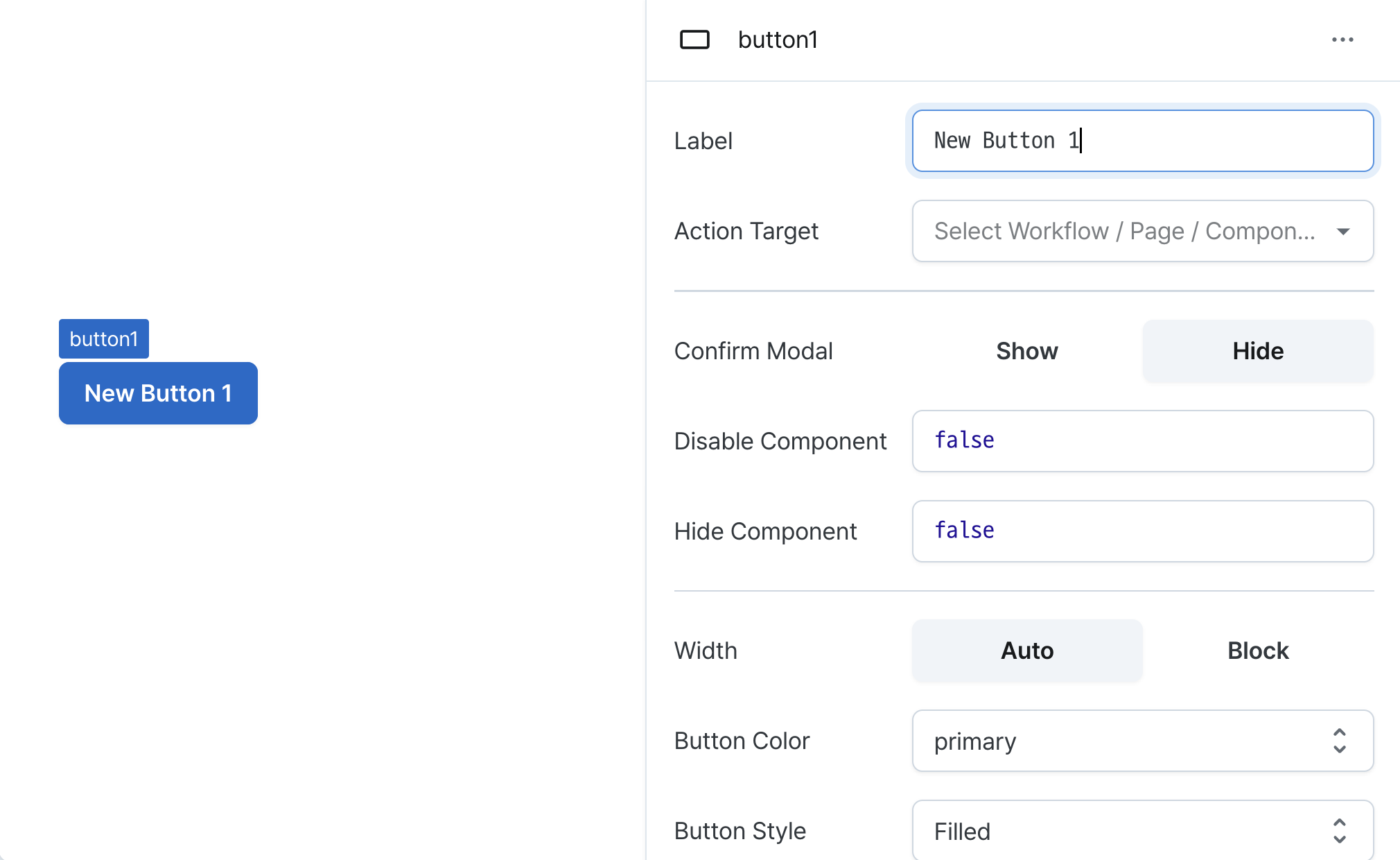
Label (label)
Sets the text displayed on the button. (Supports Template Text)
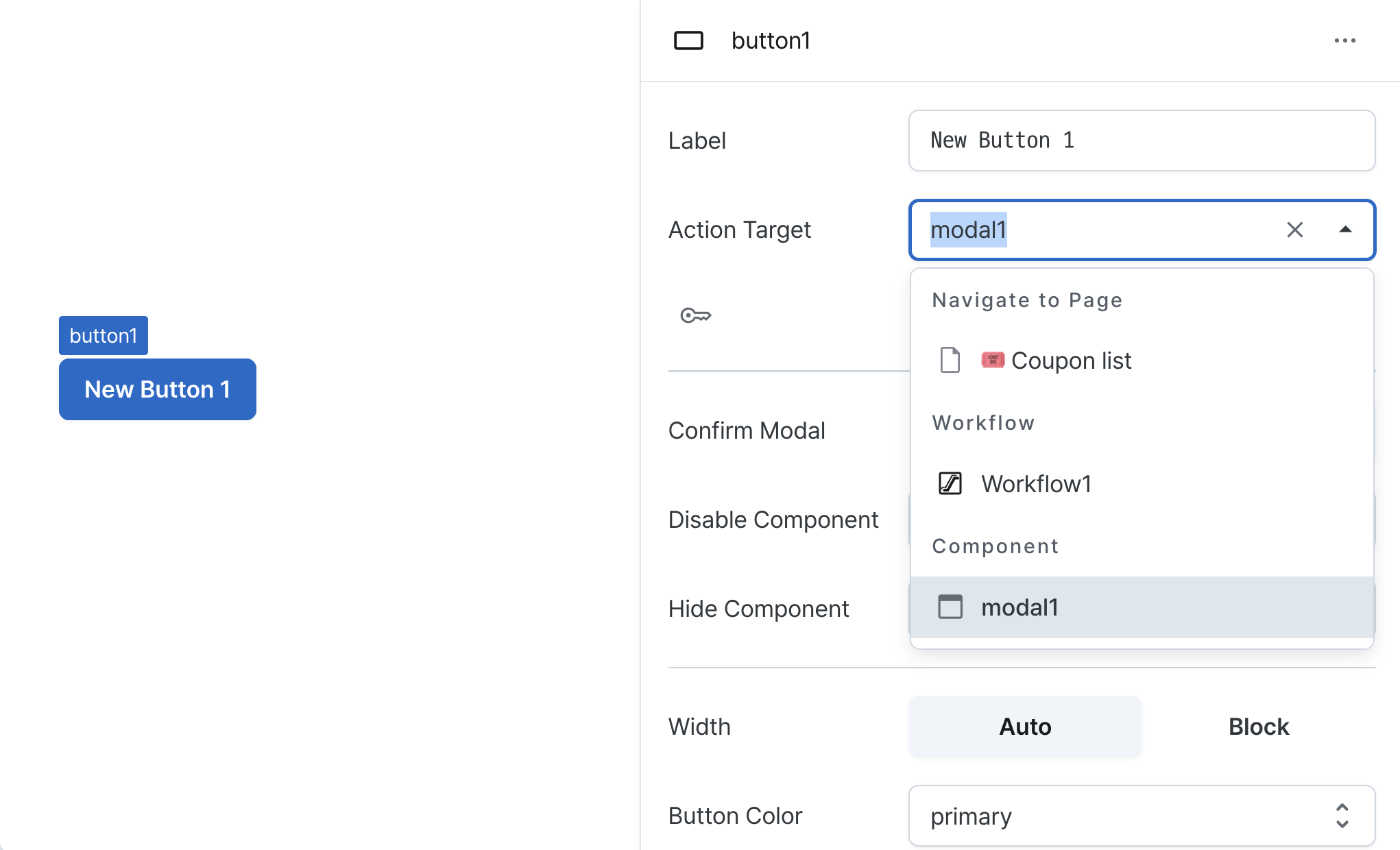
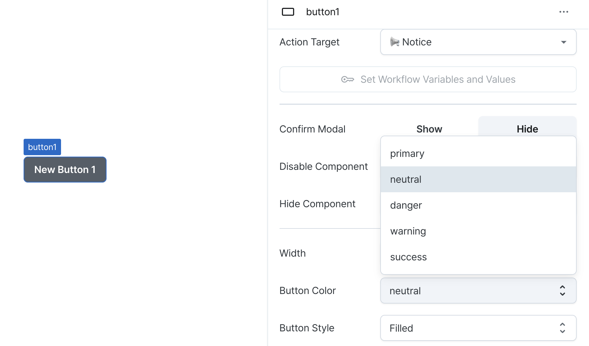
Action Target (handler)
Configures the button's click behavior.
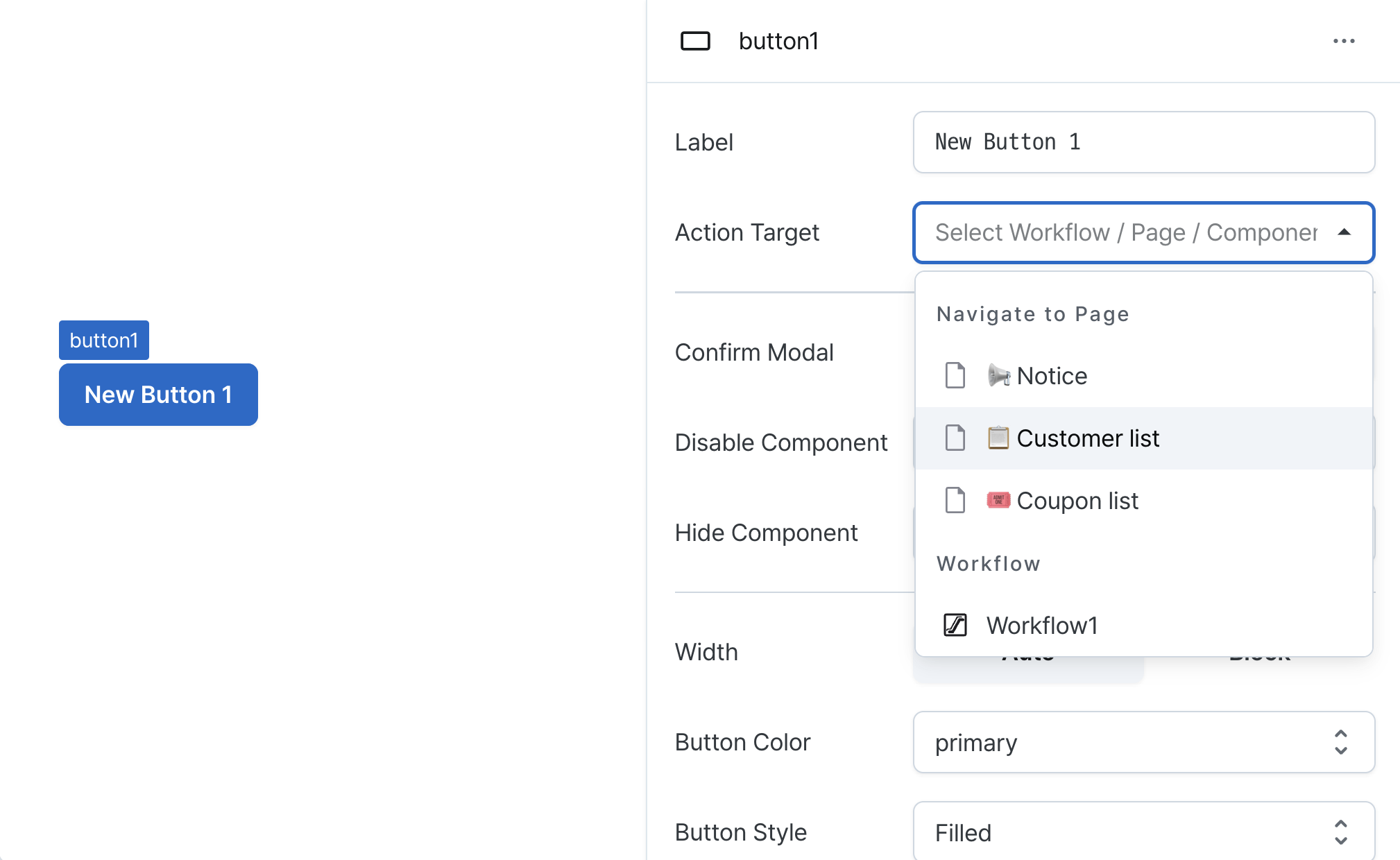
- Page Navigation
- Navigates to selected page
- Supports variable parameter passing
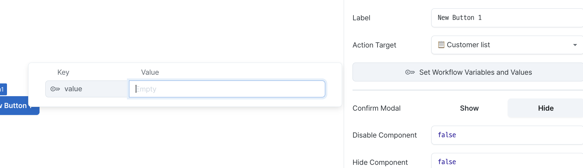
- Workflow Execution
- Runs specified workflow
- Supports variable parameter passing
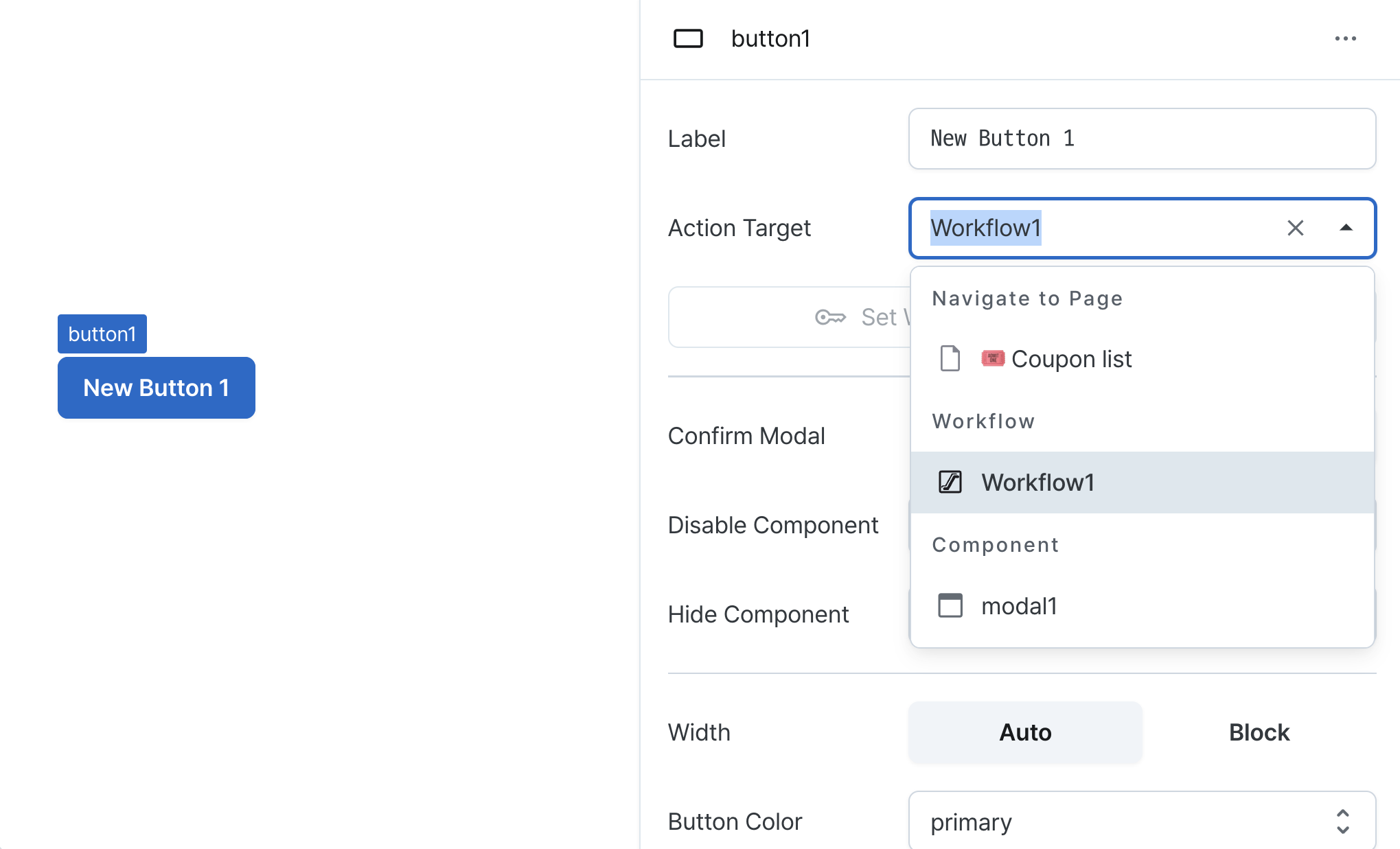
- Modal Control
- Opens or closes specified modal
- Toggles modal visibility state
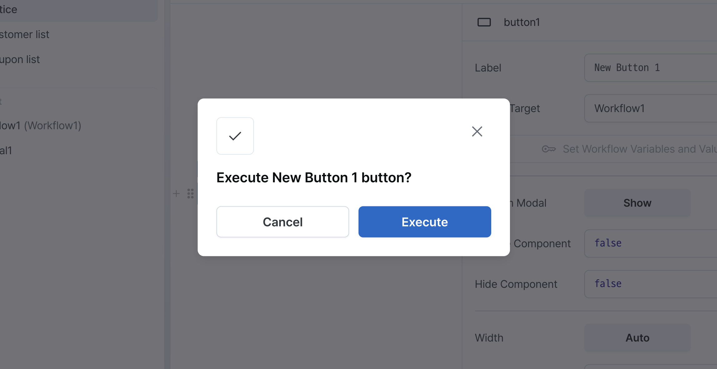
Confirm Modal (confirmModal)
Adds confirmation dialog before action execution.
Recommended for destructive or important actions.
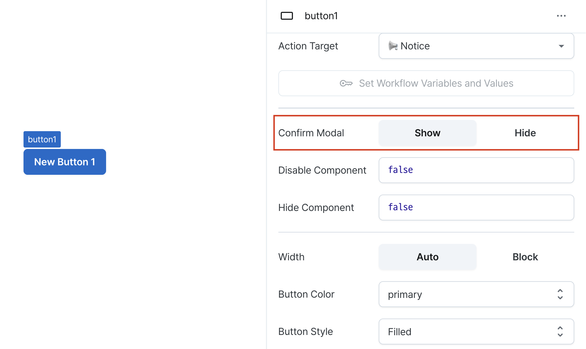
When enabled, clicking the button will show a confirmation modal like below.
Consider adding this option for actions that require careful consideration, such as deletion.
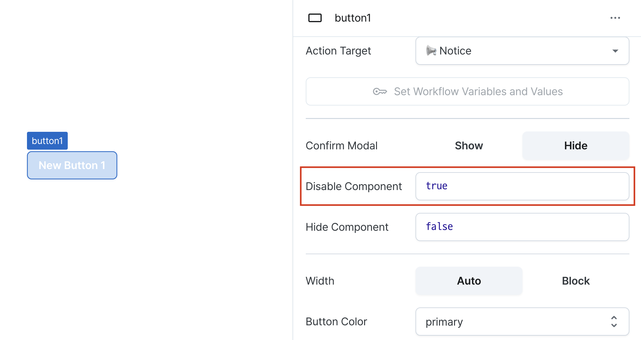
Disable Component (isDisabled)
Sets the disabled state of the component.
Can be set through workflow results, direct input.
When enabled, prevents user interaction with the component.
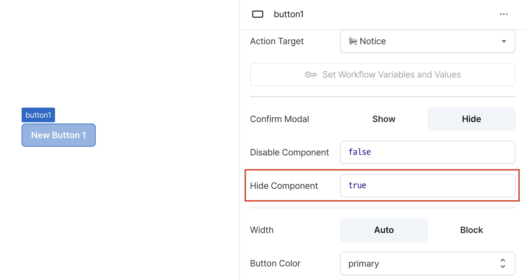
Hide Component (isHidden)
Controls visibility of the component.
When set to true:
- Hidden in deployed view
- Visible with reduced opacity in edit mode
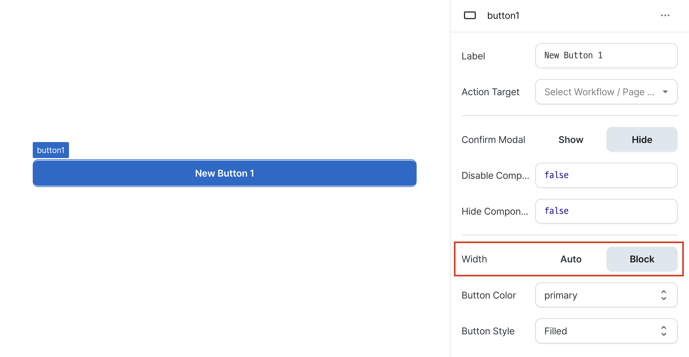
Width (display)
Sets how the component occupies width.
Selecting "Block" enables full-width usage.
Selecting "Auto" adjusts width to fit the label content.
Color (color)
Sets the button's color scheme.
Options:
neutral: Default colorprimary: Primary brand colordanger: Warning/destructive actionssuccess: Positive actions
Variant (variant)
Sets the button's visual style.
Options:
outlined: Border onlyfilled: Solid backgroundsoft: Subdued backgroundplain: Text only

States
| Property | Type | Description |
|---|---|---|
| label | string | Current text displayed on button |
Type Definitions
interface ControlComponentAction {
  // Component action type
  type: 'controlComponent';
  // Component name
  name: string;
  // Operation type
  operation: string;
}

interface NavigateToPageEventAction {
  // Page action type
  type: 'page';
  // Page ID
  pageId: string;
  // Page variables
  variables: Record<string, string>;
}

interface ExecuteWorkflowEventAction {
  // Workflow action type
  type: 'workflow';
  // Workflow ID
  workflowId: string;
  // Workflow variables
  variables: Record<string, string>;
}

interface SetPageVariableEventAction {
  // Set page variable action type
  type: 'setVariable';
  // Page variable name
  variable: string;
  // Value to set
  value: string;
}

type ExecutableEventAction = ExecuteWorkflowEventAction;

type EventAction = ControlComponentAction | NavigateToPageEventAction | ExecutableEventAction | SetPageVariableEventAction;

interface ActionHandler {
  // Action type
  action?: EventAction;
  // Show confirmation modal
  confirmModal?: boolean;
}

type ButtonColor = 'neutral' | 'primary';

type ButtonVariant = 'outlined' | 'filled' | 'soft' | 'plain';

type Display = 'inline-block' | 'block';