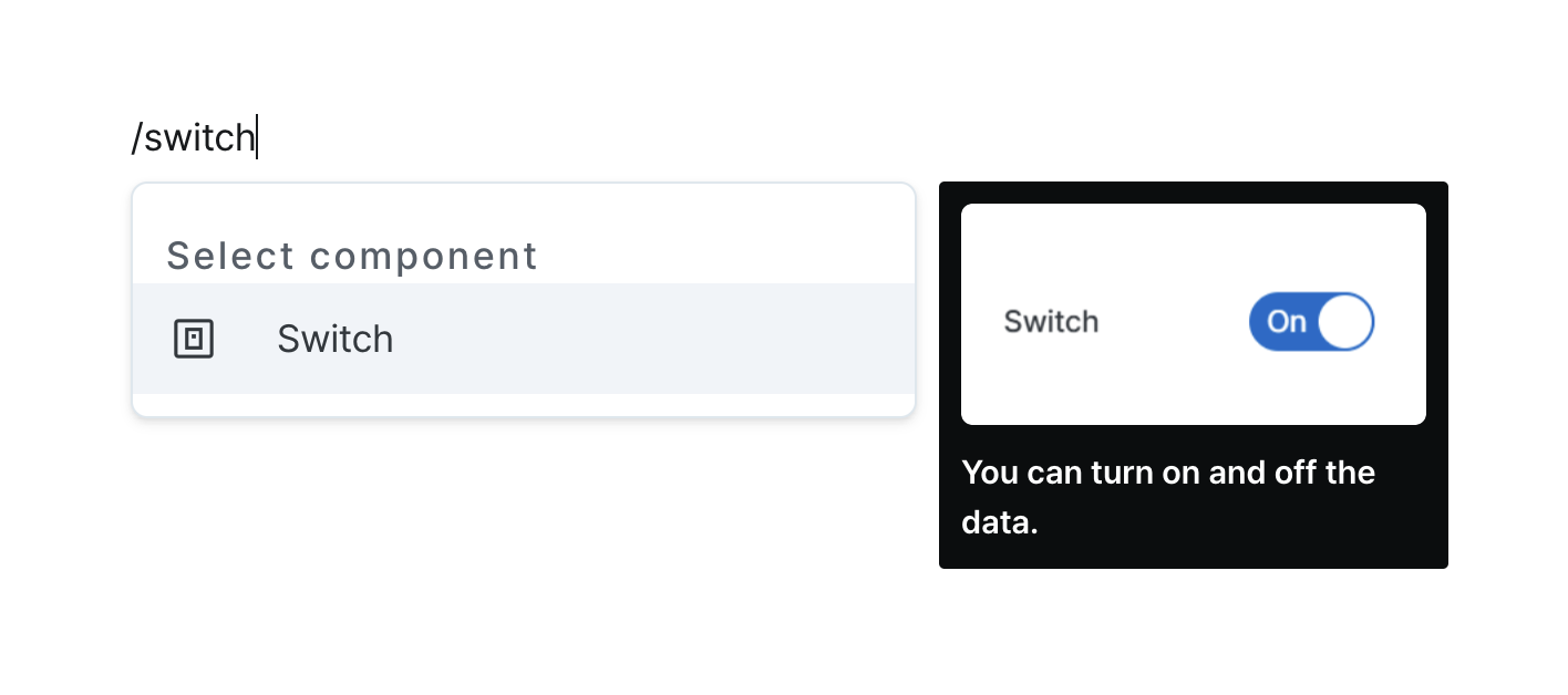
Switch
Toggle between two states with a simple switch control.
Properties
| Property | Type | Description |
|---|---|---|
| Name (name) | string | Unique identifier for the switch component |
| Label (label) | string | Text displayed on the left side of the switch |
| Default Value (defaultValue) | string (boolean) | Code that returns a default value |
| Hide Component (isHidden) | boolean | Whether to hide the switch on the deployed page |
| Width (display) | Display | How the switch component occupies width |
| Width (px) (contentWidth) | string (number) | Fixed width of the switch component |
| Label Width (labelWidth) | string | The length that the left label takes up in the switch |
Name (name)
Sets the unique identifier for the switch component. Please refer to the component naming rules
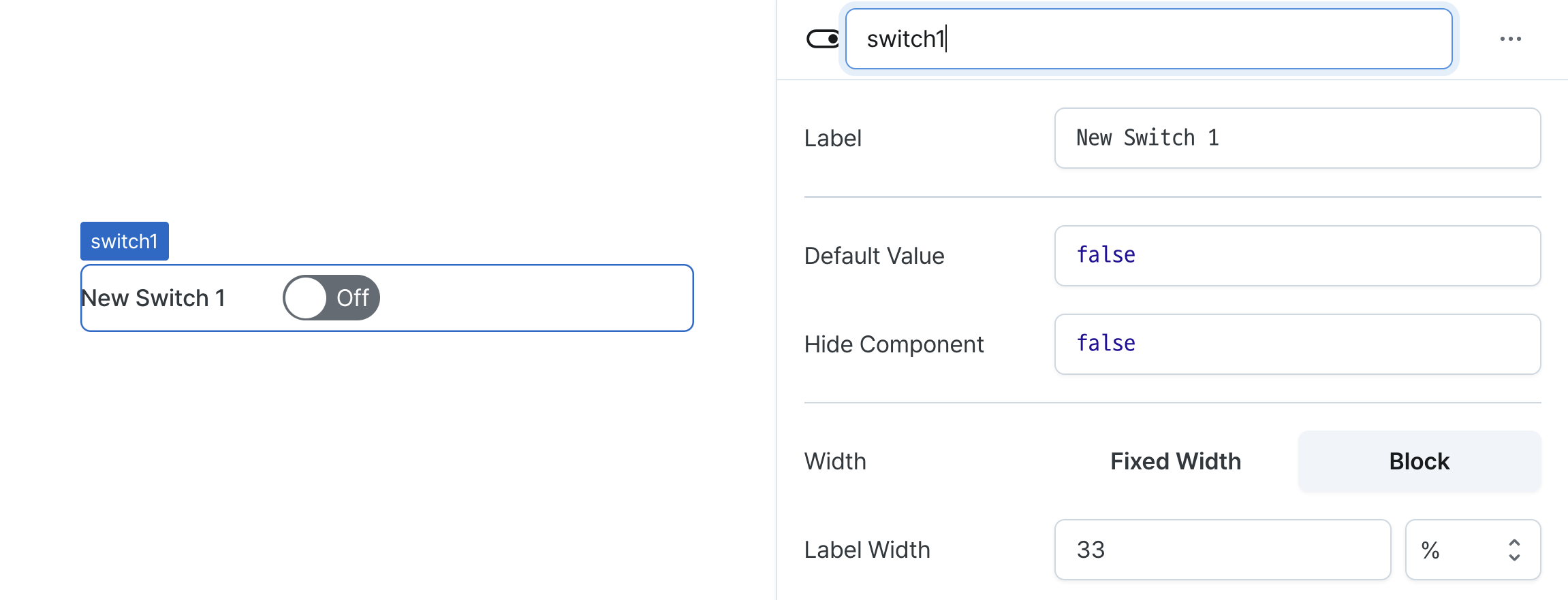
Label (label)
Sets the text displayed on the left side of the switch. (Supports Template Text)
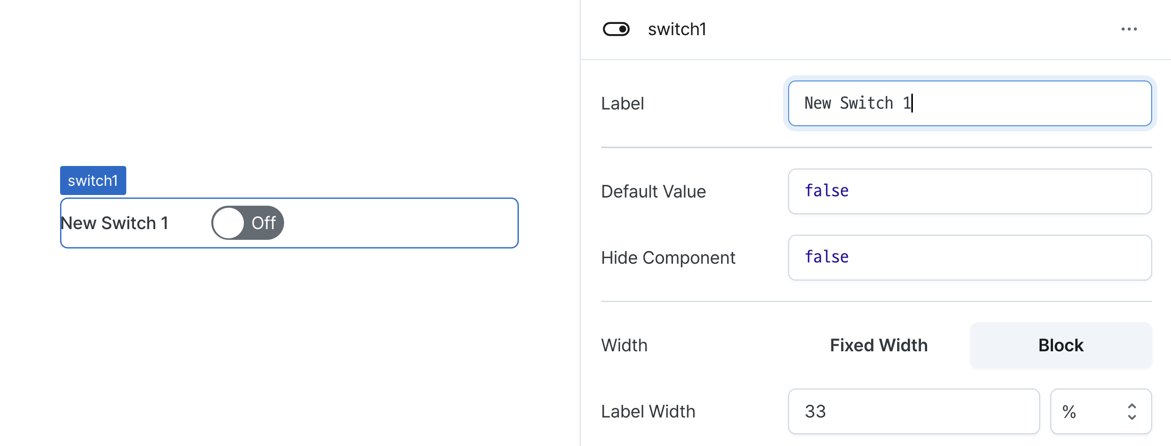
Default Value (defaultValue)
Sets the default checked value for the component.
Can be set through workflow results, direct input.
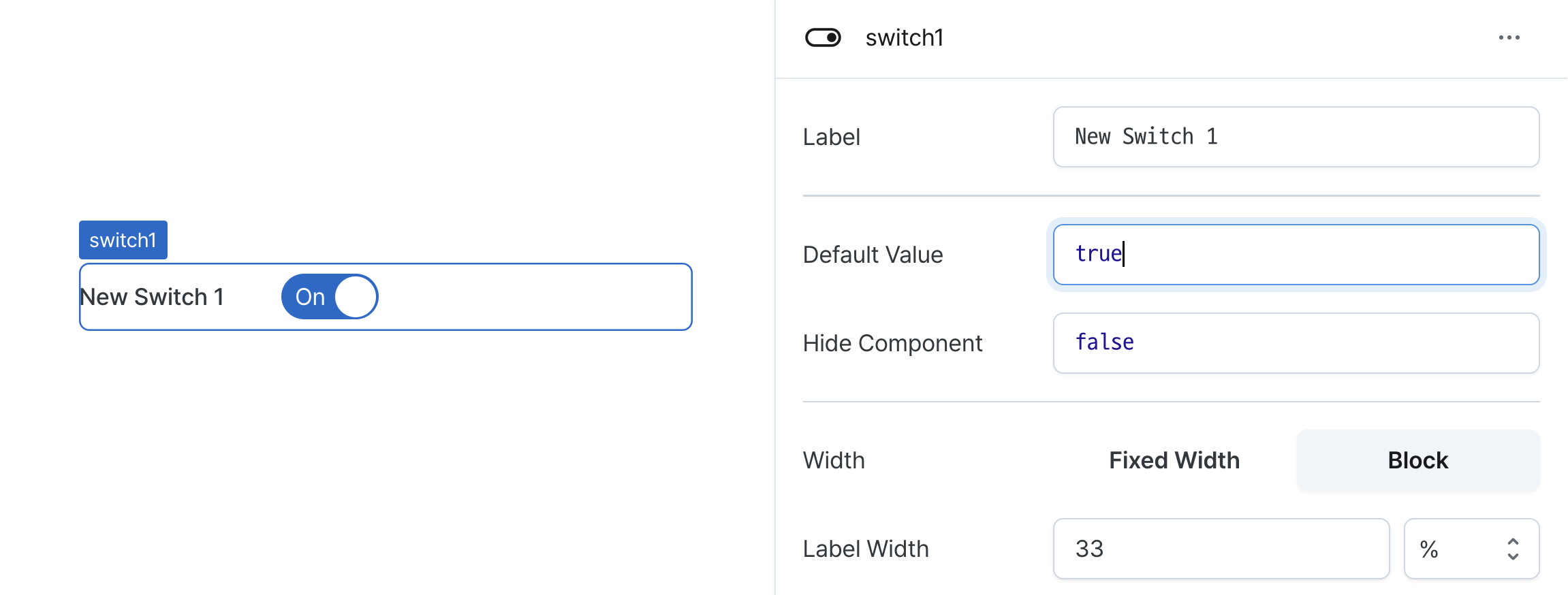
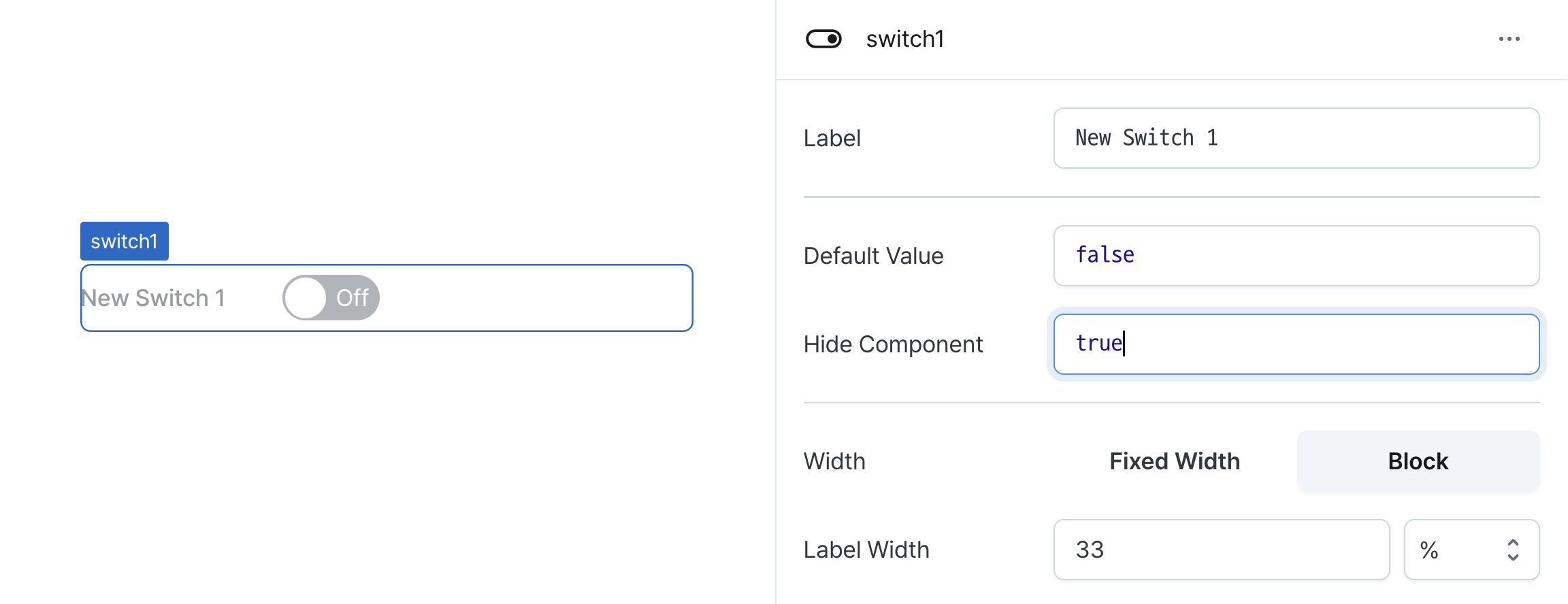
Hide Component (isHidden)
Controls visibility of the component.
When set to true:
- Hidden in deployed view
- Visible with reduced opacity in edit mode
Width (display)
Sets how the component occupies width.
Selecting "Block" enables full-width usage, while "Fixed width" allows you to enter a specific width in pixels.
Fixed-width components can be arranged sequentially.
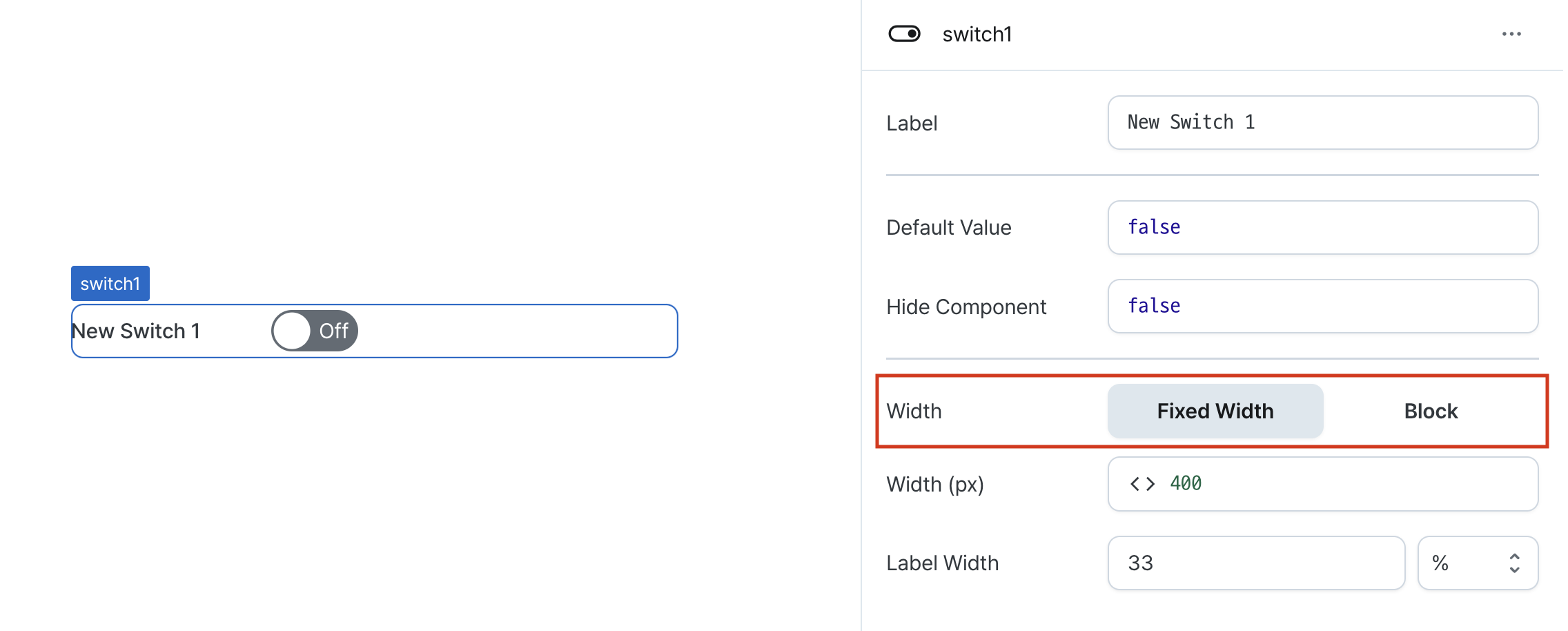
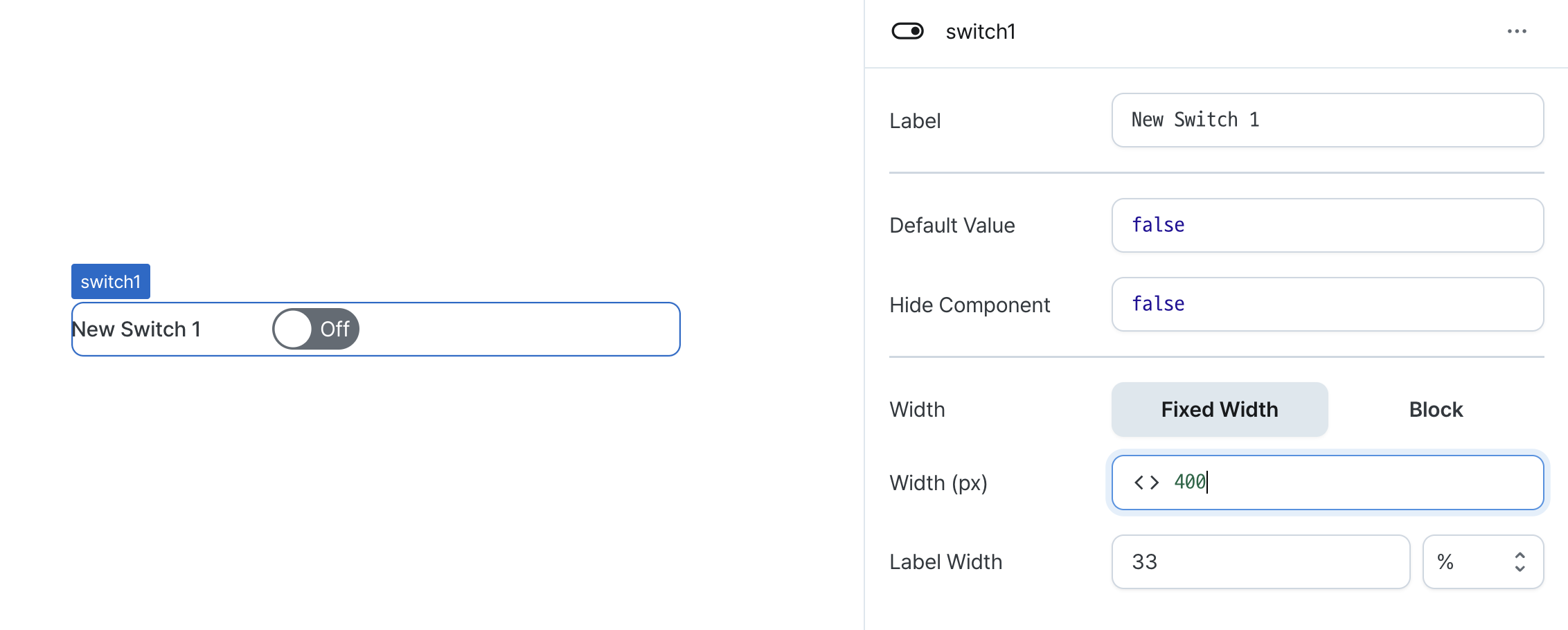
Width (px) (contentWidth)
Sets the component's width in pixels.
Can be set through workflow results, direct input.
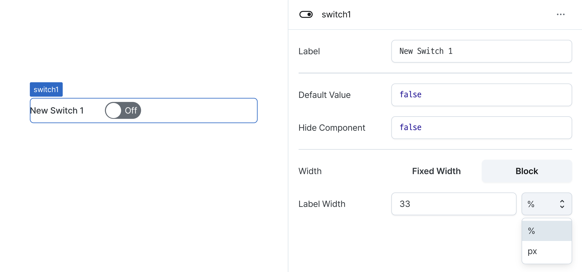
Label Width (labelWidth)
Sets the width of the label section.
Accepts values in pixels or percentages.
States
| Property | Type | Description |
|---|---|---|
| checked | boolean | Active state of the switch |
Type Definitions
type Display = 'inline-block' | 'block';