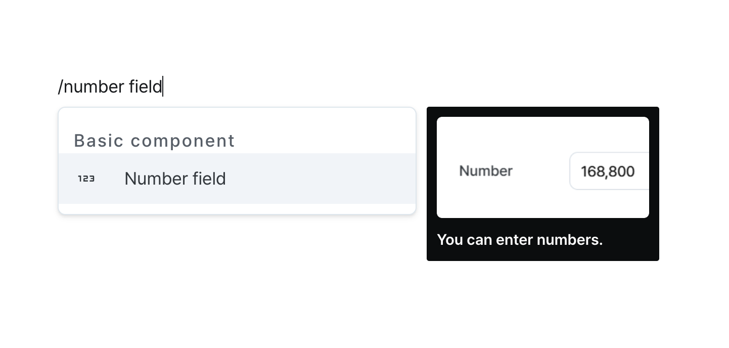
Number Field
Input and validate numerical values with formatting controls.
Properties
| Property | Type | Description |
|---|---|---|
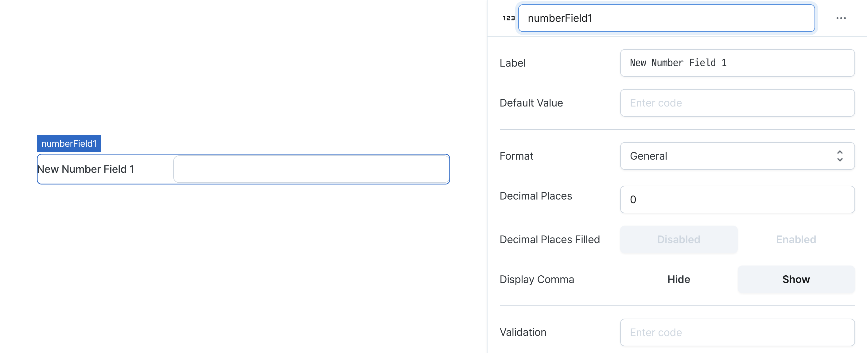
| Name (name) | string | Unique identifier for the number field component |
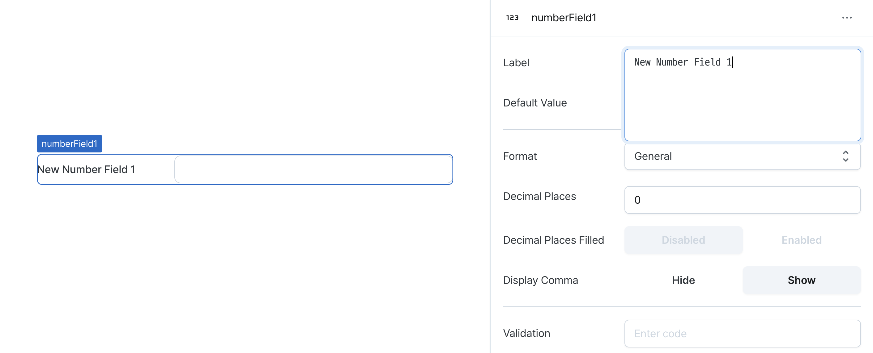
| Label (label) | string | Text displayed on the left side of the number field |
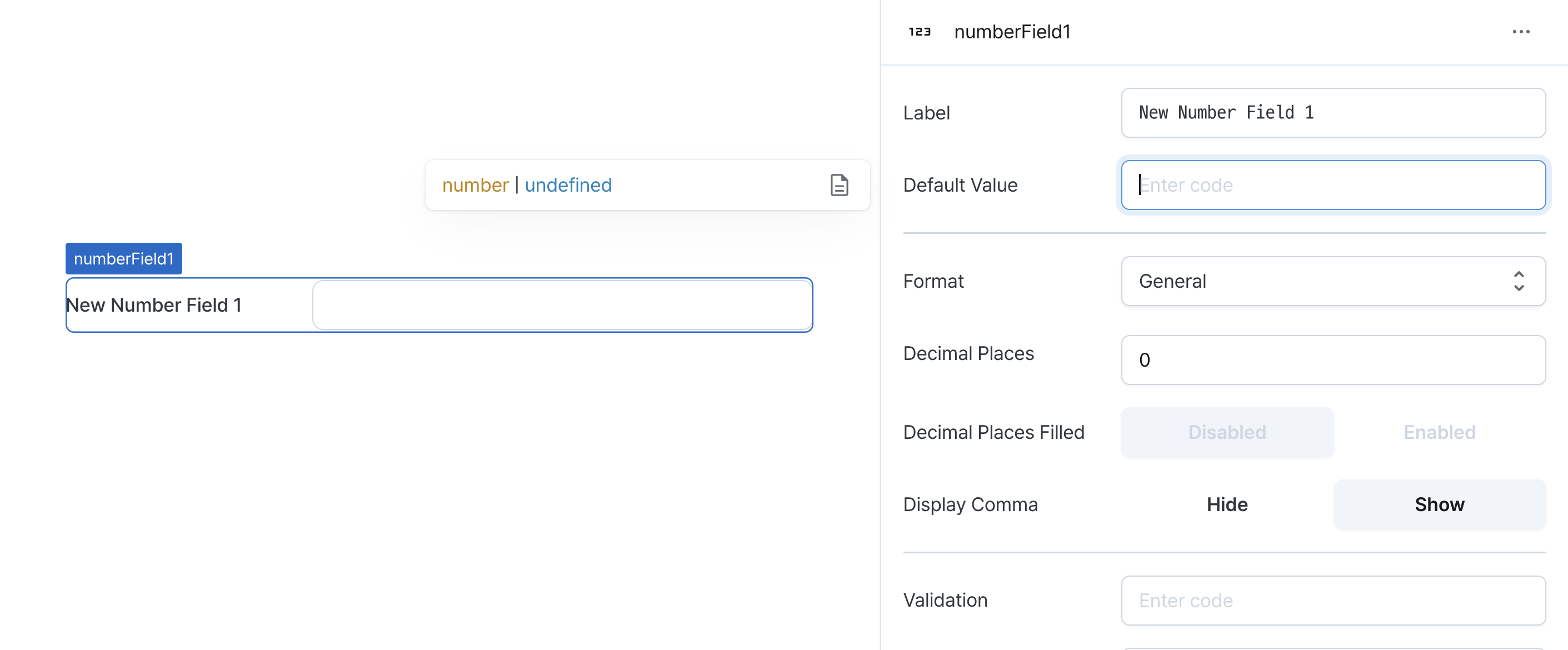
| Default Value (defaultValue) | string | The default value template applied to the number field |
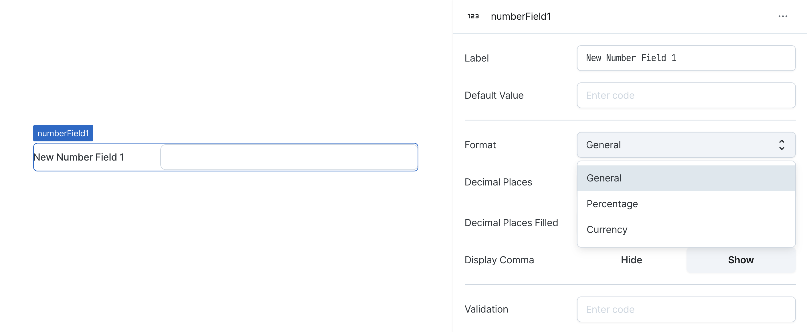
| Format (format) | NumberFieldFormat | The way to display numbers |
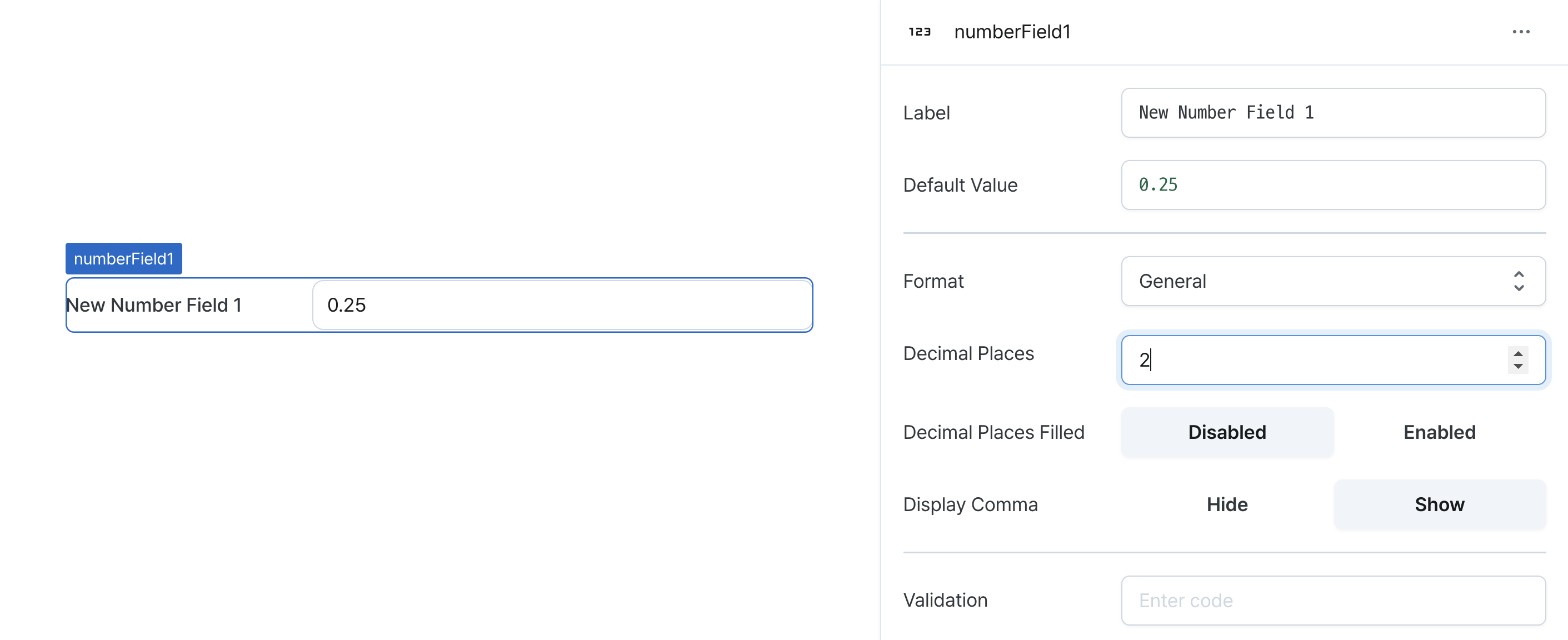
| Decimal Places (decimalPlaces) | number | Number of decimal places between 0 and 20 |
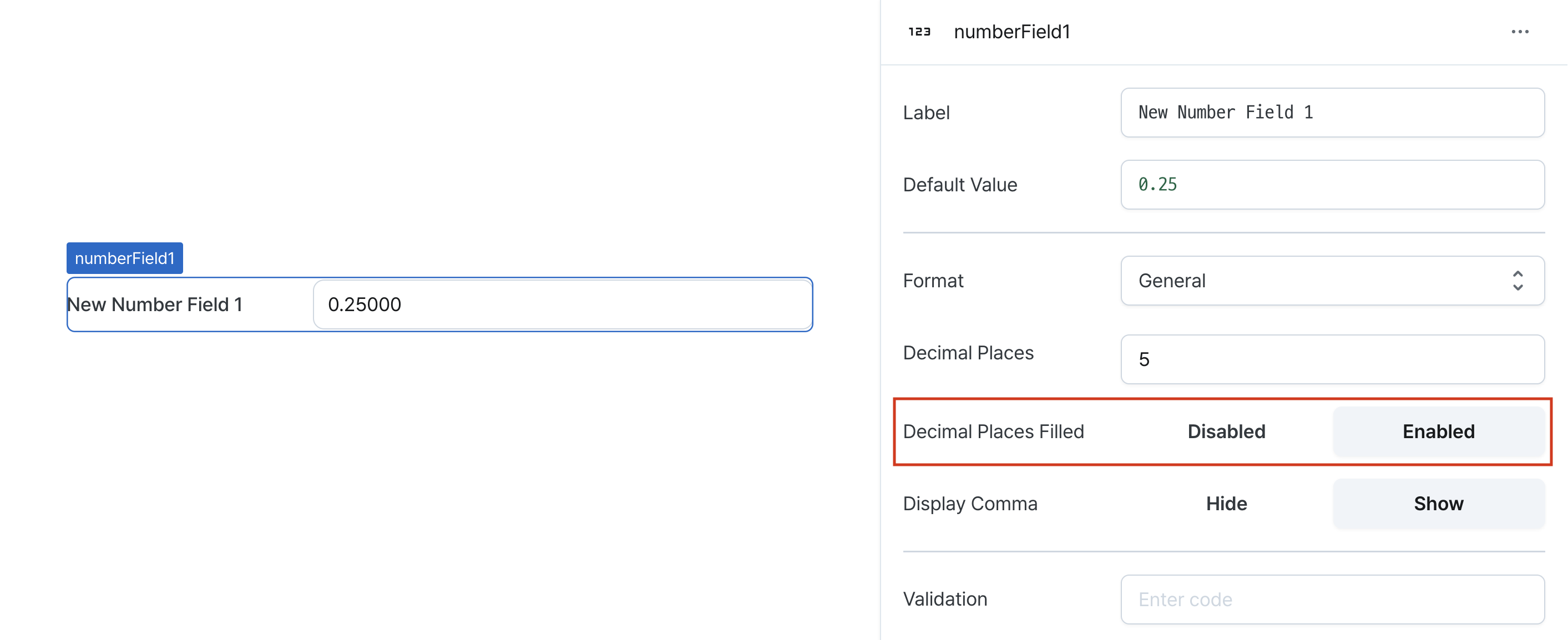
| Decimal Places Filled (isDecimalPlacesFilled) | boolean | Whether to enable filling zeros up to the specified decimal places |
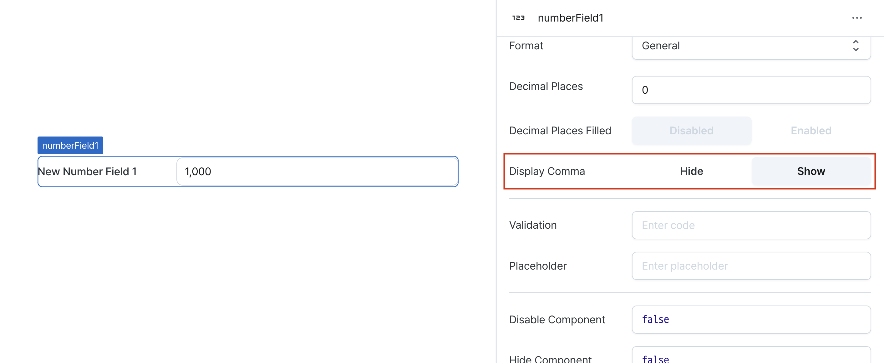
| Display Comma (useGrouping) | boolean | Whether to display commas at every 1,000 position |
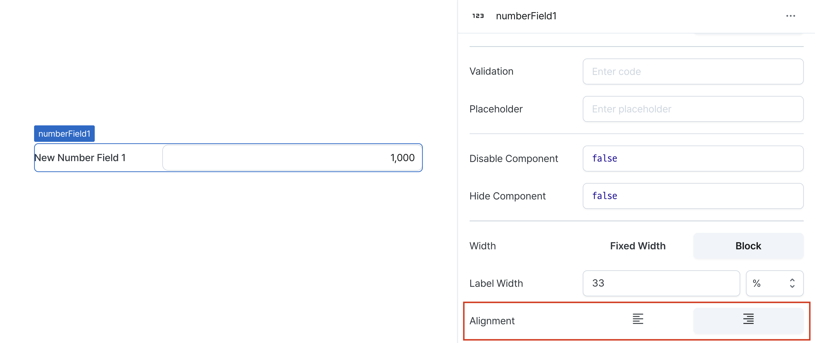
| Validation (validator) | string | Validator for the field value |
| Placeholder (placeholder) | string | Placeholder applied to the number field |
| Disable Component (isDisabled) | boolean | Whether the number field is disabled |
| Read Only (isReadonly) | boolean | Whether the number field is read-only |
| Hide Component (isHidden) | boolean | Whether to hide the number field on the deployed page |
| Width (display) | Display | How the number field component occupies width |
| Width (px) (contentWidth) | string (number) | Fixed width of the number field component |
| Label Width (labelWidth) | string | The width of the label on the left side of the number field |
| Alignment (textAlign) | 'left' | 'right' | Align the data inside the field. |
Name (name)
Sets the unique identifier for the number field component. Please refer to the component naming rules
Label (label)
Sets the text displayed on the left side of the number field. (Supports Template Text)
Default Value (defaultValue)
Sets the default value for the component.
Can be set through workflow results, direct input.
Format (format)
Determines how numbers are displayed in the field.
Options:
normal: Displays numbers in standard format
percentage: Displays numbers as percentages
currency: Displays numbers in currency format
Display format changes do not affect the underlying value.
Decimal Places (decimalPlaces)
Sets the maximum number of decimal places to display.
Accepts values between 0 and 20.
Decimal Places Filled (isDecimalPlacesFilled)
Determines whether to pad decimal places with zeros.
When enabled, numbers are padded with zeros to match the specified decimal places.
Display Comma (useGrouping)
Controls the display of thousand separators.
When enabled, adds commas as thousand separators (e.g., 1,000,000).
Validation (validator)
Sets validation rules for the field.
Can be set through workflow results, direct input.
This validates the field value and displays error messages.
// Default error message
value !== 'Hello World'

// Custom error message
value !== 'Hello World' ? 'value is not Hello World' : undefined
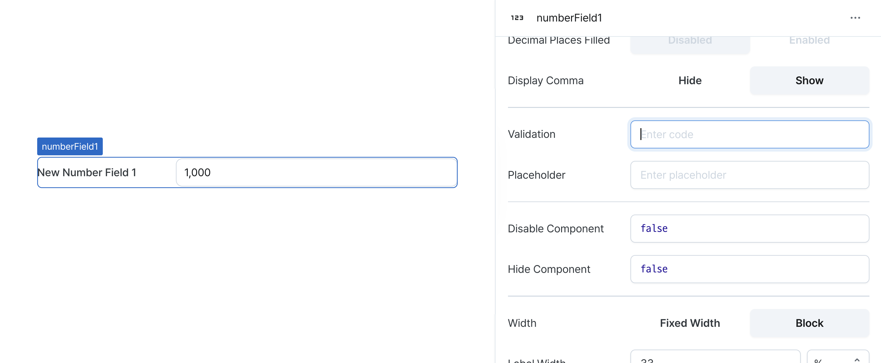
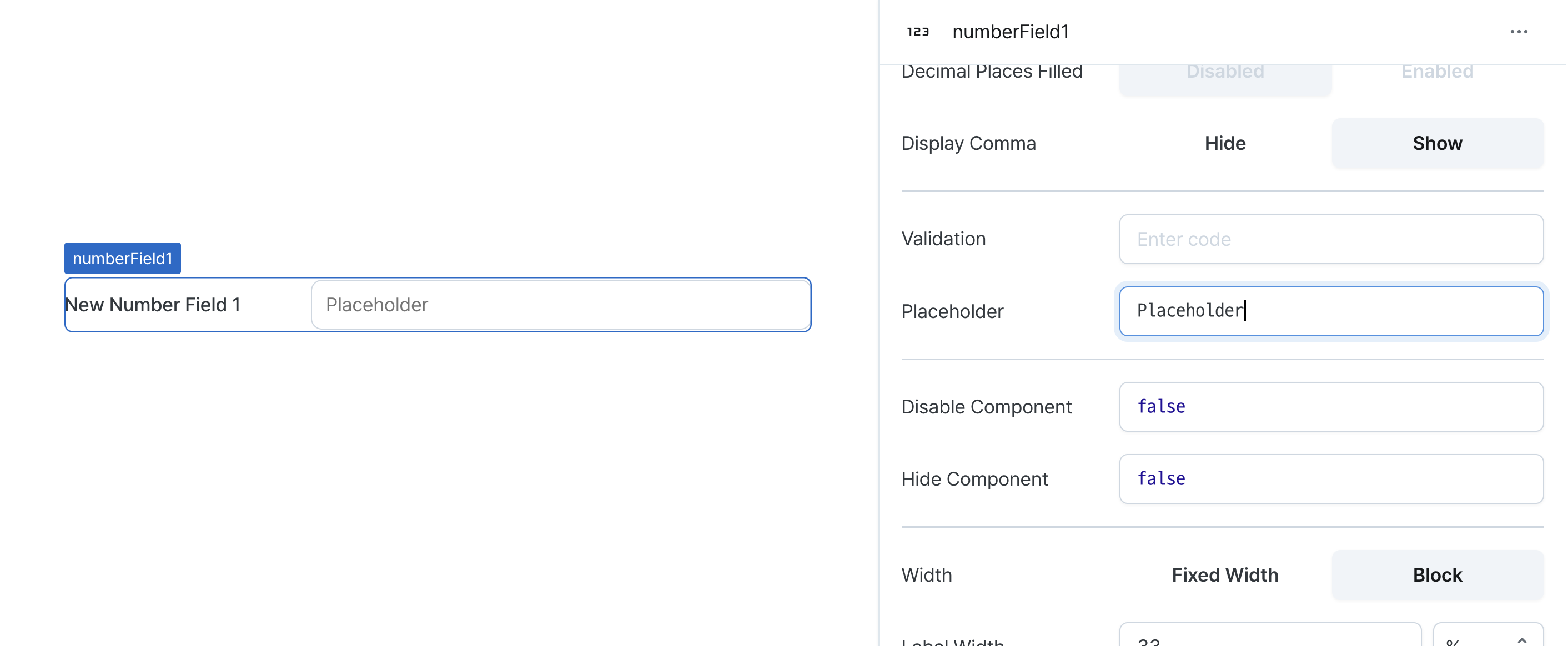
Placeholder (placeholder)
Sets the field's placeholder text.
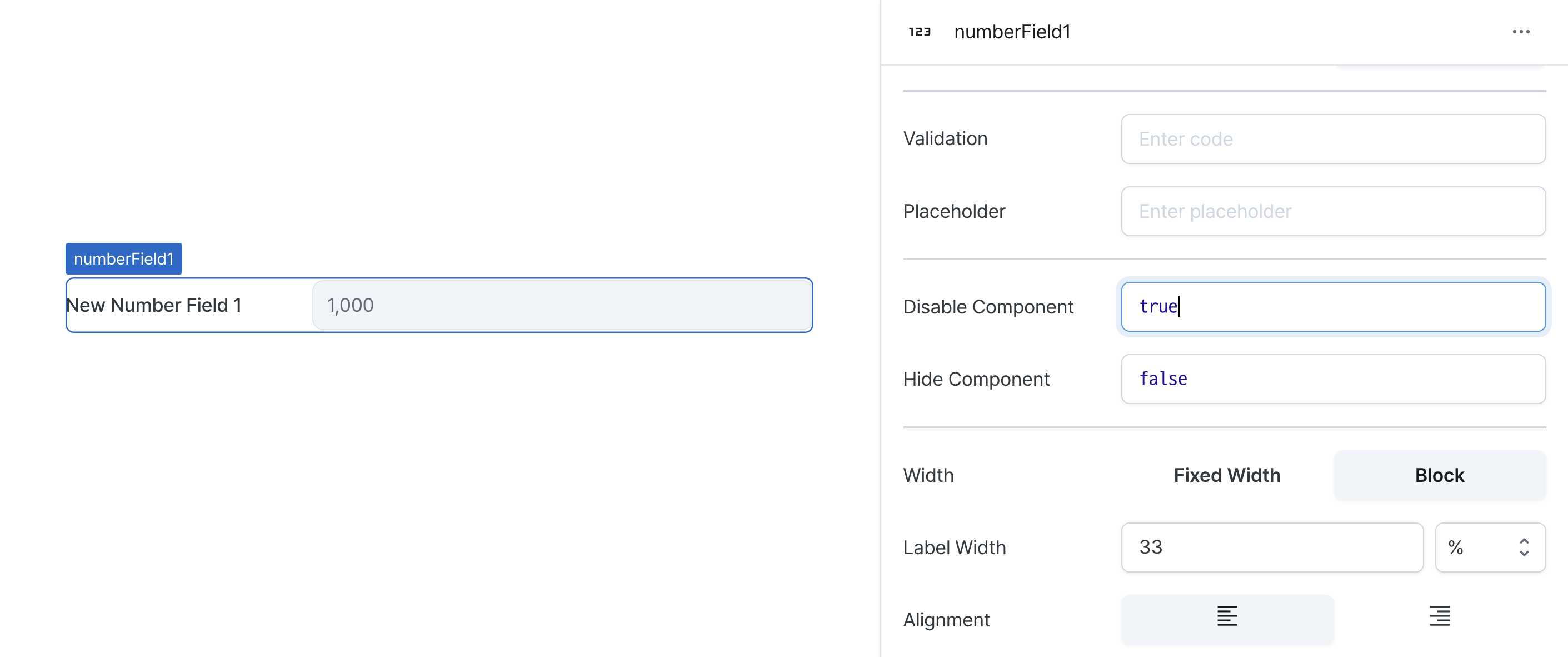
Disable Component (isDisabled)
Sets the disabled state of the component.
Can be set through workflow results, direct input.
When enabled, prevents user interaction with the component.
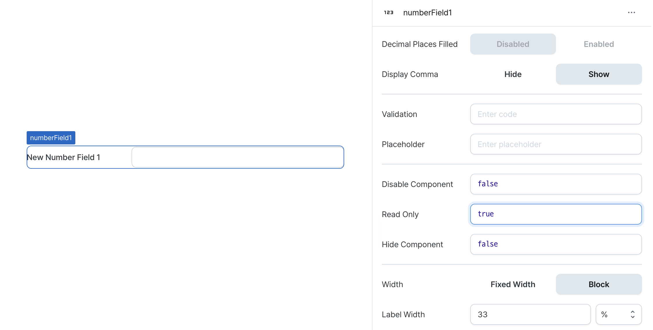
Read Only (isReadonly)
Controls the edit state of the component.
When enabled, prevents content modification while allowing viewing.
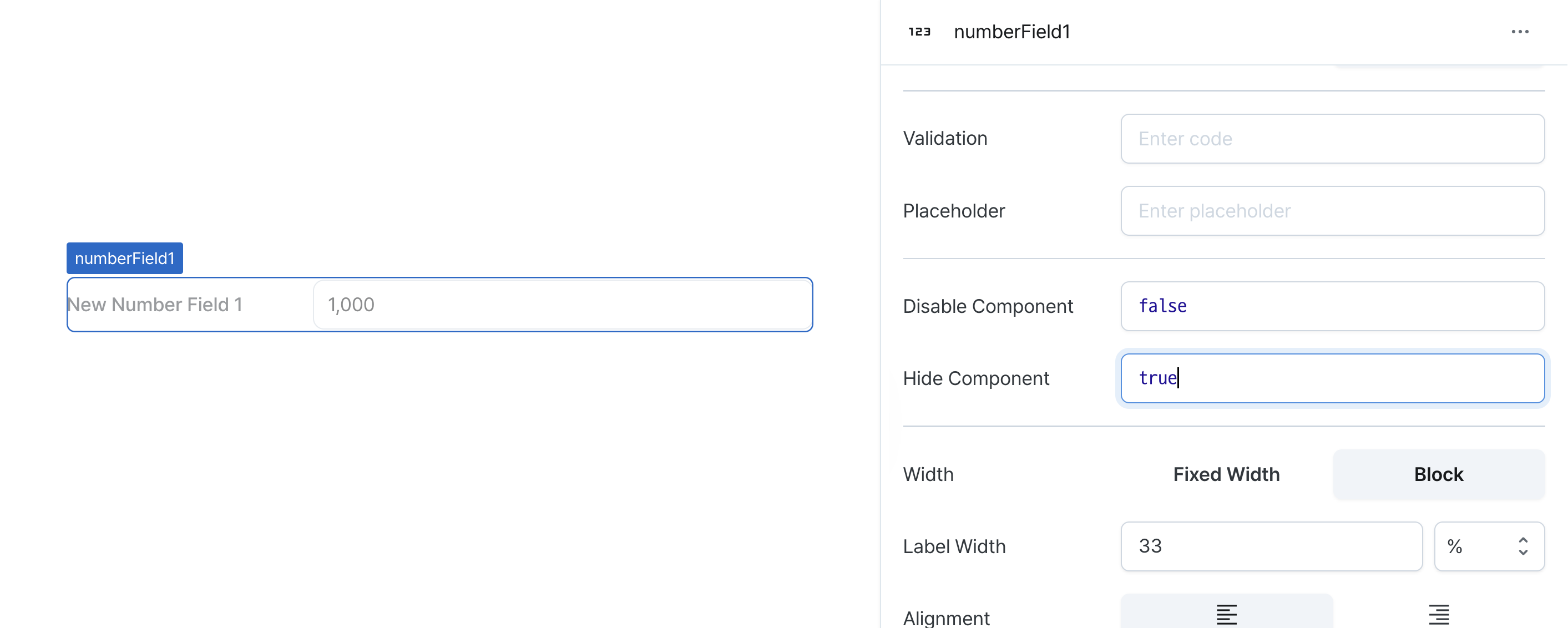
Hide Component (isHidden)
Controls visibility of the component.
When set to true:
- Hidden in deployed view
- Visible with reduced opacity in edit mode
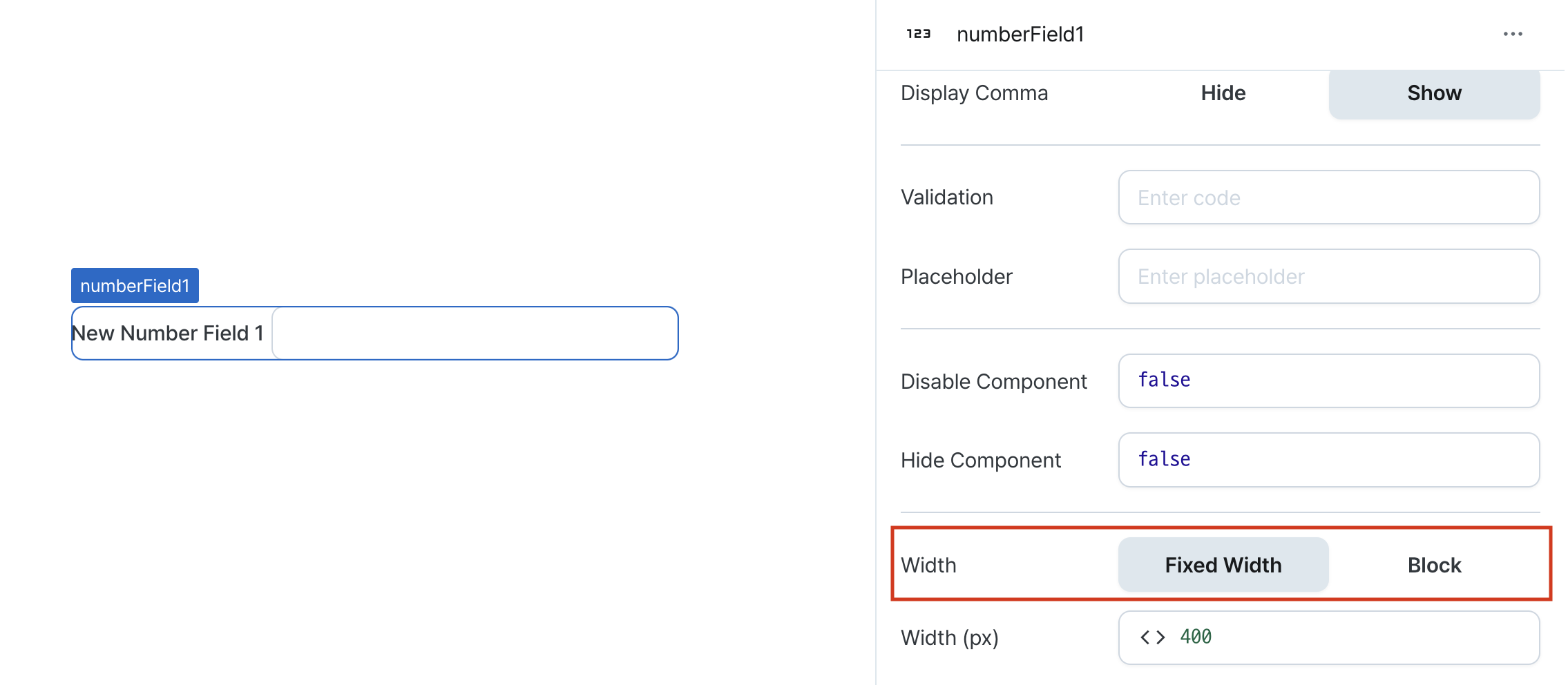
Width (display)
Sets how the component occupies width.
Selecting "Block" enables full-width usage, while "Fixed width" allows you to enter a specific width in pixels.
Fixed-width components can be arranged sequentially.
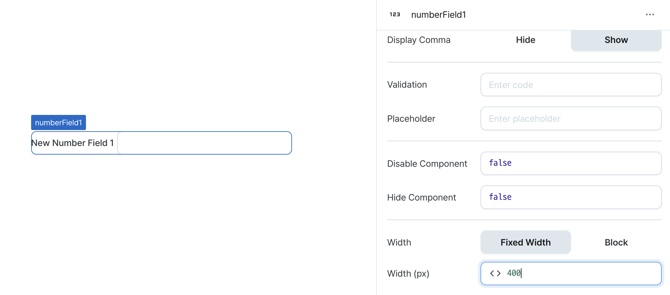
Width (px) (contentWidth)
Sets the component's width in pixels.
Can be set through workflow results, direct input.
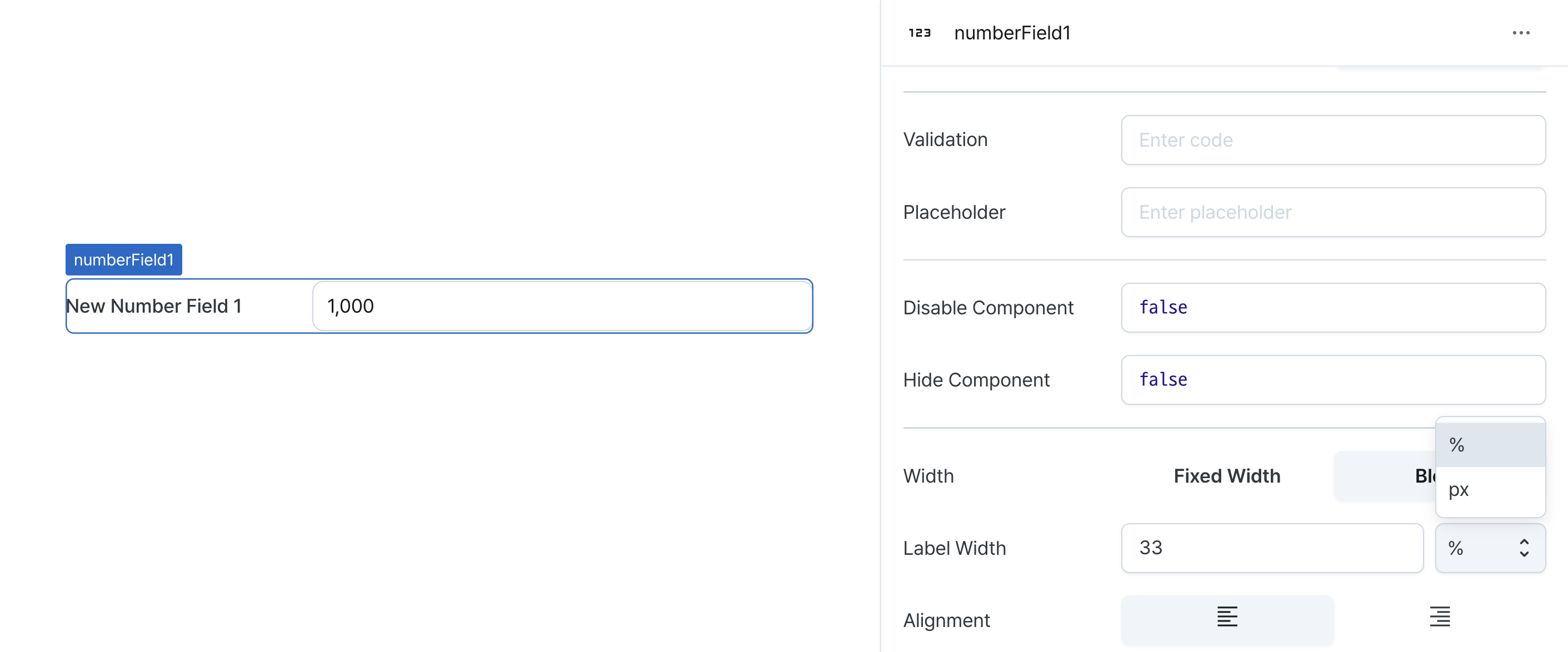
Label Width (labelWidth)
Sets the width of the label section.
Accepts values in pixels or percentages.
Alignment (textAlign)
Sets the horizontal alignment of numbers within the field.
States
| Property | Type | Description |
|---|---|---|
| value | number | The value of the number field |
Type Definitions
type Display = 'inline-block' | 'block';

type NumberFieldFormat = 'general' | 'percent' | 'currency';