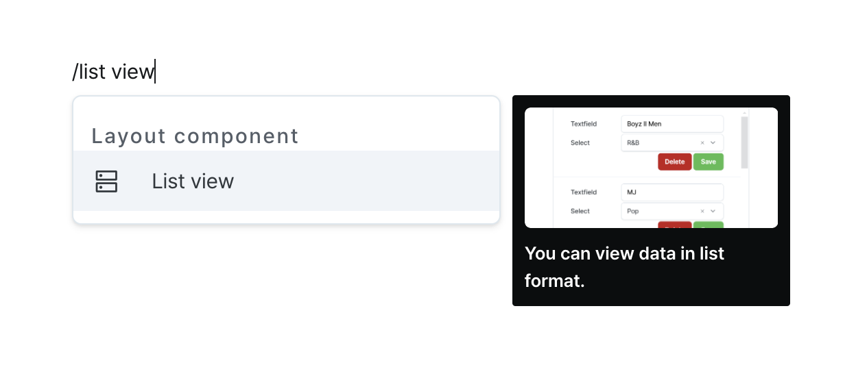
List View
Present repeating data patterns through customizable component templates.
Properties
| Properties | Type | Description |
|---|---|---|
| Name (name) | string | Unique identifier for the list view component |
| Data (code) | string (unknown[]) | Data to be displayed in the list view component |
| Type (type) | ListViewType | Type of the list view component |
| Direction (direction) | ListViewDirection | Direction of the list view component |
| Width (columnWidth) | string | Width of each column when the list view component is in list type and row direction |
| Grid Count (gridCount) | string | Number of grids to display in one row when the list view component is in grid view type |
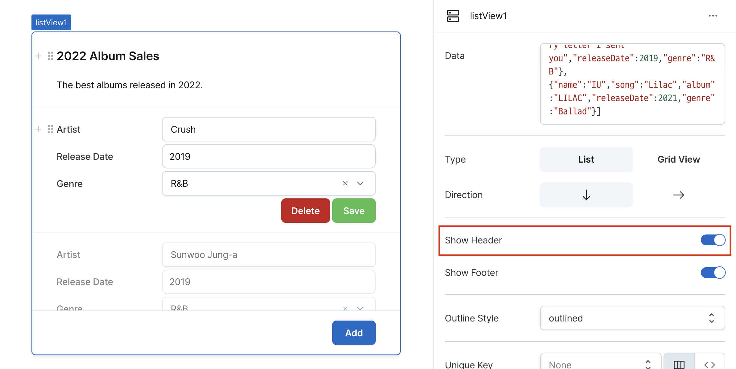
| Show Header (isHeaderVisible) | boolean | Whether to show the list view header |
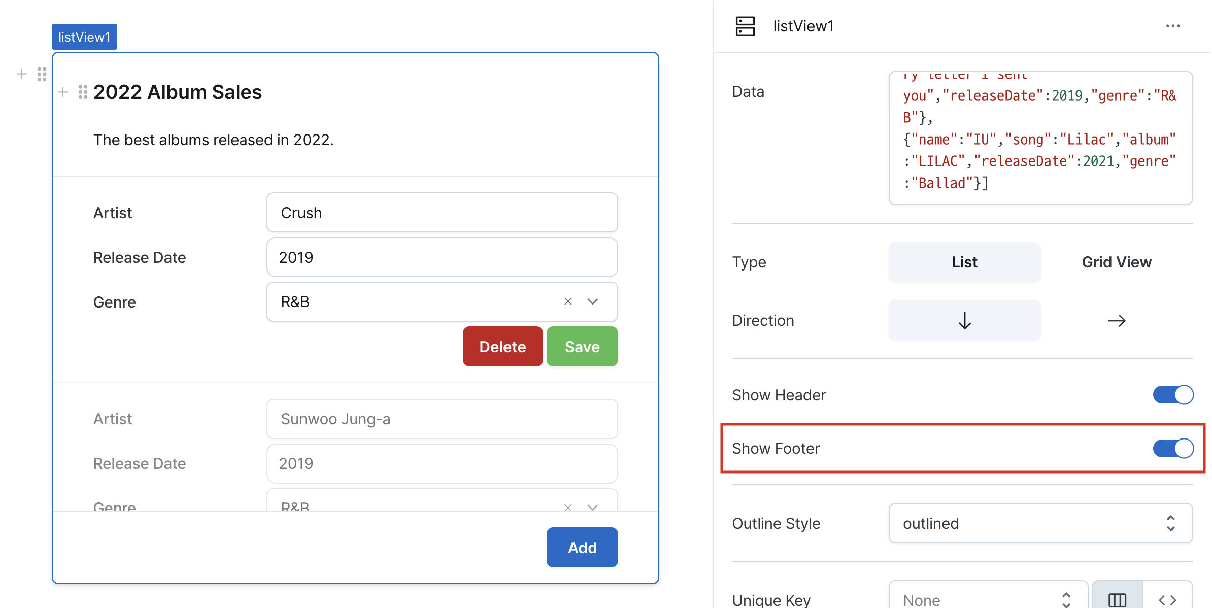
| Show Footer (isFooterVisible) | boolean | Whether to show the list view footer |
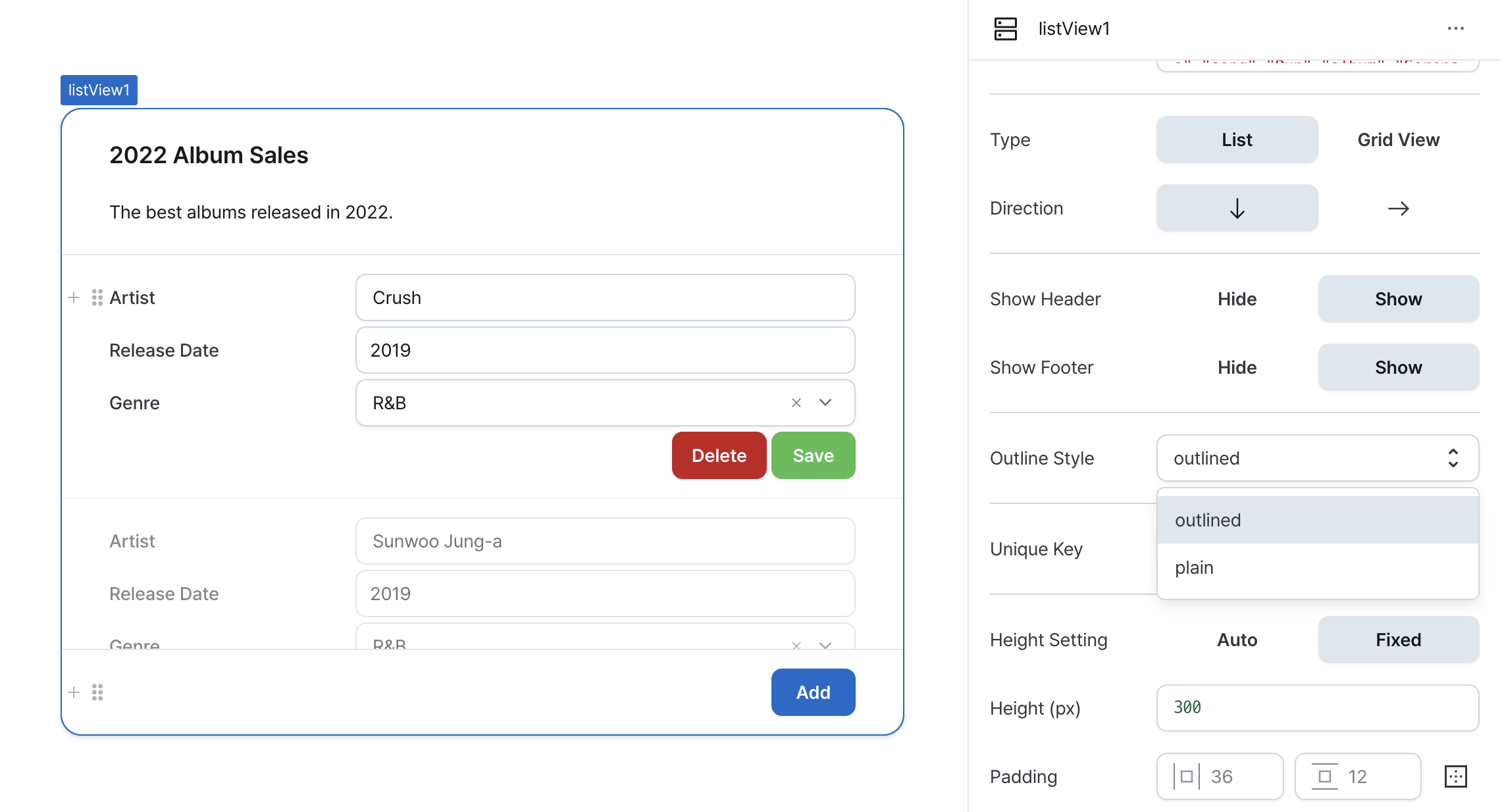
| Outline Style (outlineStyle) | OutlineStyle | Outline style of the list view |
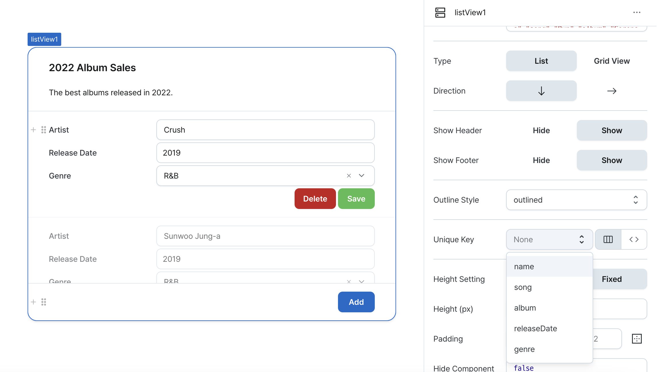
| Unique Key (rowKey) | string | Unique key for list view items |
| Height Setting (isHeightFixed) | boolean | Whether to set a fixed height for the list view content |
| Height (px) (contentHeight) | string | Fixed height of the list view content |
| Padding (padding) | string | number | Padding of the list view's header, body, and footer |
| Hide Component (isHidden) | boolean | Whether to hide the list view on the deployed page |
Name (name)
Sets the unique identifier for the list view component. Please refer to the component naming rules
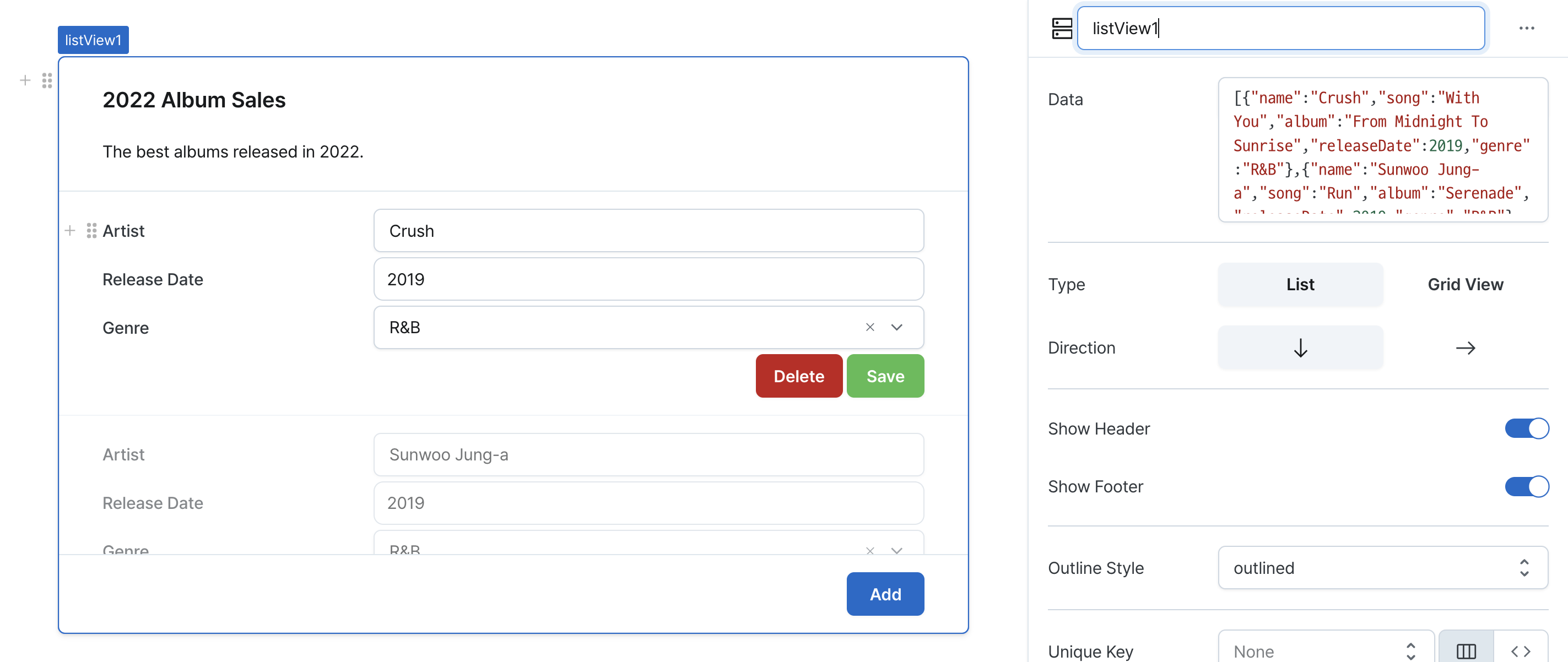
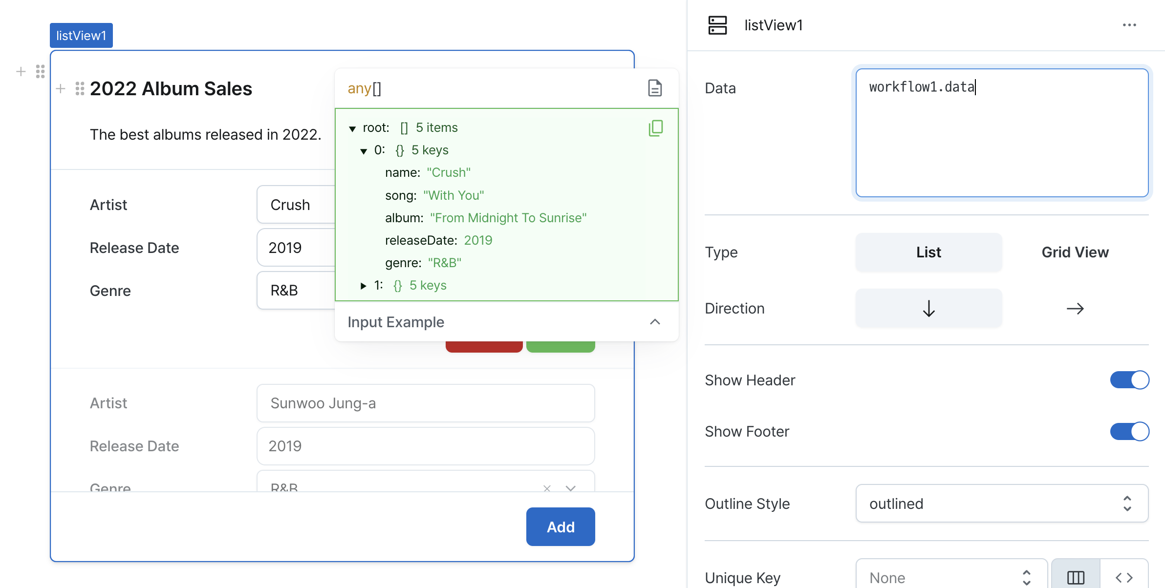
Data (code)
Sets the data series for list items.
Can be set through workflow results, direct input.
-
Direct data input
- Enter array data directly into the data property
- Example:
[
  { name: "Crush", song: "With You", album: "From Midnight To Sunrise", releaseYear: 2019, genre: "R&B" },
  { name: "Sunwoo JungA", song: "Run Away", album: "Serenade", releaseYear: 2019, genre: "R&B" },
  { name: "Kim Dong Ryul", song: "Should I Say I Love You Again", album: "Return", releaseYear: 2001, genre: "Ballad" },
  { name: "Yerin Baek", song: "Square", album: "Every letter I sent you", releaseYear: 2019, genre: "R&B" },
  { name: "IU", song: "Lilac", album: "LILAC", releaseYear: 2021, genre: "Ballad" },
];
-
Workflow execution results
- If the data of a registered workflow returns an array, you can use that workflow's data.
- Example: If a workflow named
playlist1returns the data below, thenplaylist1.datacan be used
[
  { name: "Crush", song: "With You", album: "From Midnight To Sunrise", releaseYear: 2019, genre: "R&B" },
  { name: "Sunwoo JungA", song: "Run Away", album: "Serenade", releaseYear: 2019, genre: "R&B" },
  { name: "Kim Dong Ryul", song: "Should I Say I Love You Again", album: "Return", releaseYear: 2001, genre: "Ballad" },
  { name: "Yerin Baek", song: "Square", album: "Every letter I sent you", releaseYear: 2019, genre: "R&B" },
  { name: "IU", song: "Lilac", album: "LILAC", releaseYear: 2021, genre: "Ballad" },
];
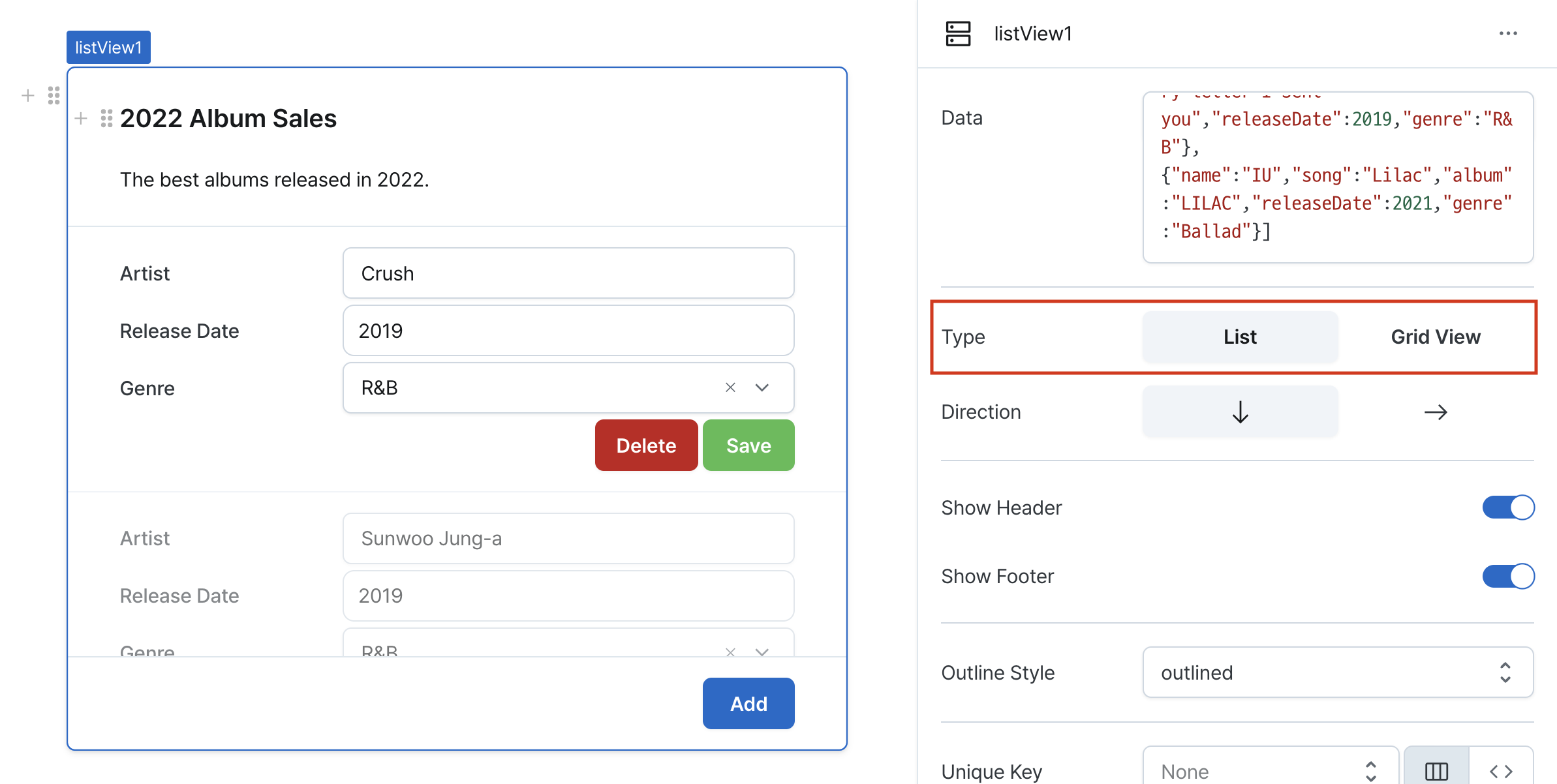
Type (type)
Sets the list view visualization style.
Options:
list: Traditional list layoutgrid: Grid-based layout
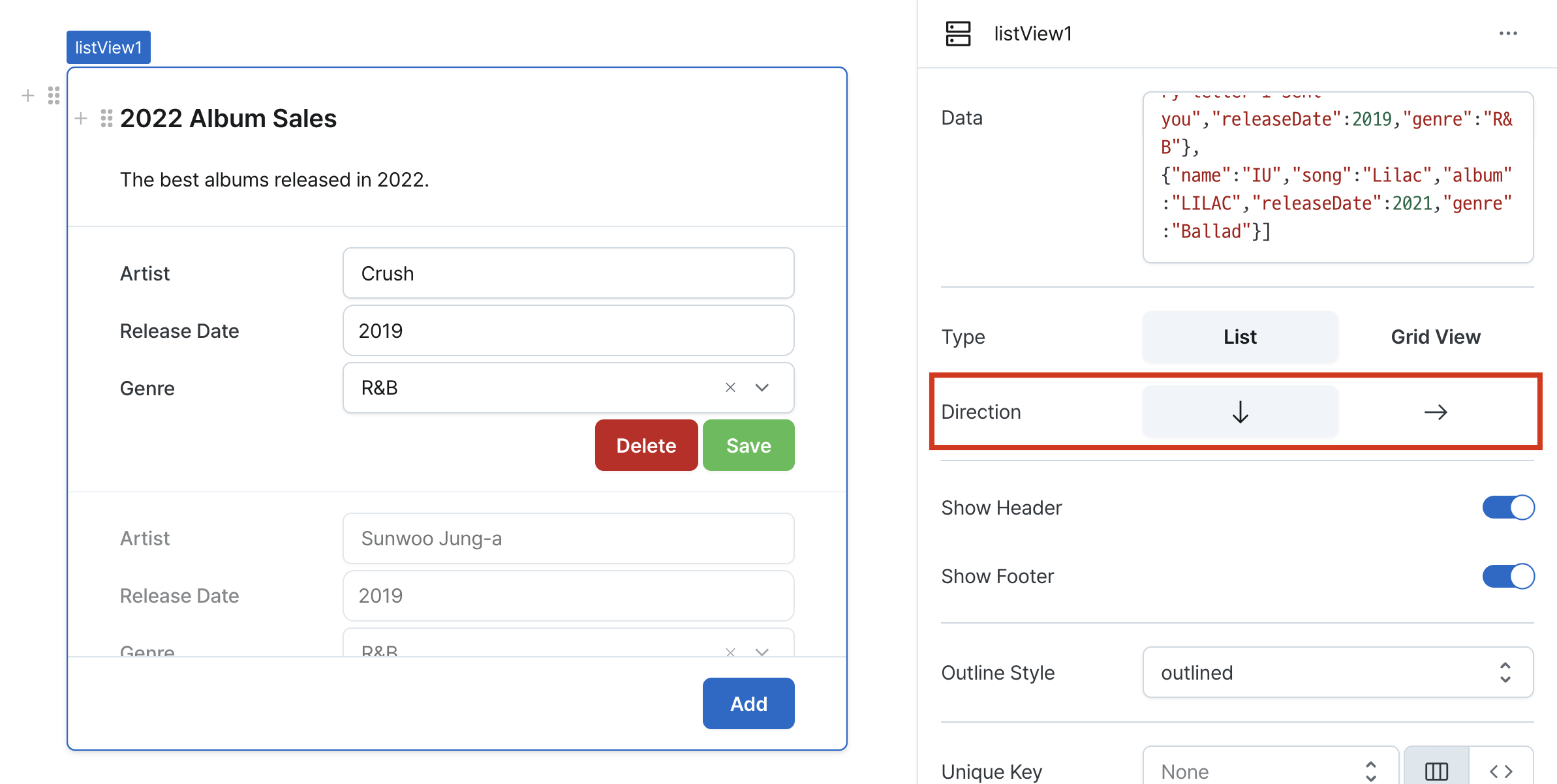
Direction (direction)
Controls item arrangement in list type.
Options:
row: Multiple items per rowcolumn: One item per row
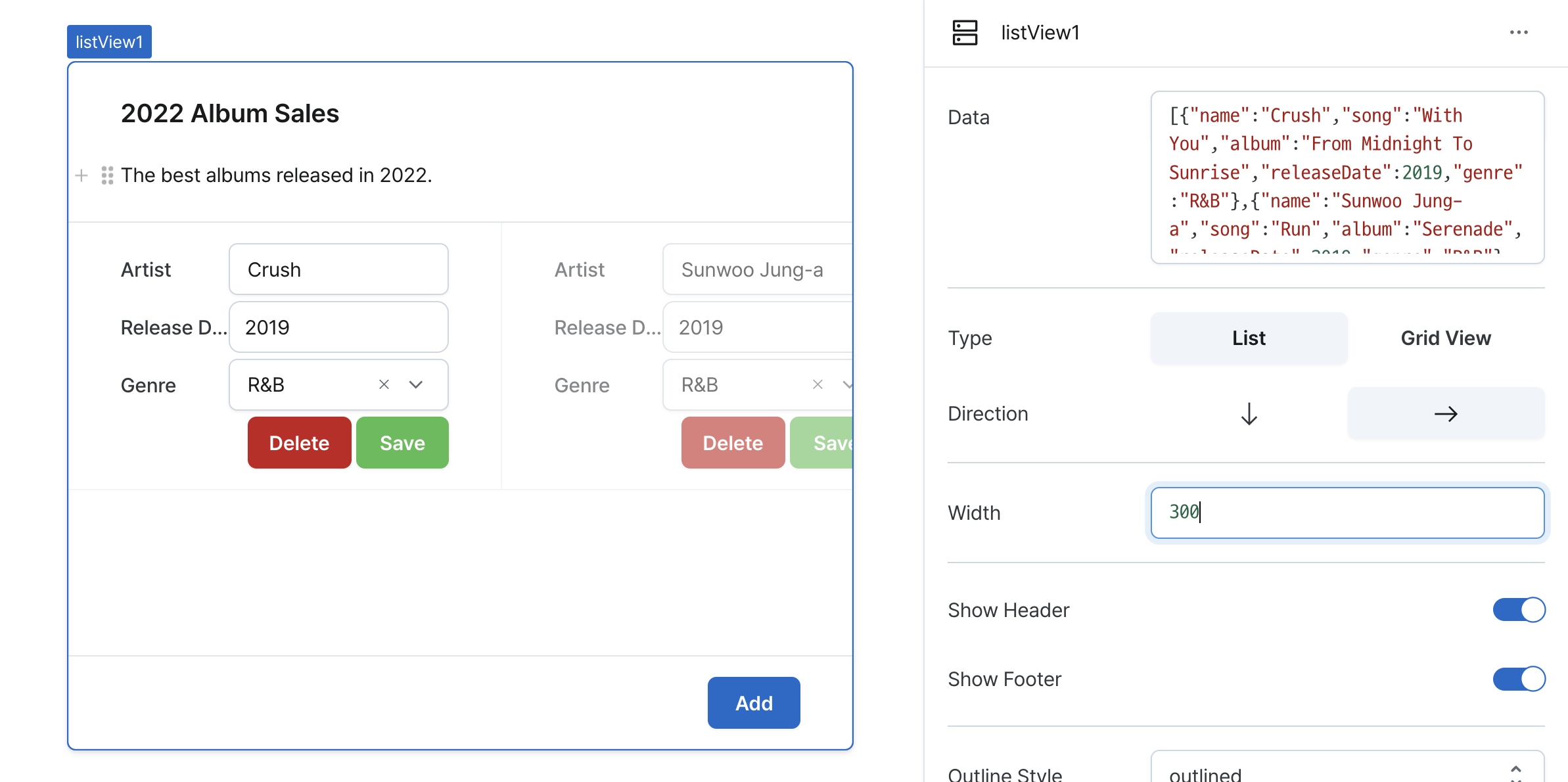
Width (columnWidth)
Sets column width for row-direction lists.
Defines width of each list item column.
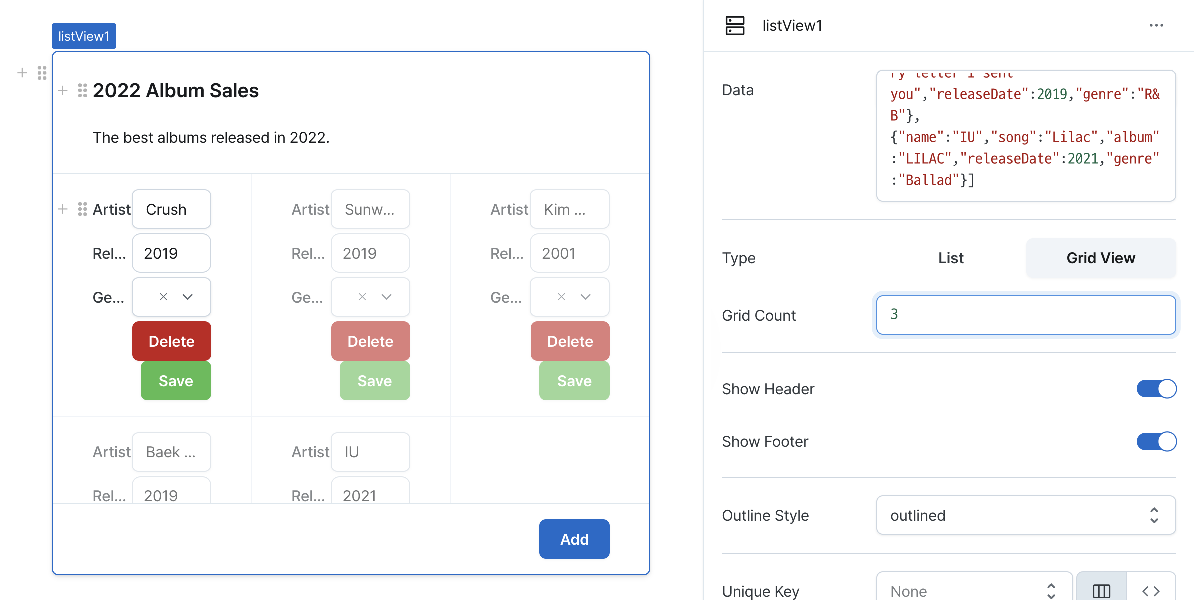
Grid Count (gridCount)
Sets number of items per row in grid view.
Controls grid layout column count.
Show Header (isHeaderVisible)
Controls visibility of the list view header.
When enabled, displays customizable header section.
Show Footer (isFooterVisible)
Controls visibility of the list view footer.
When enabled, displays customizable footer section.
Outline Style (outlineStyle)
Sets the component's outline style.
Options:
outlined: Displays bordered styleplain: Shows minimal style without border
Unique Key (rowKey)
Selects unique identifier field for list items.
Choose a field with unique values to identify and manage individual items.
Height Setting (isHeightFixed)
Controls height behavior of the component.
When set to 'auto', height adjusts automatically to content.

Height (px) (contentHeight)
Sets the component's vertical height.
Can be set through workflow results, direct input.

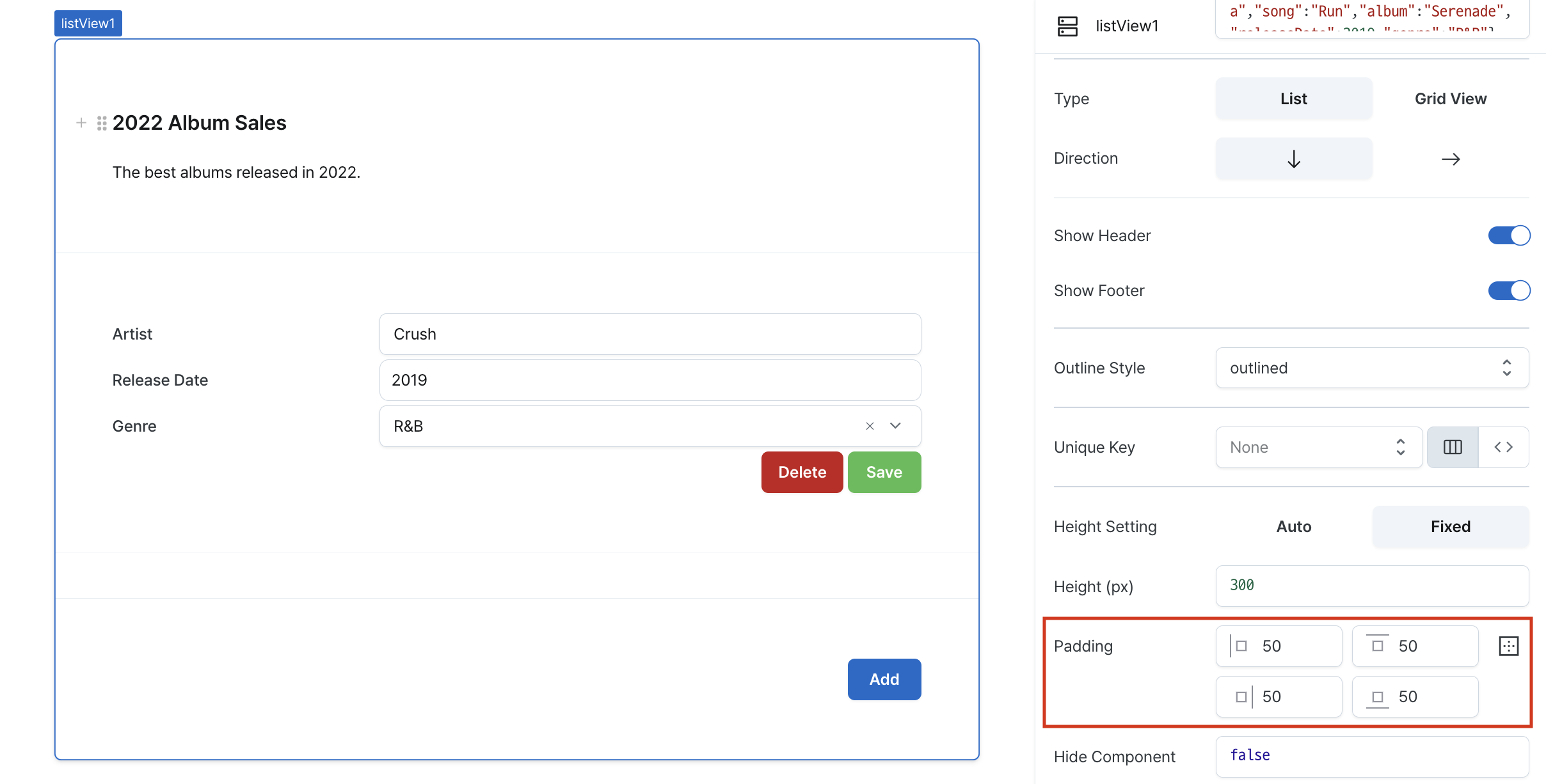
Padding (padding)
Applies the same padding to the header, body and footer.
Sets internal spacing of the component.
Input options:
- Single value: Uniform padding on all sides (e.g.,
36) - Comma-separated values: Different padding per side (e.g.,
36,24) - Expanded mode: Individual control of top, right, bottom, left
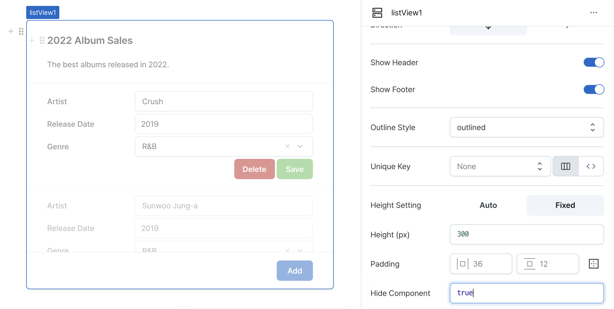
Hide Component (isHidden)
Controls visibility of the component.
When set to true:
- Hidden in deployed view
- Visible with reduced opacity in edit mode
Header
Configurable section above list items.
Available when header visibility is enabled.
Supports all components except list view and table.
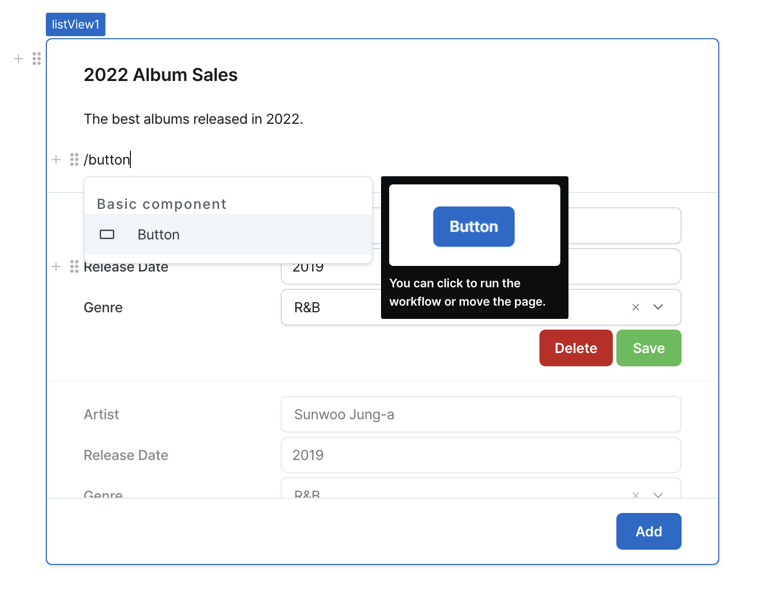
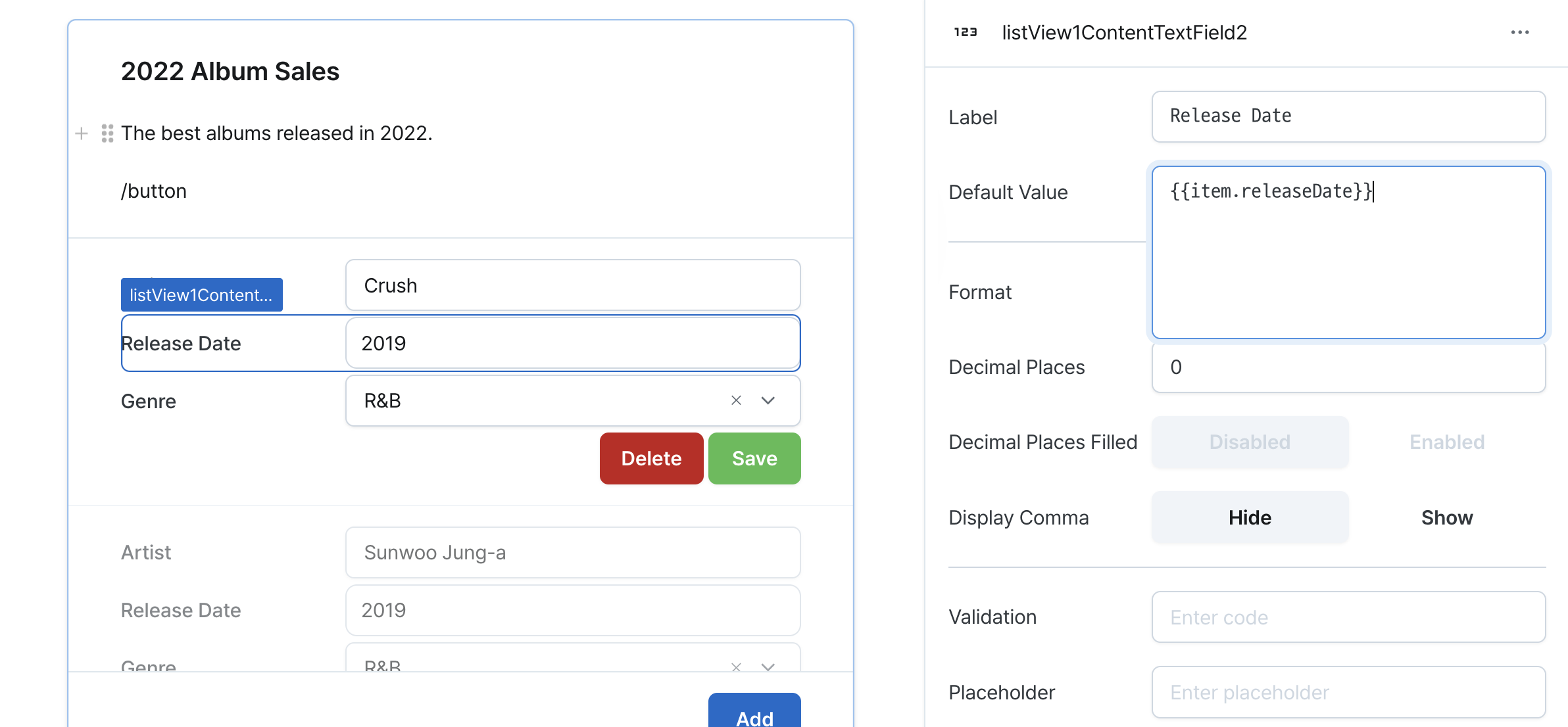
Content
Main content area defining list item template.
Features:
- Components in first item act as template
- Template repeats for each data item
- Access to currentIndex and item variables
- Components maintain individual states
Handling State
Example:
- If the list view name is
listView1and the textField name of the first item istextField1, usetextField1[0].valueto get the value of the first textField. - To get the values of all
textFieldinside the list view, usetextField1.map((textField) => textField.value).
Footer
Configurable section below list items.
Available when footer visibility is enabled.
Supports all components except list view and table.
States
| Properties | Type | Description |
|---|---|---|
| data | unknown[] | Data of the list view component |
| type | ListViewType | Type of the list view component |
| direction | ListViewDirection | Direction of the list view component |
| columnWidth | number | Width of each column when the list view component is in list type and row direction |
| gridCount | number | Number of grids to display in one row when the list view component is in grid view type |
| itemsCount | number | Number of repeated items in the list view component |
| rowKeys | unknown[] | undefined | Unique key for list view items |
| isHeightFixed | boolean | Whether to set a fixed height for the list view content |
| contentHeight | number | Fixed height of the list view content |
| isHidden | boolean | Whether to hide the list view on the deployed page |
| values | Record<string, unknown>[] | Values of components inside the list view component content |
Type Definitions
export type ListViewType = 'list' | 'grid';
export type ListViewDirection = 'column' | 'row';

interface ListViewState {
  isHidden: boolean;
  isHeightFixed: boolean;
  columnWidth?: number;
  contentHeight: number;
  data?: unkonwn[];
  direction?: ListViewDirection;
  gridCount?: number;
  itemsCount: number;
  rowKeys: unknown[] | undefined;
  type: ListViewType;
}

type OutlineStyle = 'outlined' | 'plain';