WYSIWYG Editor
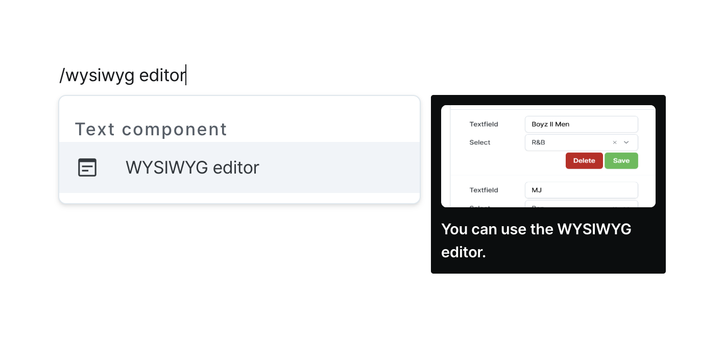
Create rich text content with formatting tools and image support.
Properties
| Property | Type | Description |
|---|---|---|
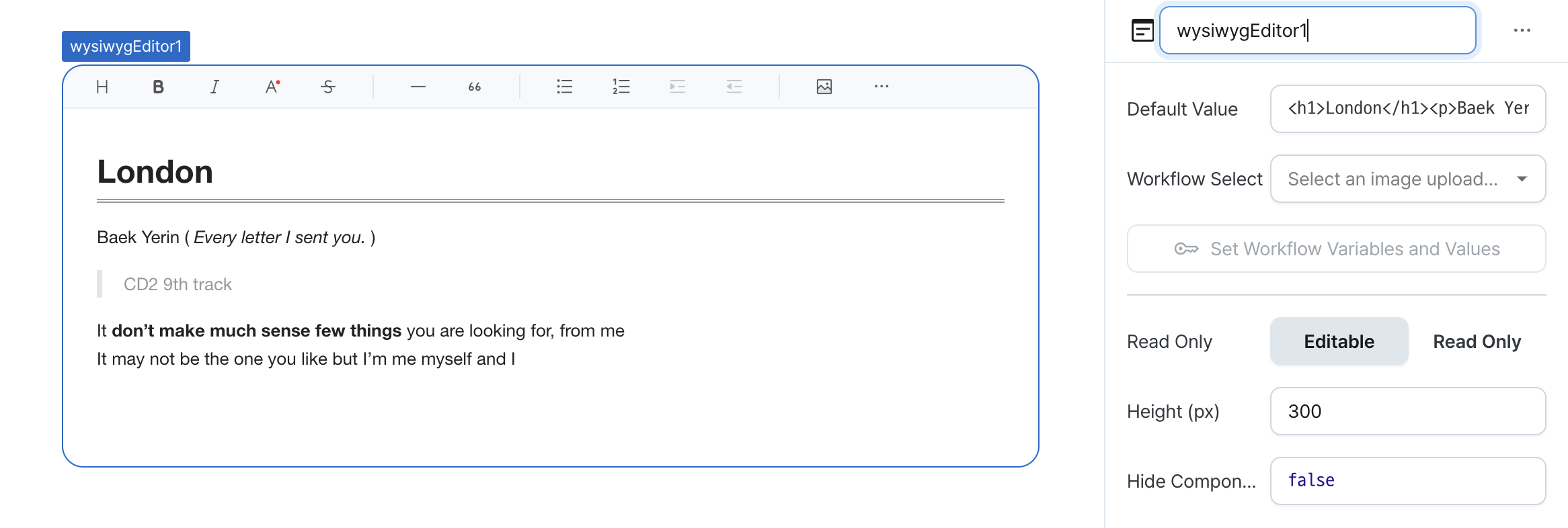
| Name (name) | string | Unique identifier for the wysiwyg editor component |
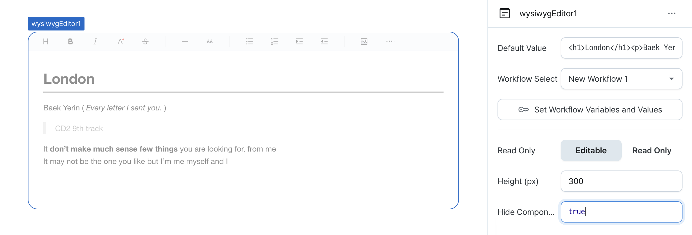
| Default Value (defaultValue) | string | Default HTML (template) input for the wysiwyg editor |
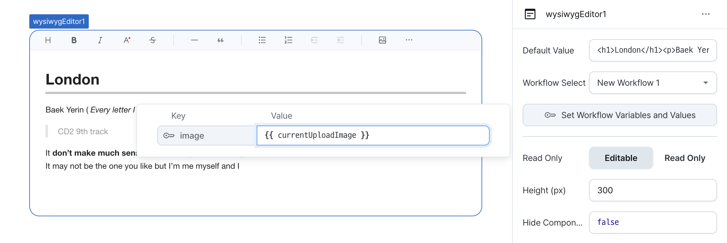
| Workflow Select (handler) | ActionHandler | Defines behavior when uploading images |
| Read Only (isReadonly) | boolean | Whether the wysiwyg editor is read-only |
| Height (px) (height) | number | Height of the wysiwyg editor |
| Hide Component (isHidden) | boolean | Whether to hide the wysiwyg on the deployed page |
Name (name)
Sets the unique identifier for the wysiwyg editor component. Please refer to the component naming rules
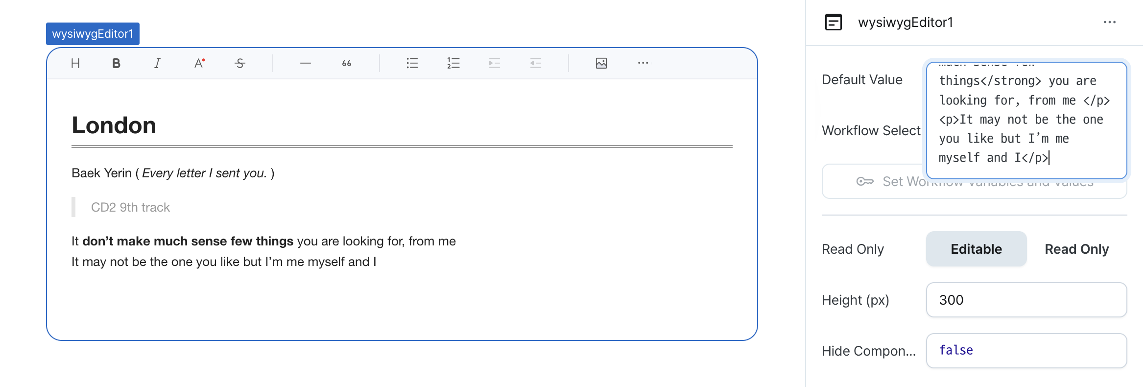
Default Value (defaultValue)
Sets the default HTML content for the editor.
Can be set through workflow results, direct input.
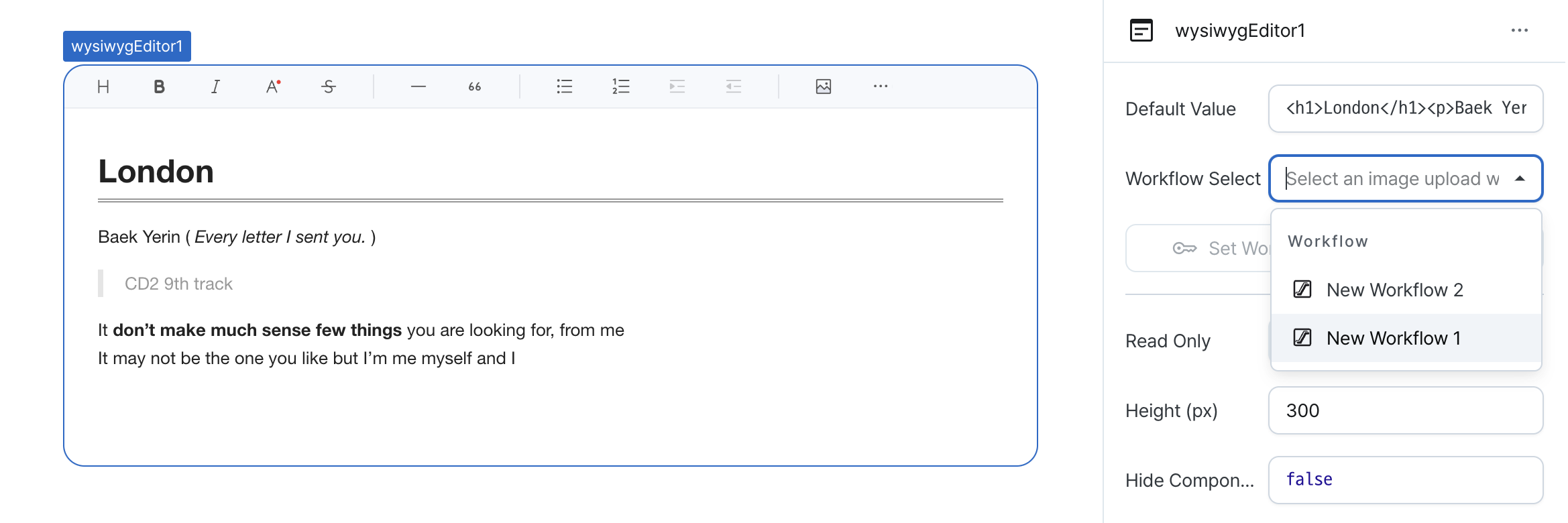
Workflow Select (handler)
Configures image upload behavior.
Options:
- Pass workflow variables for upload configuration
- Access upload image data via currentUploadImage
Common usage:
- Create workflow for cloud storage (e.g., Amazon S3) upload
- Return image URL as string after successful upload
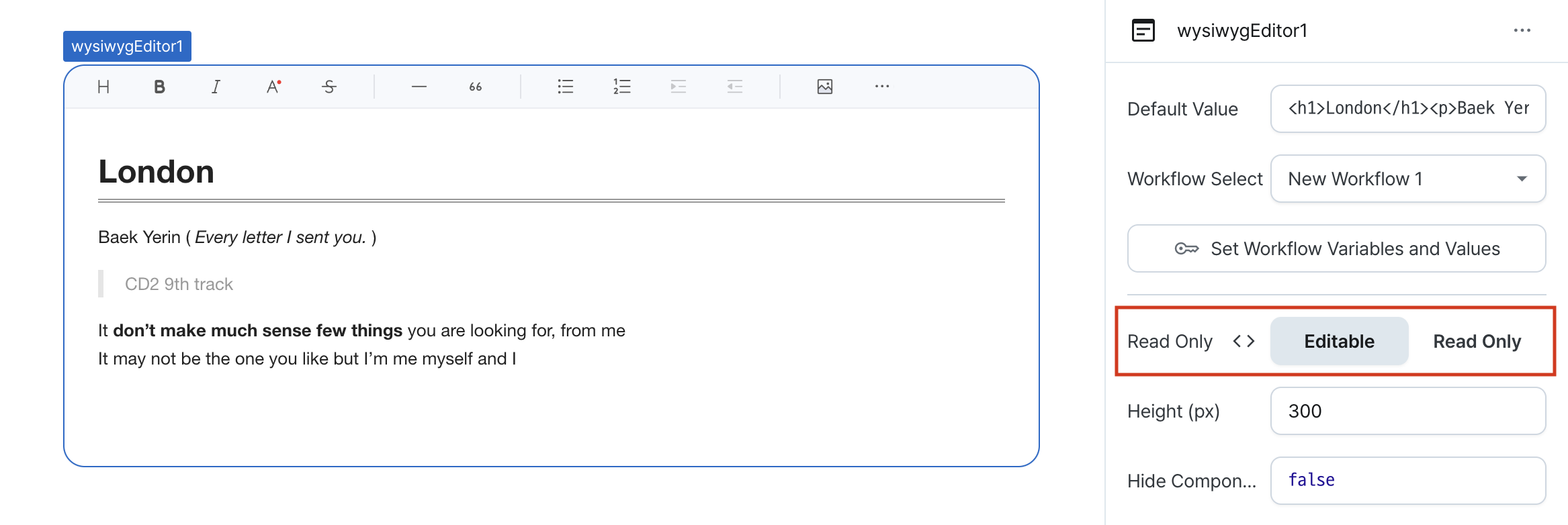
Read Only (isReadonly)
Controls the edit state of the component.
When enabled, prevents content modification while allowing viewing.
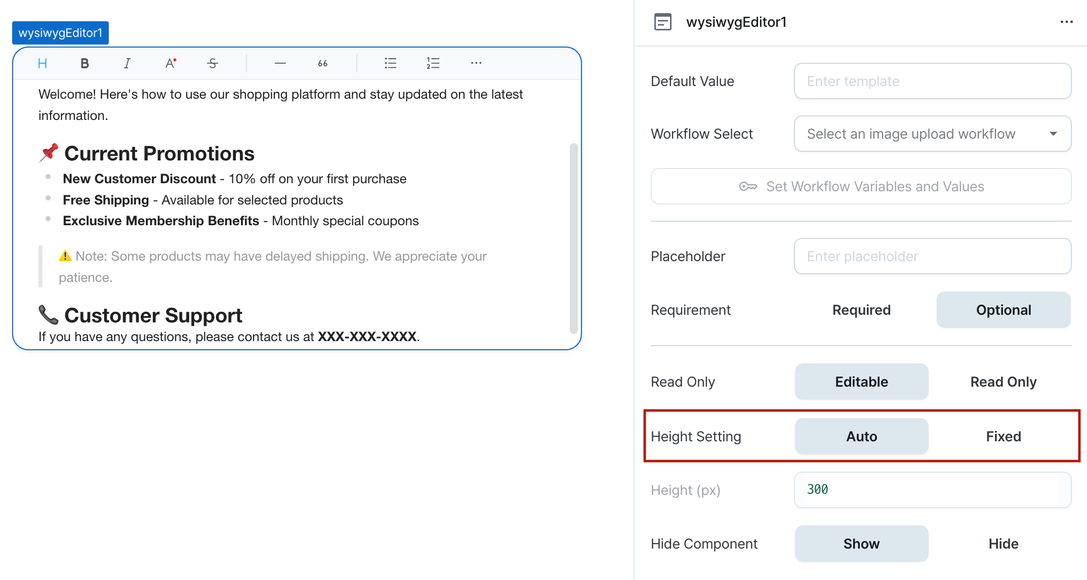
Height Setting (isHeightFixed)
Controls height behavior of the component.
When set to 'auto', height adjusts automatically to content.
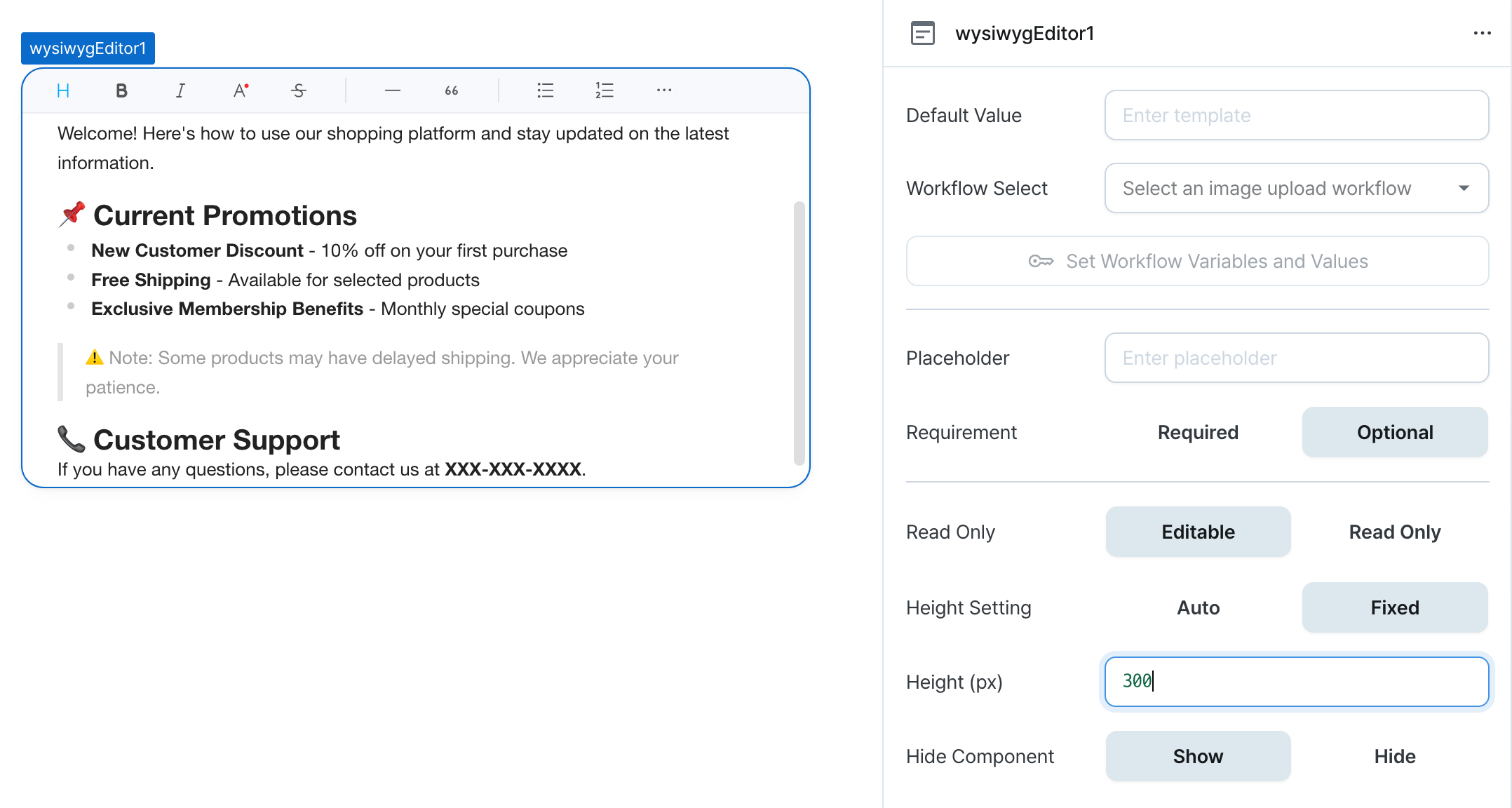
Height (px) (contentHeight)
Sets the component's vertical height.
Can be set through workflow results, direct input.
Hide Component (isHidden)
Controls visibility of the component.
When set to true:
- Hidden in deployed view
- Visible with reduced opacity in edit mode
States
| Property | Type | Description |
|---|---|---|
| value | string | The result of converting the document entered in the wysiwyg editor to HTML |
Type Definitions
interface ExecuteWorkflowEventAction {
  type: 'workflow';
  workflowId: string;
  variables: Record<string, string>;
}

interface ActionHandler {
  action: ExecuteWorkflowEventAction;
}