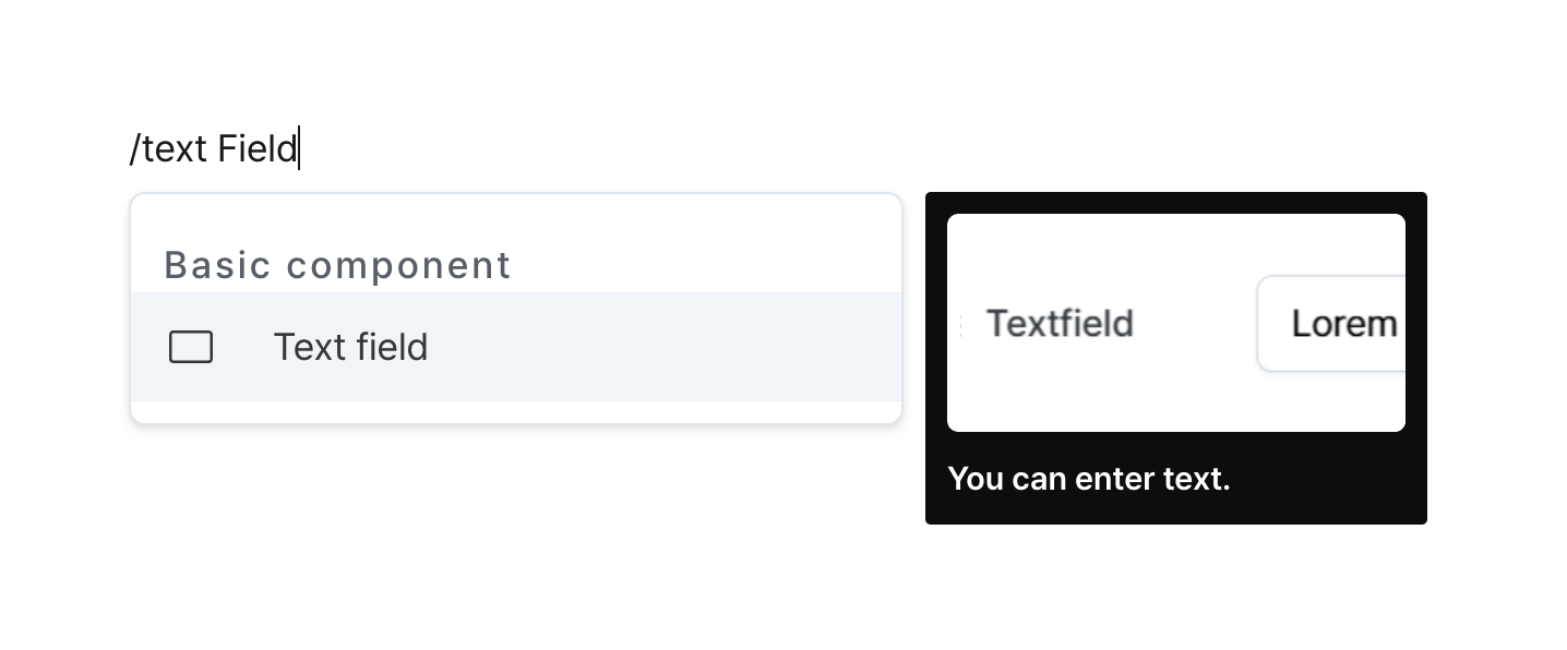
Text Field
Input and manage single-line text with validation options.
Properties
| Property | Type | Description |
|---|---|---|
| Name (name) | string | Unique identifier for the text field component |
| Label (label) | string | Text displayed on the left side of the text field |
| Default Value (defaultValue) | string | The default value template applied to the text field |
| Validaton (validator) | string | Validator for the text value |
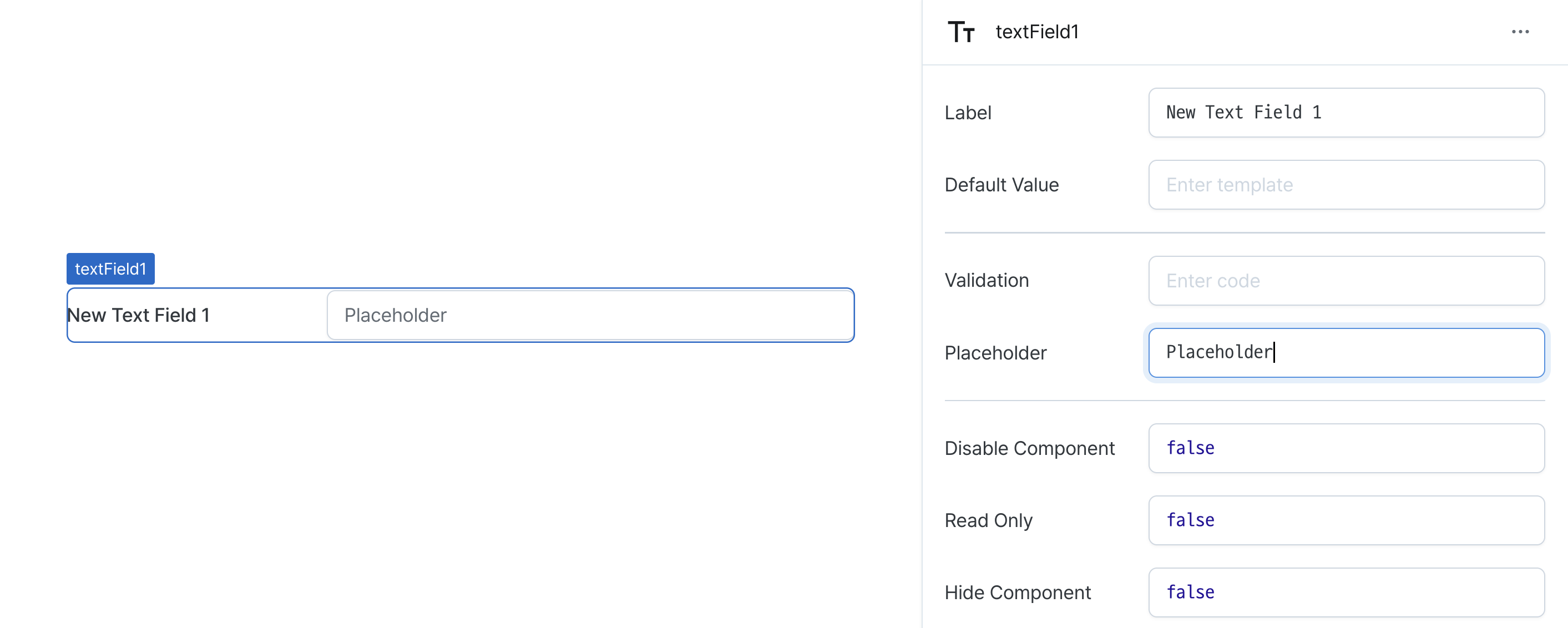
| Placeholder (placeholder) | string | Placeholder applied to the text field |
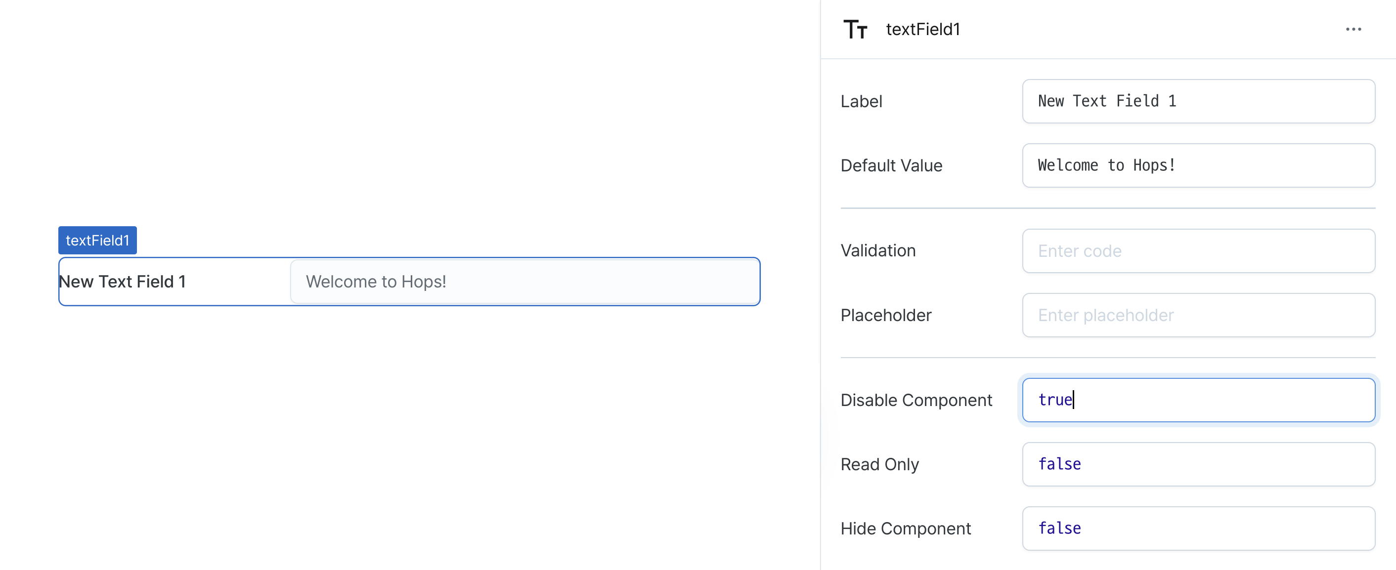
| Disable Component (isDisabled) | boolean | Whether the text field is disabled |
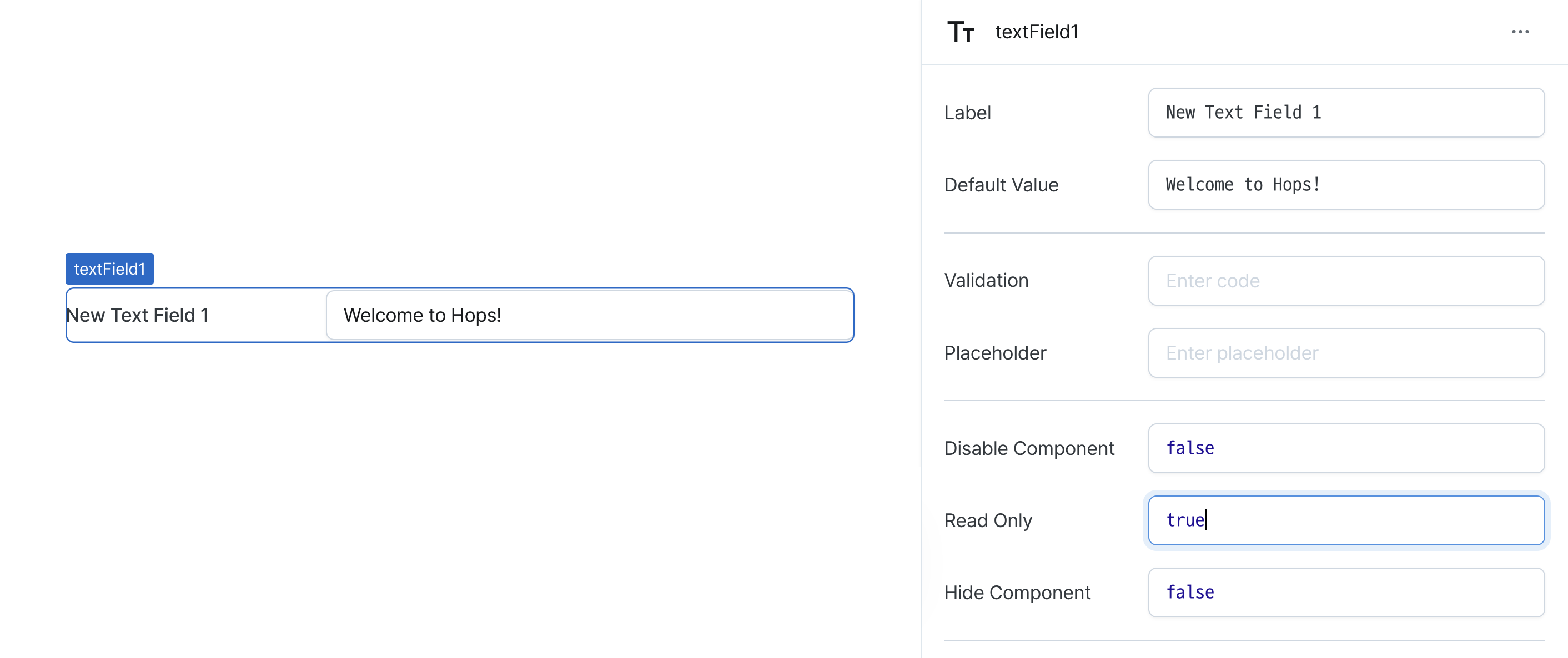
| Read Only (isReadonly) | boolean | Whether the text field is read-only |
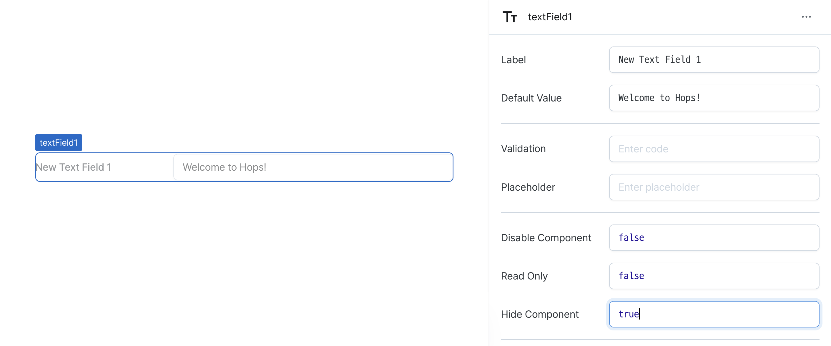
| Hide Component (isHidden) | boolean | Whether to hide the text field on the deployed page |
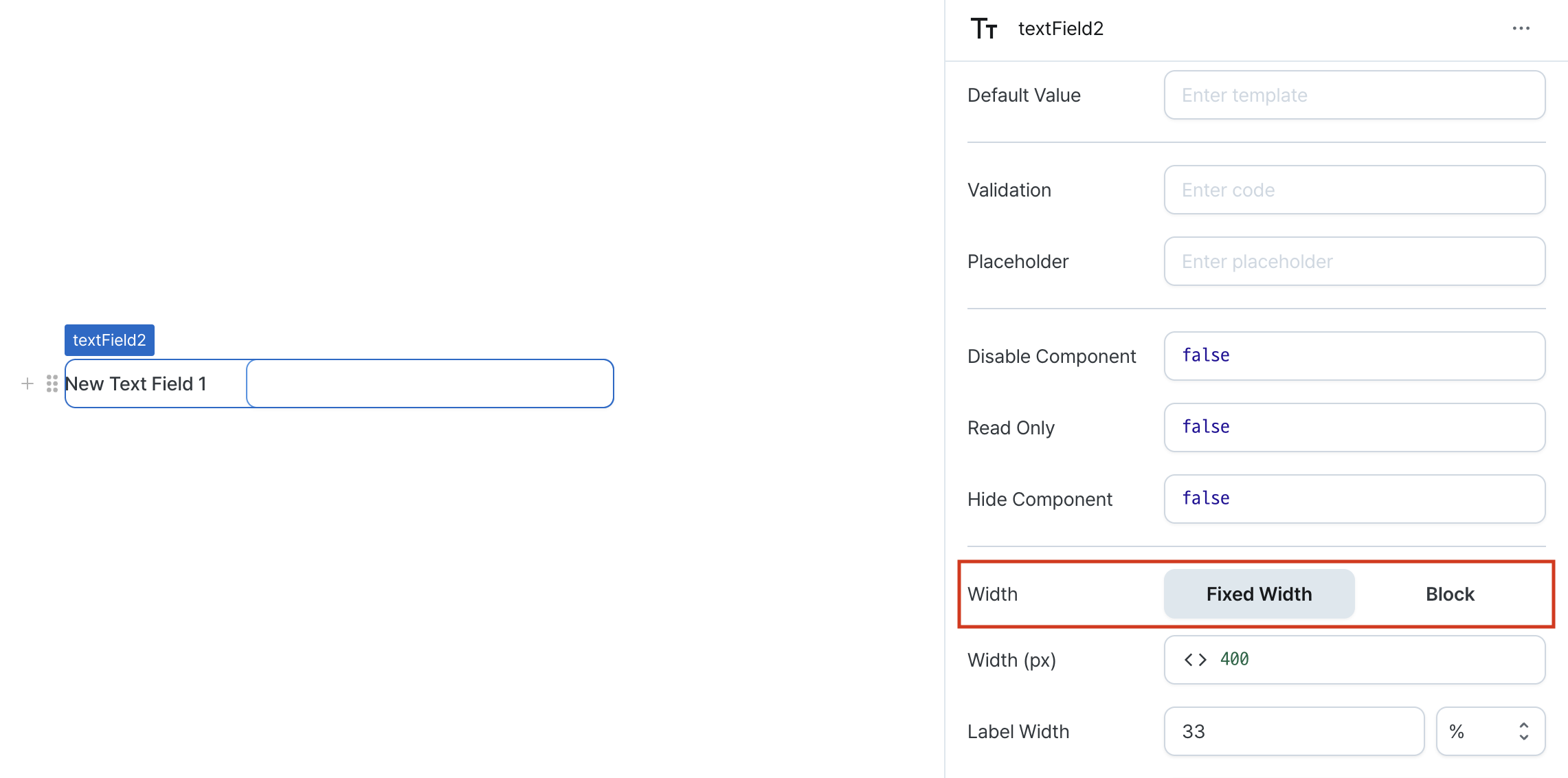
| Width (display) | Display | How the text field occupies width |
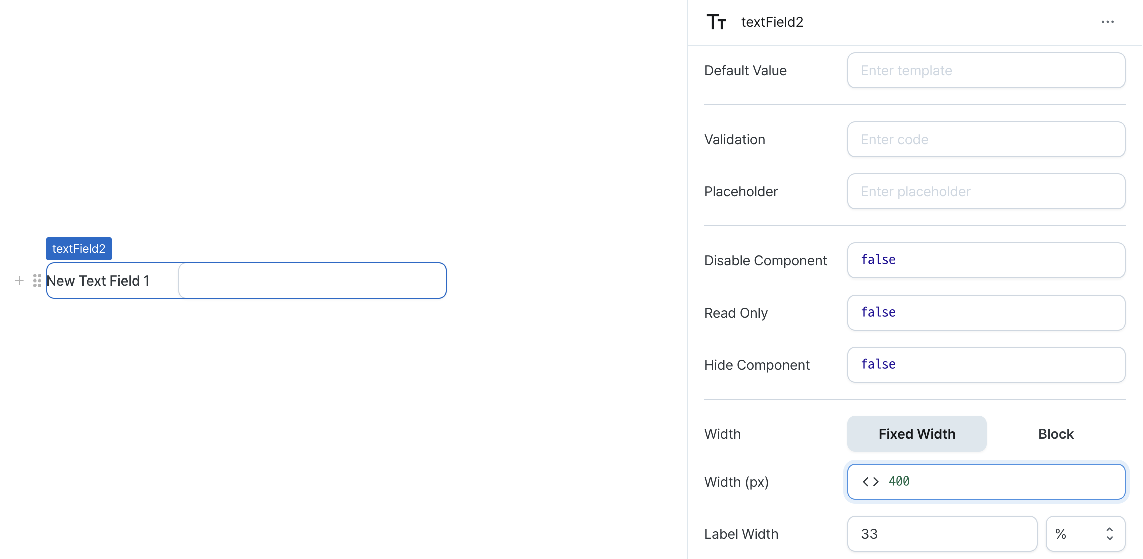
| Width (px) (contentWidth) | string (number) | Fixed width of the text field |
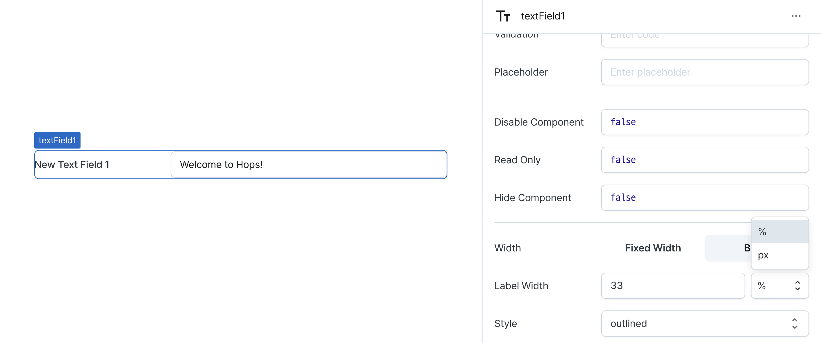
| Label Width (labelWidth) | string | The width of the label on the left side of the text field |
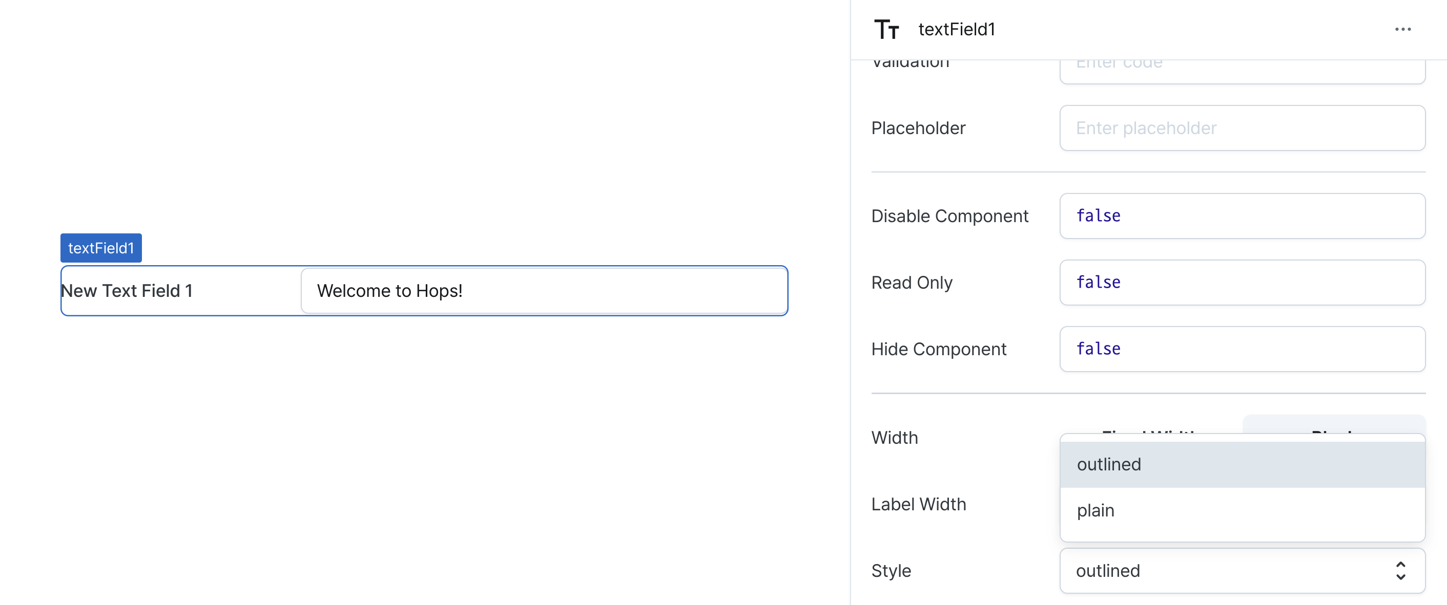
| Style (variant) | string | Text field variant style |
Name (name)
Sets the unique identifier for the text field component. Please refer to the component naming rules
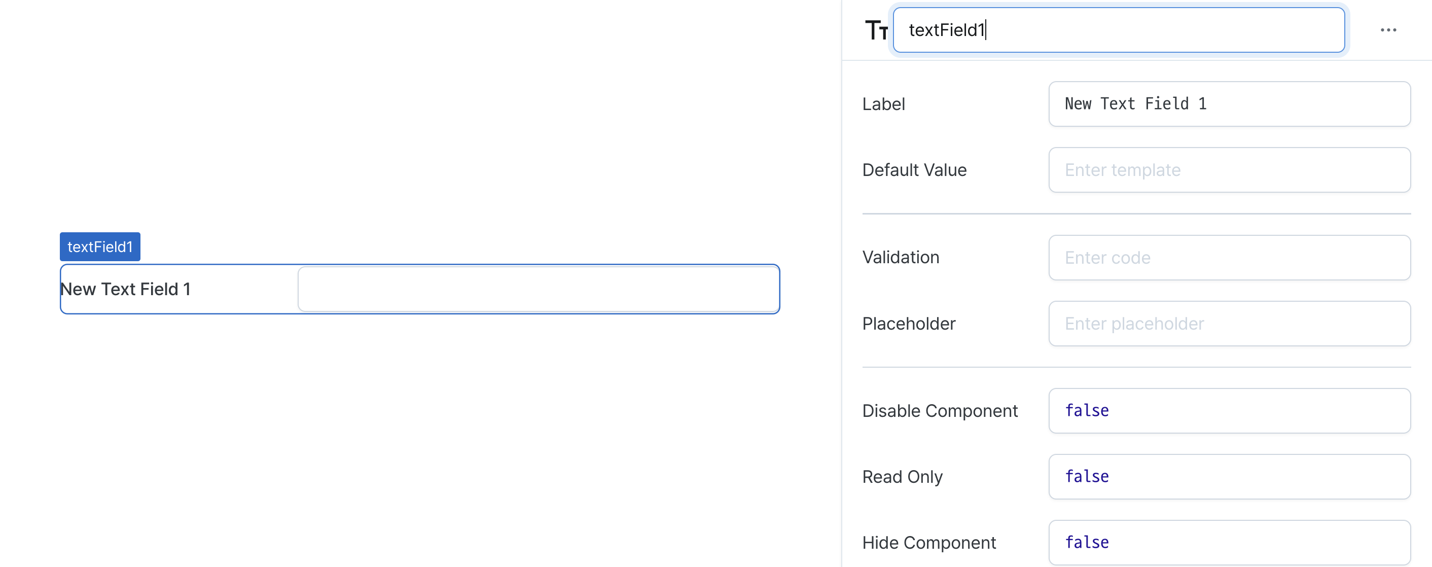
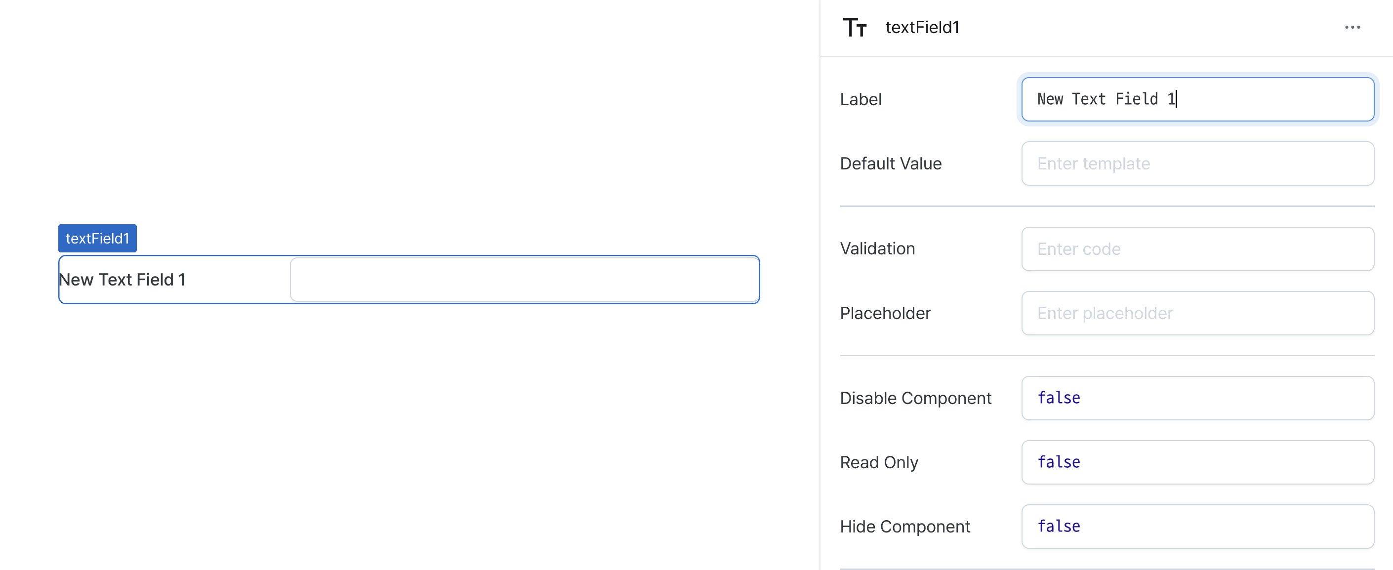
Label (label)
Sets the text displayed on the left side of the text field. (Supports Template Text)
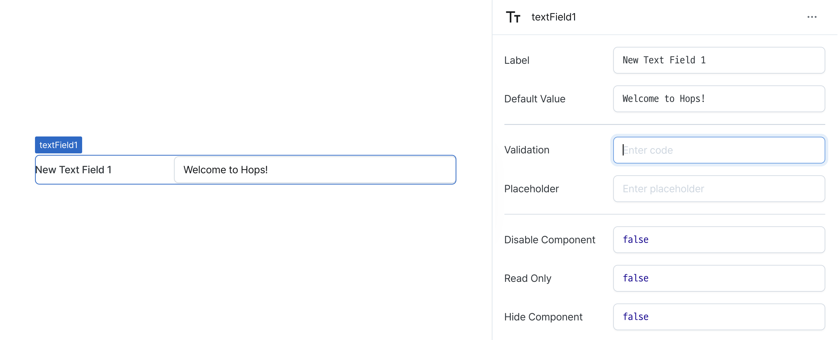
Default Value (defaultValue)
Sets the default value for the component.
Can be set through workflow results, direct input.

Validaton (validator)
Sets validation rules for the field.
Can be set through workflow results, direct input.
This validates the field value and displays error messages.
// Default error message
value !== 'Hello World'

// Custom error message
value !== 'Hello World' ? 'value is not Hello World' : undefined
Placeholder (placeholder)
Sets the field's placeholder text.
Disable Component (isDisabled)
Sets the disabled state of the component.
Can be set through workflow results, direct input.
When enabled, prevents user interaction with the component.
Read Only (isReadonly)
Controls the edit state of the component.
When enabled, prevents content modification while allowing viewing.
Hide Component (isHidden)
Controls visibility of the component.
When set to true:
- Hidden in deployed view
- Visible with reduced opacity in edit mode
Width (display)
Sets how the component occupies width.
Selecting "Block" enables full-width usage, while "Fixed width" allows you to enter a specific width in pixels.
Fixed-width components can be arranged sequentially.
Width (px) (contentWidth)
Sets the component's width in pixels.
Can be set through workflow results, direct input.
Label Width (labelWidth)
Sets the width of the label section.
Accepts values in pixels or percentages.
Style (variant)
Sets the text field's style.
outlined: Style with bordersplain: Style without borders
States
| Property | Type | Description |
|---|---|---|
| value | string | The value of text field |
Type Definitions
type Display = 'inline-block' | 'block';