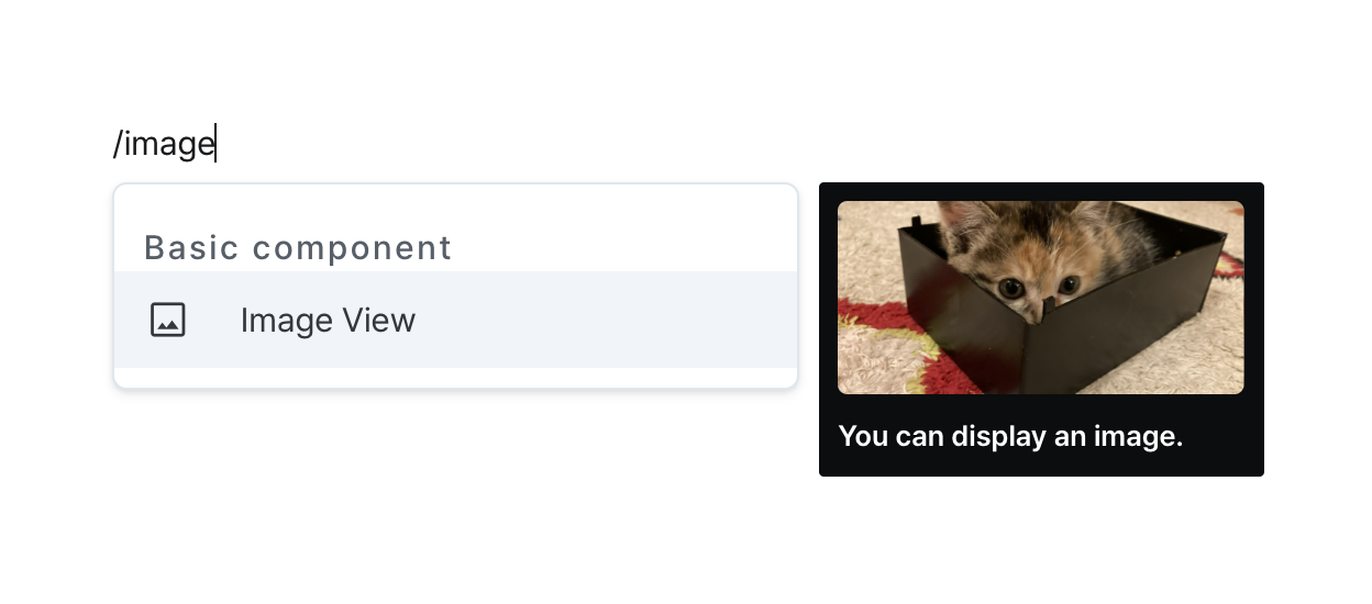
Image View
Display images with flexible sizing and presentation options.
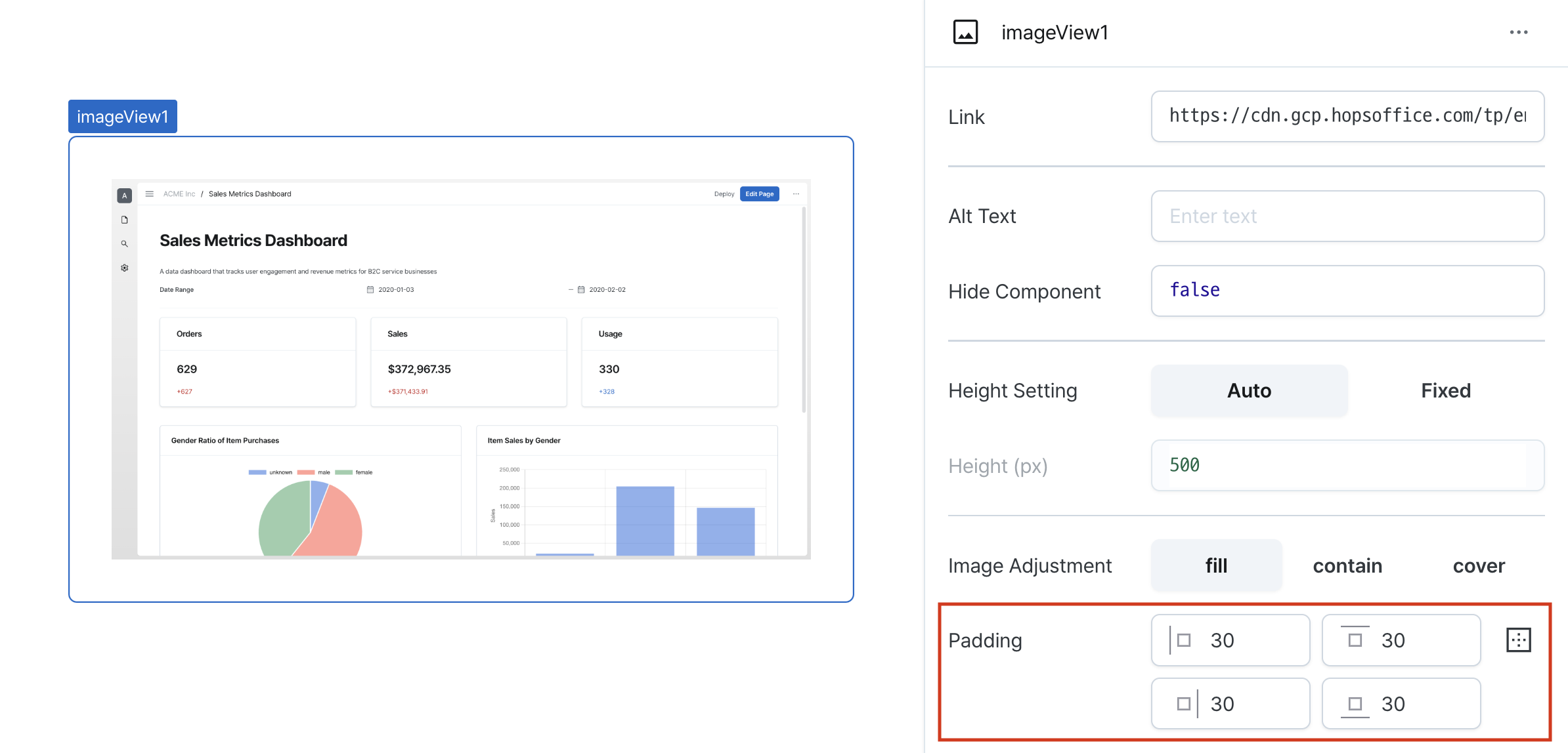
Properties
| Property | Type | Description |
|---|---|---|
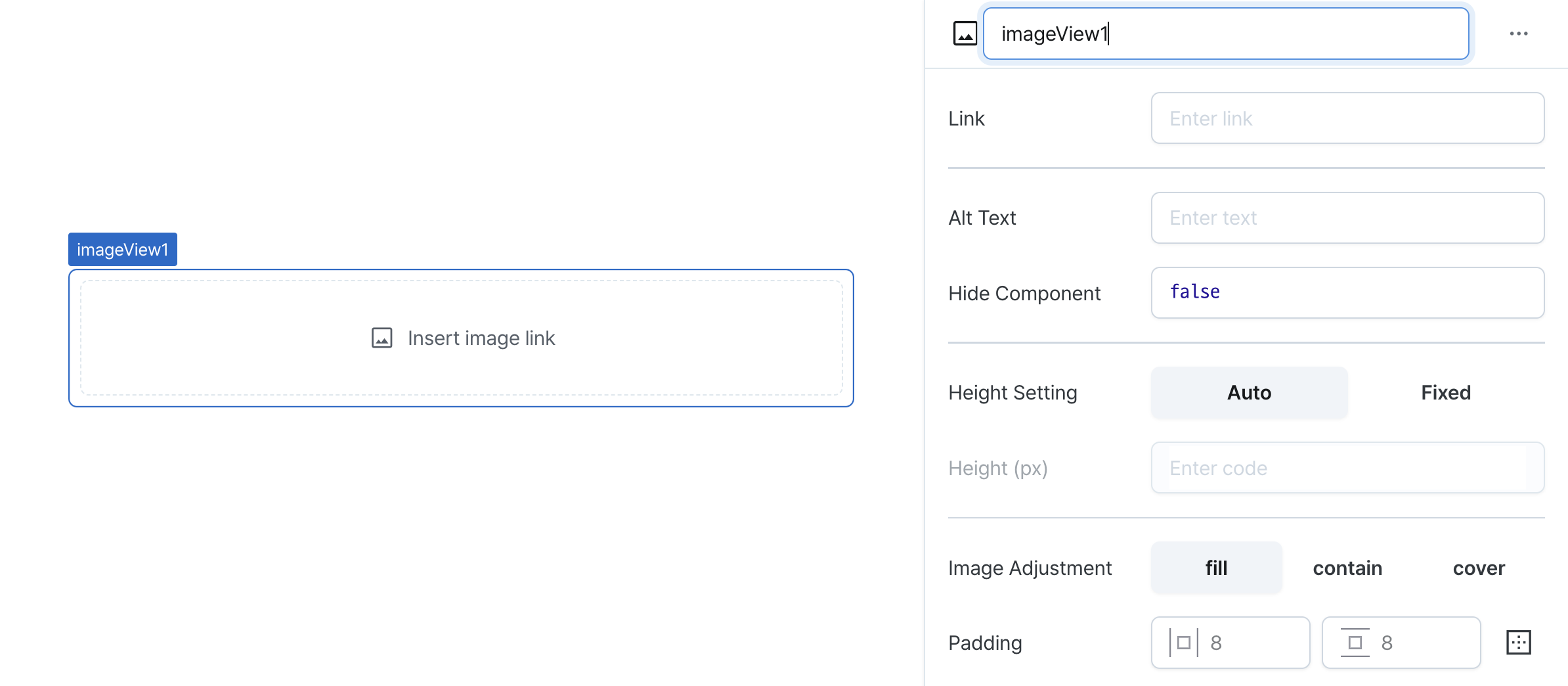
| Name (name) | string | Unique identifier for the image view component |
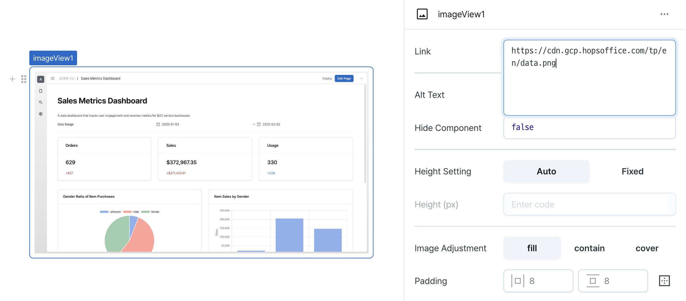
| Link (url) | string | URL of the image to display |
| Alt Text (altText) | string | Text to show when the image cannot be displayed |
| Hide Component (isHidden) | boolean | Whether to hide the image view on the deployed page |
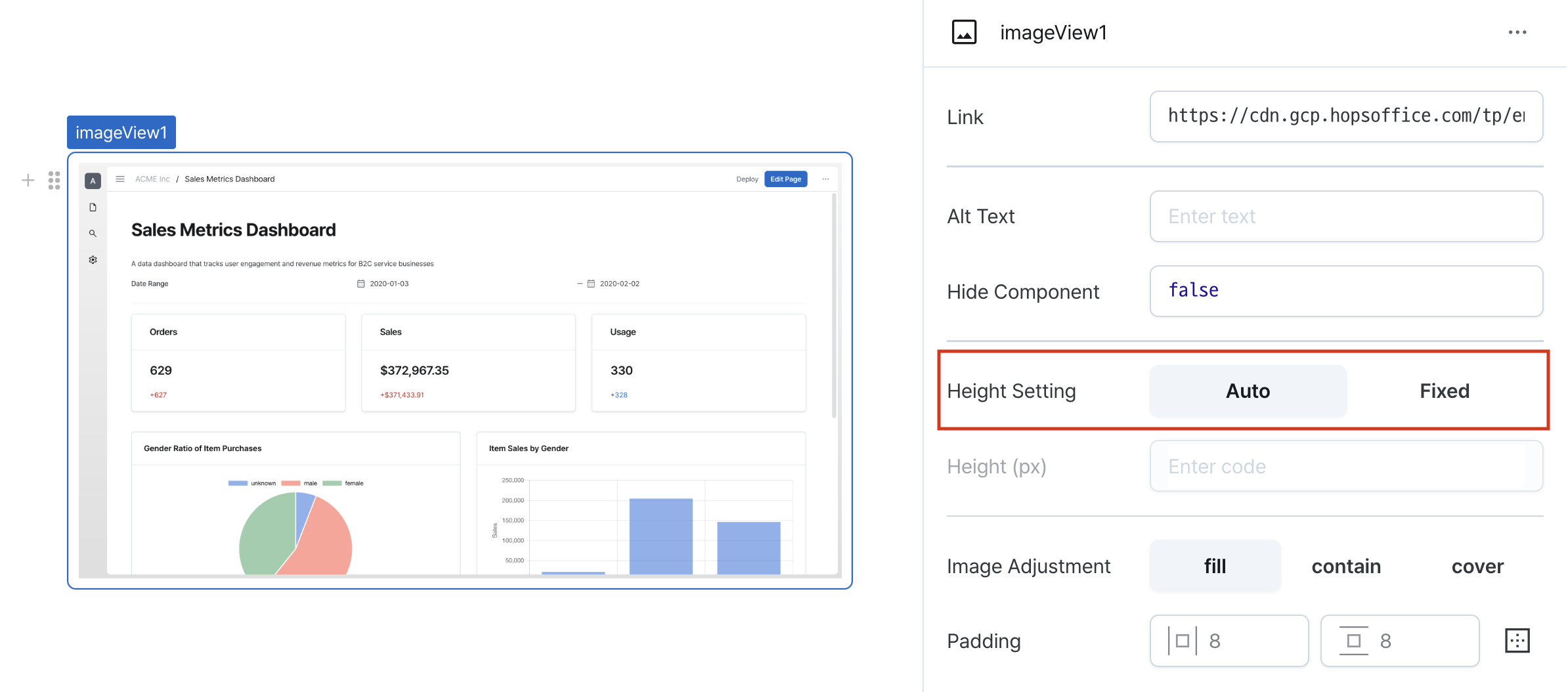
| Height Setting (isHeightFixed) | boolean | Whether to set a fixed height for the image view |
| Height (px) (contentHeight) | string (number) | Fixed height value for container content |
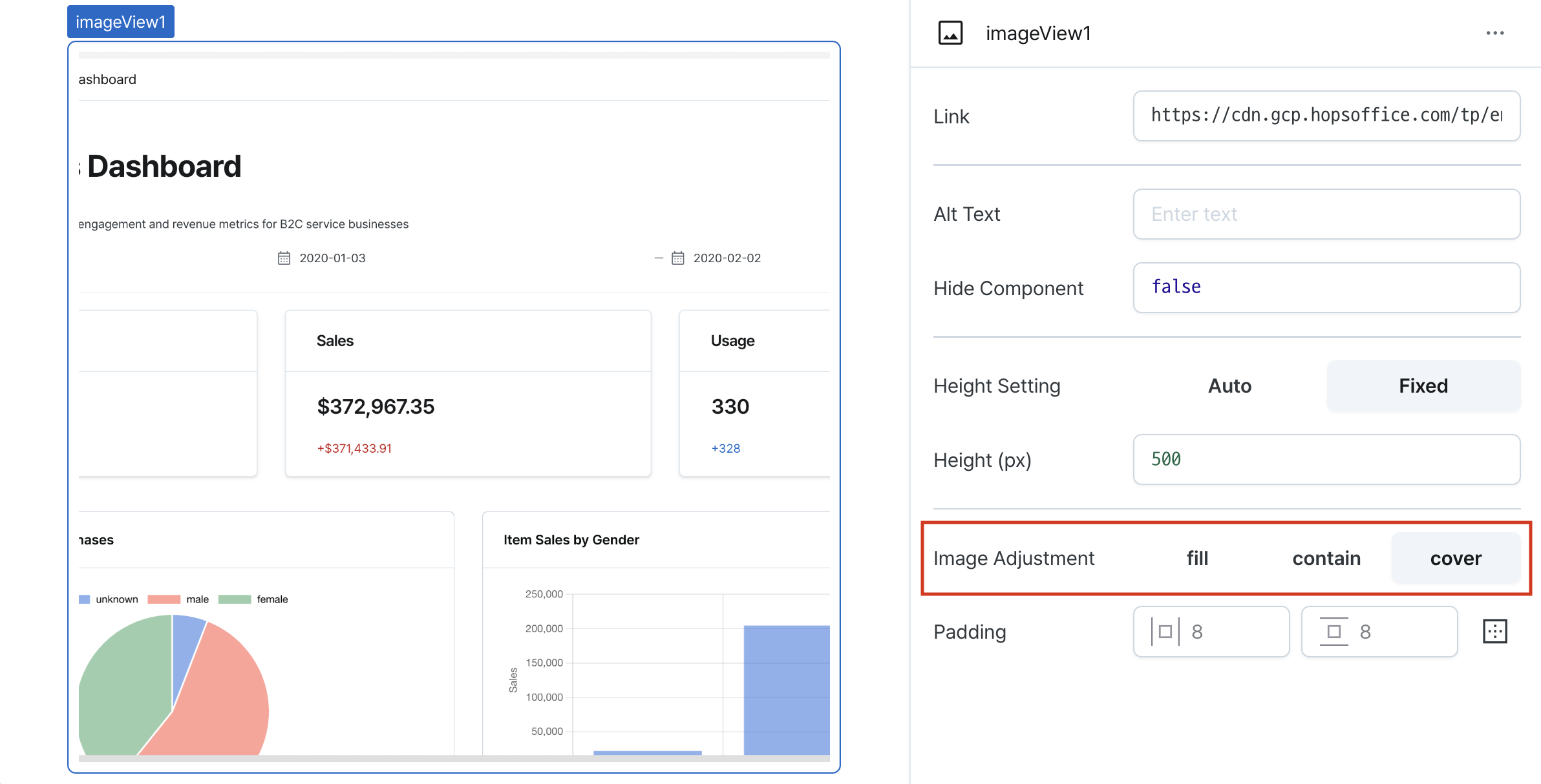
| Image Adjustment (objectFit) | ObjectFit | How to adjust the image content |
| Padding (padding) | string | number | Padding of the image view |
Name (name)
Sets the unique identifier for the image view component. Please refer to the component naming rules
URL (url)
Sets the image source URL.
Supports:
- Standard image URLs
- Data URLs
- Any URL format valid for HTML
<img>tags
Alt Text (altText)
Sets fallback text displayed when image fails to load.
Improves accessibility and provides context when image is unavailable.

Hide Component (isHidden)
Controls visibility of the component.
When set to true:
- Hidden in deployed view
- Visible with reduced opacity in edit mode

Height Setting (isHeightFixed)
Controls height behavior of the component.
When set to 'auto', height adjusts automatically to content.
Height (px) (contentHeight)
Sets the component's vertical height.
Can be set through workflow results, direct input.
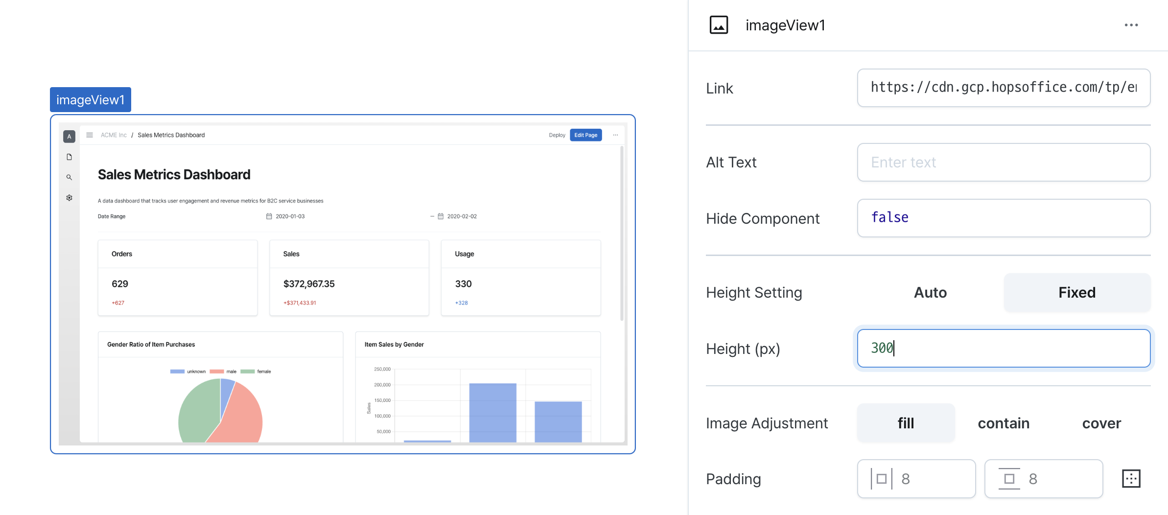
Image Adjustment (objectFit)
Controls how the image fills its container when height is fixed.
Options:
fill: Stretches image to fill container completely
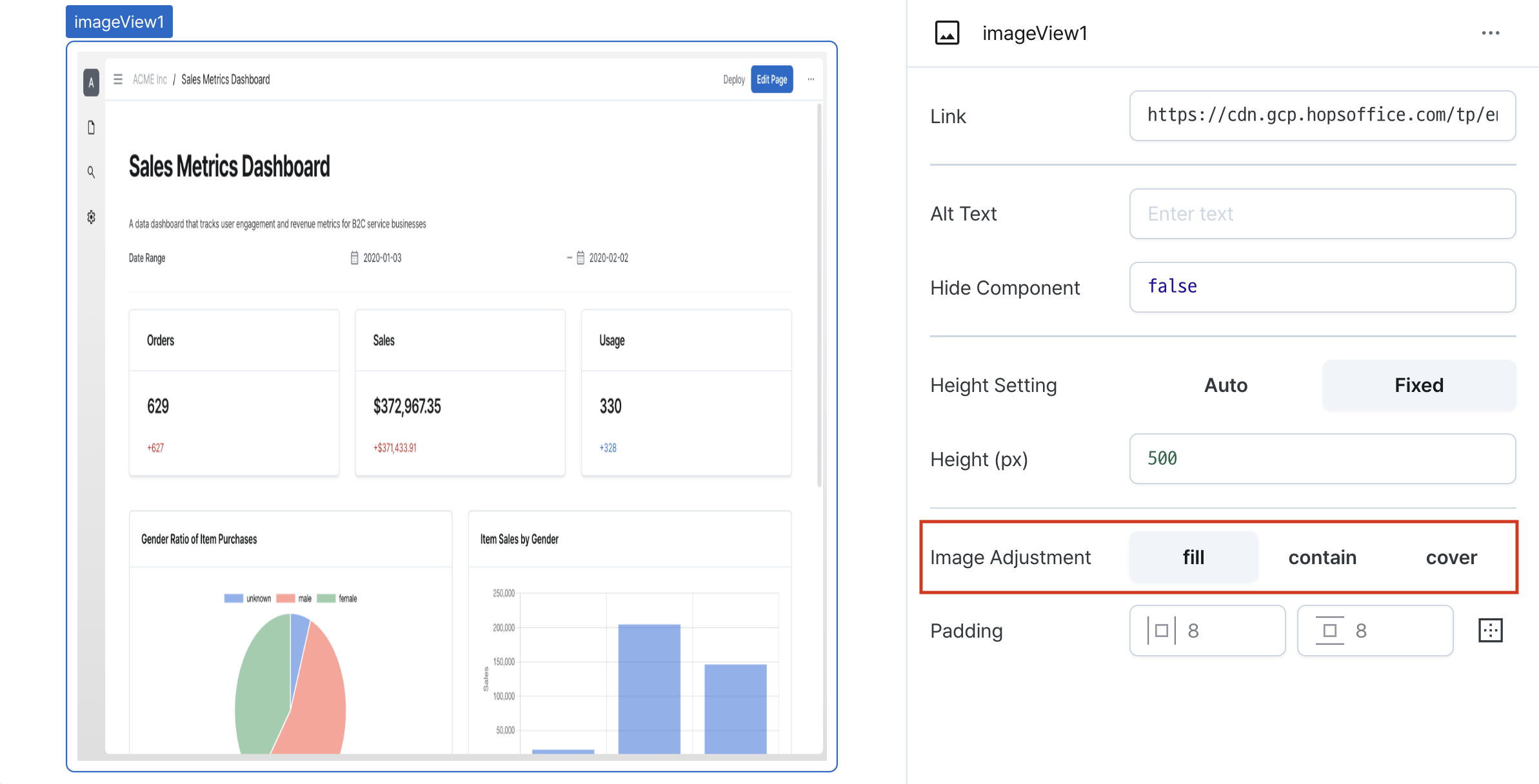
contain: Fits entire image within container
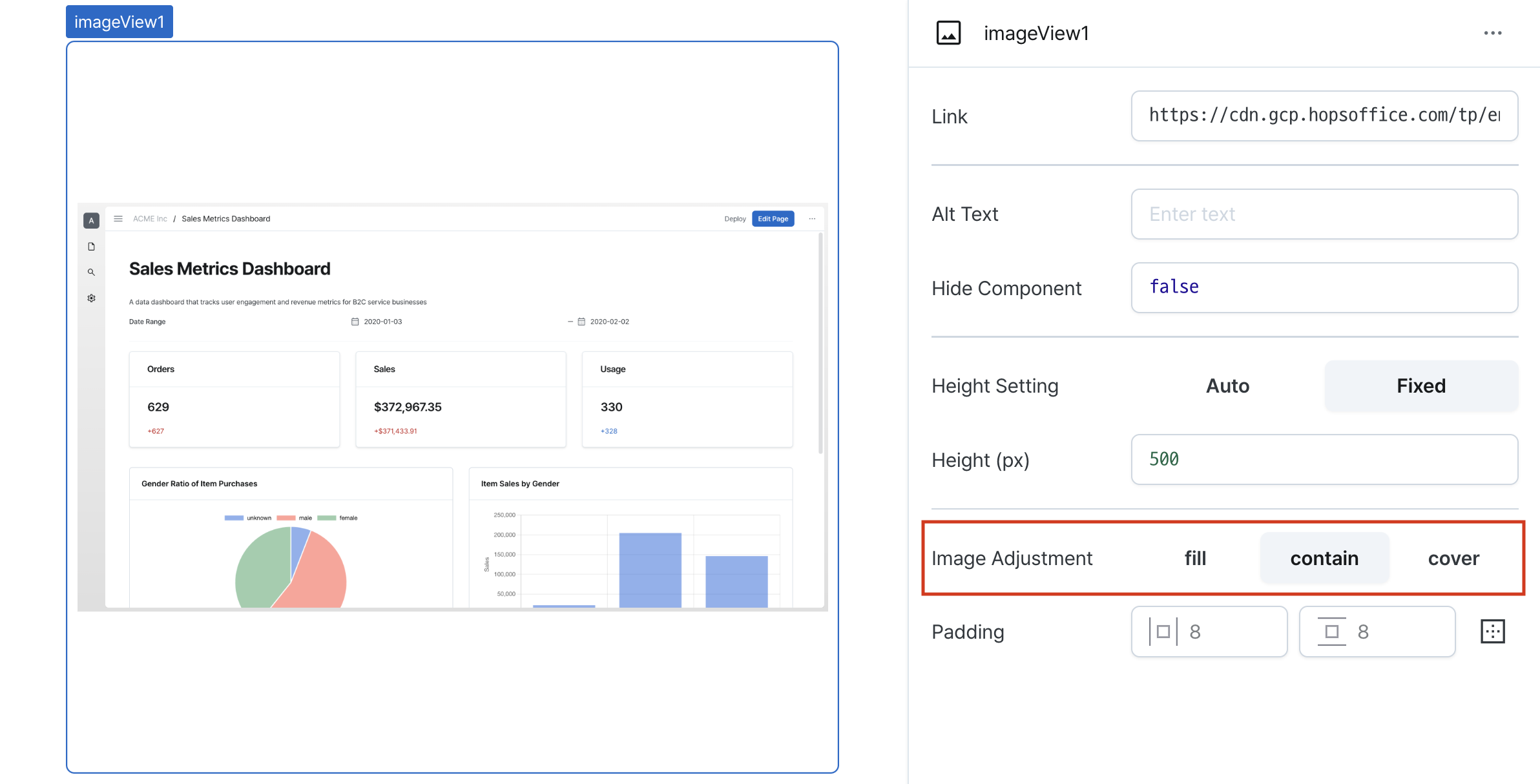
cover: Fills container while maintaining aspect ratio
Padding (padding)
Sets internal spacing of the component.
Input options:
- Single value: Uniform padding on all sides (e.g.,
36) - Comma-separated values: Different padding per side (e.g.,
36,24) - Expanded mode: Individual control of top, right, bottom, left
States
| Property | Type | Description |
|---|---|---|
| value | string | URL of the image currently displayed |
| objectFit | ObjectFit | How the image content is being adjusted |
Type Definitions
type ObjectFit = 'fill' | 'contain' | 'cover';