Link
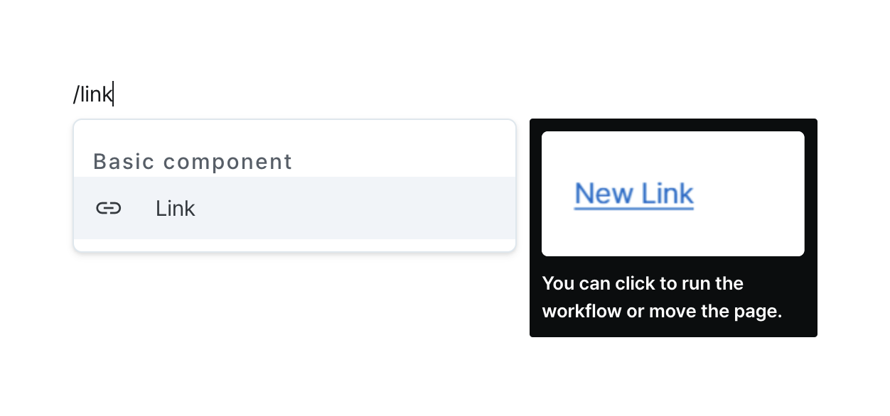
Create clickable links for web navigation or file downloads.
Properties
| Property | Type | Description |
|---|---|---|
| Name (name) | string | Unique identifier for the link component |
| Label (label) | string | Text displayed on the link |
| Link (href) | string | Web address to navigate to or file address to download when clicked |
| File Name (downloadName) | string | Name of the file to download |
| Hide Component (isHidden) | boolean | Whether to hide the link on the deployed page |
| Width (display) | Display | How the link component occupies width |
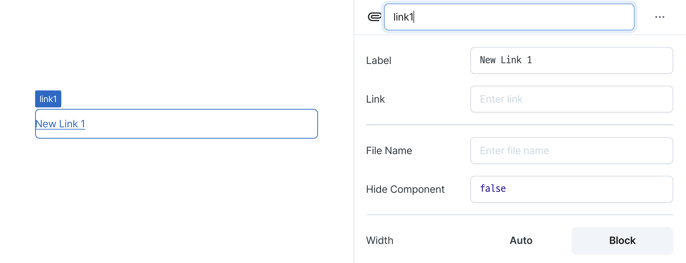
Name (name)
Sets the unique identifier for the link component. Please refer to the component naming rules
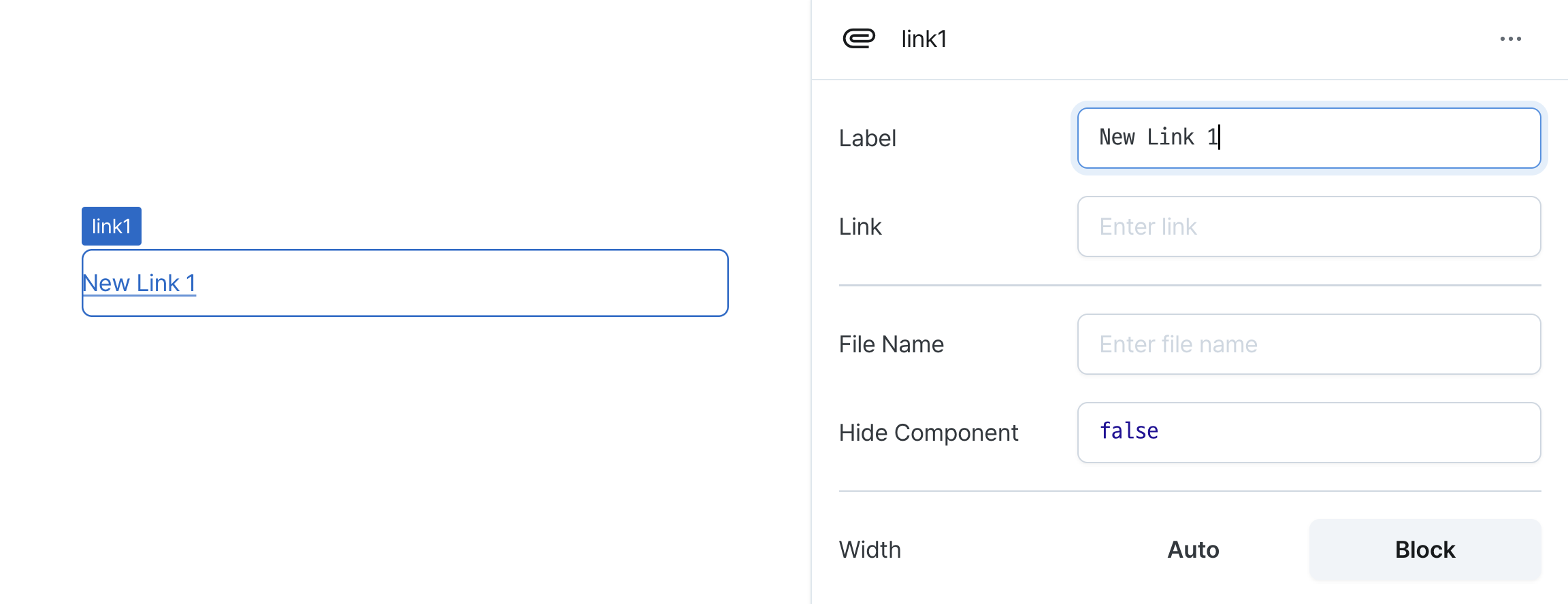
Label (label)
Sets the text displayed on the link component. (Supports Template Text)
Link (href)
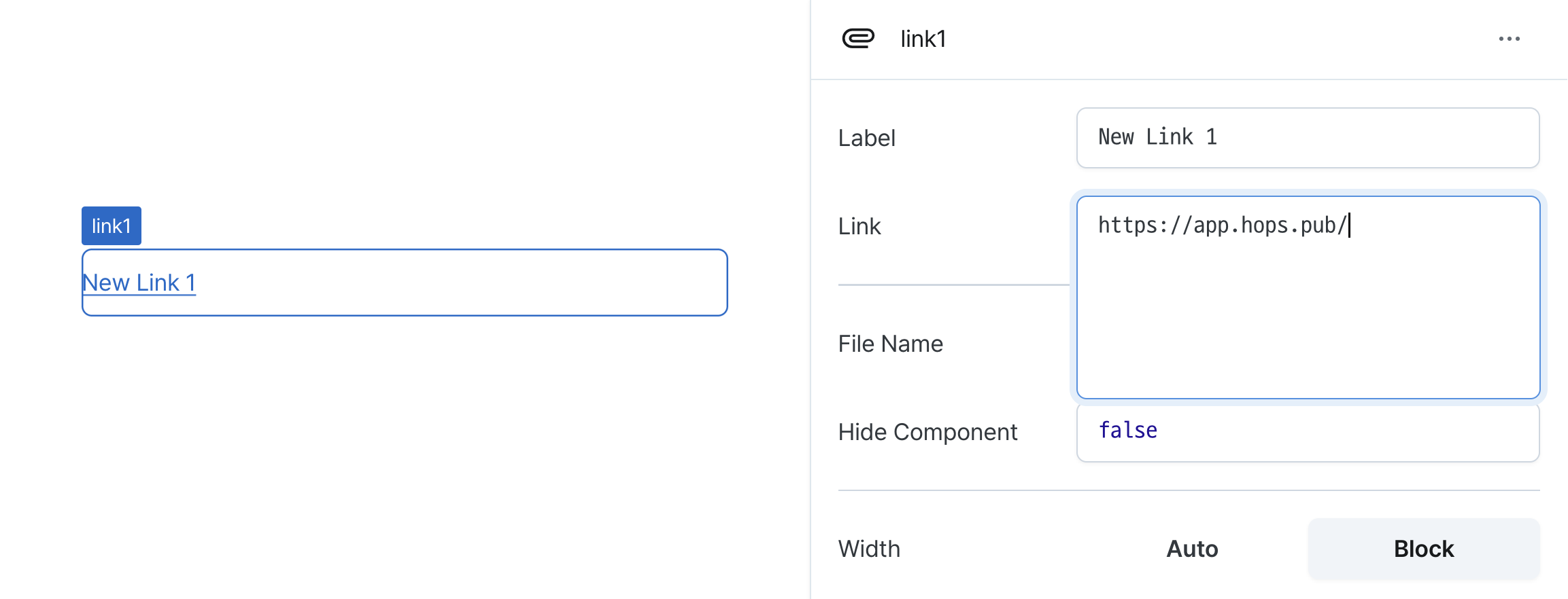
Sets the target URL for the link.
Supports:
Web URLs for navigation
- File URLs for download behavior
- Can be set through workflow results, direct input.
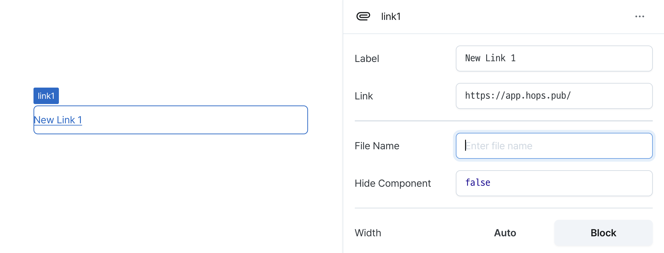
File Name (downloadName)
Sets the filename for downloaded files.
Only applies when href points to a downloadable resource.
Can be set through workflow results, direct input.
Hide Component (isHidden)
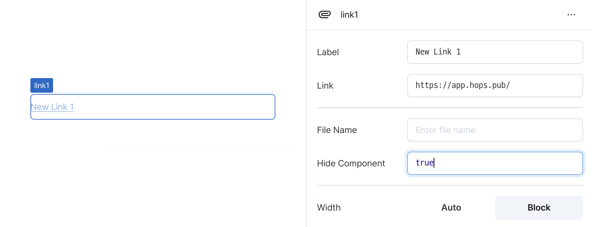
Controls visibility of the component.
When set to true:
- Hidden in deployed view
- Visible with reduced opacity in edit mode
Width (display)
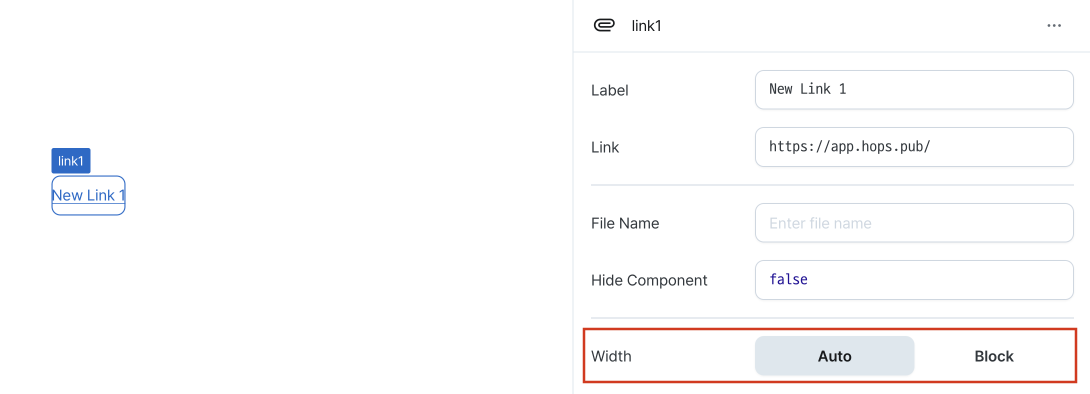
Sets how the component occupies width.
Selecting "Block" enables full-width usage.
Selecting "Auto" adjusts width to fit the label content.
States
| Property | Type | Description |
|---|---|---|
| label | string | Text displayed on the link |
| href | string | Web address to navigate to or file address to download when clicked |
| downloadName | string | Name of the file to download |
Type Definitions
type Display = 'inline-block' | 'block';