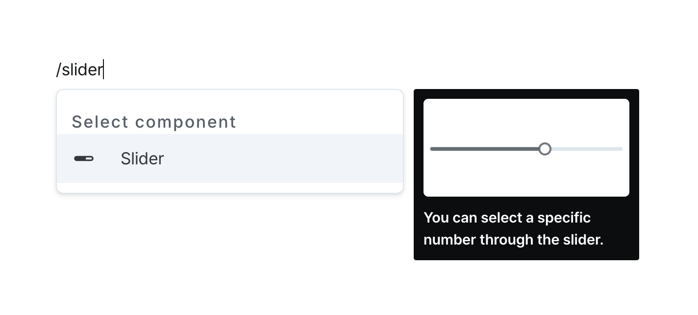
Slider
Select numerical values through an interactive sliding scale.
Properties
| Property | Type | Description |
|---|---|---|
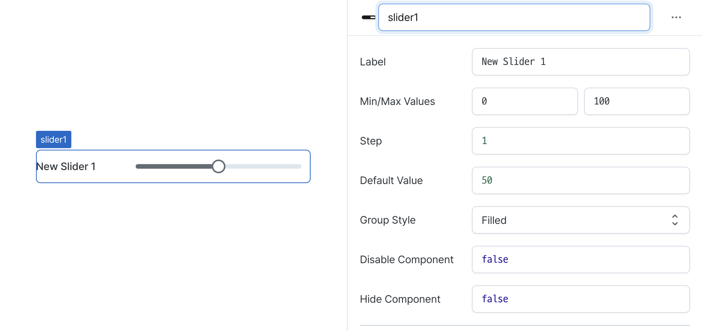
| Name (name) | string | Unique identifier for the slider component |
| Label (label) | string | Text displayed on the left side of the slider |
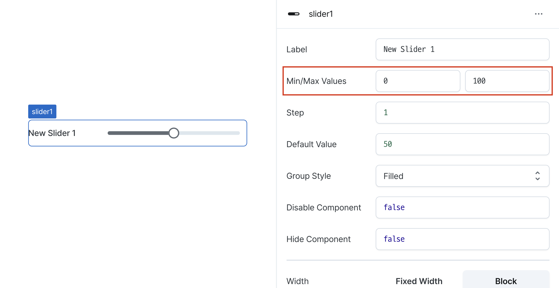
| Min/Max Values (minValue/maxValue) | string (number) | Minimum and maximum selectable values |
| Step (step) | string (number) | Step intervals between selectable values |
| Default Value (defaultValue) | string (number) | Code that returns a default value |
| Group Style (variant) | SliderVariant | Slider variant style |
| Disable Component (isDisabled) | boolean | Whether the slider is disabled |
| Hide Component (isHidden) | boolean | Whether to hide the slider on the deployed page |
| Width (display) | Display | How the slider component occupies width |
| Width (px) (contentWidth) | string (number) | Fixed width of the slider component |
| Label Width (labelWidth) | string | The length that the left label takes up in the slider |
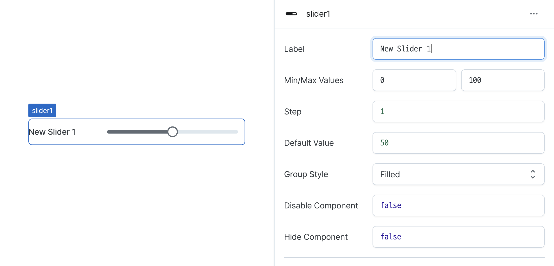
Name (name)
Sets the unique identifier for the slider component. Please refer to the component naming rules
Label (label)
Sets the text displayed on the left side of the slider. (Supports Template Text)
Min/Max Values (minValue/maxValue)
Sets the range boundaries for the slider.
Defines minimum and maximum selectable values.
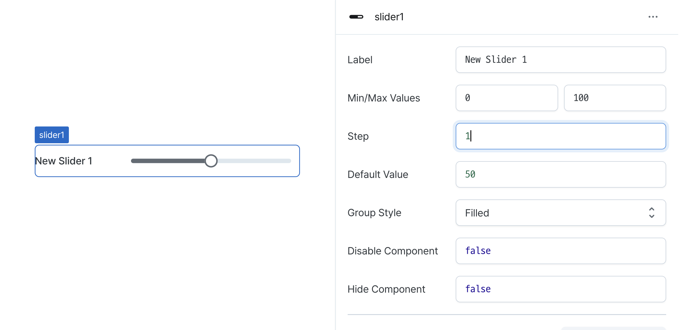
Step (step)
Sets the increment value between slider positions.
Determines how much the value changes with each movement.
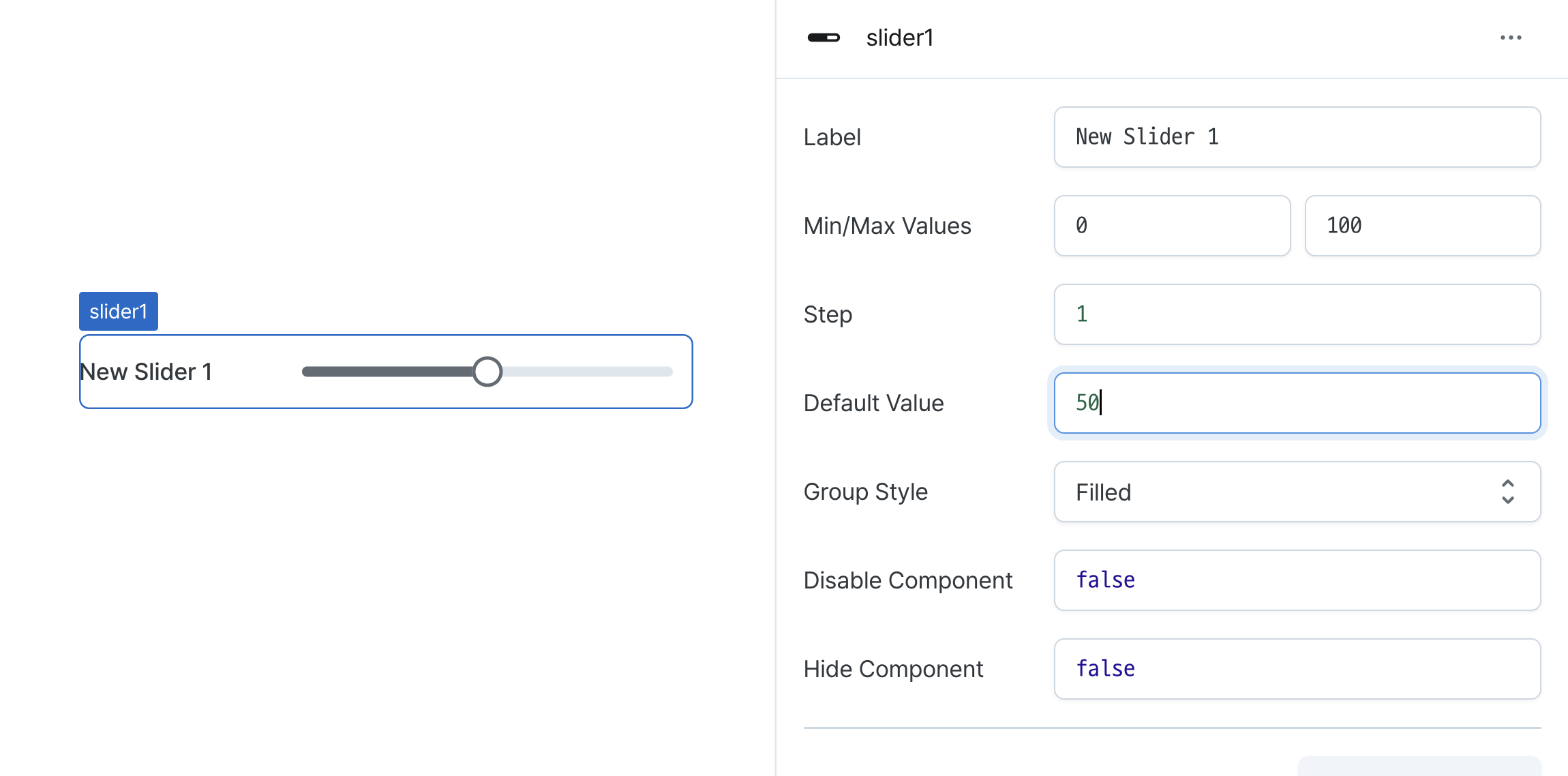
Default Value (defaultValue)
Sets the initial position of the slider.
Can be set through workflow results, direct input.
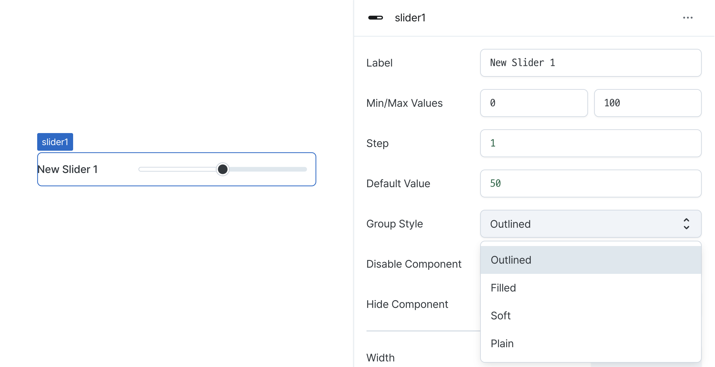
Group Style (variant)
Sets the visual style of the slider.
Options:
outlined: Shows bordered stylefilled: Shows filled stylesoft: Shows subtle styleplain: Shows minimal style
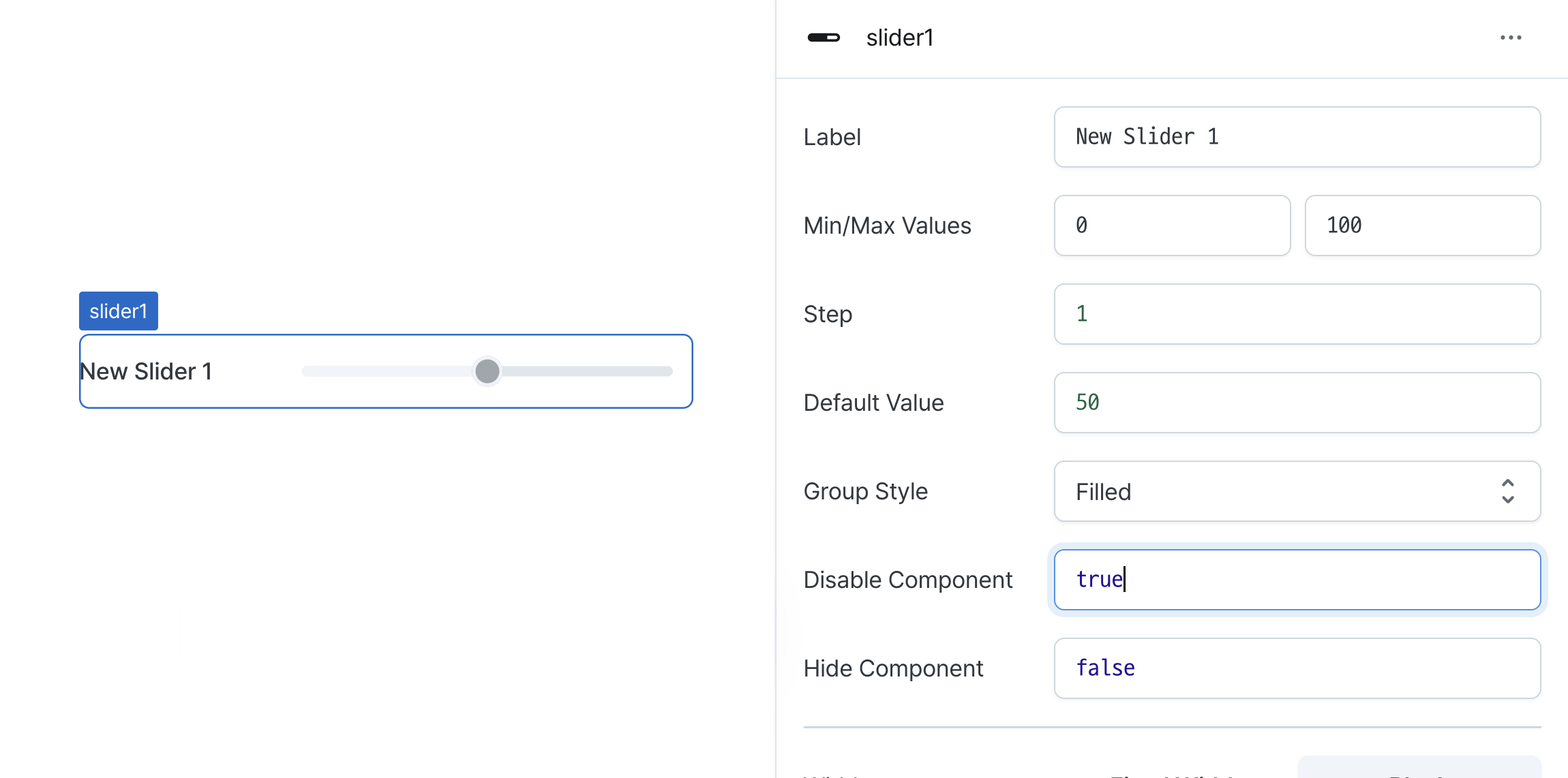
Disable Component (isDisabled)
Sets the disabled state of the component.
Can be set through workflow results, direct input.
When enabled, prevents user interaction with the component.
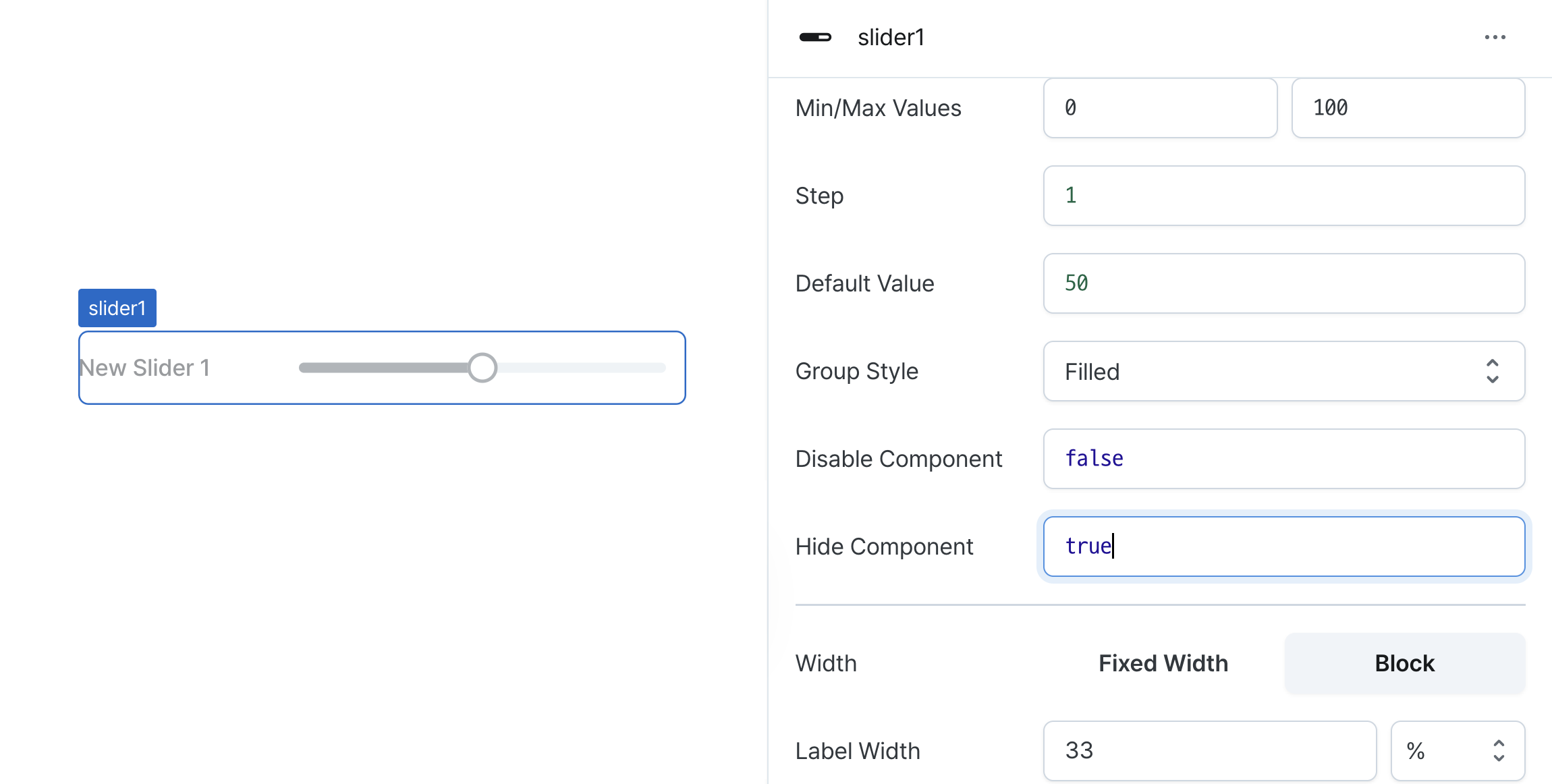
Hide Component (isHidden)
Controls visibility of the component.
When set to true:
- Hidden in deployed view
- Visible with reduced opacity in edit mode
Width (display)
Sets how the component occupies width.
Selecting "Block" enables full-width usage, while "Fixed width" allows you to enter a specific width in pixels.
Fixed-width components can be arranged sequentially.
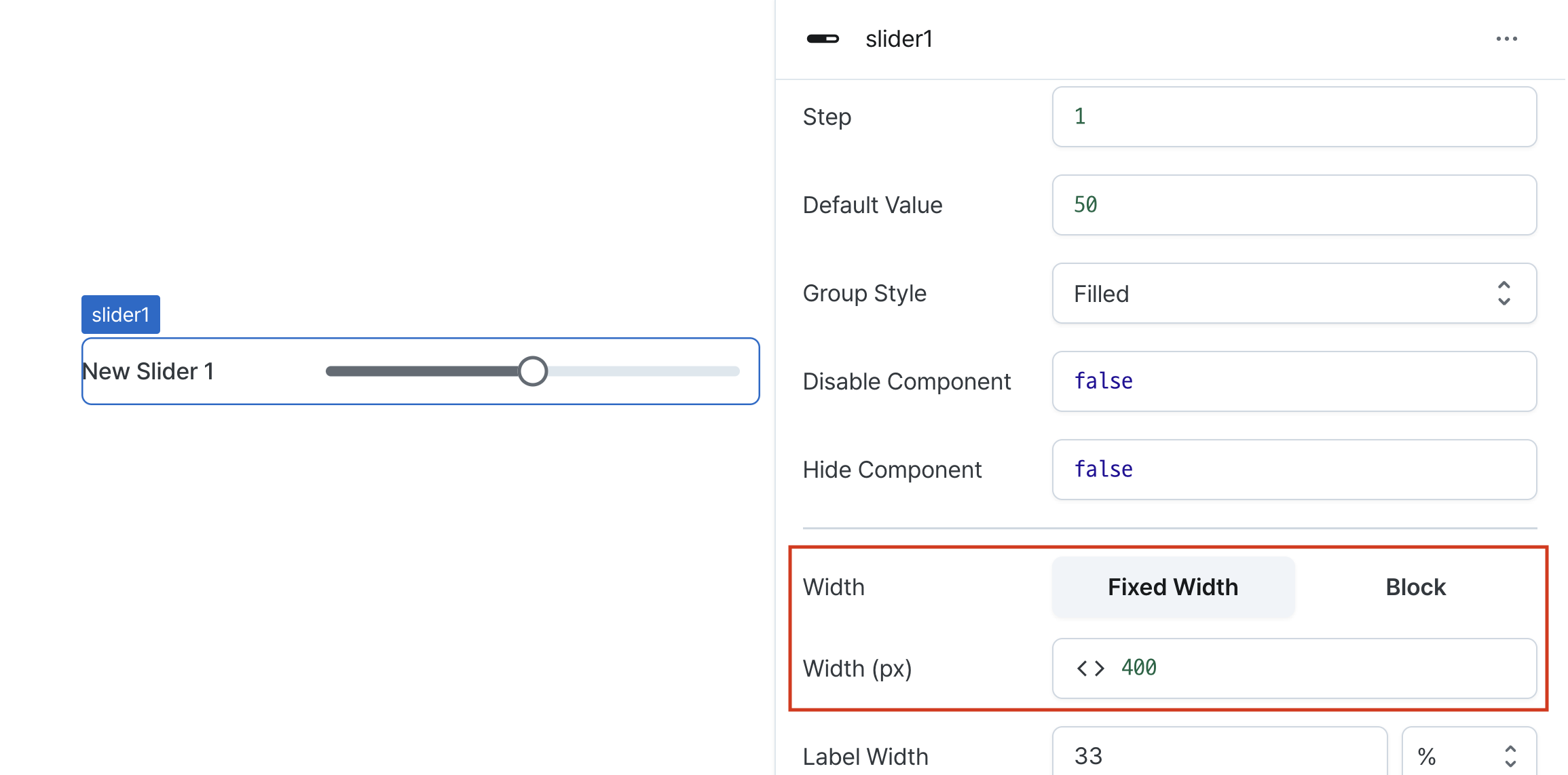
Width (px) (contentWidth)
Sets the component's width in pixels.
Can be set through workflow results, direct input.
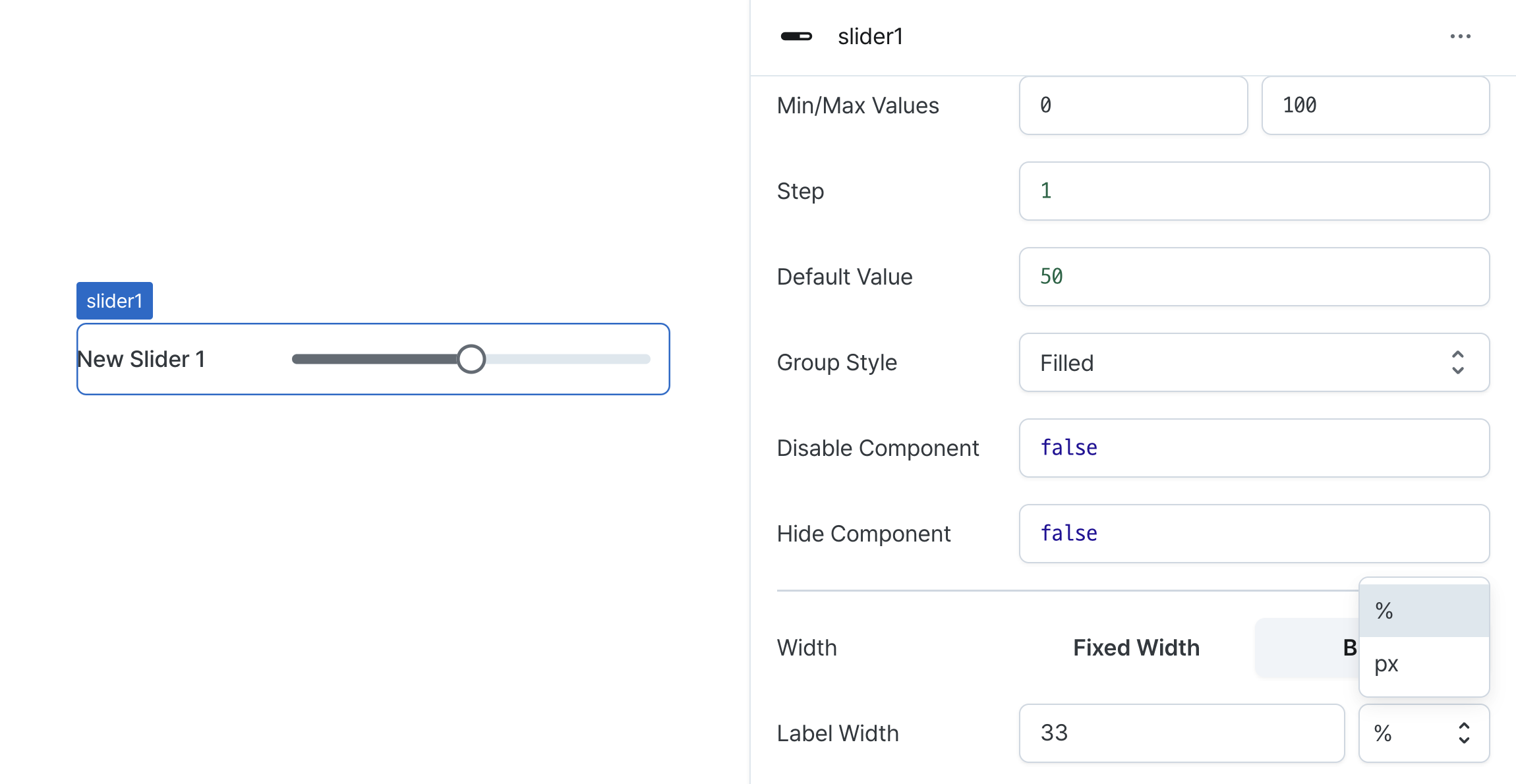
Label Width (labelWidth)
Sets the width of the label section.
Accepts values in pixels or percentages.
States
| Property | Type | Description |
|---|---|---|
| value | 'number' | 'undefined' | Selected value |
Type Definitions
type Display = 'inline-block' | 'block';

type SliderVariant = 'outlined' | 'filled' | 'soft' | 'plain';