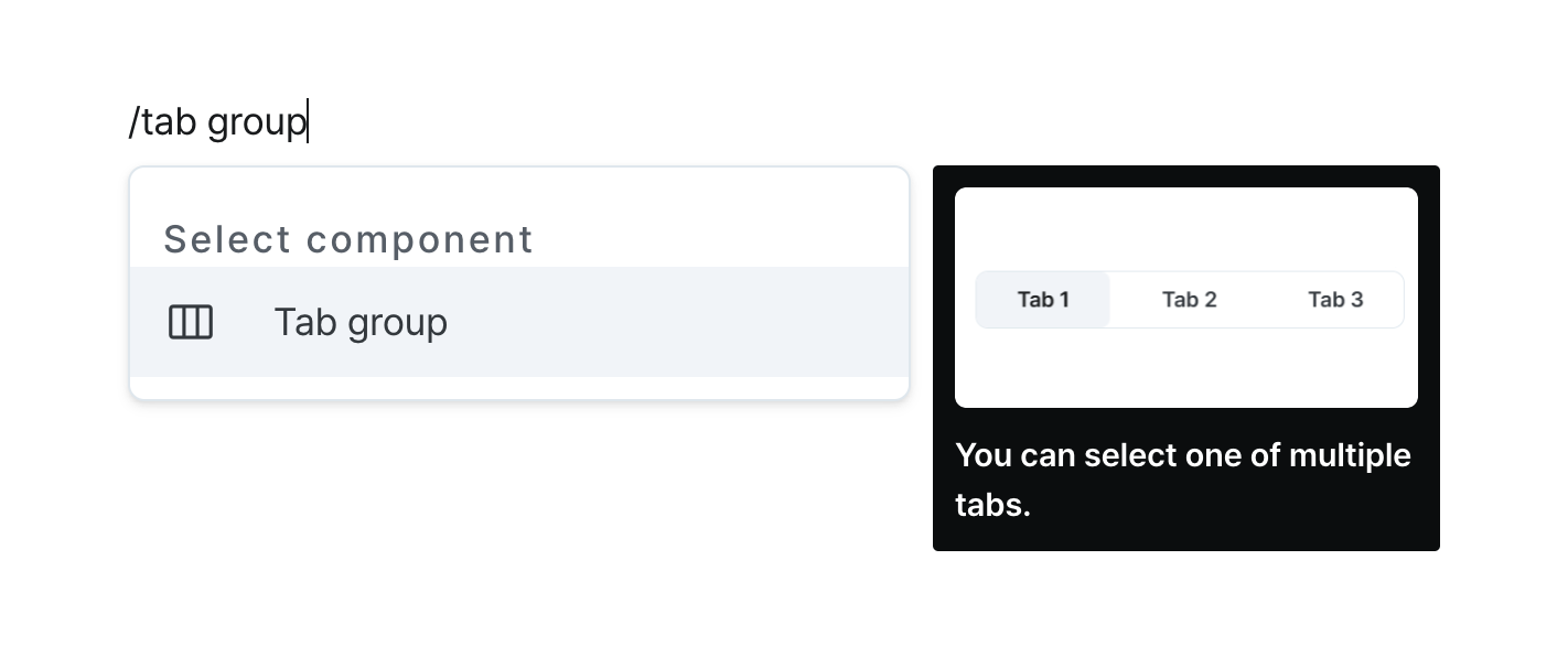
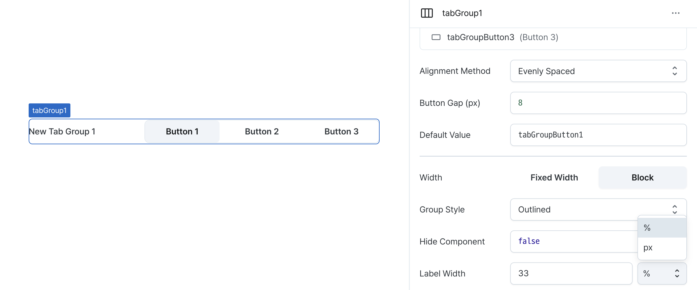
Tab Group
Organize content into selectable tabs for efficient space usage.
Properties
| Property | Type | Description |
|---|---|---|
| Name (name) | string | Unique identifier for the tab group component |
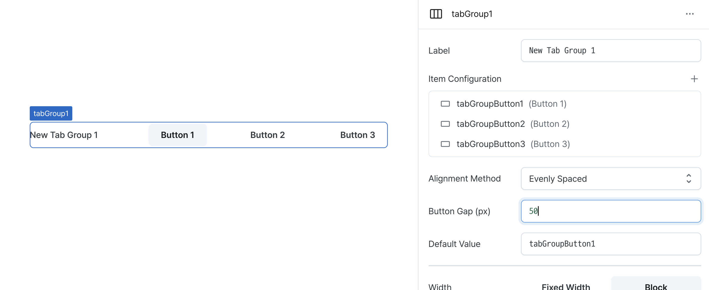
| Label (label) | string | Text displayed on the left side of the tab group |
| Item Configuration (tabs) | TabProps[] | Tab items within the tab group |
| Alignment Method (justifyContent) | TabGroupJustifyContent | Alignment method for items within the tab group |
| Button Gap (gap) | number | Spacing between items within the tab group |
| Default Value (defaultValue) | string (OptionValue) | Default selected button name value |
| Width (display) | Display | How the tab group component occupies width |
| Width (px) (contentWidth) | string (number) | Fixed width of the tab group component |
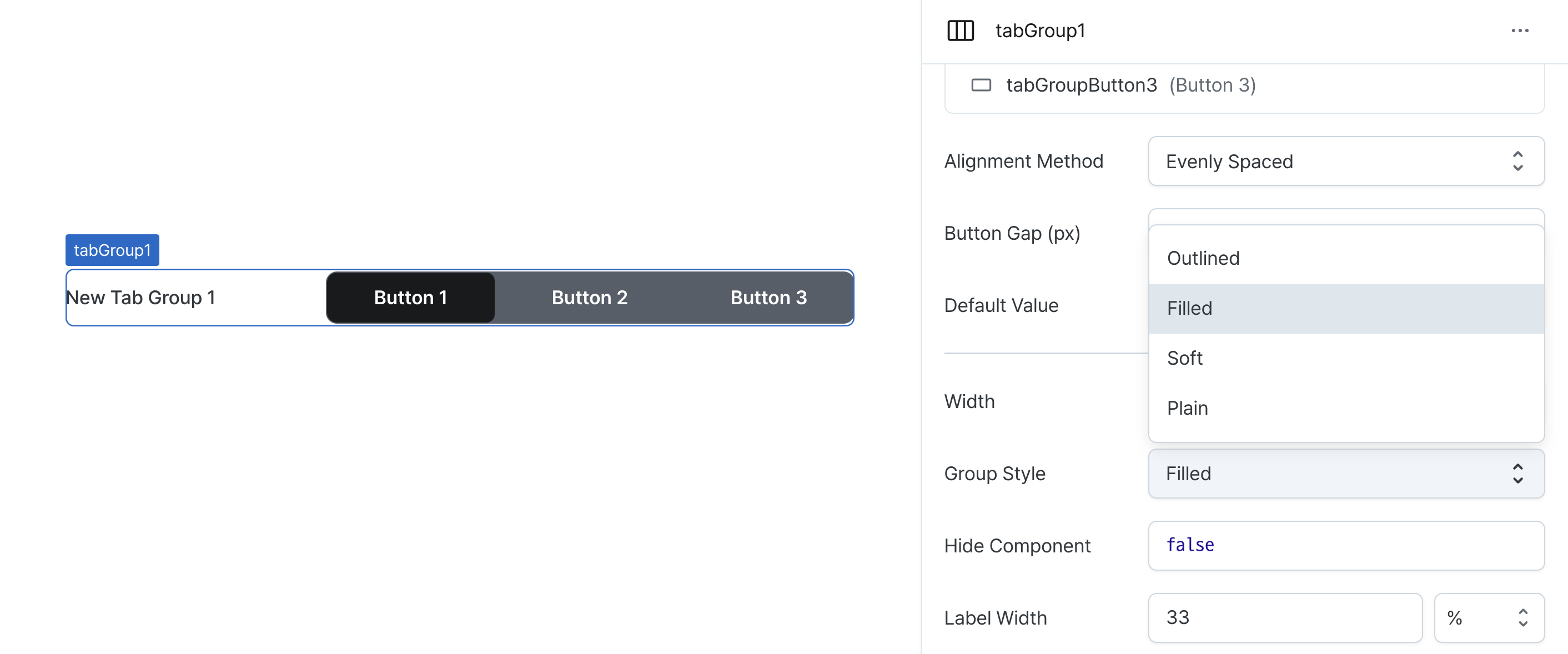
| Group Style (variant) | ButtonVariant | Tab group variant style |
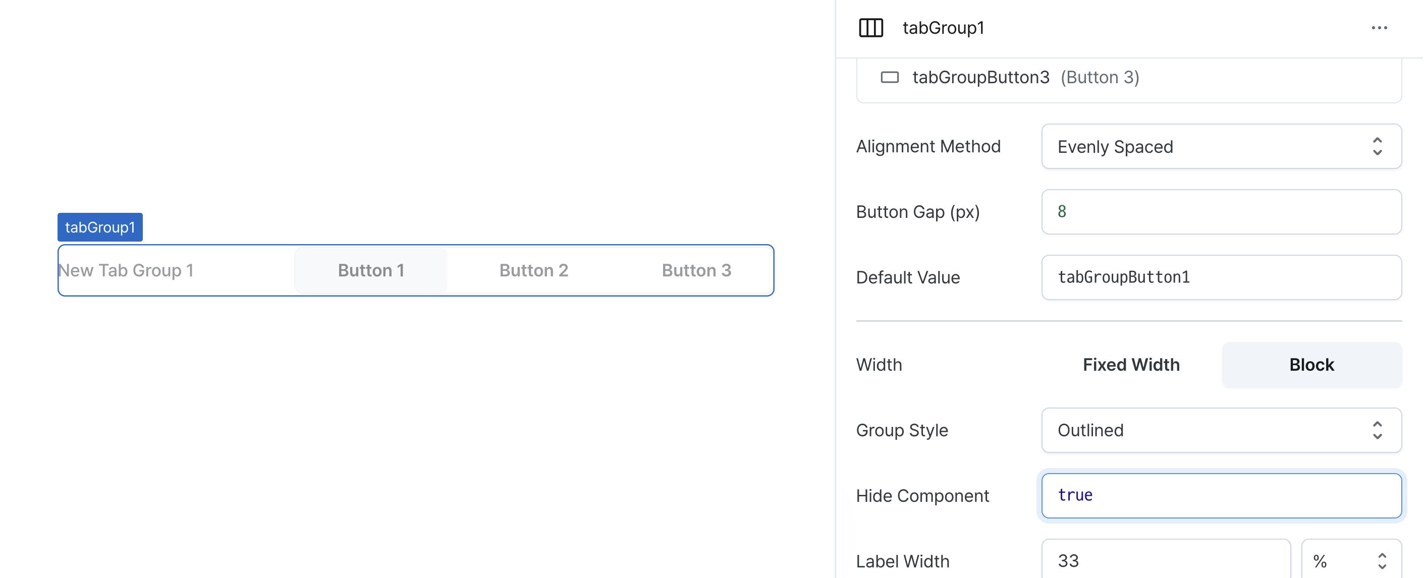
| Hide Component (isHidden) | boolean | Whether to hide the tab group on the deployed page |
| Label Width (labelWidth) | string | The width of the label on the left side of the tab group |
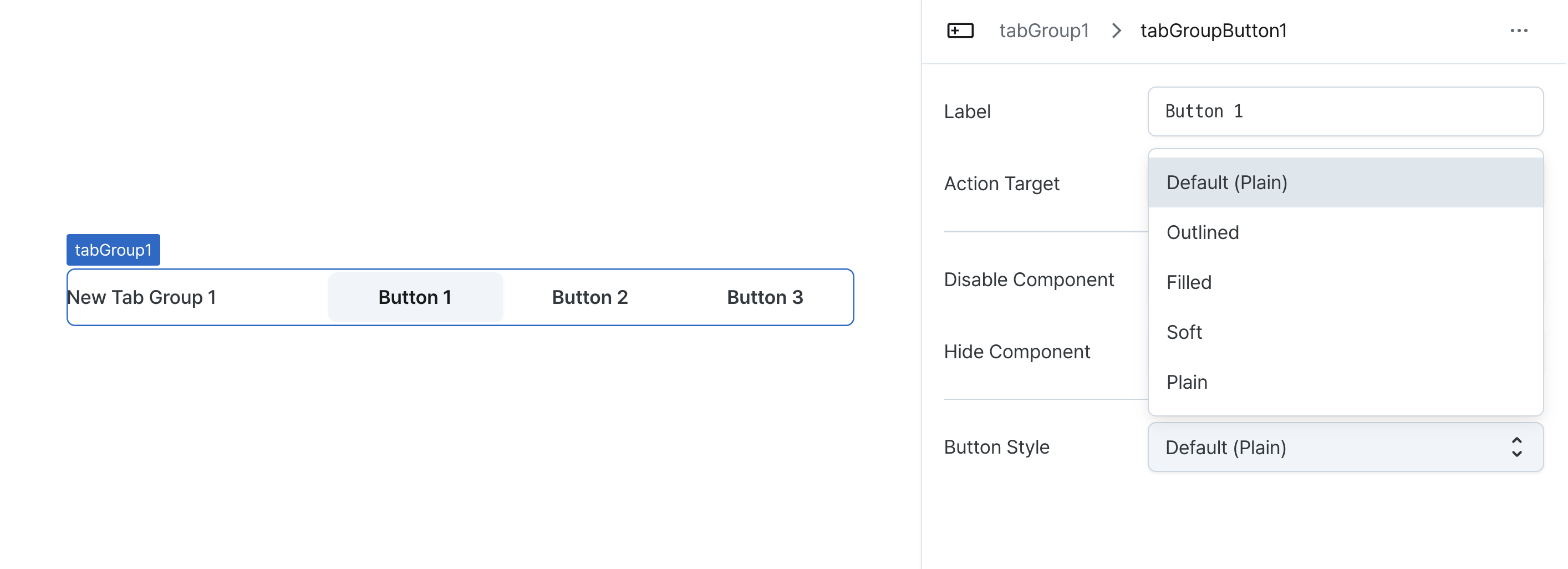
Name (name)
Sets the unique identifier for the tab group component. Please refer to the component naming rules
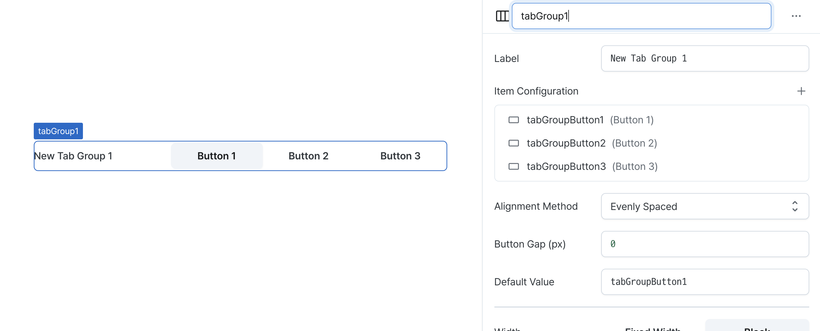
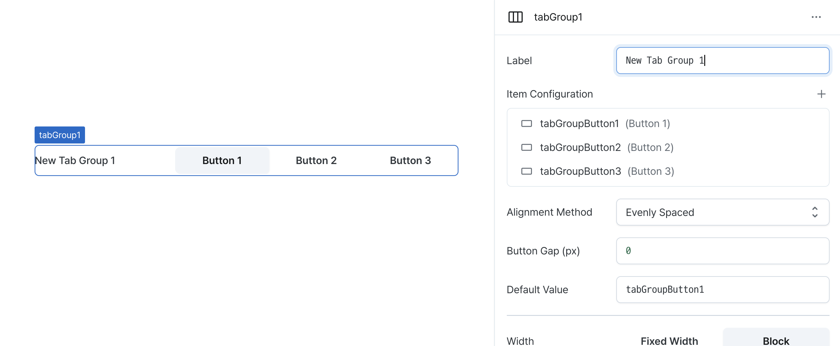
Label (label)
Sets the text displayed on the left side of the tab group. (Supports Template Text)
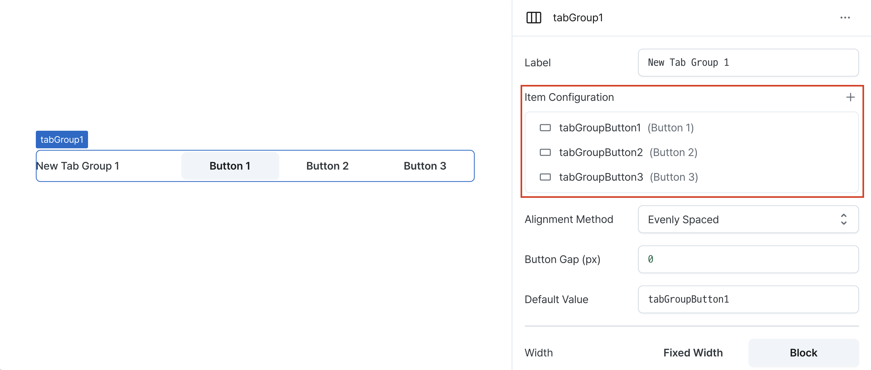
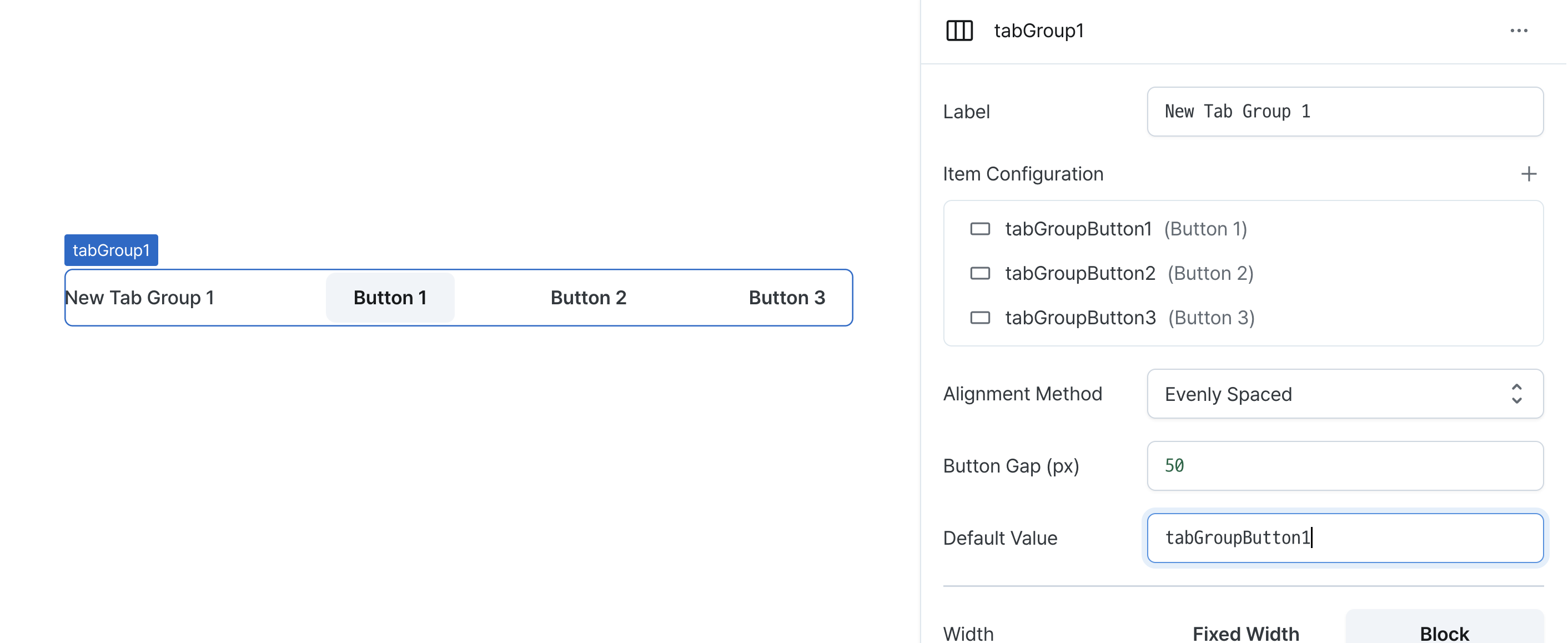
Item Configuration (tabs)
Configures the tab items in the group.
Provides options to:
- Add or remove tab items
- Modify tab properties
- Reorder tabs via drag and drop
Tab items using default style inherit the group's style settings.
For detailed button properties, see the Button documentation.
Default Value (defaultValue)
Sets the initially selected tab.
Can be set through workflow results, direct input.
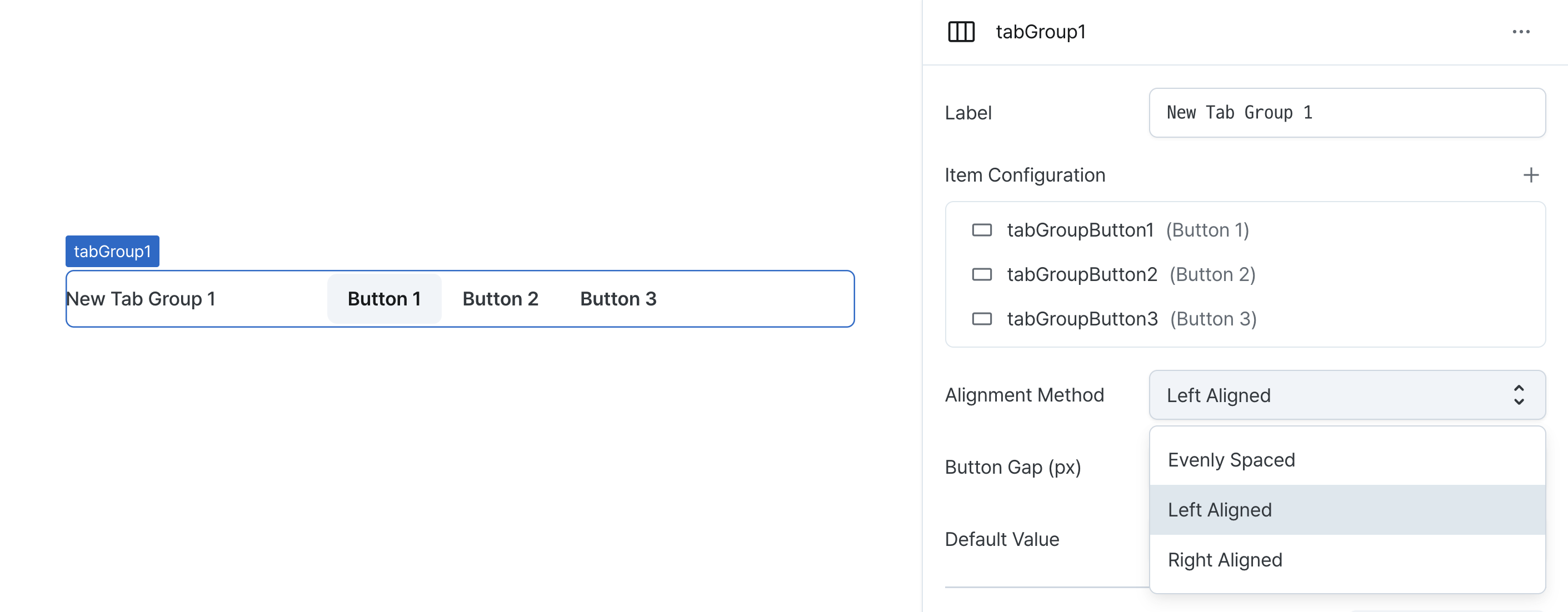
Alignment Method (justifyContent)
Controls tab item alignment within the group.
Options:
space-between: Distributes items with equal widthsleft: Aligns items to the leftright: Aligns items to the right
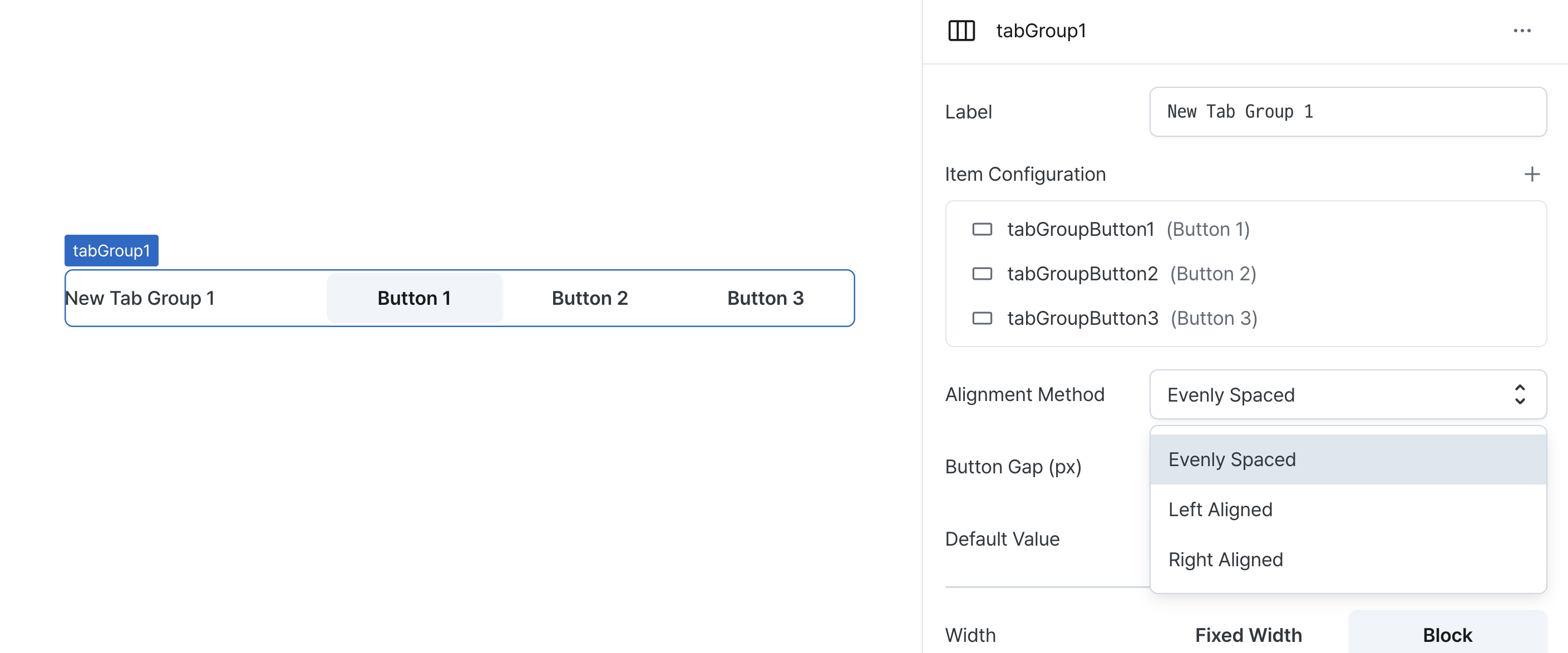
With left/right alignment, tab widths adjust to content.
Button Gap (gap)
Sets the spacing between tab items.
Accepts pixel values for consistent spacing.
Width (display)
Sets how the component occupies width.
Selecting "Block" enables full-width usage, while "Fixed width" allows you to enter a specific width in pixels.
Fixed-width components can be arranged sequentially.
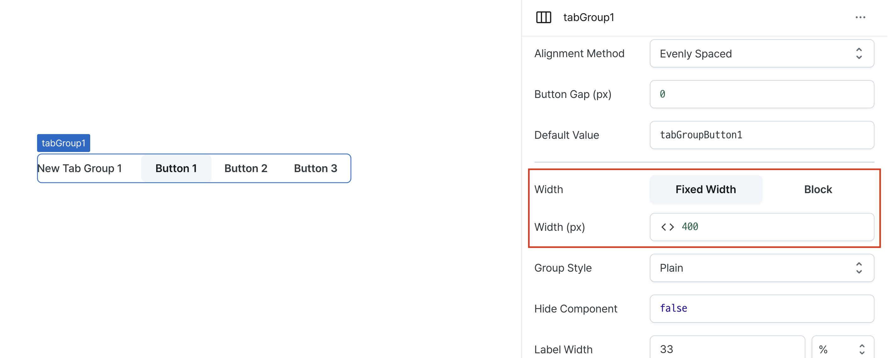
Width (px) (contentWidth)
Sets the component's width in pixels.
Can be set through workflow results, direct input.
Group Style (variant)
Sets the visual style for the entire tab group.
Individual tabs set to 'default' will inherit this style.
Hide Component (isHidden)
Controls visibility of the component.
When set to true:
- Hidden in deployed view
- Visible with reduced opacity in edit mode
Label Width (labelWidth)
Sets the width of the label section.
Accepts values in pixels or percentages.
States
| Property | Type | Description |
|---|---|---|
| value | string | Selected tab name |
| tabs | TabProps[] | List of tab items |
Type Definitions
type ButtonColor = 'neutral' | 'primary' | 'danger' | 'warning' | 'success';
type ButtonVariant = 'outlined' | 'filled' | 'soft' | 'plain';
type Display = 'inline-block' | 'block';
type TabGroupJustifyContent = 'flex-start' | 'flex-end' | 'space-between';

interface TabProps {
    // Unique name for tab item
    name: string;
    // Left text for tab item
    label: string;
    // Tab item color
    color: ButtonColor;
    // Width occupation method for tab item
    display: Display;
    // Tab item style
    variant: ButtonVariant | 'default';
    // Whether tab item is disabled (template)
    isDisabled: string (boolean);
    // Whether tab item is hidden (template)
    isHidden: string (boolean);
}