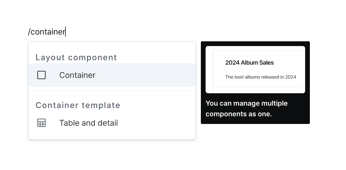
Container
Group related components together for organized management and layout control.
Properties
| Property | Type | Description |
|---|---|---|
| Name (name) | string | Unique identifier for the container component |
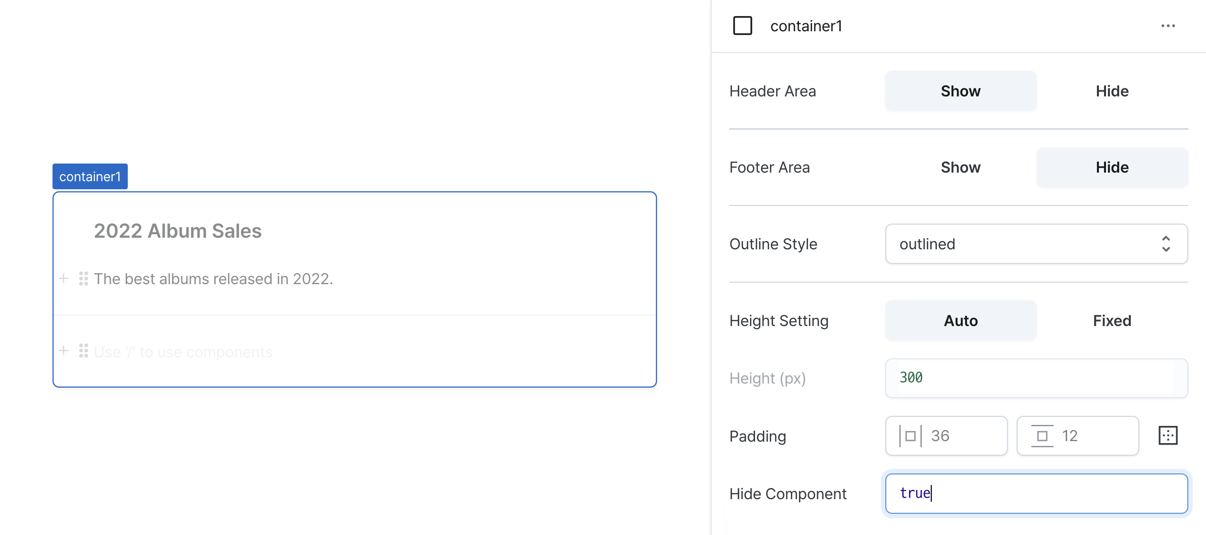
| Header Area (isHeaderVisible) | boolean | Whether to show the container header |
| Footer Area (isFooterVisible) | boolean | Whether to show the container footer |
| Outline Style (outlineStyle) | OutlineStyle | Outline style of the container |
| Height Setting (isHeightFixed) | boolean | Whether to set a fixed height for the container content |
| Height (px) (contentHeight) | string | Fixed height of the container content |
| Padding (padding) | string | number | Padding of the container's header, body, and footer |
| Hide Component (isHidden) | boolean | Whether to hide the container on the deployed page |
Name (name)
Unique identifier for the container component. Please refer to the component naming rules
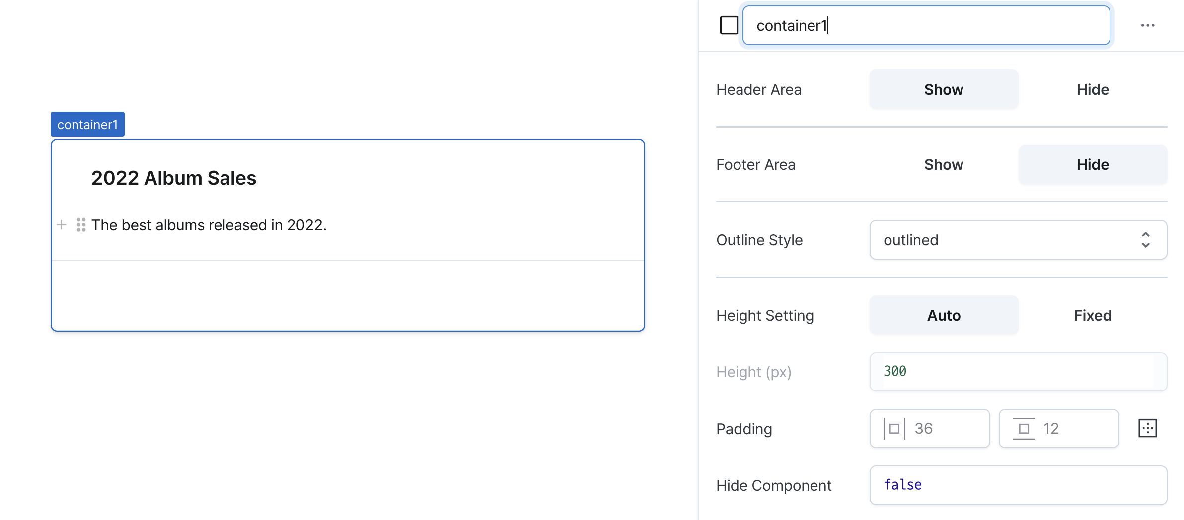
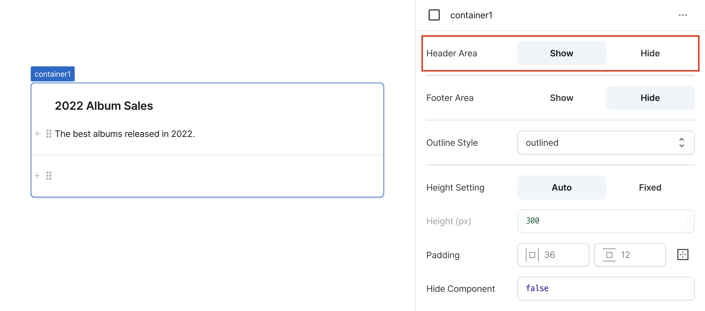
Header Area (isHeaderVisible)
Controls visibility of the container header.
When enabled, displays customizable header section.
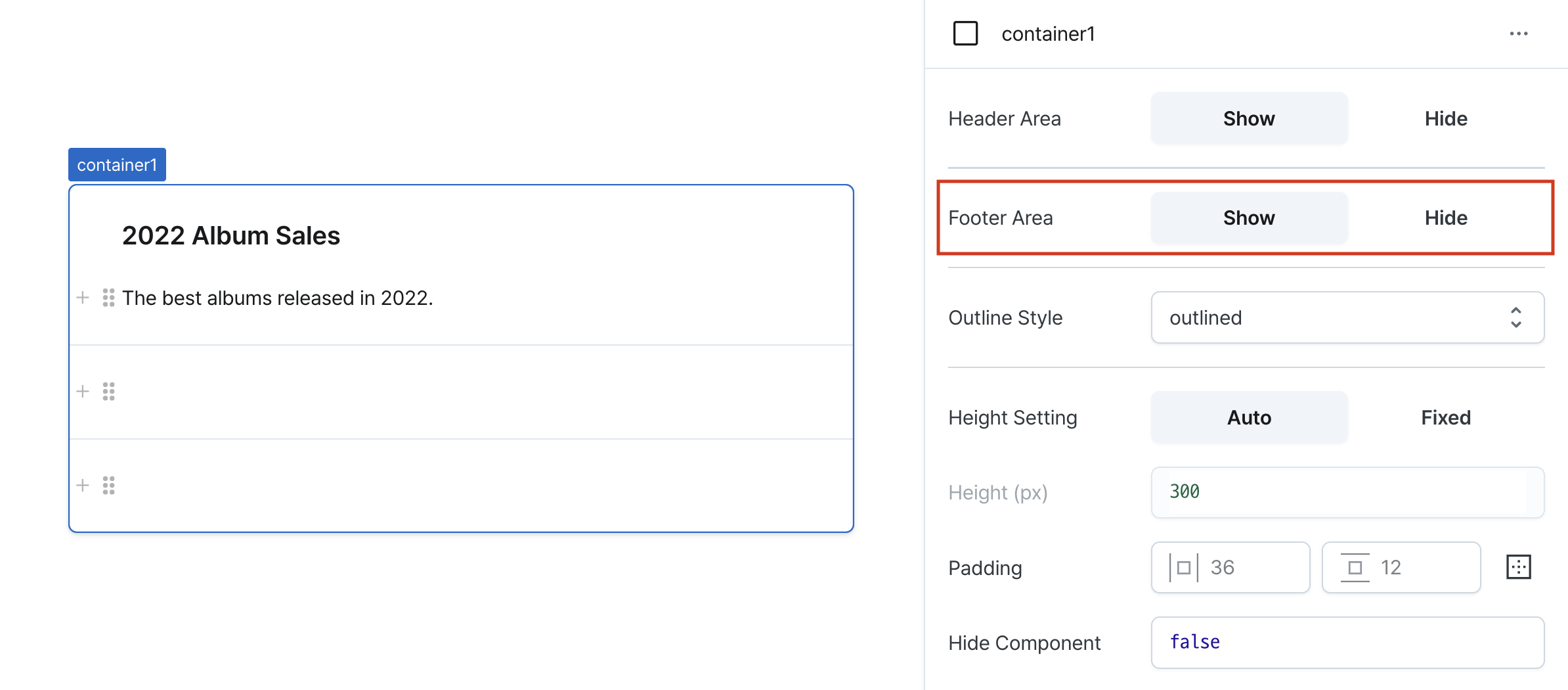
Footer Area (isFooterVisible)
Controls visibility of the container footer.
When enabled, displays customizable footer section.
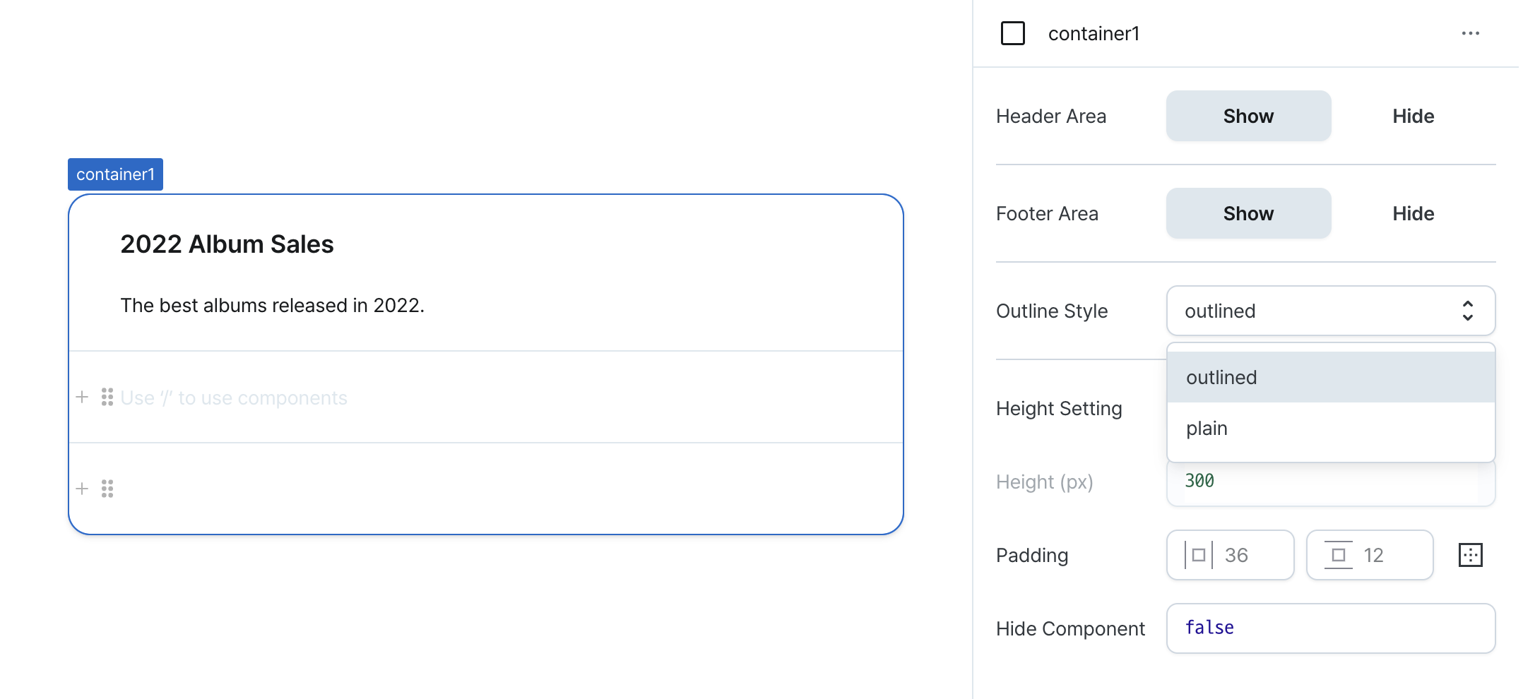
Outline Style (outlineStyle)
Sets the component's outline style.
Options:
outlined: Displays bordered styleplain: Shows minimal style without border
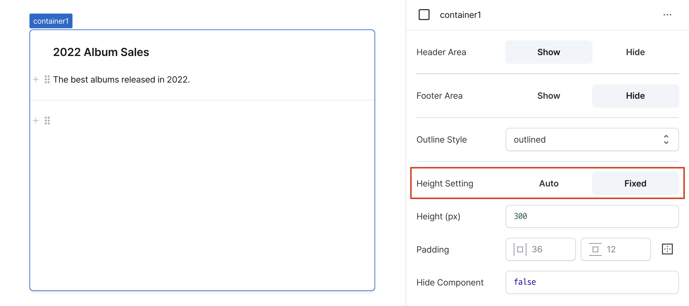
Height Setting (isHeightFixed)
Controls height behavior of the component.
When set to 'auto', height adjusts automatically to content.
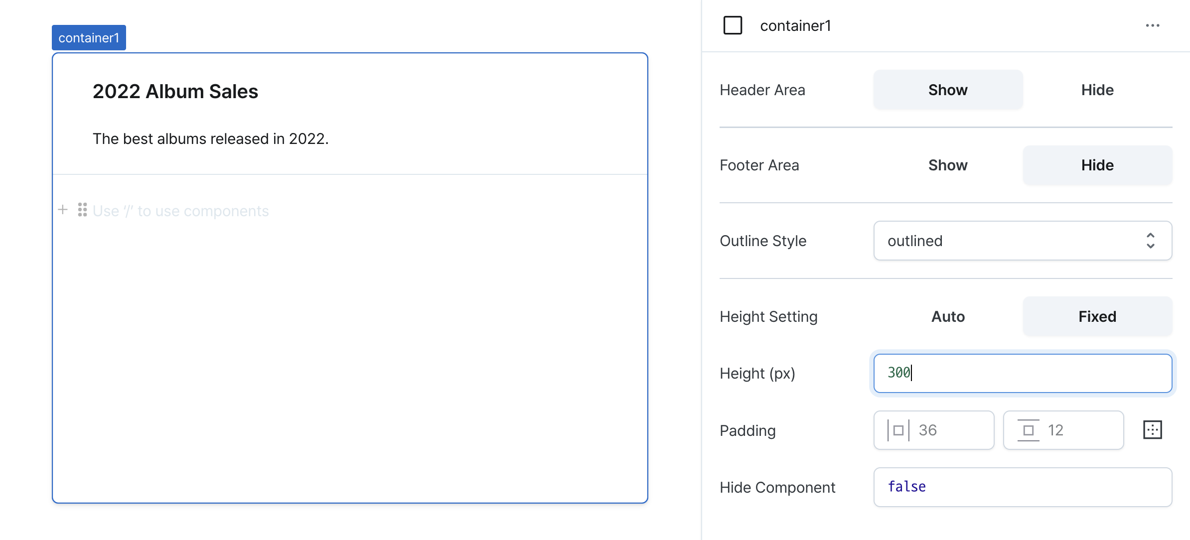
Height (px) (contentHeight)
Sets the component's vertical height.
Can be set through workflow results, direct input.
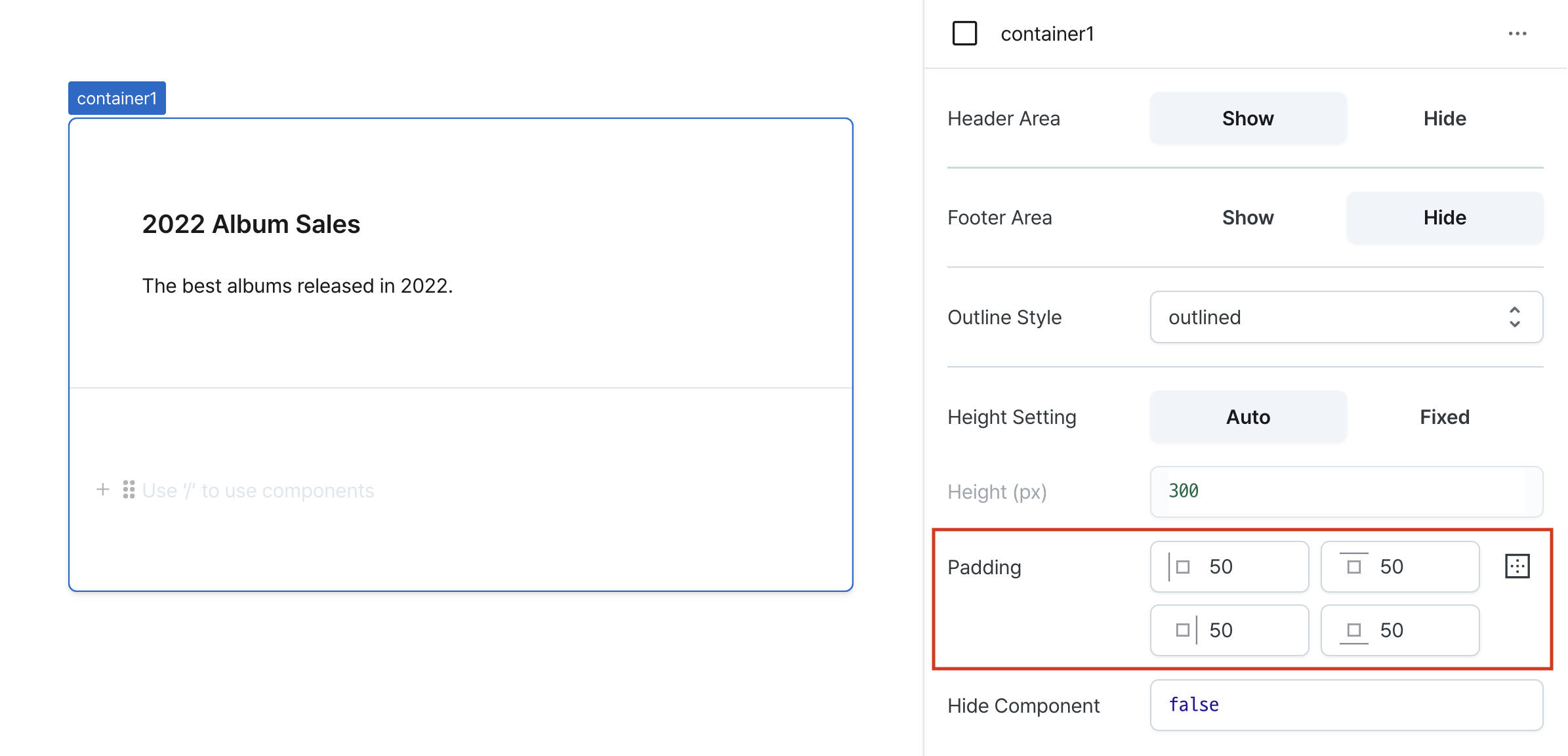
Padding (padding)
Applies the same padding to header, content and footer.
Sets internal spacing of the component.
Input options:
- Single value: Uniform padding on all sides (e.g.,
36) - Comma-separated values: Different padding per side (e.g.,
36,24) - Expanded mode: Individual control of top, right, bottom, left
Hide Component (isHidden)
Controls visibility of the component.
When set to true:
- Hidden in deployed view
- Visible with reduced opacity in edit mode
Header
Configurable section at the top of the container.
Available when header visibility is enabled.
Supports all standard components with full property configuration.
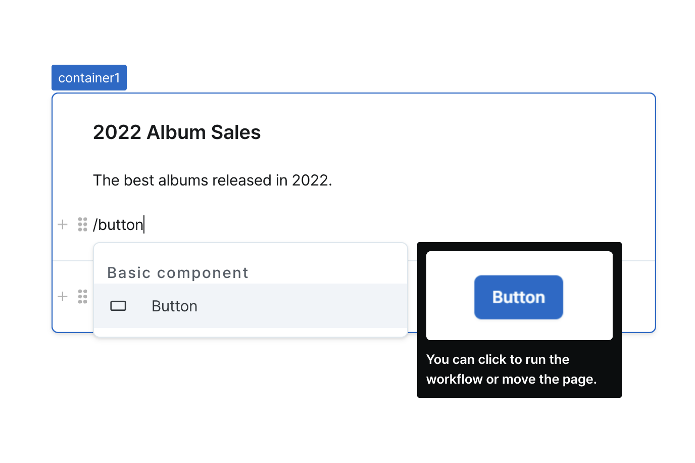
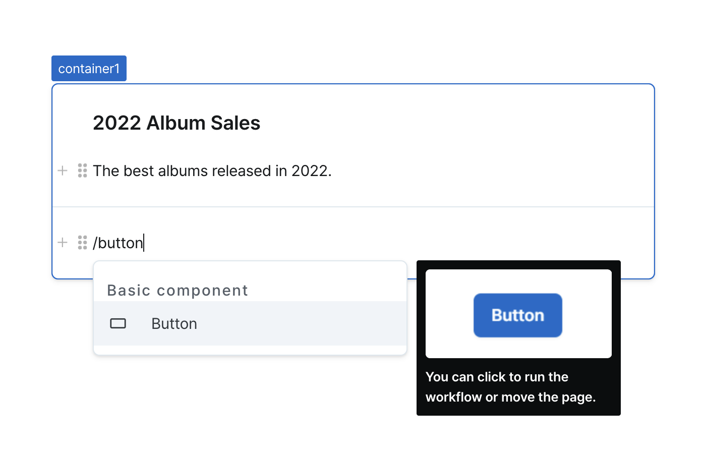
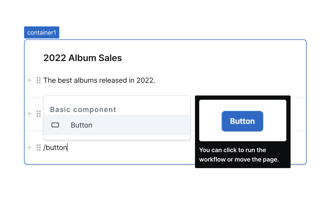
Content
Main content area of the container.
Supports all standard components with full property configuration.
Footer
Configurable section at the bottom of the container.
Available when footer visibility is enabled.
Supports all standard components with full property configuration.
States
| Property | Type | Description |
|---|---|---|
| value | Record<string, unknown> | Values of components inside container content |
Type Definitions
type OutlineStyle = 'outlined' | 'plain';