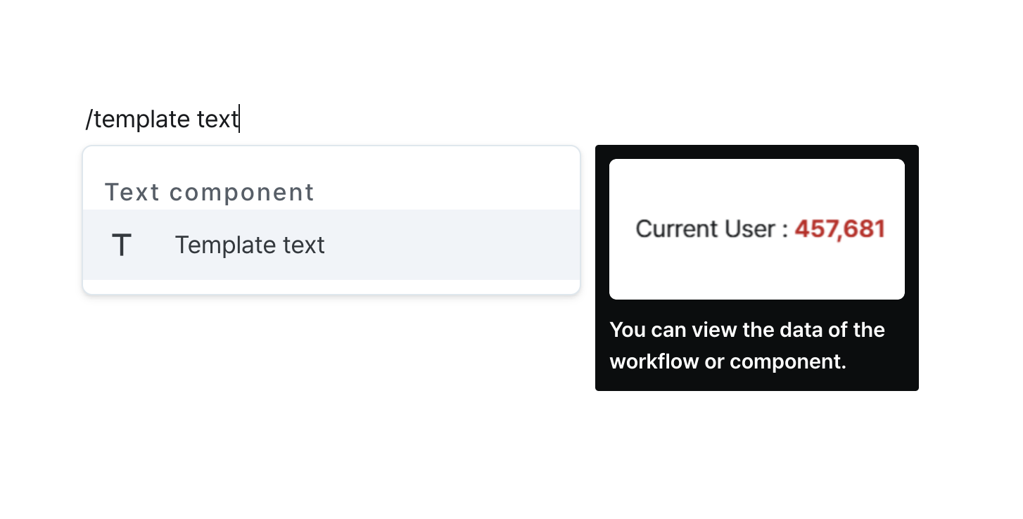
Template Text
Display dynamic content from workflows or component data through templates.
Properties
| Property | Type | Description |
|---|---|---|
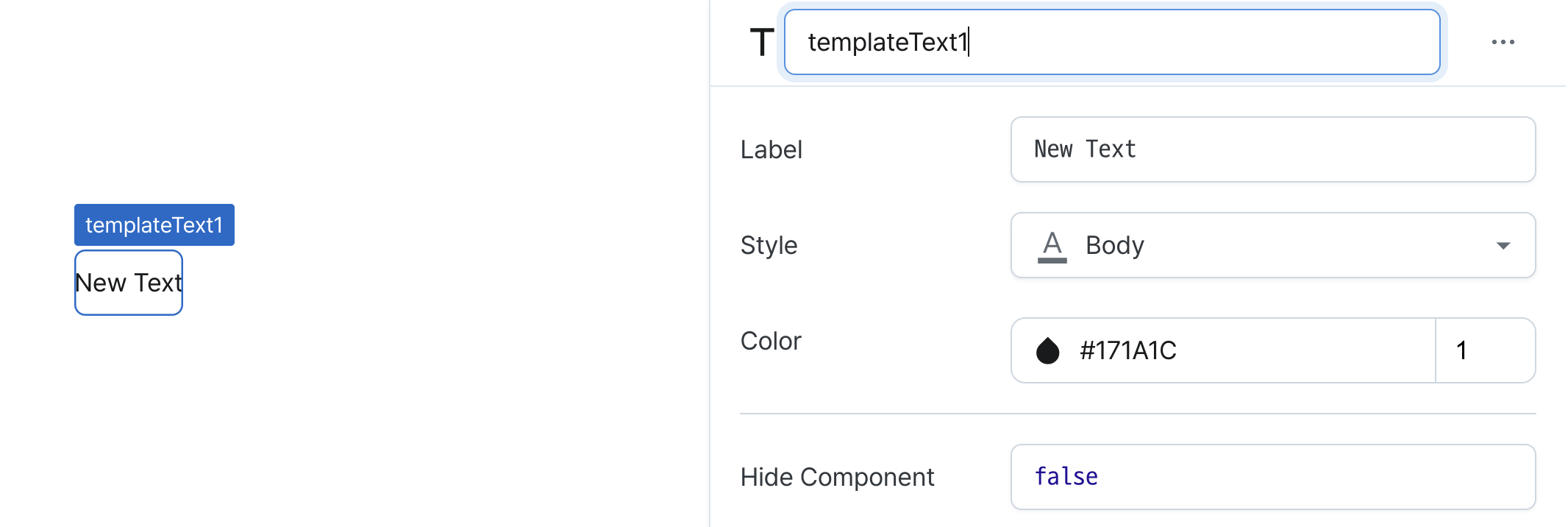
| Name (name) | string | Unique identifier for the template text component |
| Label (text) | string | Text displayed on the template text |
| Style (textStyle) | TextStyle | Style of the template text |
| Color (textColor) | string | Color of the template text |
| Hide Component (isHidden) | boolean | Whether to hide the template text on the deployed page |
Name (name)
Sets the unique identifier for the template text component. Please refer to the component naming rules
Label (text)
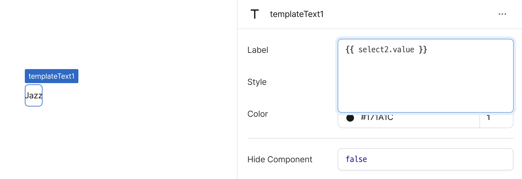
Sets the text displayed on the template text.
In the template, you can directly input values or use JavaScript and workflow results within {{}}.
For example, if a select component named select2 returns a string "Jazz", you can use it like {{ select2.value }}.
Style (textStyle)
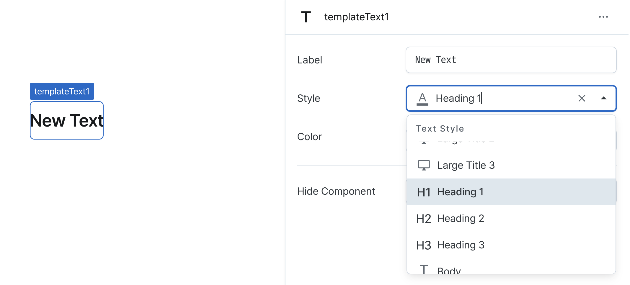
Chooses from predefined text styles to maintain consistent typography throughout your interface.
Available styles include different heading levels, body text, and display options to suit your content hierarchy needs.
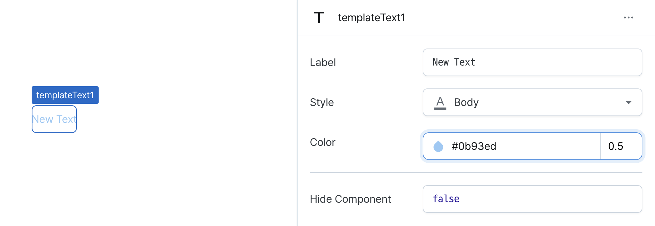
Color (textColor)
Defines the visual appearance of your template text by setting its color.
You can use custom color values to match your brand or design requirements.
The color can be set in two ways:
- Click the color icon to use our visual color picker
- Manually enter HEX color codes for precise control
You can also fine-tune the opacity level using the opacity input field on the right.
Hide Component (isHidden)
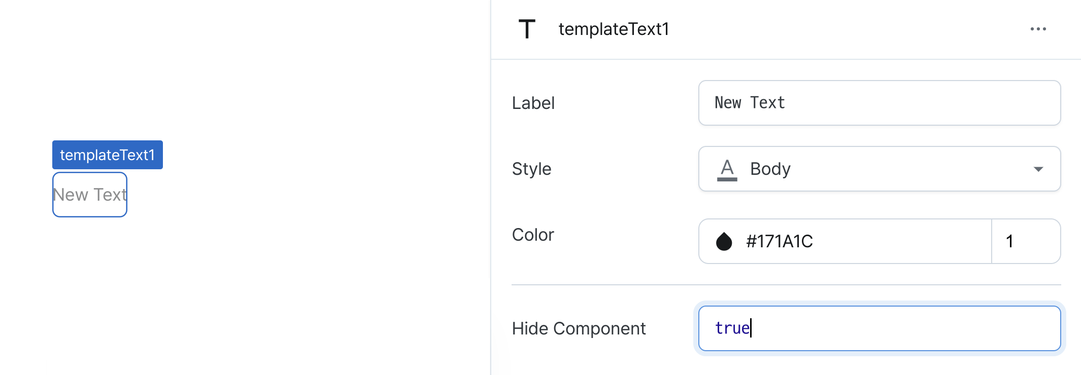
Controls visibility of the component.
When set to true:
- Hidden in deployed view
- Visible with reduced opacity in edit mode
States
| Property | Type | Description |
|---|---|---|
| value | string | Compiled result value of the text property |
Type Definitions
export type TextStyle = 'display1' | 'display2' | 'display3' | 'heading1' | 'heading2' | 'heading3' | 'body';