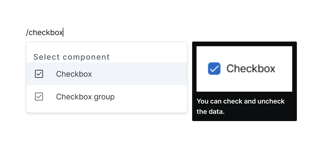
Checkbox
Give users binary choices. Whether it is checked or not.
Properties
| Property | Type | Description |
|---|---|---|
| Name (name) | string | Unique identifier for the checkbox component |
| Label (label) | string | Text displayed next to the checkbox |
| Default Value (defaultValue) | string (boolean) | Code that returns the default value |
| Disable Component (isDisabled) | boolean | Whether the checkbox is disabled |
| Hide Component (isHidden) | boolean | Whether the checkbox is hidden in deployed pages |
| Width (display) | Display | How the checkbox component occupies width |
Name (name)
Unique identifier for the checkbox component. Please refer to the component naming rules
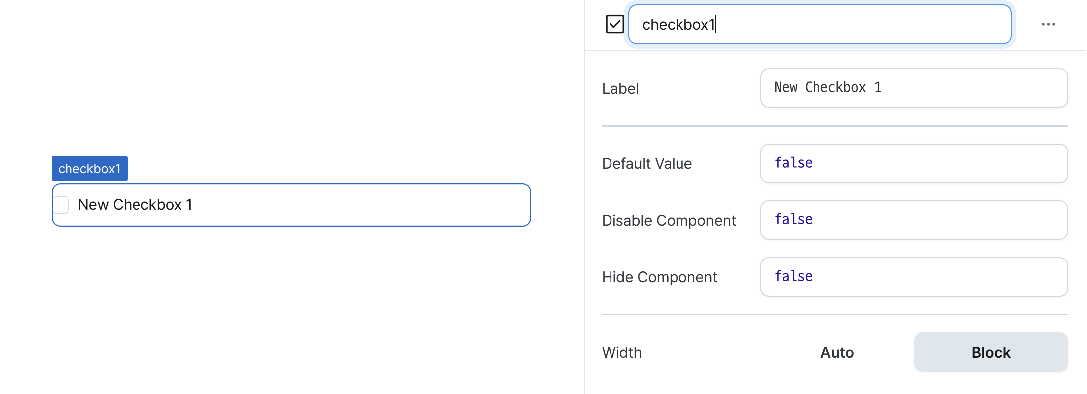
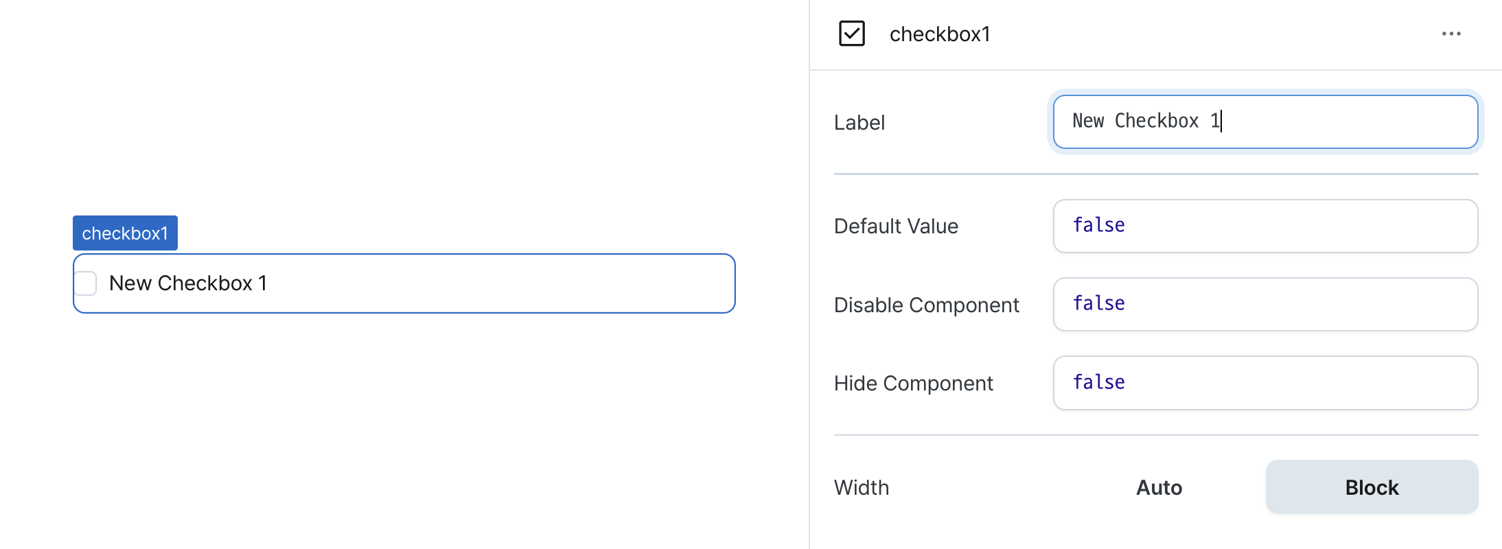
Label (label)
Sets the text displayed on the left side of the checkbox. (Supports Template Text)
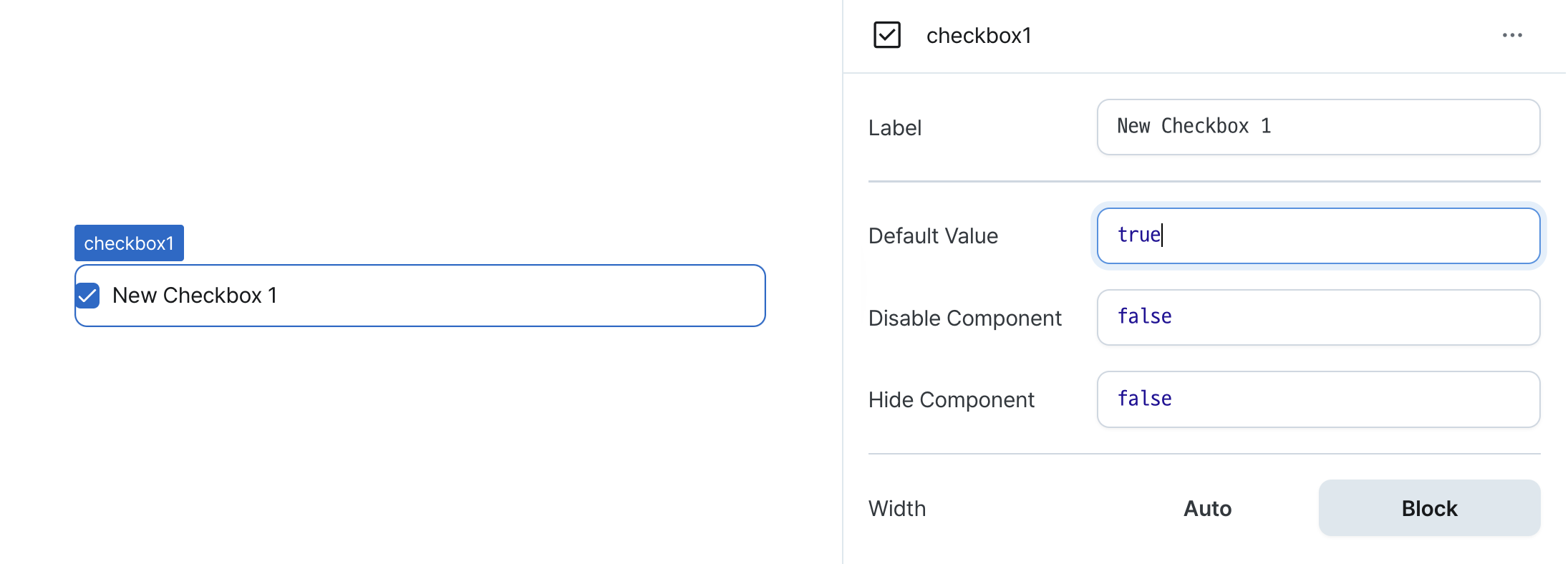
Default Value (defaultValue)
Sets the default checked value for the component.
Can be set through workflow results, direct input.
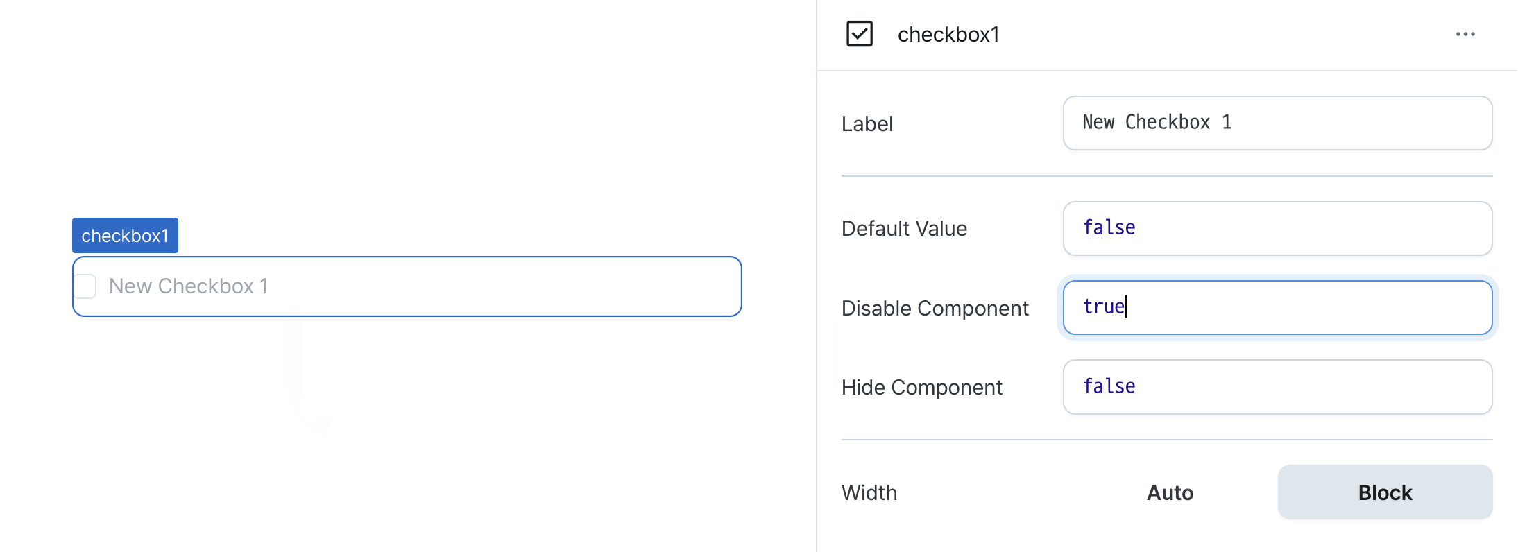
Disable Component (isDisabled)
Sets the disabled state of the component.
Can be set through workflow results, direct input.
When enabled, prevents user interaction with the component.
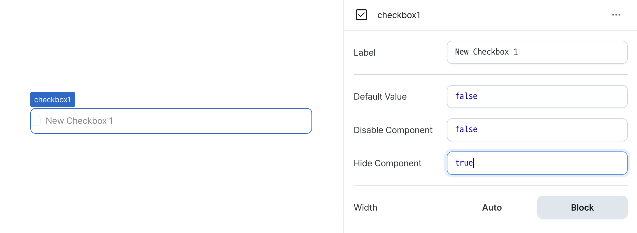
Hide Component (isHidden)
Controls visibility of the component.
When set to true:
- Hidden in deployed view
- Visible with reduced opacity in edit mode
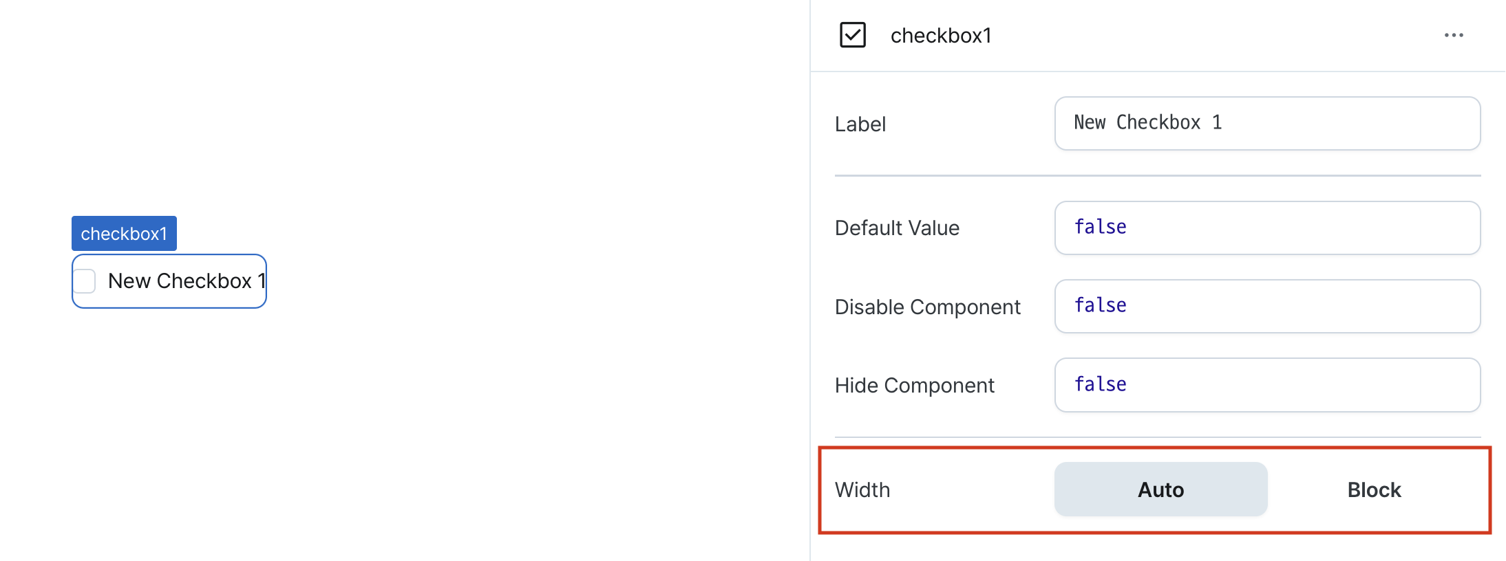
Width (display)
Sets how the component occupies width.
Selecting "Block" enables full-width usage.
Selecting "Auto" adjusts width to fit the label content.
States
| Property | Type | Description |
|---|---|---|
| checked | boolean | Checked state of the checkbox |
Type Definitions
type Display = 'inline-block' | 'block';