Metric Card
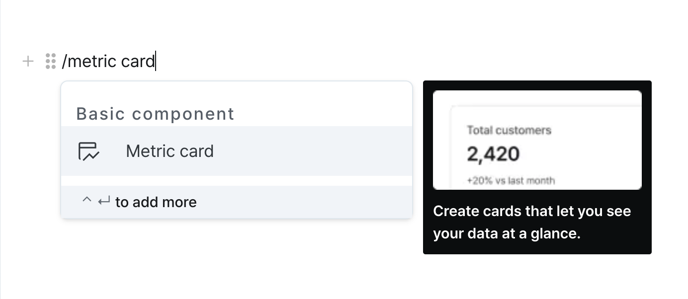
Display numerical data visually with title, value, and description.
Properties
| Property | Type | Description |
|---|---|---|
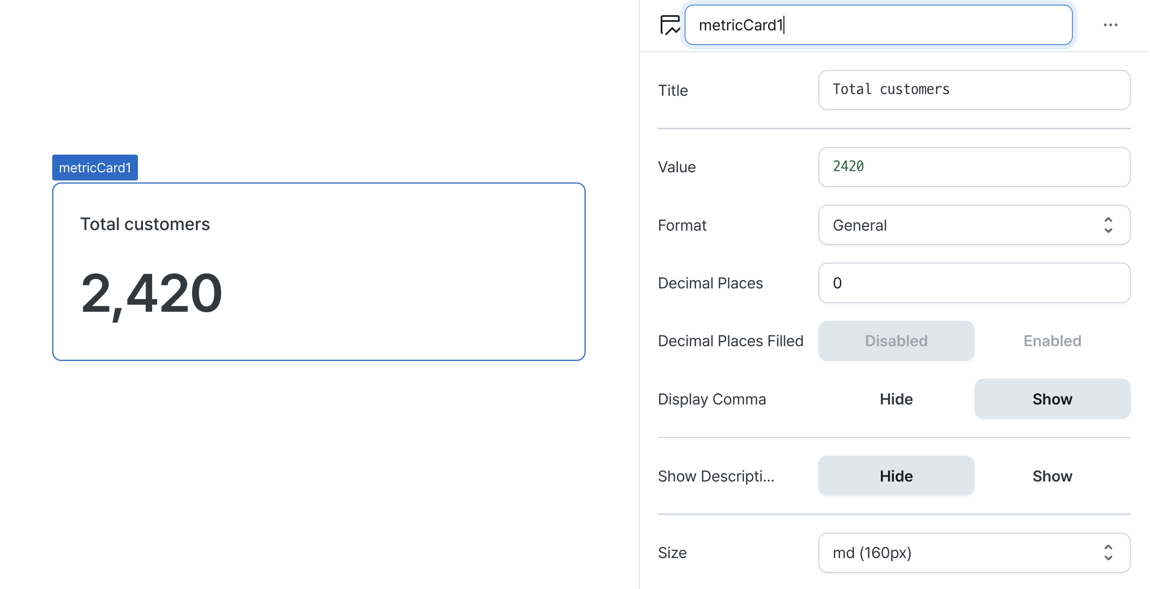
| Name (name) | string | Unique identifier for the metric card component |
| Title (title) | string | Text displayed at the top of the metric card |
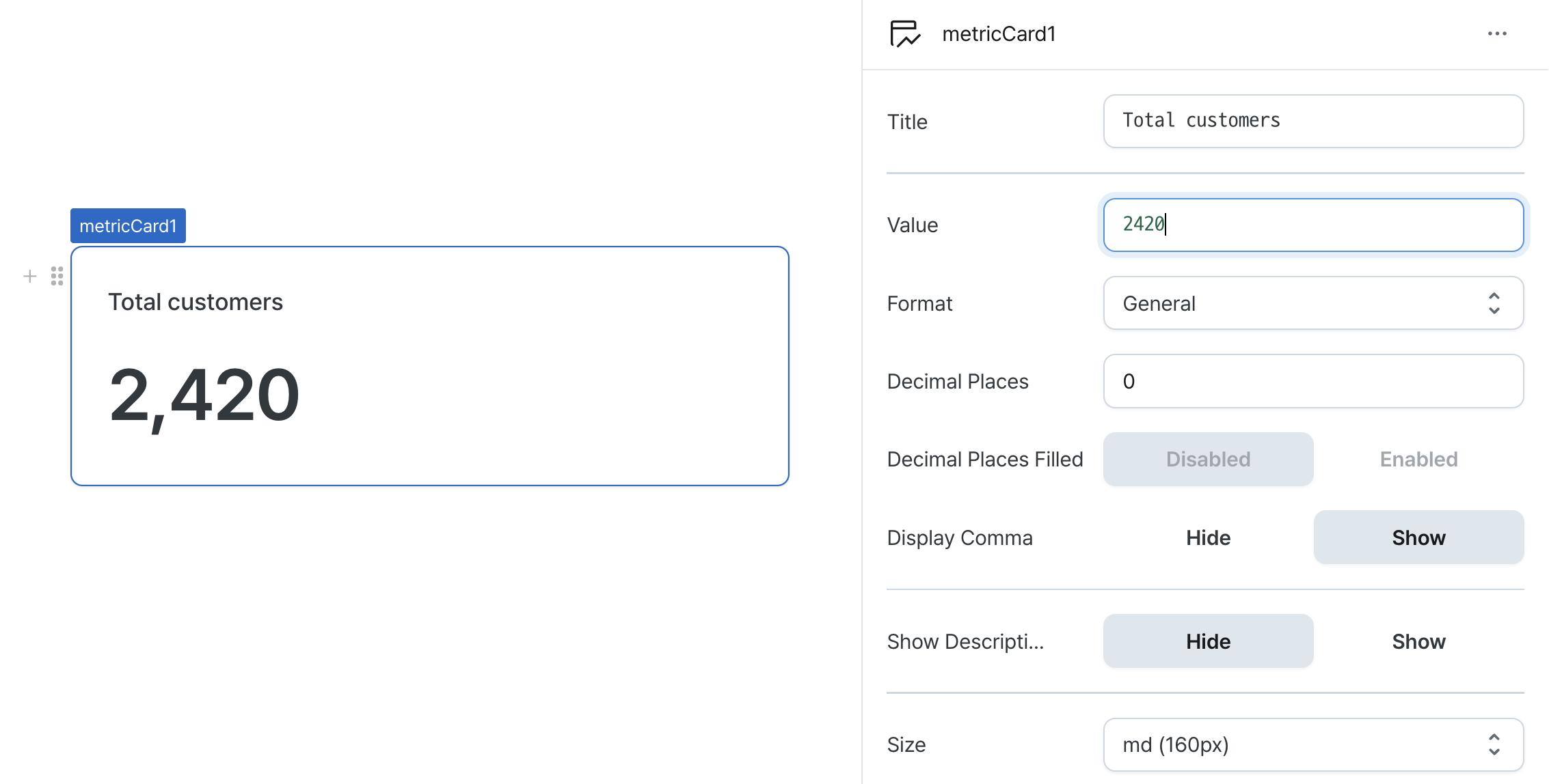
| Value (value) | string | The value to be displayed in the metric card |
| Format (format) | MetricCardFormat | The way to display the value |
| Currency Format (currencyCode) | string | Currency code to display before the value |
| Decimal Places (decimalPlaces) | number | Number of decimal places between 0 and 20 |
| Decimal Places Filled (isDecimalPlacesFilled) | boolean | Whether to enable filling zeros up to the specified decimal places |
| Display Comma (useGrouping) | boolean | Whether to display commas at every 1,000 position |
| Show Description (isDescriptionVisible) | boolean | Whether to display the description |
| Description (description) | string | Text displayed at the bottom of the metric card |
| Height (size) | MetricCardSize | Height of the metric card |
| Hide Component (isHidden) | boolean | Whether to hide the metric card on the deployed page |
Name (name)
Sets the unique identifier for the metric card component. Please refer to the component naming rules
Title (title)
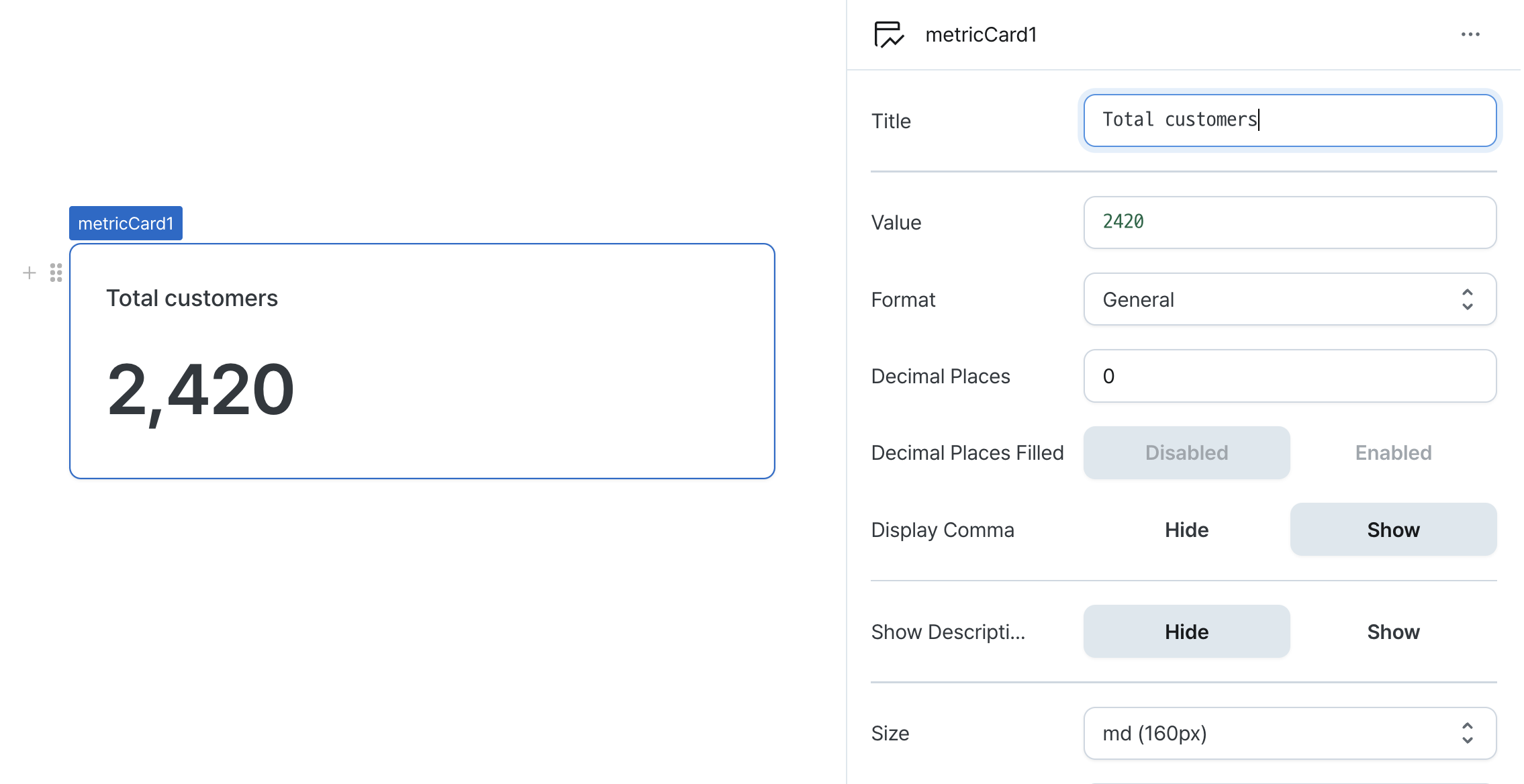
Sets the text displayed at the top of the metric card. (Supports Template Text)
Value (value)
Sets the value to be displayed in the metric card.
Can be set through workflow results, direct input.
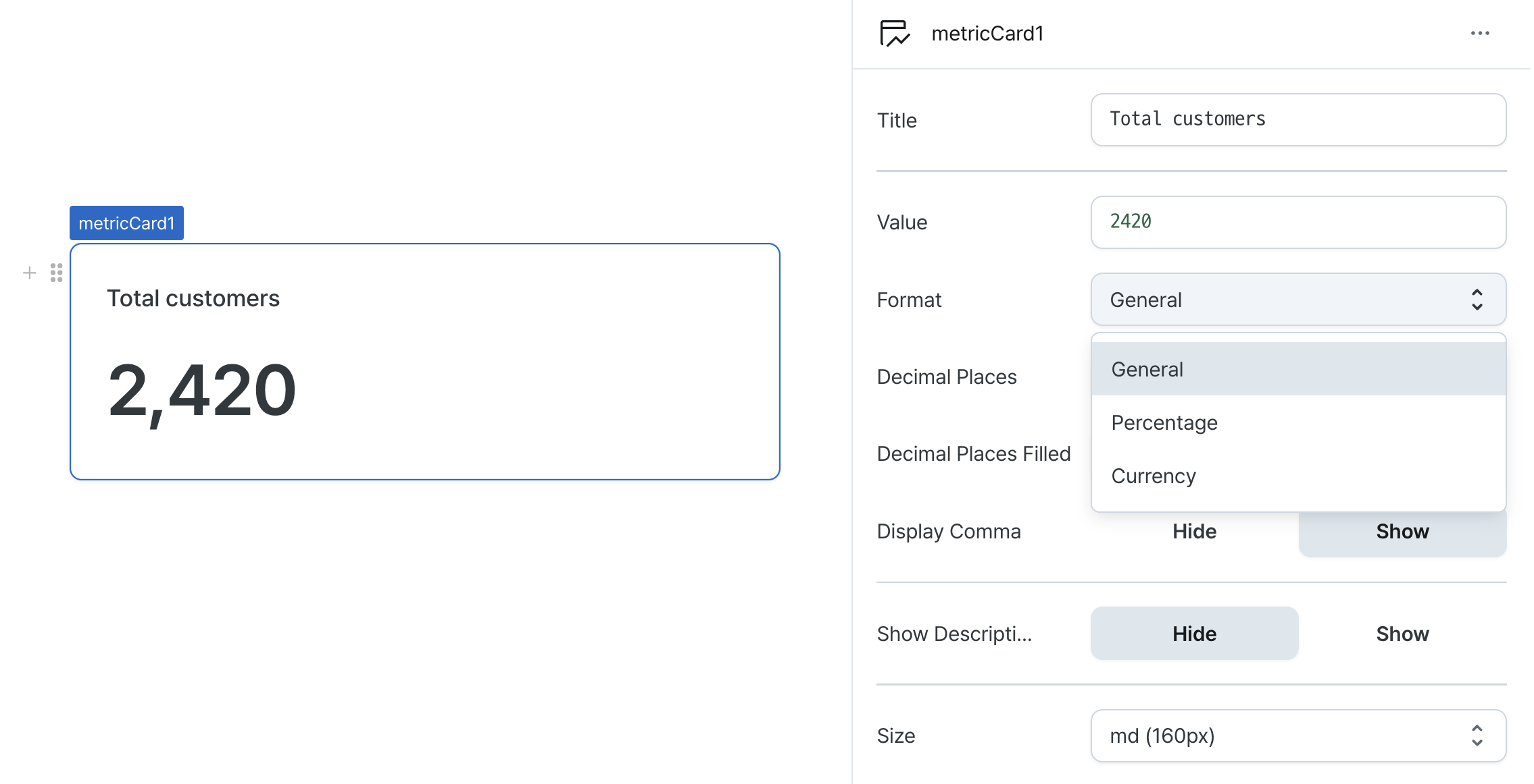
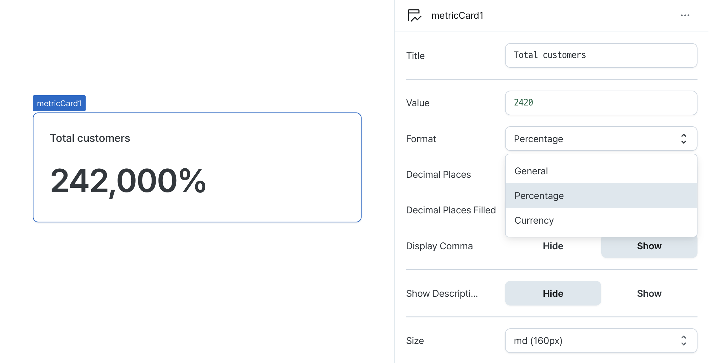
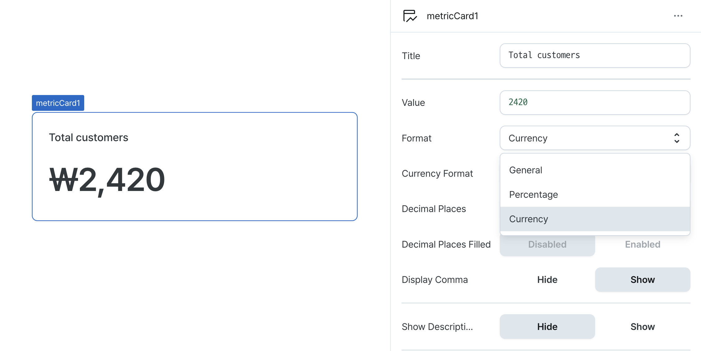
Format (format)
Determines how the value is displayed in the card.
Options:
general: Displays numbers in standard formatpercentage: Displays numbers as percentagescurrency: Displays numbers in currency format
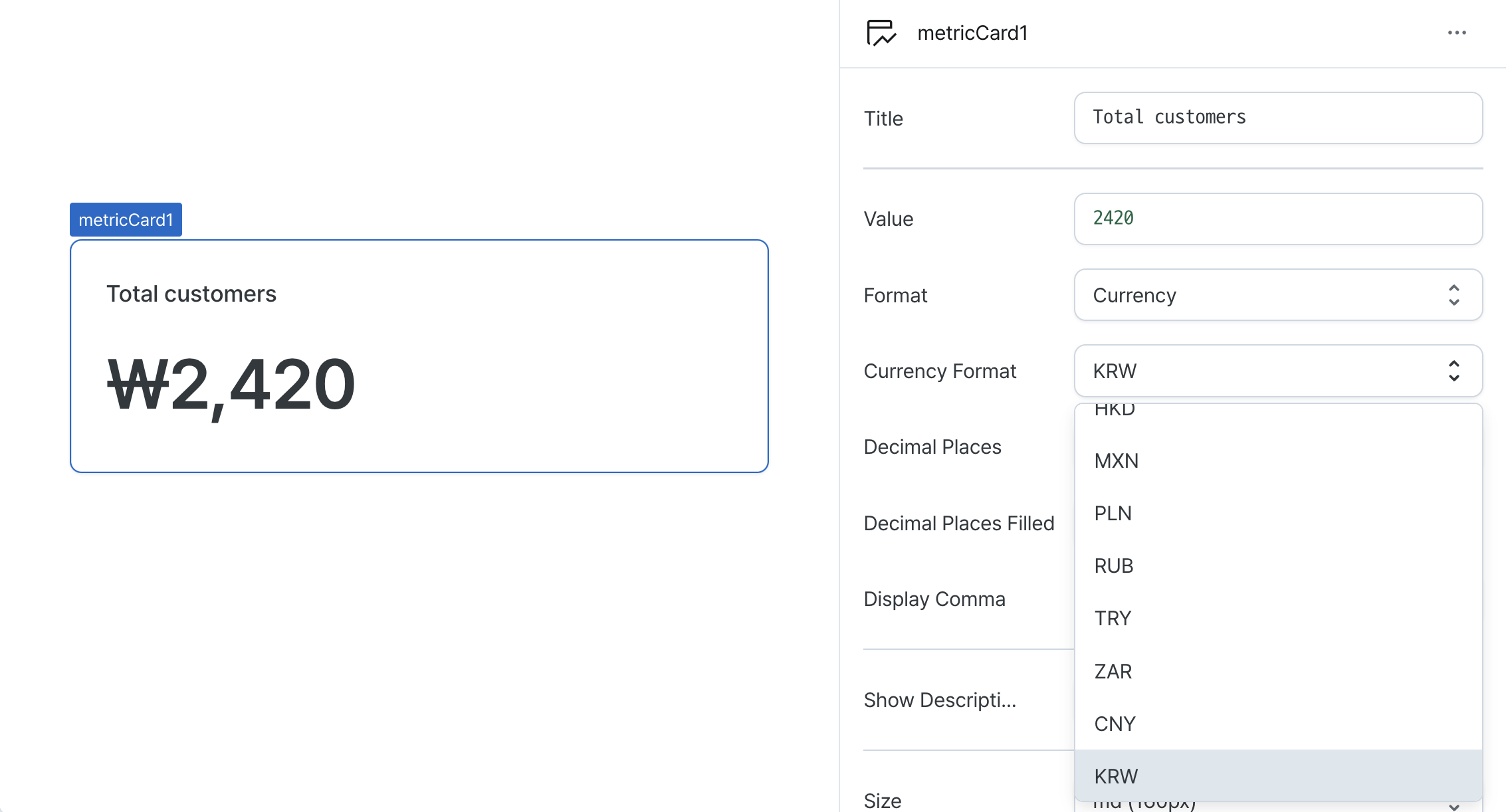
Currency Format (currencyCode)
When format is set to currency, specifies the currency code to display before the value.
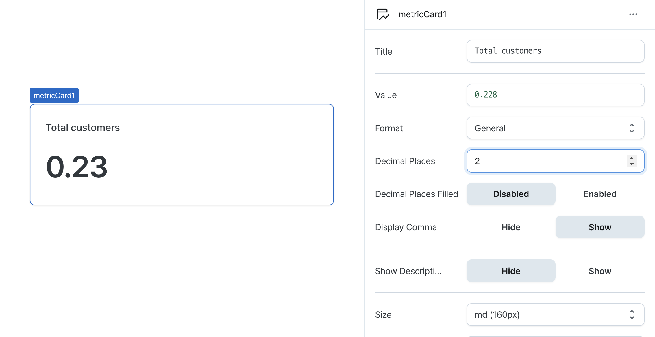
Decimal Places (decimalPlaces)
Sets the maximum number of decimal places to display.
Accepts values between 0 and 20.
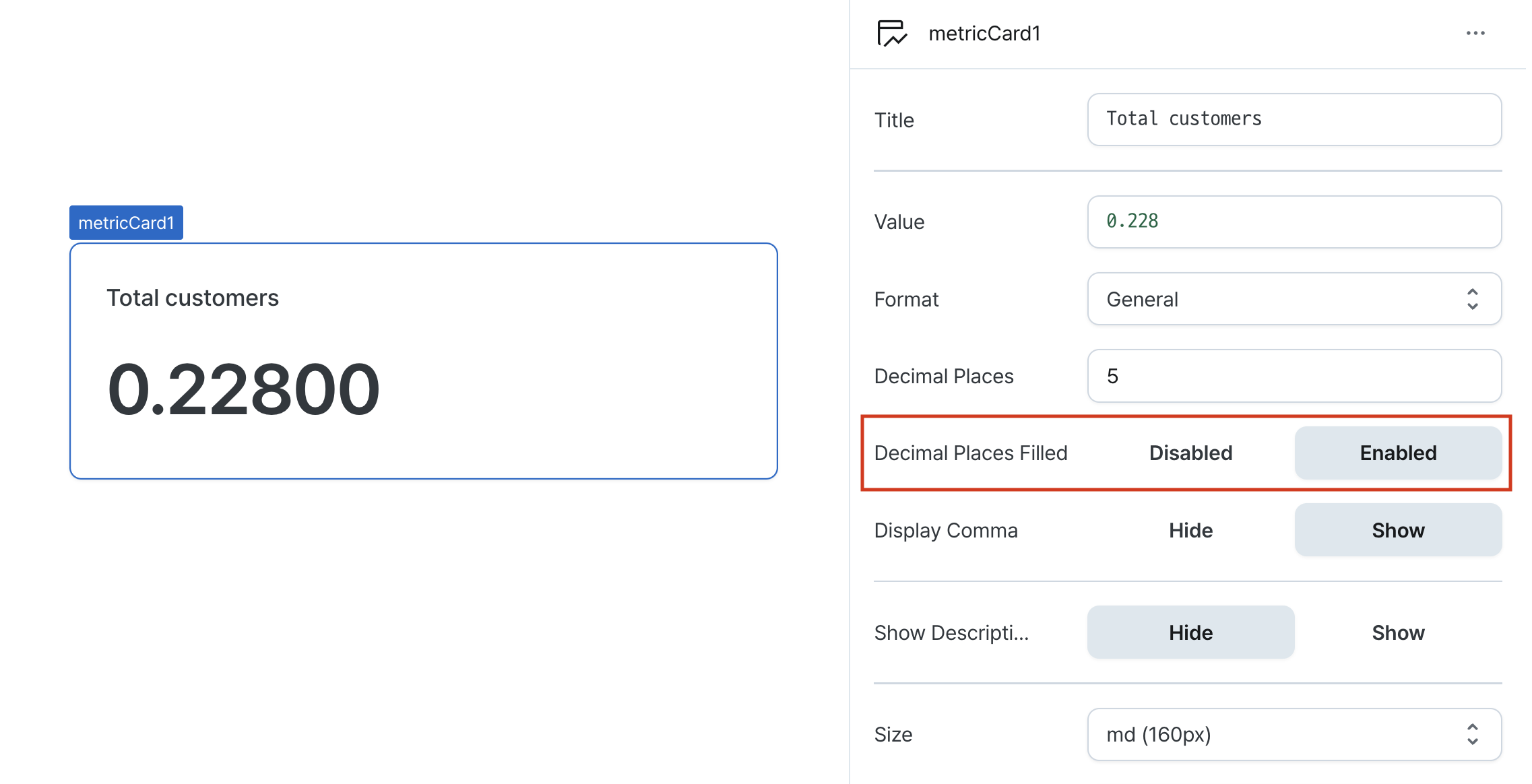
Decimal Places Filled (isDecimalPlacesFilled)
Determines whether to pad decimal places with zeros.
When enabled, numbers are padded with zeros to match the specified decimal places.
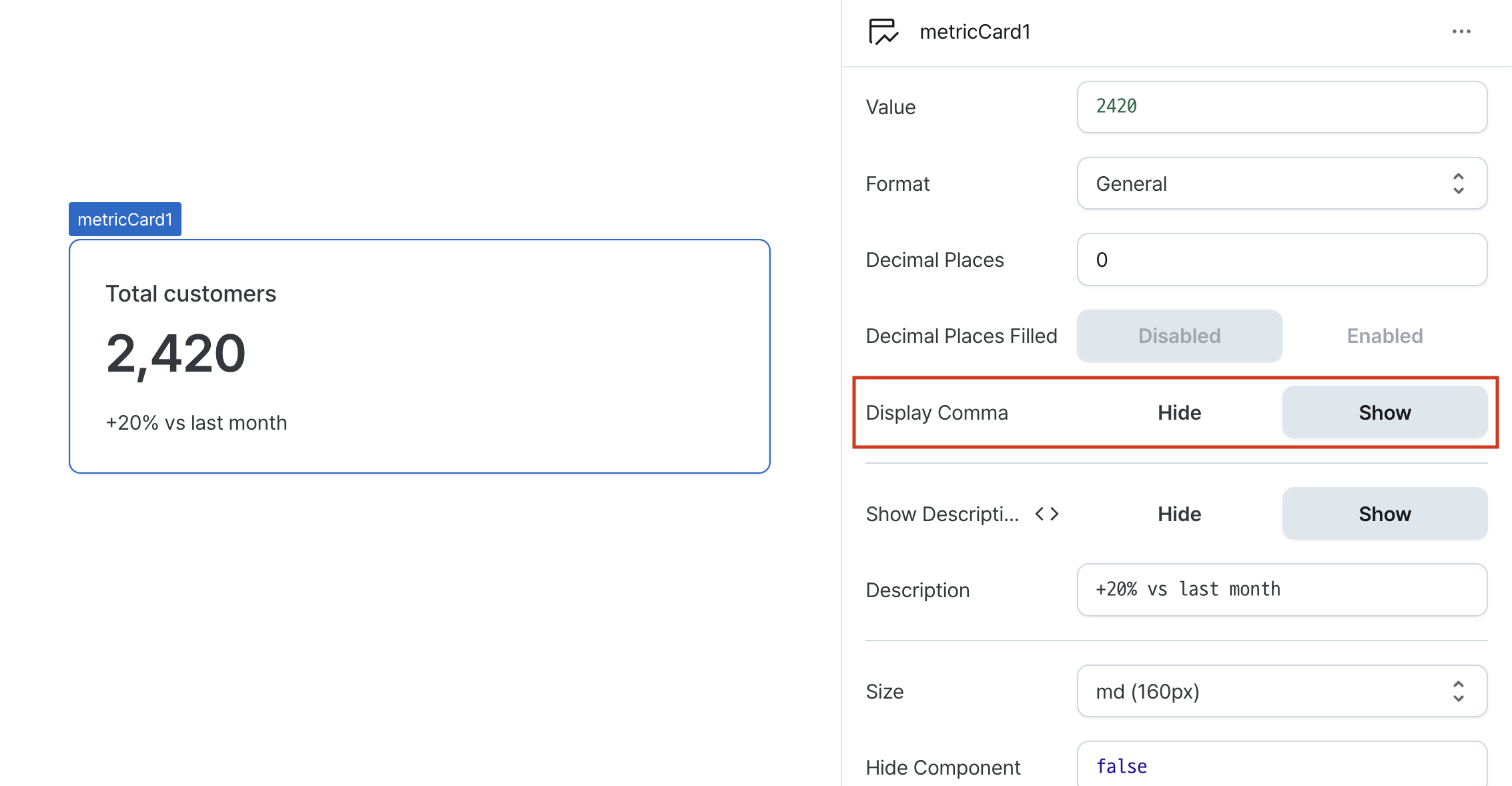
Display Comma (useGrouping)
Controls the display of thousand separators.
When enabled, adds commas as thousand separators (e.g., 1,000,000).
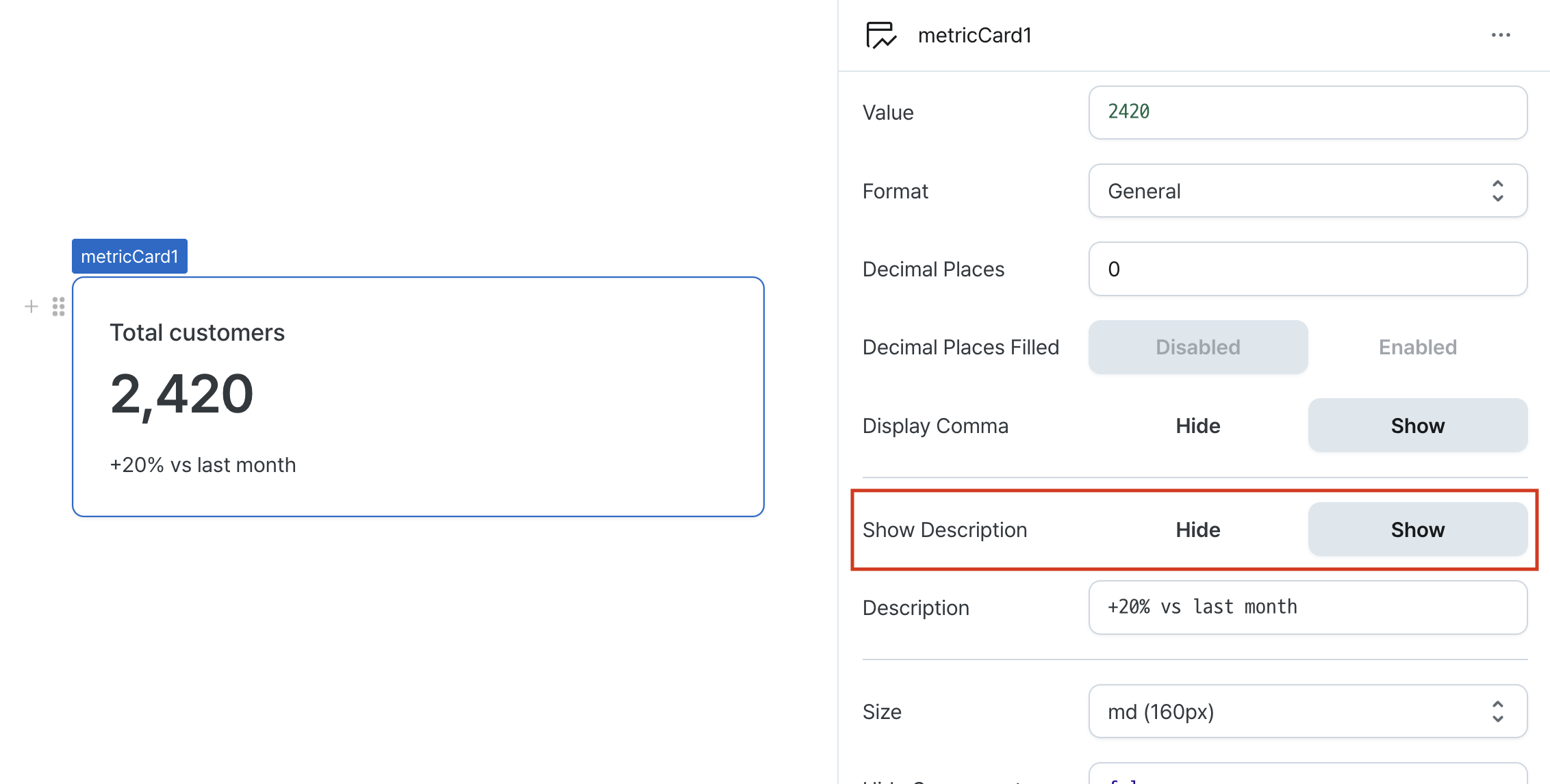
Show Description (isDescriptionVisible)
Controls whether the description is displayed.
Description (description)
Sets the text displayed at the bottom of the metric card. (Supports Template Text)
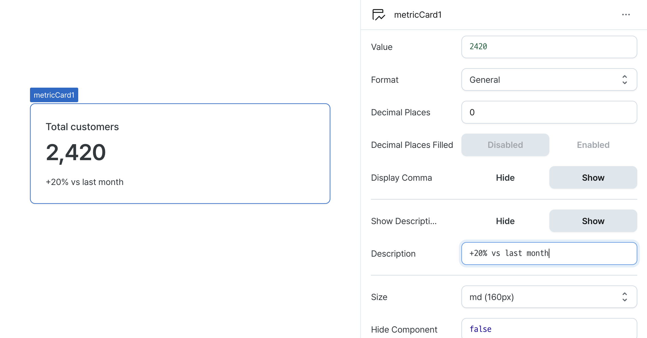
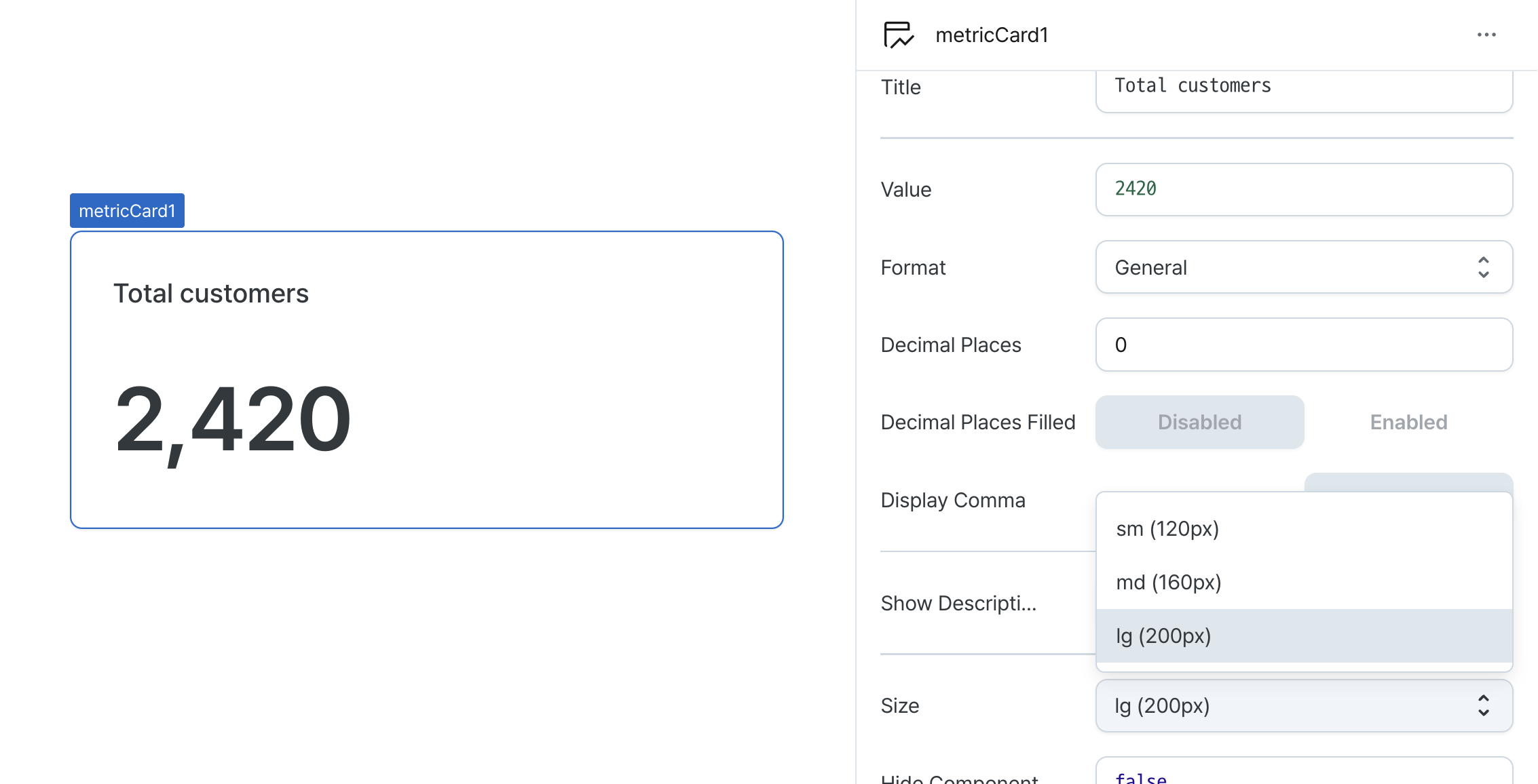
Height (size)
Sets the height of the metric card. Choose between sm, md, or lg.
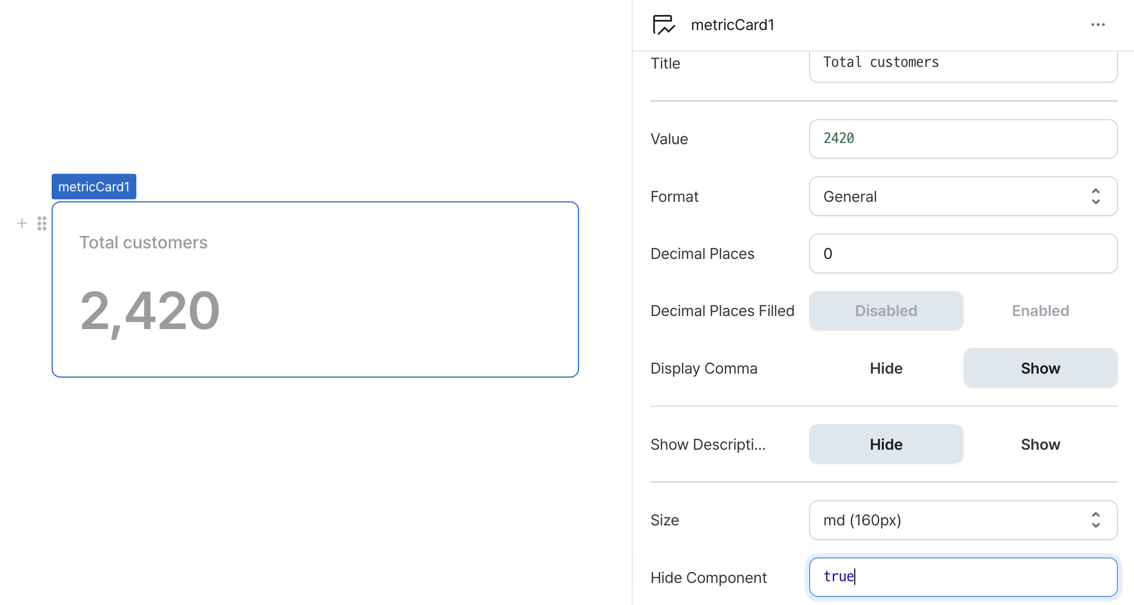
Hide Component (isHidden)
Controls visibility of the component.
When set to true:
- Hidden in deployed view
- Visible with reduced opacity in edit mode
Type Definitions
type MetricCardFormat = 'general' | 'percent' | 'currency';

type MetricCardSize = 'sm' | 'md' | 'lg';