Checkbox Group
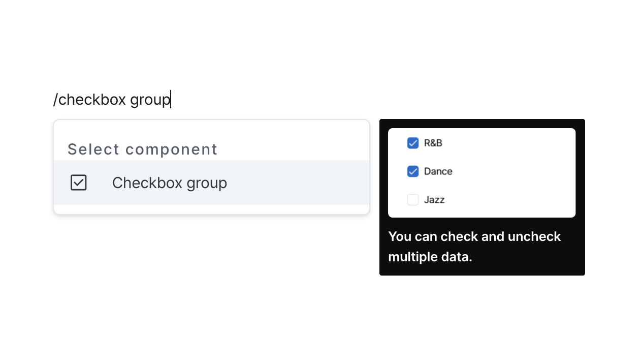
Select multiple items through a group of checkable options.
Properties
| Property | Type | Description |
|---|---|---|
| Name (name) | string | Unique identifier for the checkbox group component |
| Options (code) | string (Option[]) | Code that returns an array of options |
| Default Value (defaultValue) | string (OptionValue[]) | Code that returns an array of default values |
Name (name)
Unique identifier for the checkbox group component. Please refer to the component naming rules
Options (code)
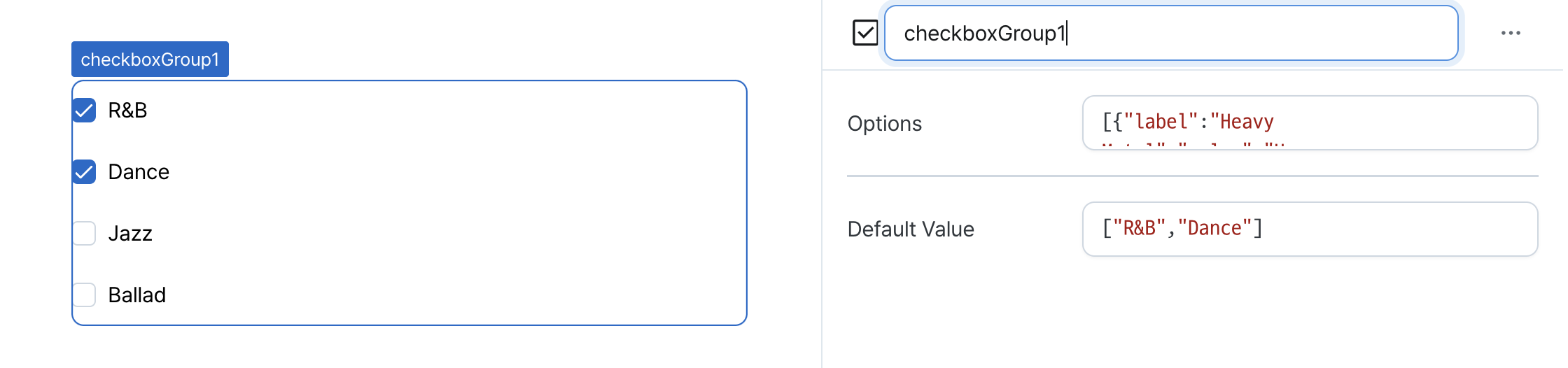
Sets the available options for the component.
Can be set through workflow results, direct input.
Example:
[
  { label: "Heavy Metal", value: "Heavy Metal", isHidden: true },
  { label: "R&B", value: "R&B" },
  { label: "Dance", value: "Dance" },
  { label: "Jazz", value: "Jazz" },
  { label: "Ballad", value: "Ballad" }
];
Default Value (defaultValue)
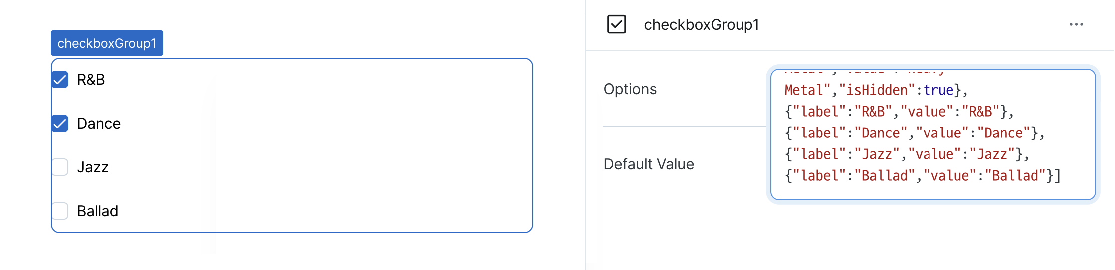
Sets the default checked values for the component.
Can be set through workflow results, direct input.
States
| Property | Type | Description |
|---|---|---|
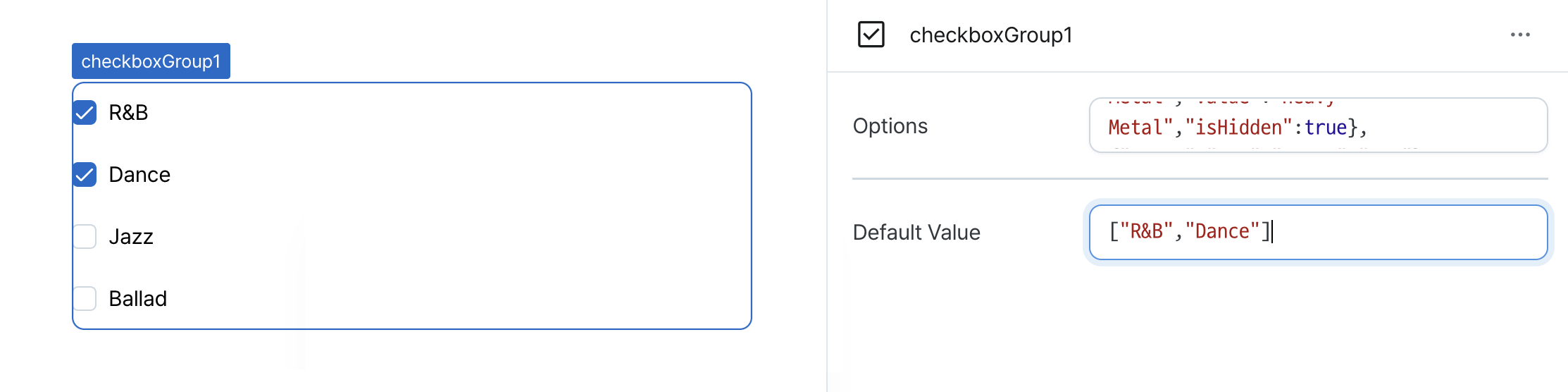
| values | string[] | Array of value from selected options |
Type Definitions
type OptionValue = string;

interface Option {
  // Option label
  label: string;
  // Option value
  value: OptionValue;
  // Option visibility
  isHidden?: boolean;
}