Registering and Using Custom Components
This document explains how to register custom components in Hops and how to use them in pages.
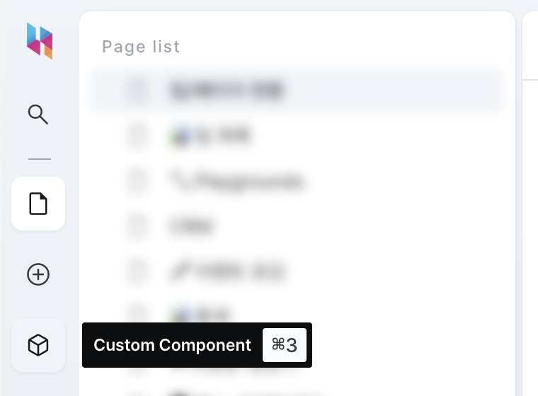
Accessing the Custom Component Management Screen
To create and manage custom components, you first need to access the custom component management screen.
- Select the Custom Components menu from the left sidebar menu.
Creating a New Custom Component
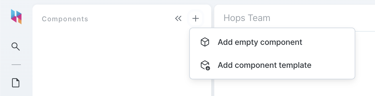
Here's how to create a new custom component:
- On the custom component list, click the [+] button in the upper right corner.
- Select a creation option:
- Empty Component: Start with an empty template
- Template Component: Start with a template that includes sample code
- After selection, a component will be added, and you'll be directed to the component editor screen.
Using the Custom Component Editor
The custom component editor is divided into three main areas:
- Preview: Area for viewing the component in real-time
- Code Editor: Area for writing React component code
- Debug Information: Area for execution results and logs of the component

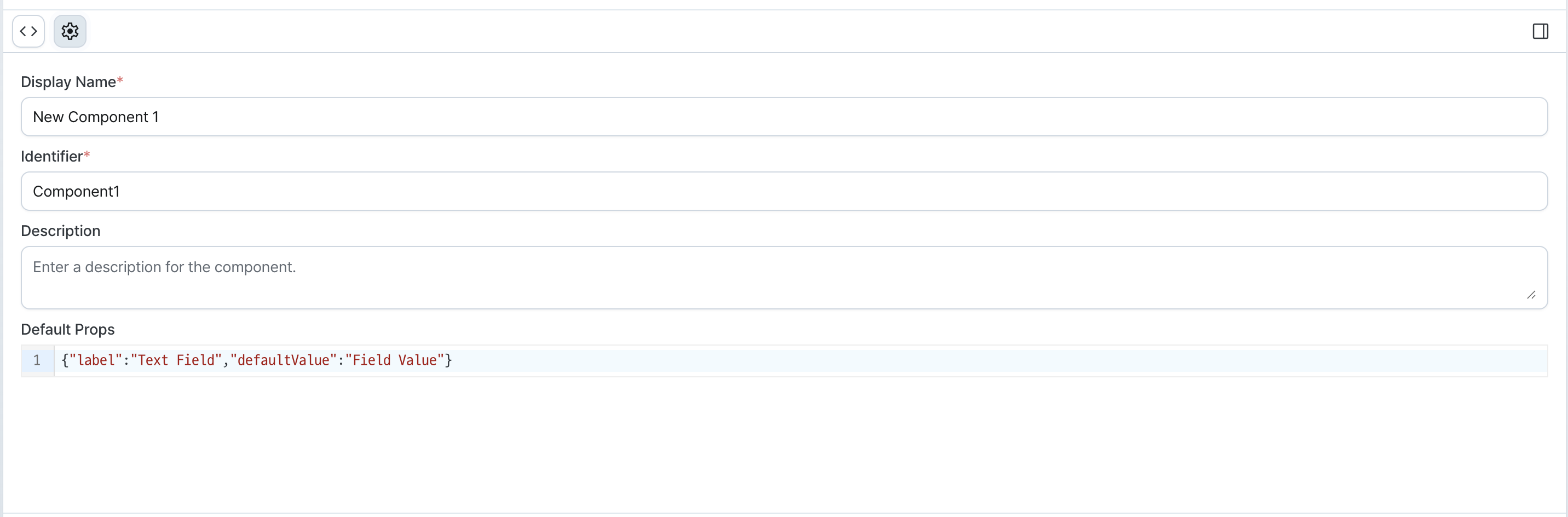
Setting Component Information
Set the basic information for the component. You can find it by tapping the gear icon at the top in the code editor area:
- Display Name: Name displayed in the custom component list and slash component list
- Identifier: Unique identifier for the component (use only English letters, numbers, and
_, must start with an English letter) - Description: Description of the component's purpose and usage (can be used to help other developers understand the component)
- Default Props: Initial property values passed to the component (passed as props to the React component)
Setting Default Props
In the Default Props section at the component information, you can set default property values for the component:
{
  "label": "Name",
  "defaultValue": "Hops Kim"
}
These settings are used as default values when the component is first added in the page editor.
Using Built-in Props
Every custom component comes with built-in properties. For example, the name property is used as the component's identifier, and the isHidden property allows you to dynamically show or hide the component on the page.
You can configure these when adding custom components to the editor.
Writing Code
Write the React-based code in the editor. For detailed information on how to write code, refer to the Writing Custom Components document.
The basic structure is as follows:
import { memo, ReactElement } from 'react';
import { CustomComponentRenderProps, useComponentState, useLogger } from '@hops/custom-component';
import { FormControl, FormLabel, Input } from '@hops/design-system';

// Define component props type
interface OwnProps {
  label: string;
  defaultValue: string;
}

// Component implementation
function Component(props: CustomComponentRenderProps<OwnProps>): ReactElement {
  // Read component properties
  const { defaultValue, label } = props;

  // Use logger
  const logger = useLogger();

  // State management
  const [value, setValue] = useComponentState<string>('inputValue', defaultValue);

  return (
    <FormControl>
      <FormLabel>{label}</FormLabel>
      <Input
        value={value}
        onChange={(e) => {
          setValue(e.target.value);
          logger.debug(`onChange called: ${e.target.value}`);
        }}
      />
    </FormControl>
  );
}

export default memo(Component);
Setting Test Props
In the debug info area, tap the gear icon at the top to set Test Props.
These settings are only used in the preview section of the component editor and are not applied to actual pages.
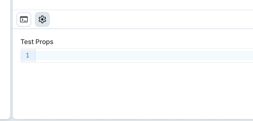
In the Test Props section, you can set property values for the preview in JSON format:
{
  "label": "Test Label",
  "defaultValue": "Test Value"
}
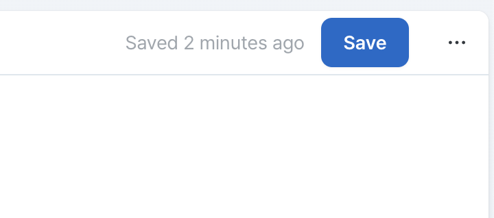
Saving and Deploying Components
After completing your work:
- Click the Save button in the upper right corner to save the component (changes are auto-saved while working)
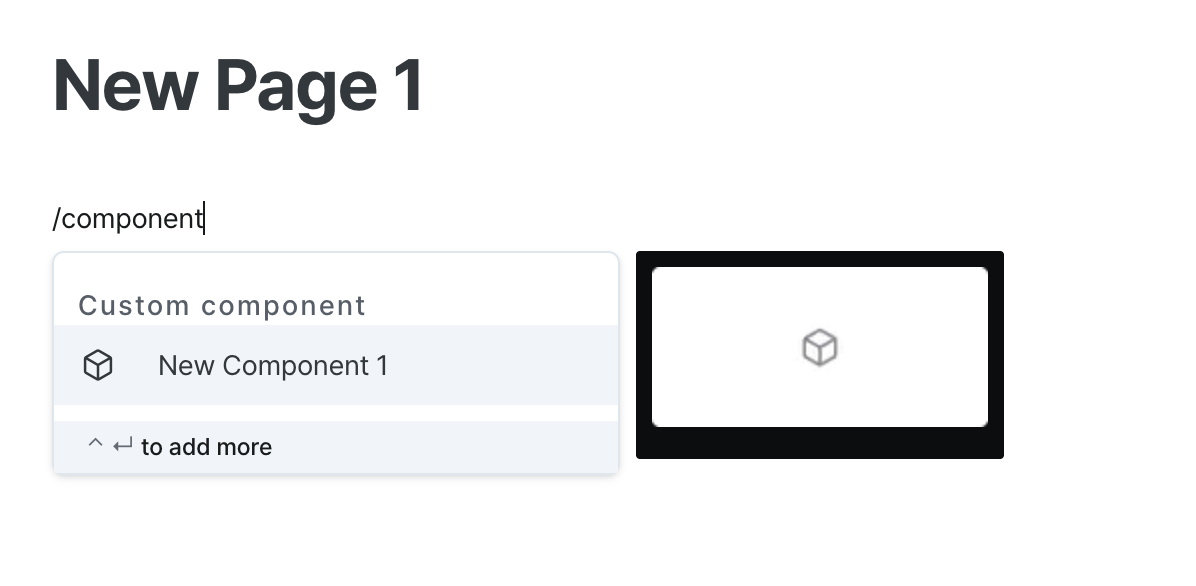
Using Custom Components in the Page Editor
Saved custom components can be used in the page editor just like regular components:
Use directly from the editor
- In the page editor, press
/and search for custom components by their display name and identifier. - Press Enter to add the custom component you entered.
Use from the component list
- select the Components button in the left sidebar.
- In the Components list, locate the Custom Components group at the bottom.
- Drag the Custom Component you want to use and drop it into the editor.

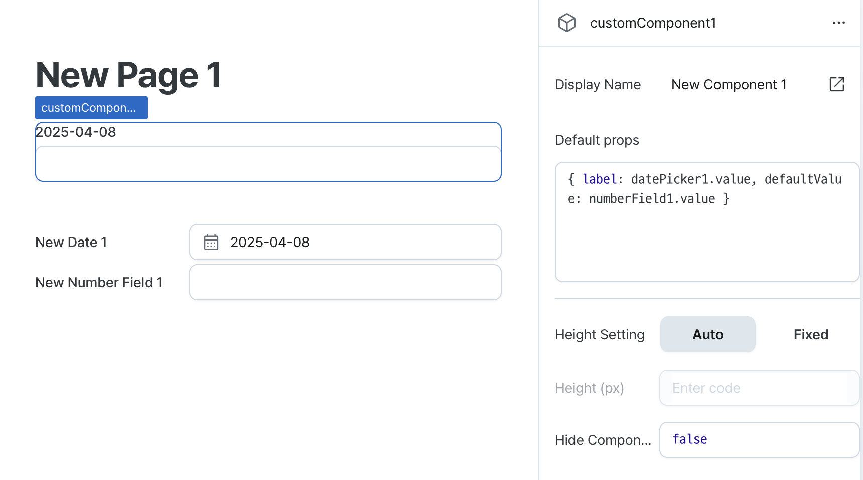
Setting Default Props for Custom Components
When you select a custom component in the page editor, you can set default props in the right property panel:
- Pass props to custom component by entering code
- Connect state of other components and workflows to use dynamic values
Using Custom Component State
The state defined by useComponentState when implementing a custom component is also externally accessible.
// State management
const [value, setValue] = useComponentState<string>('inputValue', defaultValue);
Access the state of a custom component with an accessor of the form component_name.state_name where needed.
customComponent1.inputValue;
Updating and Managing Custom Components
Updating Components
- Click on the component you want to modify from the custom component list screen.
- Apply the necessary changes in the editor.
- Changes will be saved automatically.
Duplicating Components
To create a new component based on an existing one:
- Click the options menu (⋮) of the component you want to duplicate in the custom component list.
- Select the Duplicate option.
- Enter a new name and title to complete the duplication.
Deleting Components
To delete a component that is no longer in use:
- Click the options menu (⋮) of the component you want to delete in the custom component list.
- Select the Delete option.
- Click Confirm in the confirmation dialog to complete the deletion.
Deleting a component may cause errors in all pages that use that component. Before deleting, make sure there are no pages using the component.
For more information about custom components, refer to the following documents: